50 Beautiful Landing Page Examples Built with Tailwind CSS
A curated gallery of 50 stunning landing page design patterns built with Tailwind CSS, organized by industry. Discover SaaS, e-commerce, agency, startup, and portfolio designs — plus how to build your own with pre-made blocks.
SERP Blocks Team
Product
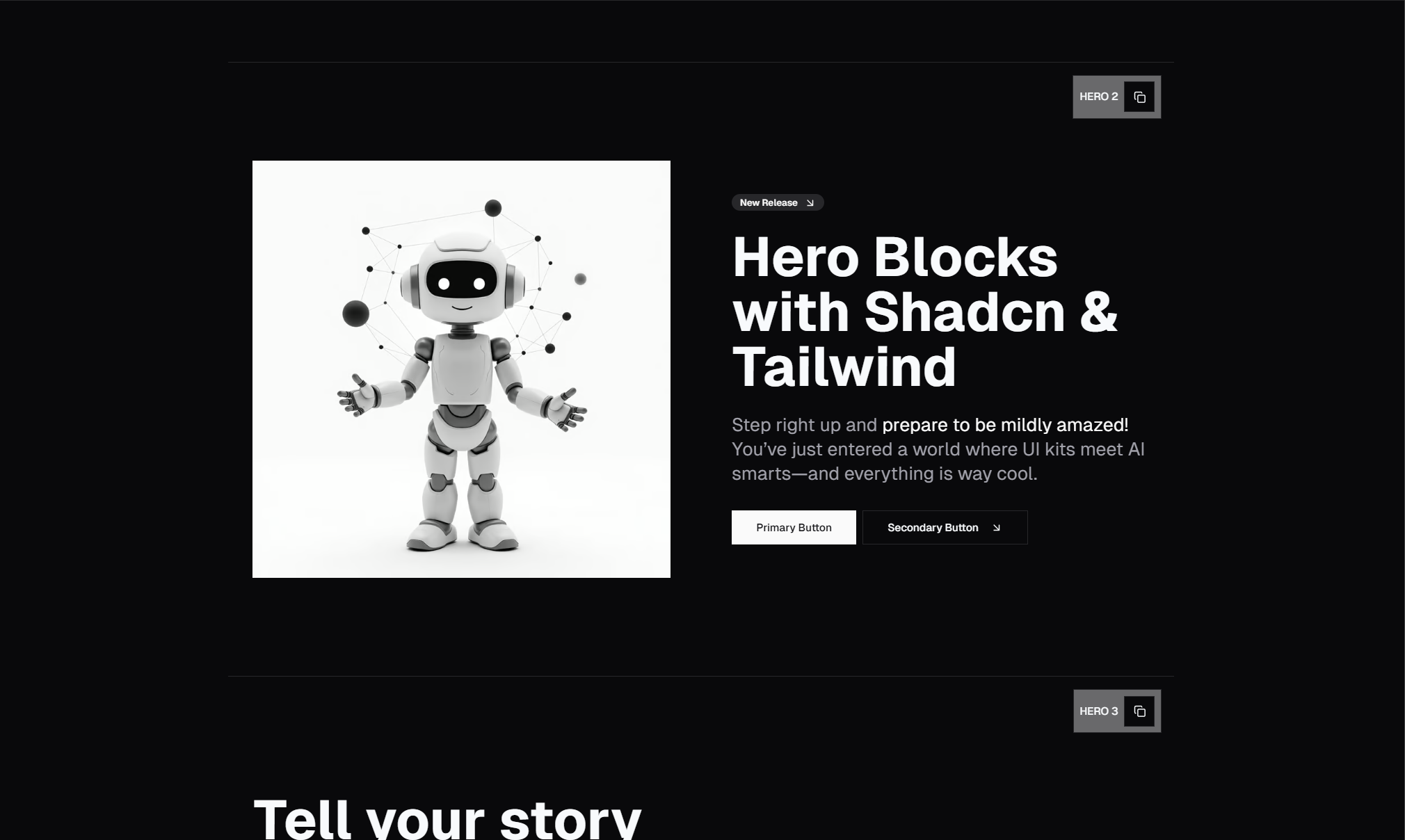
Tailwind CSS changed the way developers build landing pages. Instead of fighting opinionated frameworks or writing hundreds of lines of custom CSS, you compose utility classes directly in your markup. The result is fast, consistent, and endlessly customizable.
But knowing the tool and knowing what to build with it are two different problems. A blank Tailwind project gives you infinite possibilities — which is exactly why so many developers stare at an empty page.tsx for longer than they'd like to admit.
This post collects 50 landing page design patterns that work. They're organized by industry so you can jump straight to what's relevant, and each entry breaks down the design approach so you understand why it works — not just what it looks like.
Why Tailwind CSS Dominates Landing Page Development
Before diving into the examples, it's worth understanding why Tailwind has become the default choice for landing pages in 2026.
Rapid iteration. Landing pages live and die by conversion rates. You need to test headline sizes, button colors, section spacing, and layout variations constantly. Tailwind's utility-first approach means you change a class name instead of hunting through stylesheets.
Responsive by default. Every Tailwind utility supports responsive prefixes. A hero that looks stunning on desktop and collapses gracefully on mobile takes minutes, not hours.
Design consistency. Tailwind's spacing scale, color palette, and typography system keep your entire page visually coherent without a design system document.
Performance. Tailwind purges unused styles in production. Your landing page ships only the CSS it actually uses, which means faster load times and better Core Web Vitals.
Ecosystem. Tailwind works with React, Next.js, Vue, Astro, and virtually every modern framework. Build once, deploy anywhere.
Now let's look at what the best landing pages actually do.
SaaS Landing Pages (Examples 1–10)
SaaS landing pages have a singular job: convert visitors into trial signups or demo requests. The best ones follow a predictable structure that works because it mirrors how buyers evaluate software.
1. The Headline-First Minimal
A massive centered headline, a one-sentence subheading, and a single CTA button. No images, no distractions. This pattern works for developer tools and API products where the audience already knows what they need. The negative space forces attention onto the value proposition.
2. The Split-Screen Product Demo
Left side: headline, bullet points, and a CTA. Right side: a product screenshot or animated demo. This layout lets visitors read and evaluate simultaneously. It works especially well when your product has a visual interface worth showing off.
3. The Social Proof Stack
Hero section followed immediately by a logo bar of customer brands, then a testimonial carousel. This pattern front-loads credibility and works for products entering competitive markets where trust is the primary conversion barrier.
4. The Feature Grid Below the Fold
A clean hero transitions into a three-column or four-column feature grid. Each feature gets an icon, a heading, and two sentences. This works for products with multiple use cases that need equal billing.
5. The Interactive Pricing Anchor
The hero includes a pricing toggle or calculator right in the first viewport. This is aggressive but effective for products with transparent, competitive pricing. It filters out unqualified visitors immediately and attracts serious buyers.
6. The Video Background Hero
A looping background video behind a semi-transparent overlay with white text. This pattern suits products with strong visual stories — design tools, video platforms, or creative software. Keep the video under 10 seconds and autoplay it muted.
7. The Comparison Table Lead
Opens with a direct comparison against competitors in a clean table format, then transitions into feature sections. Works when your product has clear, measurable advantages and your audience is already comparison-shopping.
8. The Metrics Dashboard Hero
Shows real or representative metrics and charts directly in the hero section. Analytics platforms, monitoring tools, and business intelligence products benefit from this pattern because it demonstrates value instantly.
9. The Onboarding Preview
Walks visitors through the product's setup flow right on the landing page. Step 1, Step 2, Step 3 — each with a screenshot. This reduces signup anxiety by showing how simple it is to get started.
10. The Long-Form Story Page
A narrative-driven page that reads like a blog post but functions as a sales page. Headline, problem statement, solution explanation, feature details, testimonials, and a CTA repeated at intervals. This works for complex or expensive products that require education before purchase.
Relevant blocks for SaaS pages: Build these patterns using Hero blocks (81 designs), Feature blocks (132 designs), Pricing blocks (21 designs), Testimonial blocks (40 designs), and CTA blocks (32 designs).
E-Commerce Landing Pages (Examples 11–20)
E-commerce landing pages serve a different purpose than SaaS pages. They need to showcase products, build desire, and reduce purchase friction — often within a single scroll.
11. The Hero Product Showcase
A full-width product image dominates the viewport with a minimal overlay containing the product name, price, and an "Add to Cart" button. The product is the hero. This is the standard for fashion, electronics, and luxury goods.
12. The Collection Grid
A curated grid of four to six products displayed below a lifestyle hero image. Each card shows the product photo, name, price, and a quick-add button. This works for stores launching seasonal collections or curated bundles.
13. The Lifestyle Story
Full-bleed lifestyle photography with products placed naturally in context. A couple cooking with your kitchenware. Someone running in your sneakers. The product page reads like a magazine spread. Text is minimal and strategic.
14. The Limited-Time Offer
A countdown timer in the hero, bold pricing with a crossed-out original price, and urgency-driven copy. This pattern converts when the offer is genuine. Overuse kills trust, but used sparingly during actual sales events, it works.
15. The Product Configurator
An interactive landing page where visitors customize their product — choosing colors, sizes, materials, or add-ons. Each selection updates a live preview. Works for custom products like furniture, apparel, or tech accessories.
16. The Review-Led Page
Opens with a large aggregate star rating and a pull quote from a real customer review. Then transitions into product details. This pattern works when you have overwhelmingly positive reviews and want social proof to do the selling.
17. The Bundle Builder
Showcases a primary product, then invites visitors to add complementary items at a discount. Each addition updates the total price dynamically. Effective for increasing average order value.
18. The Before-and-After Split
Side-by-side images showing results — clean skin vs. acne, messy desk vs. organized, dull lawn vs. green lawn. The visual comparison does the convincing. Works for beauty, home improvement, and health products.
19. The Ingredient or Material Breakdown
A product hero followed by a detailed breakdown of what the product is made of and why each component matters. Common in skincare, supplements, and premium food brands.
20. The Subscription Landing Page
Designed for subscription boxes or recurring purchase products. Shows what's in the current box, highlights the subscription savings versus one-time purchase, and includes a clear frequency selector.
Relevant blocks for e-commerce pages: Start with Product blocks (25 designs), Product List blocks (20 designs), Shopping Cart blocks (11 designs), Reviews blocks (13 designs), and Payment Form blocks (15 designs).
Agency and Service Landing Pages (Examples 21–30)
Agencies sell expertise, not products. Their landing pages need to communicate capability, taste, and results.
21. The Portfolio-First Hero
A grid or masonry layout of past work fills the hero section. No headline needed — the work speaks for itself. Clicking a project opens a case study. This is the standard for design agencies, photographers, and creative studios.
22. The Process Timeline
A vertical timeline showing how the agency works: Discovery, Strategy, Design, Development, Launch. Each step includes a brief description and a relevant icon. This demystifies the engagement process and reduces prospect anxiety.
23. The Results Dashboard
Large, animated statistics dominate the hero: "340% average ROI increase," "$2.1M in client revenue generated," "98% client retention rate." Marketing agencies and consultancies use this pattern to lead with outcomes.
24. The Team-Forward Page
Opens with a group photo or individual headshots of the team, followed by brief bios. This pattern humanizes the agency and works especially well for boutique firms where the people are the product.
25. The Client Logo Wall
A clean hero followed by a massive grid of recognizable client logos. No descriptions needed — brand recognition does the work. This pattern is effective when your client list is your strongest selling point.
26. The Single-Service Deep Dive
Instead of listing every service, this page focuses on one offering and goes deep. Problem statement, approach, deliverables, timeline, pricing range, and case studies — all for one service. Works for agencies with a clear specialization.
27. The Before-and-After Case Study
Shows a client's website, brand, or metrics before and after the agency's work. Screenshots, data visualizations, and testimonials from the client create a compelling narrative.
28. The Awards and Press Section
A hero that prominently features industry awards, press mentions, and certifications. Awwwards Site of the Day, Forbes 30 Under 30, Clutch Top Agency — these signals build instant credibility.
29. The Interactive Service Estimator
A landing page with a built-in project cost calculator. Visitors select their project type, features needed, and timeline preferences, and the page generates an estimated investment range. Qualifies leads before they even fill out a contact form.
30. The Video Reel Hero
A full-screen video reel of past projects plays automatically in the hero. Works for video production companies, motion design studios, and creative agencies with strong visual portfolios.
Relevant blocks for agency pages: Combine Portfolio blocks (20 designs), Team blocks (23 designs), About blocks (32 designs), Stat blocks (10 designs), Timeline blocks (10 designs), and Contact blocks (33 designs).
Startup Landing Pages (Examples 31–40)
Startup landing pages have to punch above their weight. They need to look credible without a massive team, convert visitors without brand recognition, and communicate a new concept clearly.
31. The Problem-Solution Split
The top half of the page describes the problem in emotional, relatable terms. The bottom half introduces the product as the solution. A clear visual divider separates the two. This structure works for products creating new categories.
32. The Waitlist with Social Counter
A simple page with a headline, a one-liner, an email input, and a live counter showing how many people have joined the waitlist. The counter creates social proof and FOMO simultaneously.
33. The Explainer with Inline Demo
A scrolling page where each section reveals a new feature with an embedded interactive demo or animation. The visitor experiences the product while reading about it. Effective for developer tools and productivity apps.
34. The Y Combinator Style
Dead simple: a one-sentence description of what the product does, a screenshot, and a signup button. "We make X for Y." No flourishes, no animations. Lets the idea sell itself.
35. The Three-Panel Value Proposition
Three large cards arranged horizontally, each highlighting a key benefit with an icon and two sentences. Below: a single CTA. Works when your product solves exactly three distinct problems.
36. The Founder's Letter
A personal letter from the founder explaining why they built the product. Authentic, vulnerable, and specific. This pattern builds emotional connection and works well for mission-driven startups.
37. The Integration Showcase
A hero section followed by a logo grid of supported integrations. "Works with Slack, Notion, Linear, GitHub, and 50+ more." Startups in crowded markets use this to signal compatibility with existing workflows.
38. The API-First Documentation Landing
Opens with a code snippet showing how easy the API is to use. Three lines of code, a response preview, and a "Get Your API Key" button. Built for developer audiences who want to see the implementation before anything else.
39. The Side-by-Side Comparison
Directly compares the startup's product with the incumbent solution: "Before [Product]" vs. "After [Product]." Specific, measurable differences in time, cost, or complexity. Works when disrupting an established category.
40. The Community-Driven Page
Highlights the community around the product: GitHub stars, Discord members, contributors, and open-source activity. Works for developer tools and open-source projects where adoption is driven by community trust.
Relevant blocks for startup pages: Use Hero blocks (81 designs), CTA blocks (32 designs), Newsletter blocks (13 designs), Logos blocks (11 designs), Feature blocks (132 designs), and Banner blocks (20 designs).
Portfolio and Personal Landing Pages (Examples 41–50)
Personal landing pages are different from commercial ones. They express identity and attract opportunities — clients, employers, collaborators, or speaking gigs.
41. The Minimal Name Card
Just a name, a title, a one-line bio, and links to social profiles or a resume. White space dominates. This works for established professionals whose name alone carries weight.
42. The Project Gallery
A grid of project thumbnails that expand into detailed case studies. Each card shows the project name, a brief description, and the technologies used. The standard pattern for freelance developers and designers.
43. The Blog-Forward Personal Site
A hero with a brief introduction, followed immediately by recent blog posts. This positions the person as a thought leader and gives visitors a reason to return. Works for writers, educators, and developer advocates.
44. The Link-in-Bio Style
A vertical stack of buttons, each linking to a different platform or project. Instagram, YouTube, newsletter, latest project, booking link. Originally popularized by Linktree, now commonly built as custom pages.
45. The Resume Landing Page
An interactive, scrollable resume with sections for experience, education, skills, and projects. More engaging than a PDF and gives the creator full control over presentation.
46. The Speaking and Events Page
Highlights past and upcoming speaking engagements, conference talks, and podcast appearances. Each entry includes the event name, date, topic, and a link to slides or video.
47. The Open-Source Contributor Page
Pulls in GitHub contribution data, highlights maintained projects, and lists recent pull requests or releases. Built for developers whose open-source work is their primary credential.
48. The Photography or Art Portfolio
A full-bleed image gallery with minimal navigation. Images load in a masonry or justified grid. Clicking opens a lightbox. The design stays invisible to let the work shine.
49. The Newsletter Landing Page
A single-purpose page designed to convert visitors into email subscribers. A compelling headline about what the newsletter covers, a preview of past issues, and a prominent email input. Nothing else.
50. The Multi-Discipline Creative
For people who do several things — code, design, write, photograph. A tabbed or segmented layout lets visitors explore each discipline separately. Each tab contains its own mini-portfolio.
Relevant blocks for portfolio pages: Start with Portfolio blocks (20 designs), Gallery blocks (25 designs), Blog List blocks (27 designs), Link Hub blocks (14 designs), Content blocks (13 designs), and Newsletter blocks (13 designs).
Design Principles That Make These Landing Pages Work
Across all 50 examples, several principles appear consistently.
Visual Hierarchy Is Non-Negotiable
Every effective landing page has a clear reading order: headline, subheading, supporting content, CTA. Tailwind makes this straightforward with its typography utilities — text-5xl font-bold for headlines, text-xl text-muted-foreground for subheadings, and consistent spacing with space-y and gap utilities.
White Space Creates Focus
The best landing pages feel spacious. They use generous padding between sections, wide margins on content containers, and deliberate emptiness around CTAs. Cramming more content into the viewport almost always reduces conversions.
Consistent Color Usage
High-performing pages use color sparingly and intentionally. A neutral background, dark text, and a single accent color for CTAs and key elements. Tailwind's color system with its shade scales makes this easy to maintain.
Mobile-First Isn't Optional
Over 60% of landing page traffic comes from mobile devices. Every pattern in this list needs to work on a 375px-wide screen. Tailwind's responsive prefixes (sm:, md:, lg:) make it possible to design for mobile first and enhance for larger screens.
Speed Wins
A landing page that takes 4 seconds to load loses nearly half its visitors. Tailwind's purged CSS output is typically under 10KB in production. Combine that with Next.js image optimization and code splitting, and you get landing pages that score 95+ on Lighthouse.
Build Your Own with SERP Blocks
Every design pattern in this list is achievable with the SERP Blocks library. Instead of building from scratch, you start with pre-built sections and customize them to match your brand.
The library includes over 1,200 blocks across 55+ categories. For landing pages specifically, you'll find the most value in:
81 Hero blocks covering every layout style from minimal centered designs to complex split-screen arrangements
132 Feature blocks for showcasing product capabilities in grids, lists, and bento layouts
40 Testimonial blocks for social proof sections with carousels, grids, and highlight cards
33 Contact blocks for lead capture and inquiry forms
32 CTA blocks for conversion-driving sections
21 Pricing blocks for transparent pricing tables and toggles
21 FAQ blocks for addressing objections before they become deal-breakers
21 Footer blocks for polished page endings with navigation and legal links
17 Navbar blocks for consistent top-of-page navigation
Every block is built with Shadcn UI components and Tailwind CSS, supports dark mode, and is designed for Next.js with React Server Component compatibility. You get 60 blocks free to start, and a one-time Pro purchase unlocks the full library — no subscriptions, no recurring fees.
Whether you're building a SaaS landing page, an e-commerce storefront, an agency portfolio, or a personal site, the fastest path from concept to production is combining these pre-built blocks with your own content and branding.
Browse the full library at blocks.serp.co and start building today.