132 Feature Section Blocks Built with Shadcn UI
The largest collection of feature section components for React and Next.js. Bento grids, icon grids, alternating layouts, and more — all built with Shadcn UI and Tailwind CSS.
SERP Blocks Team
Product
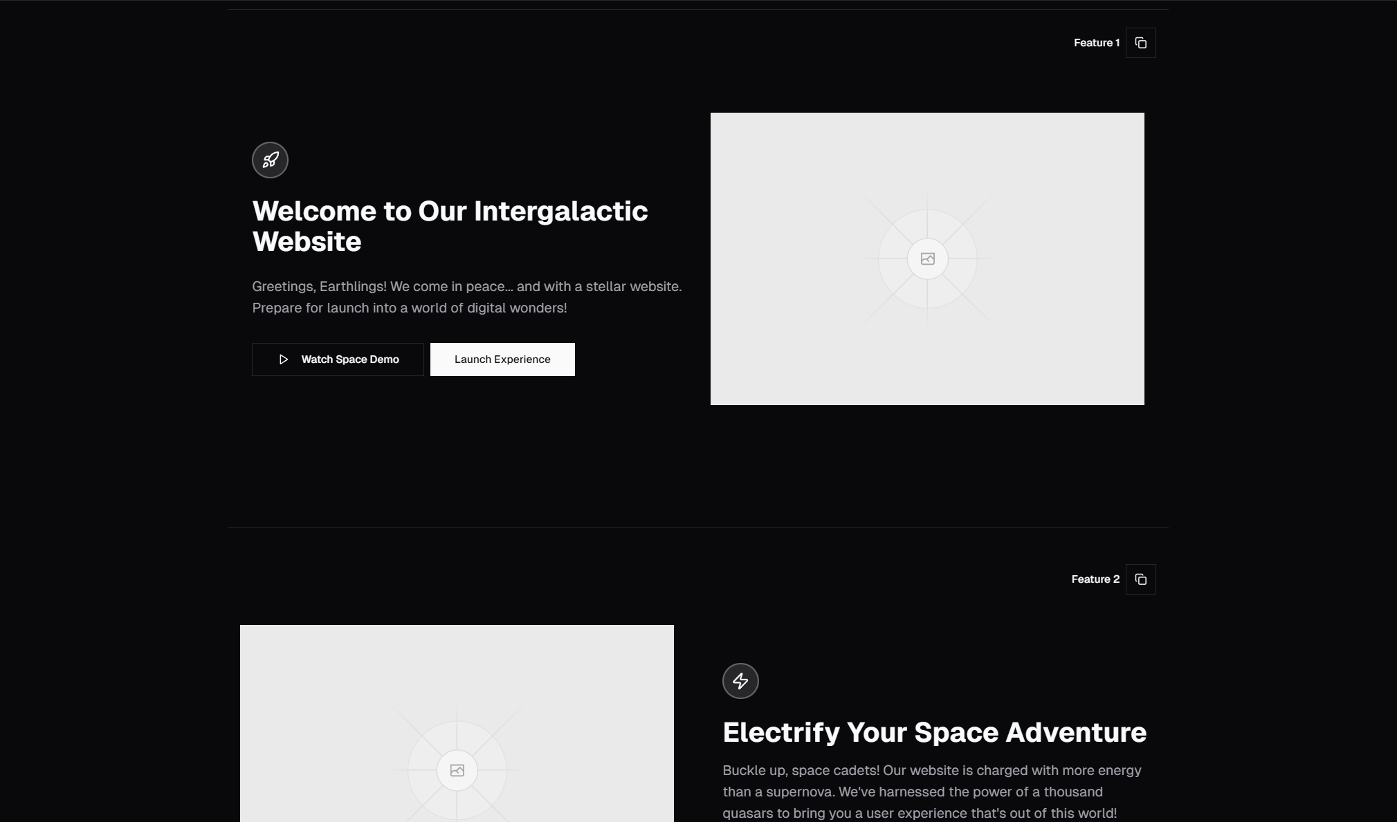
Feature sections are where you sell the details. After your hero hooks someone's attention, the feature section explains what your product actually does, why it matters, and how it's different. Every SaaS landing page, every product site, every startup homepage needs them.
We've built 132 feature section blocks in the SERP Blocks library. That's the largest collection of feature components available for Shadcn UI and it covers every layout pattern you'll encounter in modern web design.
Why 132 Variants?
Because feature sections aren't one-size-fits-all. A developer tools startup needs a different layout than an e-commerce platform. A three-feature product needs a different grid than a twelve-feature suite. By providing 132 variants, you can find the exact layout that matches your content — not the other way around.
Every block in the feature collection is built with Shadcn UI components and Tailwind CSS, supports dark mode, and is fully responsive.
Feature Section Layout Patterns
Icon Grid Layouts
The classic approach: a grid of features, each with an icon, heading, and short description. These work well when you have 3-12 features of roughly equal importance and want a clean, scannable overview.
Variants include:
3-column grids for focused products with a few key features
4-column grids for comprehensive feature overviews
2-column grids with larger cards for detailed descriptions
Responsive grids that collapse from 4 columns on desktop to 1 on mobile
Icon grids are the workhorse of feature sections. They're familiar to visitors, easy to scan, and work with almost any amount of content.
Bento Grid Layouts
The 2025-2026 design trend that's here to stay. Bento grids use varying card sizes — some large, some small — to create visual hierarchy within a feature grid. The larger cards highlight your most important features while smaller cards fill in the details.
Bento layouts reference Apple's design language and work especially well for products with a clear feature hierarchy. They feel more dynamic than uniform grids without sacrificing scannability.
Our bento variants include layouts with:
One large feature card + multiple small cards
Two medium cards + four small cards
Asymmetric arrangements with image-heavy and text-heavy cards
Alternating Layouts
Feature + image, then image + feature, alternating down the page. This zigzag pattern is effective for walking visitors through a workflow or showing different aspects of your product with screenshots or illustrations alongside each feature.
Alternating layouts work best when each feature has a strong visual component — a screenshot, illustration, or diagram that needs room to breathe. They create a natural reading rhythm that guides the eye down the page.
Feature Sections with Screenshots
Dedicated sections where product screenshots or mockups take center stage, with feature descriptions arranged around them. These are ideal for products with a visual interface — dashboards, design tools, mobile apps — where showing is more persuasive than telling.
Variants include:
Centered screenshot with feature bullets on each side
Full-width screenshot with feature cards overlaid
Browser mockup frames with annotated feature callouts
Features with Tabs or Toggles
Interactive sections where visitors can switch between different feature categories or views. A tab bar or toggle at the top lets users explore different aspects of your product without scrolling through a massive list.
These work well for products with many features that naturally group into categories — like "Design", "Development", "Analytics" — where showing everything at once would be overwhelming.
Features with Statistics
Sections that combine feature descriptions with hard numbers — "99.9% uptime", "50ms response time", "10,000+ users". Statistics add credibility and make abstract features concrete. These are particularly effective for infrastructure products, APIs, and enterprise tools where performance matters.
Minimal Feature Sections
Clean, typography-driven layouts with generous whitespace. No icons, no illustrations — just headings, descriptions, and careful spacing. These project confidence and work well for premium products, design tools, and developer-focused brands.
Features with Pricing Integration
Sections that tie features directly to pricing tiers, showing which features are available at each level. This saves visitors from jumping between your features and pricing pages and reduces friction in the decision-making process.
Choosing the Right Feature Layout
The best layout depends on your content:
| Content | Recommended Layout |
| 3-6 equal features | Icon Grid |
| Features with clear hierarchy | Bento Grid |
| Features that need visual demos | Alternating with Screenshots |
| 10+ features across categories | Tabbed |
| Performance-focused product | Features with Statistics |
| Simple, confident brand | Minimal |
Building Feature Sections That Convert
Layout is just the starting point. Here are the principles that make feature sections effective:
Lead with benefits, not features. "Save 10 hours per week" beats "Automated workflow engine." Visitors care about outcomes, not implementations.
Use specific numbers. "Used by 14,000 developers" is more convincing than "Used by thousands." Specificity creates credibility.
Show, don't tell. If your feature has a visual component, include a screenshot or demo. A picture of your dashboard says more than three paragraphs describing it.
Maintain visual hierarchy. Not all features are equally important. Use card size, placement, and visual weight to guide the eye to your most compelling features first.
Keep descriptions short. Each feature description should be 1-2 sentences. If you need more, you're explaining too much — simplify the message or link to a detail page.
Technical Details
All 132 feature blocks are:
Built with Shadcn UI — Button, Card, Badge, Tabs, and other standard components
Styled with Tailwind CSS — No custom CSS files, fully utility-based
Responsive — Mobile-first design that scales up to wide screens
Dark mode ready — CSS variable theming that adapts to your theme
Accessible — Proper heading hierarchy, alt text patterns, and keyboard navigation
Copy-paste ready — Drop into any Next.js, React, Astro, or Vue project
Pairing Feature Sections with Other Blocks
Feature sections rarely stand alone. In a typical landing page flow:
Hero section — Hook attention (81 blocks available)
Feature section — Explain the value (132 blocks)
Testimonials — Build trust (40 blocks)
Pricing — Convert (21 blocks)
CTA — Final push (32 blocks)
Footer — Close the page (21 blocks)
With SERP Blocks, you can assemble this entire page in minutes using blocks that are already designed to work together visually.