Best Shadcn Hero Sections: 81 Examples for Next.js
Browse 81 ready-to-use hero section blocks built with Shadcn UI and Tailwind CSS. Centered, split-screen, video background, gradient overlays, and more — all copy-paste ready for your Next.js project.
SERP Blocks Team
Product
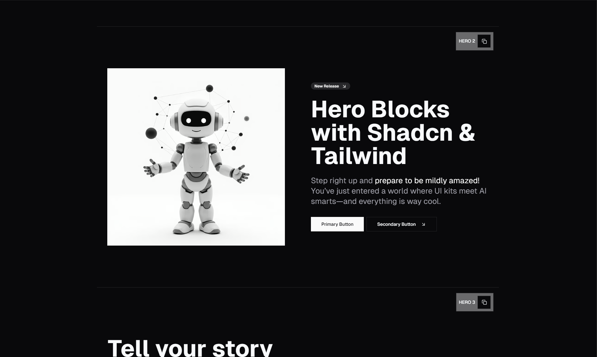
The hero section is the first thing visitors see when they land on your site. It sets the tone, communicates your value proposition, and determines whether someone scrolls or bounces. Getting it right matters more than almost any other section on the page.
We built 81 hero section blocks as part of the SERP Blocks library — every one of them designed with Shadcn UI and Tailwind CSS, optimized for Next.js, and ready to copy-paste into your project.
This post walks through the major categories, explains when to use each style, and shows you what's available.
Why Hero Sections Are Worth Getting Right
Your hero section has roughly 3 seconds to make an impression. According to eye-tracking studies, visitors scan in an F-pattern — they read the headline, glance at the subheading, and look for a call-to-action. If your hero doesn't deliver on all three, the rest of your page barely matters.
A well-designed hero section does three things:
Communicates your core value in a single headline
Provides context with a supporting description
Drives action with a clear, visible CTA button
The trouble is that building a great hero from scratch takes time — responsive layouts, proper spacing, typography scales, dark mode support, and animation polish. That's where pre-built blocks save hours of work.
The 81 Hero Blocks in SERP Blocks
Every hero block in our hero collection is built with real Shadcn UI components, uses Tailwind CSS for styling, and supports dark mode out of the box. They're grouped into several distinct styles.
Centered Heroes
The most common and versatile layout. A centered headline, subtext, and one or two CTA buttons stacked vertically in the middle of the viewport. Clean, scannable, and effective for nearly any product or service.
Centered heroes work well when your message is short and punchy. They're the default choice for SaaS landing pages, portfolio sites, and startup homepages.
When to use them: General-purpose landing pages, product launches, and any page where the headline is the star.
Split-Screen Heroes
The viewport divides into two halves — text on one side, an image or illustration on the other. This layout gives you room to show your product alongside the pitch.
Split heroes are popular with e-commerce, app showcases, and any product that benefits from a visual demo. The image side can hold a screenshot, mockup, illustration, or even a video embed.
When to use them: Product pages, app landing pages, and anywhere you want to show rather than tell.
Heroes with Background Images
Full-bleed background images with text overlaid using gradient or color overlays for readability. These create an immersive, editorial feel that works well for creative agencies, photography portfolios, and lifestyle brands.
The key challenge with background image heroes is maintaining text contrast across different images. Our blocks handle this with carefully tuned gradient overlays that keep text readable without washing out the background.
When to use them: Creative agencies, photography sites, travel, hospitality, and lifestyle brands.
Gradient Background Heroes
Bold gradient backgrounds — linear, radial, or mesh — that create visual interest without needing a photo. These are trending heavily in 2026, especially with the mesh gradient and aurora effects that have become popular in SaaS design.
When to use them: SaaS products, developer tools, tech startups, and any brand with a strong color identity.
Heroes with Video Backgrounds
Auto-playing background videos that loop behind text content. These grab attention immediately but need to be used carefully — the video should enhance, not distract from, the message.
When to use them: Brand storytelling, event pages, media companies, and product showcases where motion adds value.
Heroes with Social Proof
Hero sections that integrate trust signals directly — logo bars, star ratings, user counts, or testimonial snippets. Instead of separating the hero from social proof, these combine both into a single impactful section.
When to use them: Conversion-focused landing pages, especially in competitive markets where trust is a deciding factor.
Heroes with App Screenshots
Device mockups (phones, laptops, tablets) displaying your app interface. These give visitors an immediate preview of what they're signing up for. Several variants include floating UI elements or tilted perspective views for added depth.
When to use them: Mobile apps, SaaS dashboards, and any digital product with a visual interface worth showing.
Minimal Heroes
Stripped-back designs with maximum whitespace, a single headline, and one CTA. No images, no gradients — just typography and spacing doing the work. These are surprisingly hard to execute well because every element is exposed.
When to use them: Developer tools, design portfolios, and brands that want to project sophistication and confidence.
How to Use These Blocks in Your Project
Every hero block in SERP Blocks follows the same workflow:
Browse the hero collection and find a design you like
Copy the code — it's built with standard Shadcn UI components and Tailwind classes
Paste it into your Next.js project
Customize the text, images, colors, and CTA links to match your brand
The blocks use Shadcn's theming system, so if you've already configured your theme colors and CSS variables, the blocks will inherit your design tokens automatically.
Responsive Behavior
All 81 hero blocks are fully responsive. On desktop, split-screen layouts display side-by-side. On mobile, they stack vertically with adjusted typography scales. Background images resize and reposition using CSS object-fit. Video backgrounds gracefully degrade on mobile where autoplay may be restricted.
We test every block across breakpoints: mobile (375px), tablet (768px), and desktop (1280px+).
Dark Mode Support
Every hero block supports dark mode through Tailwind's dark: variant classes and Shadcn UI's CSS variable theming. Switch your theme and the hero adapts — backgrounds, text colors, overlays, and button styles all adjust automatically.
Performance Considerations
Hero sections sit at the top of the page, so they directly impact your Largest Contentful Paint (LCP) score. Our blocks are built with performance in mind:
Images use Next.js
<Image>with priority loading for above-the-fold contentVideos are lazy-loaded and use compressed formats
Fonts use
font-display: swapto avoid render-blockingAnimations use CSS transforms for GPU acceleration, not layout-triggering properties
Which Hero Style Should You Choose?
| Goal | Recommended Style |
| Communicate a clear value prop | Centered |
| Show your product visually | Split-screen or App Screenshot |
| Create an emotional connection | Background Image or Video |
| Build immediate trust | Social Proof |
| Project technical credibility | Minimal or Gradient |
Beyond Heroes: Building a Complete Page
A hero section is just the beginning. SERP Blocks includes 1200+ blocks across 50+ categories — feature sections, testimonials, pricing tables, CTAs, footers, and much more. You can assemble an entire landing page in minutes by combining blocks from different categories.
60 blocks are completely free. The Pro plan gives you access to all 1200+ blocks with a one-time payment and lifetime access.