32 CTA Section Components That Actually Convert
Browse 32 call-to-action section designs for React and Next.js — banner CTAs, inline CTAs, with social proof, exit-intent style. Built with Shadcn UI and Tailwind CSS.
SERP Blocks Team
Product
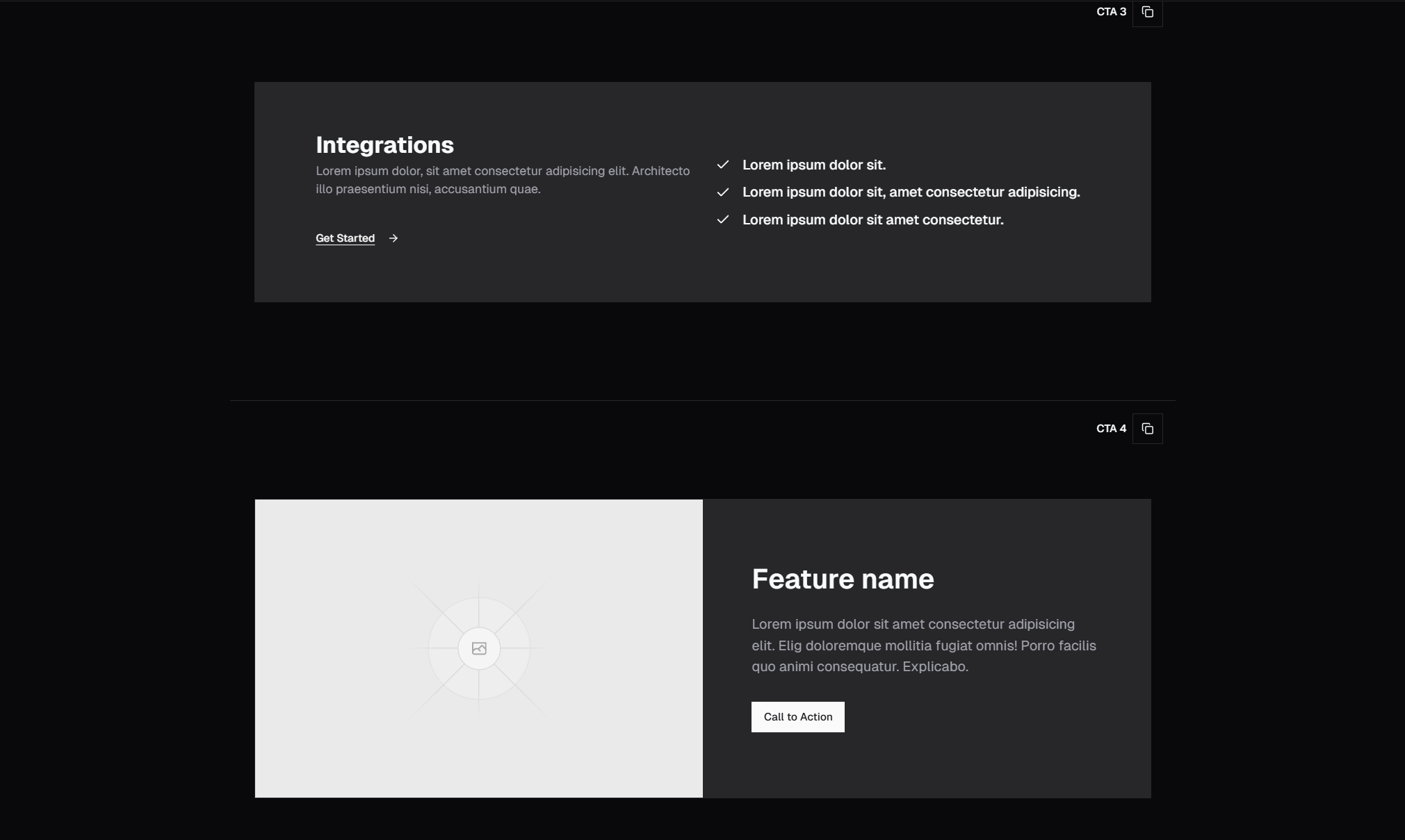
A landing page without a strong call-to-action is a brochure. CTAs are where browsing becomes action — where a visitor decides to sign up, start a trial, book a demo, or make a purchase. The design and placement of your CTA sections directly determines your conversion rate.
The SERP Blocks CTA collection includes 32 call-to-action section designs. These aren't just buttons — they're full-width, self-contained sections designed to break through scrolling momentum and drive action.
CTA Section Categories
Banner CTAs
Full-width sections with a bold background color or gradient, a compelling headline, and one or two action buttons. These are the most common CTA pattern — visually distinct from surrounding content, impossible to miss, and simple enough to process in a second.
Banner CTAs work through contrast. If your page content uses a white or light background, a bold colored CTA section creates a visual break that demands attention. The combination of headline + button is the most effective two-element pattern in conversion design.
Inline CTAs
Sections that blend more naturally into the page flow. Rather than a stark visual break, inline CTAs use cards, bordered sections, or subtle background shifts to present the action within the content rhythm. These feel less aggressive and work well for audiences who resist hard sells.
CTAs with Social Proof
CTA sections that integrate trust signals directly: user counts ("Join 14,000+ developers"), logo bars, rating badges, or a brief testimonial. Social proof at the point of decision reduces friction because visitors see evidence of others' positive choices right when they're making their own.
This pattern is especially effective when paired with a free trial or free tier offer — "Join 14,000+ developers — start free" combines low risk with social validation.
CTAs with Email Capture
Sections where the CTA is an email input + submit button rather than a link button. These are used for newsletter signups, waitlists, early access, and lead magnets. The form is embedded directly in the CTA section, eliminating the extra step of navigating to a separate signup page.
Variants include:
Single email field + button (highest conversion, lowest barrier)
Email + name fields for personalized follow-up
Email with checkbox for terms/consent (GDPR compliance)
CTAs with Feature Highlights
Sections that reinforce key features or benefits alongside the CTA. A brief 3-column feature summary reminds visitors of the value before asking them to act. This pattern is effective at the bottom of long pages where the visitor may have forgotten the opening pitch.
Split CTAs with Image
The section divides into text + CTA on one side and an image or illustration on the other. The visual element creates emotional resonance — a product screenshot, a happy customer photo, or an aspirational illustration — while the text handles the logical argument.
Minimal CTAs
Clean, typography-driven sections with maximum whitespace. Just a short headline, a subline, and a single button. No images, no gradients, no distractions. These project confidence — the product is compelling enough that the CTA doesn't need to work hard.
Urgency CTAs
Sections with countdown timers, limited-time badges, or scarcity indicators. "Early access pricing ends March 31" or "Only 12 spots remaining." Urgency is a powerful conversion lever when used honestly — but it backfires instantly if visitors suspect manufactured scarcity.
CTA Placement Strategy
The most effective pages include multiple CTAs at strategic points:
After the hero — For visitors who arrive already convinced (referral traffic, returning visitors). A brief CTA early on catches them before they bounce.
After features — The logical point of conversion: you've explained the product, now ask for action. This is the primary CTA placement.
After testimonials — Social proof creates a surge of confidence. Capturing that moment with an immediate CTA capitalizes on the emotional response.
At page bottom — The final CTA catches visitors who scrolled the entire page. These are highly engaged but possibly still undecided — the bottom CTA gives them one more chance.
CTA Copywriting Principles
Action-Oriented Text
"Get started free" outperforms "Submit." "Start building" outperforms "Sign up." The button text should describe what happens next, not the action itself. Visitors click because they want the outcome, not the process.
Reduce Perceived Risk
"Start free trial — no credit card required" removes two objections in one line. "Cancel anytime" addresses commitment anxiety. The less risk visitors perceive, the more likely they are to click.
Specificity Beats Vagueness
"Get 60 free components" is more compelling than "Get started." Specific numbers ground the offer in concrete value. Vague CTAs feel like they could lead anywhere — specific ones tell visitors exactly what they're getting.
Contrast Button Copy with Context
If your page talks about problems, the CTA should talk about solutions. If your page talks about features, the CTA should talk about outcomes. The CTA copy should complement — not repeat — the surrounding content.
Design for Conversion
Button Contrast
CTA buttons must stand out from everything else on the page. Use your primary brand color at full saturation, or a contrasting accent color. If your page uses blue throughout, a green or orange CTA button creates the visual distinction that draws clicks.
Whitespace Around CTAs
Don't crowd your CTA section. Generous padding above and below gives the section visual breathing room, making it feel important rather than crammed. SERP Blocks CTA sections include appropriate spacing by default.
Mobile CTA Optimization
On mobile, CTA buttons should be full-width and positioned within thumb reach. Our blocks handle responsive CTA sizing automatically — buttons expand to full width on narrow screens and maintain comfortable touch targets (minimum 48px height).
Complete Landing Page Assembly
CTAs don't work in isolation. They're the payoff of a carefully structured argument:
Hero (81 blocks) — Hook attention
Features (132 blocks) — Explain value
Testimonials (40 blocks) — Build trust
Pricing (21 blocks) — Present options
CTA (32 blocks) — Drive action
Footer (21 blocks) — Close with navigation
SERP Blocks provides 1200+ blocks across 50+ categories, all designed to work together. 60 are free, with the full library available through a one-time Pro purchase.