33 Contact Form Designs Built with Shadcn UI and Tailwind
Browse 33 contact page and form section designs for React and Next.js. Simple forms, split layouts, with maps, floating labels — all built with Shadcn UI and Tailwind CSS.
SERP Blocks Team
Product
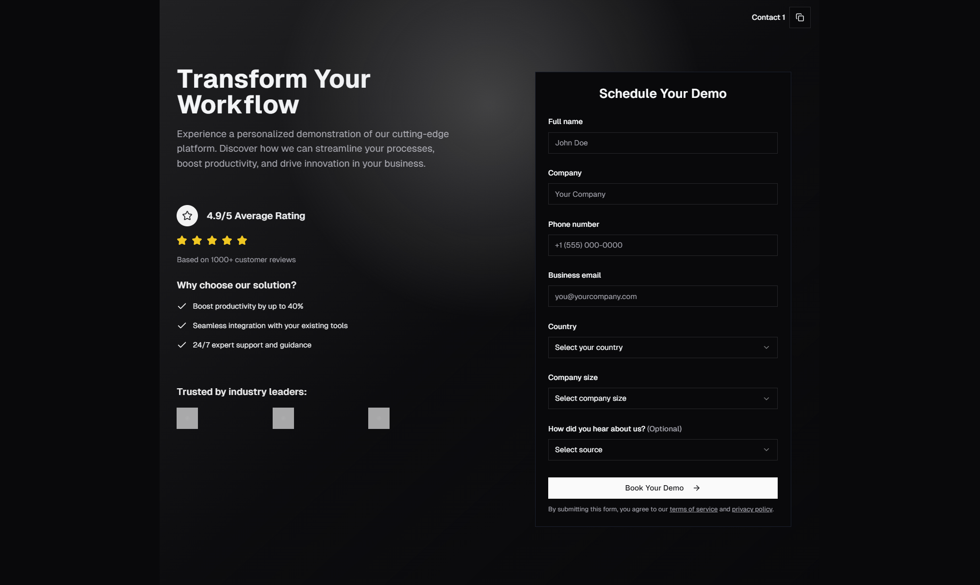
The contact page is one of the most visited pages on any business website — and one of the most neglected in terms of design. Most developers throw together a basic form with name, email, and message fields and call it done. But a well-designed contact section can significantly increase form completions and lead quality.
The SERP Blocks contact collection includes 33 contact form designs, each with a distinct layout, style, and approach to gathering visitor information.
Contact Form Layout Patterns
Simple Form Layouts
Clean, centered forms with standard fields: name, email, subject, and message. These are the no-nonsense approach — minimal distractions, clear labels, obvious submit button. They work for any business and are the safest default choice.
Variants include:
Single-column forms with stacked fields
Two-column forms with name and email side-by-side
Forms with and without subject/topic dropdowns
Compact forms with fewer fields for higher completion rates
Split-Screen Layouts
The page divides into two halves — the form on one side and contact information, an image, or a map on the other. This layout gives the contact page more visual weight and provides additional context (office address, phone number, business hours) without cluttering the form itself.
Split layouts are popular for businesses with physical locations, agencies that want to show their office, and companies that want to display multiple contact methods alongside the form.
Contact with Map Integration
Sections that include an embedded map alongside or behind the contact form. These are essential for businesses where physical location matters — restaurants, retail stores, offices with walk-in clients, and event venues.
Map variants include full-width background maps with an overlaid form card, side-by-side map and form layouts, and multi-location maps with location selectors.
Contact Cards
Instead of a full-page form, these designs present contact options as a set of cards — one for email, one for phone, one for chat, one for office visits. Each card has an icon, label, and direct contact action. This pattern works well for businesses that offer multiple support channels.
Multi-Step Contact Forms
Forms that break the submission into steps: first select the topic, then provide details, then enter contact info. Multi-step forms can actually increase completion rates for complex inquiries because each individual step feels manageable, even if the total information gathered is the same.
Contact with FAQ
Sections that combine a contact form with a frequently asked questions accordion. The FAQ answers common questions before the visitor reaches the form, which reduces support volume and ensures that form submissions are higher-quality inquiries.
This pattern pairs naturally with our FAQ collection (21 standalone FAQ blocks available).
Floating Label Forms
Forms where the label text sits inside the input field and floats above when the user focuses or types. This design is more compact and visually clean, though it requires careful implementation to remain accessible.
Our floating label variants include proper ARIA labels and placeholder handling to ensure screen readers can parse the form correctly.
Contact with Social Links
Sections that include social media links and messaging app icons alongside the form. For businesses where customers prefer to reach out via Twitter/X, LinkedIn, WhatsApp, or Discord, these designs make all channels visible and accessible.
Form UX Best Practices
Reduce Field Count
Every additional field reduces form completion rates. Ask yourself: do you really need a phone number? A company name? A subject line? If a field isn't essential for your response, remove it. The optimal contact form has 3-4 fields.
Use Clear Labels
Don't rely solely on placeholder text for labels — placeholders disappear when the user starts typing, which can cause confusion. Use visible labels above each field, or floating labels that remain visible during input.
Provide Feedback
After submission, show a clear success message. Don't just redirect to a generic thank-you page — confirm what happens next: "We'll respond within 24 hours" or "Check your email for a confirmation." Setting expectations reduces follow-up inquiries.
Mobile Optimization
Contact forms get significant mobile traffic. Ensure:
Input fields are large enough for touch (minimum 44px height)
The keyboard type matches the field (email keyboard for email, phone keyboard for phone)
The form doesn't require horizontal scrolling
The submit button is full-width on mobile
All 33 SERP Blocks contact designs handle these concerns out of the box.
Spam Prevention
Contact forms attract spam. Consider adding:
Honeypot fields (invisible fields that bots fill out)
Rate limiting on the submission endpoint
Simple challenge questions
Our blocks provide the frontend design — pair them with server-side validation using React Hook Form and Zod for a complete solution.
Accessibility Considerations
Contact forms are critical for accessibility because they're often the primary way visitors communicate with your business. All SERP Blocks contact forms include:
Proper
<label>elements associated with inputs viahtmlForRequired field indicators with
aria-requiredError messages linked to inputs with
aria-describedbyLogical tab order for keyboard navigation
Sufficient color contrast for all text and borders
Integrating Contact Forms with Backend Services
The blocks handle the frontend design. For the backend, popular options include:
Server Actions in Next.js — Process form data directly in your Next.js app
Resend — Send email notifications when a form is submitted
Formspree — Managed form backend with spam filtering
ConvertKit/Mailchimp — If the contact form doubles as a lead capture
Building a Complete Contact Page
A contact page is more than just a form. Combine contact blocks with:
Navbar (17 blocks) — Navigation header
FAQ sections (21 blocks) — Answer common questions
Footer (21 blocks) — Site-wide footer with additional links
All 1200+ blocks in SERP Blocks are designed to work together. 60 are free, with the full library available through a one-time Pro purchase.