21 FAQ Accordion Components with Shadcn UI
Browse 21 FAQ section designs for React and Next.js — simple accordions, categorized FAQs, searchable, side-by-side layouts. Built with Shadcn UI and Tailwind CSS.
SERP Blocks Team
Product
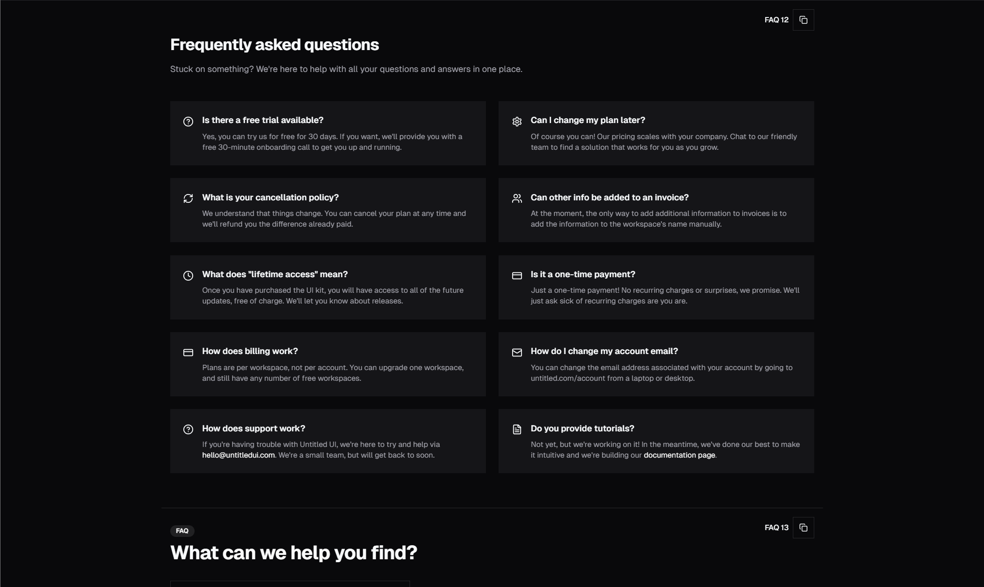
FAQ sections serve a dual purpose: they answer visitor questions and they reduce support requests. A well-structured FAQ section can handle dozens of inquiries that would otherwise hit your inbox. And from an SEO perspective, FAQ content is one of the easiest ways to capture long-tail search traffic and qualify for Google's rich results.
The SERP Blocks FAQ collection includes 21 FAQ section designs — from simple accordions to categorized, searchable, and multi-column layouts.
FAQ Layout Patterns
Simple Accordion
The standard pattern: a vertical list of questions, each expandable to reveal the answer. Click a question, the answer slides open. Click again (or click another question), it closes. This is the most familiar FAQ pattern and works for any number of questions.
Simple accordion FAQs use Shadcn UI's Accordion component, which is built on Radix UI's accessible accordion primitive. This means keyboard navigation works out of the box — users can navigate questions with arrow keys, expand with Enter/Space, and the component manages focus correctly.
Variants include:
Single-open (only one answer visible at a time)
Multi-open (multiple answers can be expanded simultaneously)
With icons (plus/minus or chevron indicators)
With numbered questions
With borders between items vs. borderless
Categorized FAQs
FAQs grouped under category headings — "Billing", "Technical", "Account", "Getting Started". This pattern is essential when you have more than 10-15 questions, because a single flat list becomes overwhelming. Categories help visitors jump to the section that's relevant to them.
Variants include:
Tabbed categories (horizontal tabs that switch between question sets)
Accordion-within-accordion (category headings expand to show question groups)
Sidebar category navigation with scrolling question area
Side-by-Side Layouts
Two-column layouts where questions and answers are displayed in parallel columns, or where the FAQ section sits alongside additional content (contact info, search bar, support links). These layouts make efficient use of horizontal space on desktop while stacking vertically on mobile.
A common pattern: FAQ accordion on the left, a "Still have questions? Contact us" card on the right. This catches visitors whose question isn't answered in the FAQ and directs them to support without requiring them to navigate away.
FAQ with Search
A search input at the top of the FAQ section that filters questions in real-time as the user types. This is valuable for large FAQ sections (20+ questions) where scrolling through categories still takes effort. Users can type a keyword and instantly see matching questions.
Search-filtered FAQs use client-side filtering — no API calls needed. The search matches against both question text and answer content, so visitors find relevant results even if their search terms appear in the answer rather than the question.
Grid Layouts
Questions and answers displayed as cards in a grid rather than a vertical accordion. Each card shows the question as the heading and the answer as the body, all visible at once without expanding. This works well when answers are short (1-2 sentences) and you want everything scannable at a glance.
Grid FAQs trade the compact footprint of accordions for immediate visibility. They're better for overview pages or marketing contexts where you want visitors to see all the answers without interaction.
FAQ with Rich Content
Accordions where answers include more than just text — code blocks, images, links, numbered steps, or embedded videos. These are useful for technical documentation, developer tools, and products where FAQ answers need to show rather than tell.
FAQ Schema Markup for SEO
Google supports FAQ rich results — expanded question-and-answer displays directly in search results. Implementing FAQ schema markup can significantly increase your visibility and click-through rate.
To qualify for FAQ rich results, your page needs:
Visible FAQ content on the page (Google won't index hidden content)
JSON-LD structured data that marks up each question and answer
Here's the schema structure:
{
  "@context": "https://schema.org",
  "@type": "FAQPage",
  "mainEntity": [
    {
      "@type": "Question",
      "name": "What is Shadcn UI?",
      "acceptedAnswer": {
        "@type": "Answer",
        "text": "Shadcn UI is a collection of reusable React components built on Radix UI and styled with Tailwind CSS."
      }
    }
  ]
}
Add this as a <script type="application/ld+json"> tag in your page's <head>. Each question-answer pair in your FAQ section should have a corresponding entry in the schema.
The SEO benefit is substantial: FAQ rich results take up more visual space in search results, pushing competitors lower on the page and attracting more clicks to your result.
FAQ Design Best Practices
Write Questions from the User's Perspective
Use first-person phrasing: "How do I cancel my subscription?" instead of "Cancellation policy." Users scan FAQ sections looking for their exact question — matching their language increases the chance they'll find it.
Keep Answers Concise
If an answer exceeds 3-4 sentences, it probably belongs in a help article or documentation page, not an FAQ. Link to the detailed resource instead of cramming everything into the accordion.
Order by Frequency
Put the most commonly asked questions first. If you have analytics on your support tickets, use that data to determine the order. The top 3-5 questions should handle the majority of visitor inquiries.
Include a Contact Fallback
Always include a "Still have questions?" section at the bottom of your FAQ with a link to your contact page or support channel. No FAQ section can anticipate every question — make the path to human support obvious.
Update Regularly
FAQs go stale quickly. Review your FAQ content quarterly, remove questions that are no longer relevant, and add new ones based on recent support trends.
Accessibility
FAQ accordions have specific accessibility requirements:
Keyboard navigation: Arrow keys move between questions, Enter/Space toggles the current question
ARIA attributes:
aria-expandedon the trigger,aria-controlspointing to the content panelFocus management: Focus stays on the trigger after expanding/collapsing
Screen reader announcements: State changes are announced properly
All SERP Blocks FAQ components inherit these behaviors from Radix UI's accordion primitive — accessibility is handled automatically.
Where to Place FAQ Sections
On Pricing Pages
Address billing questions, refund policies, and plan comparison directly alongside the pricing. This reduces purchasing friction and prevents visitors from leaving to search for answers.
On Product Pages
Technical questions, compatibility information, and integration details relevant to the specific product or feature being presented.
On Contact Pages
Pair with contact forms to deflect common inquiries. Our contact collection (33 blocks) includes several "contact + FAQ" combination layouts.
As Standalone Pages
Dedicated FAQ or help center pages for comprehensive question coverage. Combine with navigation, search, and category filtering for a self-service support experience.
Building FAQ Sections with SERP Blocks
All 21 FAQ blocks are built with Shadcn UI's Accordion component and Tailwind CSS. They support dark mode, are fully responsive, and include proper accessibility attributes.
They pair naturally with other SERP Blocks sections — especially contact forms (33 blocks), pricing pages (21 blocks), and CTA sections (32 blocks).
SERP Blocks includes 1200+ total blocks across 50+ categories. 60 are free, with the full library available through a one-time Pro purchase.