Build a Complete E-commerce Product Page with Shadcn UI
Assemble a full e-commerce product page using Shadcn UI blocks — product info, image gallery, reviews, related products, and shopping cart. Step-by-step for Next.js.
SERP Blocks Team
Product
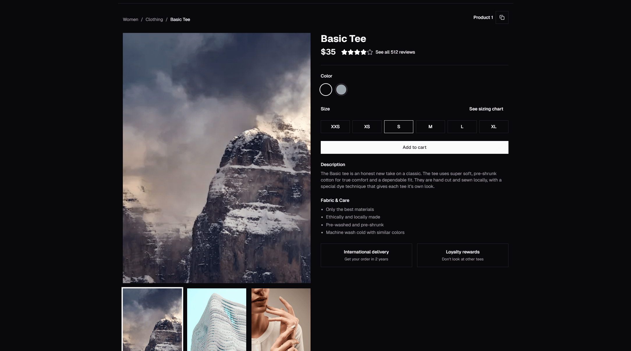
E-commerce product pages are deceptively complex. There's the image gallery with zoom and thumbnails. The product info with variants, sizing, and availability. The add-to-cart flow. Reviews with star ratings. Related product recommendations. Each piece requires careful design, responsive behavior, and interactive state management.
Building all of this from scratch for a custom storefront can take weeks. With SERP Blocks, you can assemble a complete product page in an afternoon using pre-built components designed specifically for e-commerce.
Product Page Anatomy
A well-structured product page includes these sections:
Navbar with cart icon and item count
Product info — Images, title, price, variants, add-to-cart
Product description — Detailed specs, features, materials
Reviews — Star ratings, written reviews, review summary
Related products — Cross-sell recommendations
Footer — Standard site navigation
Let's build each section.
Product Info Section
The product info section is the core of the page — it's where the purchase decision happens. Browse the product collection (25 designs) for the main product display, and the product info collection (15 designs) for detailed specification layouts.
Image Gallery
Product images need to handle:
Multiple images with thumbnail navigation
Zoom on hover or click for detail inspection
Mobile swipe for touch navigation
Different aspect ratios for various product types
Our product blocks include gallery patterns with horizontal thumbnail strips, vertical sidebar thumbnails, and full-screen lightbox views.
Pricing and Variants
The pricing area needs to handle:
Base price with optional sale/discount display
Variant selectors — color swatches, size buttons, material dropdowns
Availability indicators — In stock, low stock, out of stock
Quantity selector with increment/decrement controls
Add to Cart
The add-to-cart button is the most important interactive element on the page. It should be:
Visually prominent (primary color, full width on mobile)
Always visible without scrolling on desktop
Responsive with clear feedback on click (loading state, success confirmation)
Product Description
Below the main product info, the product info collection (15 designs) provides layouts for:
Tabbed content — Description, Specifications, Shipping, Returns in separate tabs
Accordion sections — Expandable detail sections
Feature grid — Key specs displayed in a scannable grid format
Rich text — Formatted product descriptions with images and bullet points
Tabs are the most popular pattern because they keep the page compact while giving visitors access to all the information they need.
Reviews Section
Customer reviews are critical for e-commerce conversion. The reviews collection (13 designs) includes:
Review summary — Average rating, rating distribution bar chart, total review count
Individual review cards — Star rating, reviewer name, date, review text, helpful vote buttons
Photo reviews — Reviews with customer-uploaded images
Verified purchase badges — Trust indicators for authenticated buyers
A good reviews section includes both the aggregate summary (4.7 out of 5 stars from 2,400 reviews) and individual reviews sorted by relevance or date. The summary gives a quick trust signal; the individual reviews provide specific proof points.
Related Products
Cross-selling increases average order value. The product list collection (20 designs) provides grid layouts for showing related or recommended products at the bottom of the page.
Common patterns:
"You might also like" — Products in the same category
"Frequently bought together" — Bundle suggestions
"Recently viewed" — Personalized browsing history
Each related product card includes an image, title, price, and quick-add button.
Shopping Cart
When a visitor adds to cart, they need a cart experience. The shopping cart collection (11 designs) includes:
Slide-out cart — A sidebar that opens from the right, showing cart contents without leaving the page
Dropdown cart — A mini-cart dropdown from the navbar cart icon
Full-page cart — A dedicated cart page with detailed line items, quantity editors, and order summary
Mini cart — A compact floating widget showing item count and total
The slide-out cart is the most popular pattern because it keeps the shopper on the product page while confirming their selection.
Checkout Flow
Beyond the product page, SERP Blocks provides components for the full purchase flow:
Payment forms (15 designs) — Credit card inputs, billing address, payment method selection
Order confirmation (10 designs) — Success pages with order details, tracking info, and upsell CTAs
Refund status (10 designs) — Return and refund tracking interfaces
Category and Browse Pages
Product pages don't exist in isolation. Visitors need to browse and filter products to find what they want:
Shop category (20 designs) — Category landing pages with filters, sort controls, and product grids
Product list (20 designs) — Product grid and list views with various card styles
Gallery (25 designs) — Image-heavy layouts for visual product browsing
Technical Considerations
Performance
E-commerce pages are image-heavy. Optimize with:
Next.js
<Image>component for automatic format conversion and responsive sizingpriorityprop on above-the-fold product imagesLazy loading for below-the-fold content (reviews, related products)
Blur placeholder for images during loading
SEO
Product pages need structured data for Google Shopping results:
{
  "@context": "https://schema.org",
  "@type": "Product",
  "name": "Product Name",
  "image": "https://example.com/product.jpg",
  "offers": {
    "@type": "Offer",
    "price": "49.99",
    "priceCurrency": "USD",
    "availability": "https://schema.org/InStock"
  },
  "aggregateRating": {
    "@type": "AggregateRating",
    "ratingValue": "4.7",
    "reviewCount": "2400"
  }
}
State Management
Product pages need client-side state for:
Selected variant (color, size)
Cart contents
Review filters and sorting
Keep state management simple. React's useState handles variant selection. A context provider or lightweight store (Zustand) handles the cart. Server-side data fetching handles reviews.
Complete E-commerce Block Summary
| Section | Category | Count |
| Product Display | Product | 25 |
| Product Details | Product Info | 15 |
| Browse/Category | Shop Category | 20 |
| Product Grids | Product List | 20 |
| Reviews | Reviews | 13 |
| Cart | Shopping Cart | 11 |
| Checkout | Payment Form | 15 |
| Confirmation | Order Confirmation | 10 |
| Returns | Refund Status | 10 |
That's 139 blocks dedicated to e-commerce — enough to build a complete online store UI without designing a single component from scratch. All available at SERP Blocks with 60 free blocks and the full 1200+ library through a one-time Pro purchase.