Build a Portfolio Website in 30 Minutes with Shadcn Blocks
Step-by-step guide to assembling a developer or designer portfolio using Shadcn UI blocks — Hero, About, Portfolio grid, Gallery, Contact form, and Footer. Perfect for freelancers and agencies.
SERP Blocks Team
Product
Your portfolio is your most important marketing asset. It's the page that lands you freelance clients, gets you hired, and convinces agencies to bring you on. Yet most developers and designers spend weeks building their portfolio site — tweaking layouts, debugging responsive grids, redesigning the contact form for the fourth time — instead of filling it with the work that actually wins projects.
The solution is to stop building portfolio components from scratch. Pre-built blocks give you professional layouts that you can assemble in minutes and customize with your own content. This guide shows you how to build a complete portfolio website in 30 minutes using SERP Blocks and Next.js.
Who This Is For
This tutorial targets three audiences:
Freelance developers who need a professional web presence to attract clients
Designers who want a portfolio that showcases their visual work without spending weeks on the site itself
Agencies that need a clean, multi-project portfolio to establish credibility
The end result works for all three. The difference is in the content you put into the blocks, not the blocks themselves.
The Portfolio Structure
Every effective portfolio site follows a proven sequence:
Navbar — Clean navigation with your name or logo
Hero — Your headline, title, and primary CTA
About — Who you are, what you do, your background
Portfolio grid — Your best work, filterable by category
Gallery — Visual showcase of project details and screenshots
Skills/stats — Technologies, experience, and key numbers
Contact — How to hire you or start a conversation
Footer — Social links, copyright, secondary navigation
Let's build each section.
Step 1: Set Up Your Project
npx create-next-app@latest my-portfolio --typescript --tailwind --app
cd my-portfolio
npx shadcn@latest init
You now have a Next.js project with Tailwind CSS and Shadcn UI configured. Everything you build from here is copy-paste blocks plus your own content.
Step 2: Choose Your Navbar
Browse the navbar collection (17 designs). For a portfolio site, you want minimal navigation — your name isn't a SaaS product with a dozen pages.
Pick a navbar with these elements:
Your name or logo on the left
3-5 anchor links — About, Work, Contact — that scroll to sections on the page
A CTA button — "Hire Me" or "Get in Touch" linking to the contact section
A transparent navbar that overlays the hero section works particularly well for portfolios. It lets your hero visual extend to the top of the viewport without a hard break between navigation and content.
For a single-page portfolio (where all sections live on one page), use smooth-scroll anchor links. For a multi-page portfolio (separate pages for each project), use standard route links.
Step 3: Make a Strong First Impression with the Hero
The hero is your 3-second pitch. A visitor decides whether to keep scrolling or leave based on what they see here. Browse the hero collection (81 designs) with these portfolio-specific guidelines:
For developers: Use a minimal hero with a strong headline and subtle background. Something like "Full-Stack Developer" with a one-line description of your specialty and a CTA to view your work. Developers hiring other developers appreciate restraint — let your projects speak for themselves.
For designers: Use a hero with visual impact. A split-screen layout with a large portfolio piece on one side and your introduction on the other. Or a full-bleed background image from your best project with text overlay. Your hero is itself a demonstration of your design taste.
For agencies: Use a hero with a video background or animated element. Agencies need to project scale and professionalism. A looping showreel behind your agency name and tagline sets the tone immediately.
For freelancers: Use a hero with a personal photo. Freelancing is personal — clients hire people, not logos. A professional headshot alongside your name, title, and a "Let's Work Together" button creates immediate human connection.
Your hero headline should be specific. "Web Developer" says nothing. "I build high-converting SaaS landing pages in React" tells a potential client exactly what you do and whether you're a fit.
Step 4: Tell Your Story with the About Section
The about section builds trust. Browse the about collection (32 designs) and choose based on how much personal context you want to share:
Split layout — Photo on one side, bio text on the other. Clean and personal
Timeline about — Your career journey as a visual timeline. Great for showing progression and experience depth
Stats + bio — Your story alongside key numbers (years of experience, projects completed, clients served)
Skill-focused about — Brief bio with a prominent technology or skill grid below
For freelancers, the split layout with a personal photo is the strongest choice. Clients want to know who they're hiring. Include a concise bio that answers three questions: what you specialize in, who you've worked with, and what makes your approach different.
For agencies, use a stats + bio layout. Lead with impressive numbers — "150+ projects delivered" or "Clients in 12 countries" — then follow with the team's story and philosophy.
Resist the urge to write a novel. Three to four paragraphs is the sweet spot. Your work speaks louder than your bio.
Step 5: Showcase Your Work with the Portfolio Grid
This is the section that closes deals. Browse the portfolio collection (20 designs) and pick a layout that presents your projects effectively:
Masonry grid — Varying image sizes create visual interest. Best for designers with projects of different aspect ratios
Uniform grid — Consistent card sizes for a clean, organized look. Best for developers showing project screenshots
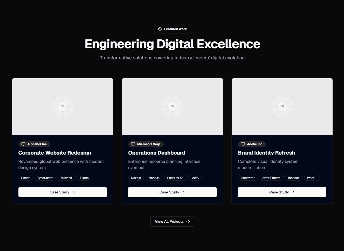
Case study cards — Larger cards with project title, description, and technology tags. Best for agencies that want to highlight process and outcomes
Filterable grid — Category tabs above the grid let visitors filter by project type. Essential if you work across multiple domains
Implementing Project Filtering
If your work spans multiple categories (web apps, mobile apps, branding, e-commerce), filtering is critical. Visitors looking for a specific type of project shouldn't have to scan your entire portfolio.
Build a simple filter with React state:
const categories = ["All", "Web Apps", "Mobile", "E-Commerce", "Branding"];
const [activeCategory, setActiveCategory] = useState("All");

const filteredProjects = activeCategory === "All"
  ? projects
  : projects.filter((p) => p.category === activeCategory);
Display the categories as tabs or buttons above the grid. When a visitor clicks a category, the grid filters with a smooth CSS transition. The portfolio blocks from SERP Blocks include these filter patterns — you supply the category data and project list.
Curate, Don't Dump
Show 6-12 of your best projects, not every project you've ever touched. A portfolio with 8 strong pieces is far more impressive than one with 40 mediocre ones. For each project, include:
A high-quality screenshot or thumbnail
The project name
A one-line description
Technology tags (React, Node.js, Figma, etc.)
A link to the live site or case study
Step 6: Add Visual Depth with a Gallery
While the portfolio grid shows project overviews, a gallery lets you go deeper. Browse the gallery collection (25 designs) and choose a style:
Lightbox gallery — Thumbnails that expand to full-size images on click. Let visitors inspect details without leaving the page
Carousel gallery — Horizontal scrolling through project screenshots. Great for showing multi-screen flows or design iterations
Before/after gallery — Slider comparison of old vs. new designs. Powerful for redesign projects
Categorized gallery — Grouped by project or type with section headers
Use the gallery to show what the portfolio grid can't: detailed UI screenshots, mobile responsive views, design system components, wireframes-to-final comparisons, or client deliverables.
Responsive Gallery Layouts
Gallery layouts need to work across all screen sizes. On desktop, a 3-4 column masonry grid with lightbox preview provides the best browsing experience. On tablet, collapse to 2 columns. On mobile, a single column or horizontal carousel ensures images are large enough to actually see.
The gallery blocks handle these breakpoints out of the box. Tailwind's responsive utilities (grid-cols-1 md:grid-cols-2 lg:grid-cols-4) manage the transitions, and the lightbox overlay works on touch devices with swipe navigation.
For image performance, use Next.js <Image> component with sizes and priority attributes. Gallery thumbnails should be optimized to load quickly, with full-resolution images loaded only when the lightbox opens.
Step 7: Show Your Numbers with Stats
Hard numbers build credibility faster than paragraphs of text. Browse the stat collection (10 designs) and add a stats section:
Years of experience — Establishes tenure and reliability
Projects completed — Shows volume and delivery capability
Clients served — Implies demand and repeat business
Technologies — Count of tools in your stack (if impressive)
A simple four-column stat bar between sections adds visual variety and gives skimmers something concrete to anchor on. Animated counters that tick up as the section scrolls into view add polish without hurting performance.
Step 8: Make It Easy to Hire You
The contact section is your conversion point. Every other section on the page exists to drive visitors here. Browse the contact collection (33 designs) and choose based on your workflow:
Simple form — Name, email, message. Low friction, high completion rate. Best for freelancers who want to start a conversation
Detailed form — Adds budget range, project type, and timeline dropdowns. Better for agencies that need to qualify leads before responding
Split contact — Form on one side, contact details (email, phone, location, social links) on the other. Good when you want to offer multiple communication channels
Calendar embed — Replace the form with a Calendly or Cal.com embed. Skips the back-and-forth and lets prospects book a call directly
For freelancers, the simple form with your email and social links is the best combination. Make the submit button text action-oriented: "Send Message" or "Start a Project" instead of generic "Submit."
For agencies, the detailed form with project type and budget fields saves time on both sides. Leads self-qualify, and you can prioritize responses based on fit.
Form Backend
Connect the form to a backend that sends you an email notification. Options include:
Server action in Next.js — Handle submission in a server action, send email via Resend or SendGrid
Formspree — No backend needed, point the form action to your Formspree endpoint
API route — Create an API route that validates the input and forwards it to your email
Whichever approach you choose, add a success state to the form. After submission, show a confirmation message so visitors know their message was received.
Step 9: Close with a Professional Footer
The footer provides closure and secondary navigation. Browse the footer collection (21 designs):
Minimal footer — Your name, copyright, and social icons. Perfect for single-page portfolios
Multi-column footer — Navigation links, social links, and contact info in organized columns. Better for multi-page portfolios
CTA footer — A final "Let's work together" message above the standard footer links. One more conversion opportunity
Social links in the footer are essential for portfolios. Include links to:
GitHub — For developers, this is expected
Dribbble or Behance — For designers, this is your secondary portfolio
LinkedIn — Professional networking and credibility
Twitter/X — If you're active and it shows industry engagement
Step 10: Polish and Deploy
With all sections in place, handle the finishing touches:
Smooth scrolling: For single-page portfolios, add smooth scroll behavior:
html {
  scroll-behavior: smooth;
}
Dark mode: Shadcn UI supports dark mode out of the box. Add a theme toggle to your navbar. Many developers prefer dark mode, and offering it signals attention to user experience.
Favicon and metadata: Add a proper favicon, Open Graph image, and meta description. When someone shares your portfolio link on Slack or Twitter, it should show a polished preview — not a blank card.
Performance: Run a Lighthouse audit. Portfolio sites should score 95+ on all metrics. With static Next.js pages and optimized images, this is achievable without any special effort.
Deployment: Deploy to Vercel for the fastest path to production:
npx vercelYour portfolio is live. Custom domain setup takes 5 minutes in the Vercel dashboard.
Customization Strategies
Once the structure is assembled, make it yours:
Color scheme: Adjust your Shadcn UI CSS variables to match your personal brand. A cohesive color palette across all sections makes the site feel custom-built rather than templated. Two accent colors plus neutrals is the sweet spot.
Typography: Swap the default font for one that reflects your personality. Inter for clean and modern. Playfair Display for editorial elegance. JetBrains Mono for developer credibility. Import through next/font for zero-layout-shift loading.
Animations: Add subtle entrance animations to sections as they scroll into view. Framer Motion works perfectly with React and Shadcn UI. Keep animations under 300ms and use them sparingly — your work is the star, not the transitions.
Content updates: The project data (titles, descriptions, images, links) should be stored in a structured format — a JSON file, a content directory, or a headless CMS. This makes updating your portfolio a content task, not a code task.
The Result
In 30 minutes of assembly and an hour of content customization, you have a complete portfolio website with:
Professional navigation with smooth-scroll anchor links
A compelling hero section tailored to your role
An about section that tells your story
A filterable portfolio grid showcasing your best work
A visual gallery for detailed project screenshots
Stats that quantify your experience
A contact form that converts visitors into clients
A polished footer with social links
Every section is responsive, supports dark mode, and uses consistent Shadcn UI theming.
All Block Categories Used
| Section | Category | Blocks Available |
| Navbar | Navbar | 17 |
| Hero | Hero | 81 |
| About | About | 32 |
| Portfolio | Portfolio | 20 |
| Gallery | Gallery | 25 |
| Stats | Stat | 10 |
| Contact | Contact | 33 |
| Footer | Footer | 21 |
That's 239 block options across 8 categories — all available at SERP Blocks. 60 blocks are free, with the full 1200+ block library available through a one-time Pro purchase.