How to Build a SaaS Landing Page with Shadcn UI in 10 Minutes
Step-by-step guide to assembling a complete SaaS landing page using Shadcn UI blocks — Hero, Features, Pricing, Testimonials, CTA, and Footer. Copy-paste and ship.
SERP Blocks Team
Product
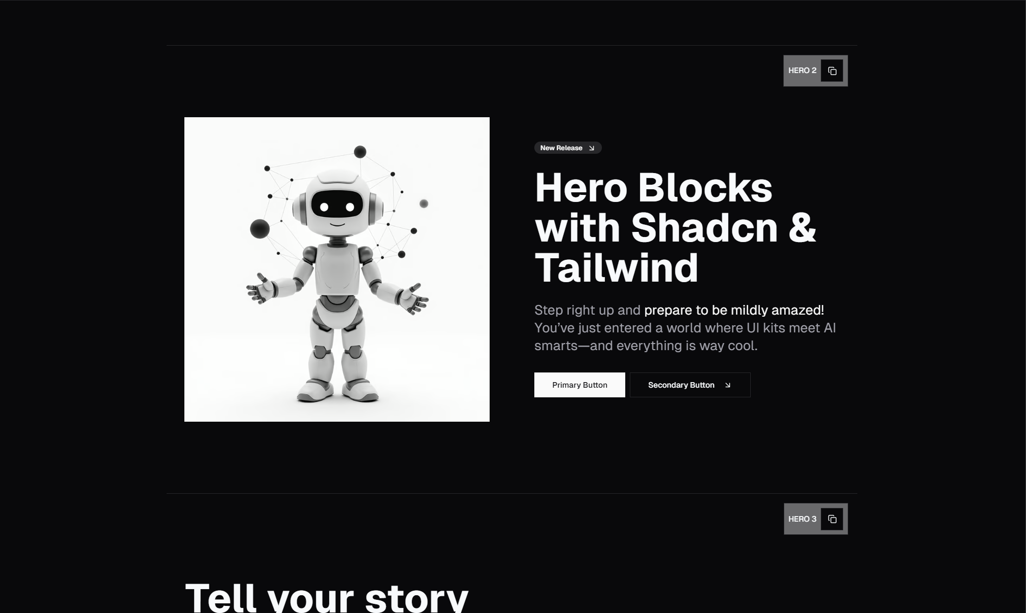
Building a SaaS landing page from scratch takes days. Designing the hero section, coding responsive feature grids, building pricing toggles, styling testimonial carousels — each section is a mini-project on its own. By the time you've finished the footer, you've spent a week on a page that should have taken an afternoon.
With pre-built Shadcn UI blocks, you can assemble a complete, professional SaaS landing page in minutes. This guide walks through the process section by section.
The Landing Page Structure
Every high-converting SaaS landing page follows the same proven structure:
Navbar — Navigation and brand identity
Hero — Value proposition and primary CTA
Logo Cloud — Social proof from recognizable brands
Features — What the product does
Testimonials — What users say about it
Pricing — How much it costs
FAQ — Address objections
CTA — Final conversion push
Footer — Navigation, legal, social links
Each of these maps directly to a block category in SERP Blocks. Let's build it.
Step 1: Set Up Your Next.js Project
If you don't already have a project, create one:
npx create-next-app@latest my-saas --typescript --tailwind --app
cd my-saas
npx shadcn@latest init
This gives you a Next.js App Router project with Tailwind CSS and Shadcn UI configured.
Step 2: Choose Your Navbar
The navbar sets the tone for the entire page. Browse the navbar collection (17 designs) and pick one that matches your brand:
Transparent navbar — Overlays the hero section, great for image-heavy heroes
Solid navbar — Clear separation between navigation and content
Mega menu navbar — For products with multiple pages or documentation
Copy the navbar code and paste it into your layout file so it appears on every page.
Step 3: Add Your Hero Section
The hero is the most important section on the page. Browse the hero collection (81 designs) and choose based on your content:
Centered hero if your headline is strong enough to stand alone
Split-screen hero if you have a product screenshot or demo to show
Hero with social proof if you have impressive user numbers or brand logos
Paste the hero code into your landing page component. Replace the placeholder text with your actual headline, subheading, and CTA button text.
Pro tip: Your headline should communicate the core outcome, not the product category. "Deploy 10x faster" beats "CI/CD Platform."
Step 4: Add a Logo Cloud
Right after the hero, a logo cloud of recognizable customer logos builds instant credibility. Browse the logo collection (11 designs) and pick a style:
Scrolling marquee — Animated row of logos, great for many logos
Static grid — Clean grid for 4-8 logos
Grayscale with color on hover — Subtle and professional
This section takes 30 seconds to add and makes a measurable difference in visitor confidence.
Step 5: Build Your Feature Section
Now explain what your product does. Browse the feature collection (132 designs) and choose based on how many features you need to highlight:
3-feature icon grid — Clean and focused for simple products
Bento grid — Varying card sizes for visual hierarchy
Alternating layout — Feature + screenshot pairs for detailed walkthroughs
Tabbed features — Categories for products with many features
Feature sections are where you sell the details. Lead with benefits ("Save 10 hours/week") not features ("Automated workflow engine").
Step 6: Add Testimonials
Social proof is the bridge between your claims and the visitor's trust. Browse the testimonial collection (40 designs):
Carousel — Cycle through multiple testimonials without taking up vertical space
Grid — Show 3-6 testimonials simultaneously
Single spotlight — One powerful quote from a recognizable person
Use real testimonials with real photos. Specific results ("Reduced deploy time by 80%") are far more persuasive than generic praise ("Great tool!").
Step 7: Add Pricing
This is the highest-intent section on the page. Browse the pricing collection (21 designs):
Three-column — Classic starter/pro/enterprise layout
With toggle — Monthly/annual switch showing savings
With comparison table — Detailed feature breakdown per tier
Highlight your recommended plan with a visual badge or border. The center column in a three-tier layout gets the most attention — put your most profitable plan there.
Step 8: Address Objections with FAQ
A FAQ section below pricing handles last-minute concerns. Browse the FAQ collection (21 designs):
Simple accordion — Clean, expandable questions
Categorized — Grouped by topic (Billing, Features, Support)
With search — Filterable for large FAQ sets
Cover the questions that would otherwise become support tickets: billing, refunds, integrations, and data privacy.
Step 9: Final CTA Push
For visitors who scrolled through everything but haven't converted, a final CTA section catches them. Browse the CTA collection (32 designs):
Banner CTA — Bold background with clear action
CTA with social proof — User count + action button
Email capture CTA — Direct signup without navigating away
The final CTA should be visually distinct from everything above it. A bold background color or gradient creates the visual break that demands one last moment of attention.
Step 10: Close with a Footer
The footer provides navigation, legal links, and brand closure. Browse the footer collection (21 designs):
Multi-column — Product, Company, Resources, Legal columns
Minimal — Logo, copyright, and a few essential links
With newsletter — Email signup integrated into the footer
The Result
In 10 steps — each taking about a minute of browsing, copying, and pasting — you have a complete SaaS landing page with:
Professional navigation
A compelling hero section
Social proof from brand logos
Detailed feature explanations
User testimonials
Clear pricing with tier comparison
FAQ addressing common objections
A conversion-focused CTA
A complete footer
Every section is responsive, supports dark mode, and uses consistent Shadcn UI theming. The total time from "empty page" to "ready to customize" is under 10 minutes.
Customization
Once the structure is in place, customize:
Text — Replace all copy with your actual messaging
Images — Add your product screenshots, team photos, and brand assets
Colors — Adjust your Shadcn CSS variables to match your brand
Links — Wire up CTA buttons to your signup flow
The blocks give you the structure and design. You bring the content and brand.
All Block Categories Used
| Section | Category | Blocks Available |
| Navbar | Navbar | 17 |
| Hero | Hero | 81 |
| Logos | Logos | 11 |
| Features | Feature | 132 |
| Testimonials | Testimonial | 40 |
| Pricing | Pricing | 21 |
| FAQ | FAQ | 21 |
| CTA | CTA | 32 |
| Footer | Footer | 21 |
That's 376 block options across 9 categories — all available at SERP Blocks. 60 blocks are free, with the full 1200+ block library available through a one-time Pro purchase.