Building an Agency Website with Shadcn UI Blocks
Assemble a complete digital agency website using pre-built Shadcn UI blocks — portfolio, team, about, testimonials, contact, and more. A practical guide for agencies and freelancers.
SERP Blocks Team
Product
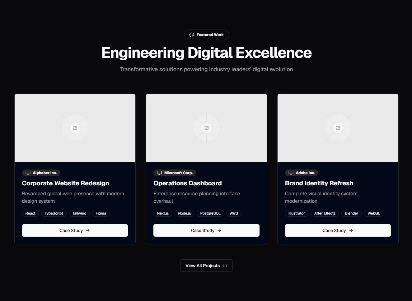
Agency websites have a paradox: the people who build websites for others often have the worst websites themselves. It's not a skills problem — it's a time problem. Client work always takes priority over your own site. Your portfolio page is six months out of date, the team section still shows someone who left last quarter, and the contact form hasn't been tested since you built it.
The fix is to stop building your agency site from scratch and start assembling it from pre-built sections. This guide walks through building a complete digital agency website using SERP Blocks — 1200+ production-ready page sections for Shadcn UI and Tailwind CSS. Every section is copy-paste, fully customizable, and responsive by default.
What an Agency Website Needs
After reviewing hundreds of successful agency websites — from boutique design studios to full-service digital agencies — the highest-performing sites share this structure:
Navigation — Clean, brand-forward header
Hero — The agency's value proposition in one scroll
Client logos — Credibility through association
Services — What you do, clearly explained
Portfolio / Case studies — Proof that you do it well
About — Your story, values, and approach
Team — The people clients will work with
Testimonials — What clients say after the project ships
Awards / Recognition — Third-party validation
Contact — Make it easy to start a conversation
CTA — A final conversion nudge
Footer — Navigation, legal, and social links
Let's build each section.
Navigation: First Impressions
Agency navigation needs to balance professionalism with personality. Browse the navbar collection (17 designs) and look for layouts that support:
Logo placement — Your brand mark should be prominent
Service/work links — The two pages visitors care most about
Contact CTA — A visible button in the header (not buried in a dropdown)
For larger agencies with multiple service lines, a navbar with dropdown menus works well. For boutique studios or freelancers, a minimal horizontal nav with 4-5 links keeps things clean.
One pattern that works particularly well for agencies: a sticky navbar that transitions from transparent (over the hero) to solid (on scroll). Several SERP Blocks navbar variants support this pattern out of the box.
Hero: Your Agency's Elevator Pitch
The hero is where potential clients decide whether to keep scrolling or bounce. Browse the hero collection (81 designs) with agency-specific criteria:
For full-service agencies: Use a video or reel hero. A looping showreel of past work immediately demonstrates capability. Choose a hero layout with background video support and a headline overlay.
For design-focused studios: Use a split-screen hero with a single stunning project image on one side and your headline on the other. Let the work speak visually.
For development agencies: Use a clean typographic hero with a strong headline and a subtle code or grid motif. Developers hiring other developers respect restraint over flash.
For freelancers: Use a personal hero with your photo, a conversational headline, and a direct CTA ("Let's talk about your project"). Freelance clients are buying you, not a brand.
Your headline should communicate outcome, not process. "We build products that grow businesses" beats "Full-service digital agency specializing in web development and design." The first tells the client what they get. The second describes what you do.
Client Logos: Borrowed Credibility
Immediately after the hero, show who you've worked with. Browse the logo collection (11 designs) for client logo displays.
This section does more work than any other on an agency site. When a potential client sees logos they recognize, the sales conversation shifts from "Can this agency do good work?" to "This agency already works with companies like mine."
Tips for agency logo sections:
Use grayscale logos with color on hover — it looks professional and prevents visual clutter
Show 6-12 logos — enough for credibility, not so many that it feels like you're overcompensating
Mix company sizes — a few recognizable brands plus several niche leaders shows range
Rotate if needed — if you have 20+ notable clients, use a marquee or carousel variant
If your agency is new and doesn't have recognizable client logos yet, skip this section. Replace it with a stat section from the stat collection (10 designs) — "50+ projects delivered," "12 industries served," "98% client retention rate."
Services: What You Actually Do
Potential clients need to quickly understand your service offerings. Use a feature section (132 designs) to present your services with clarity.
Icon grid layout — Best for agencies with 4-6 clearly defined services. Each service gets an icon, a title, and a 2-sentence description. Web Design, Development, Branding, SEO, Content Strategy, Analytics.
Alternating rows layout — Best for agencies that want to explain each service in depth. Each row gets a title, a paragraph of description, and an accompanying image or illustration. This works well when your services are complex or differentiated.
Tabbed layout — Best for agencies with many services across categories. Group services into tabs like "Design," "Development," "Marketing," and "Strategy." Visitors self-select their area of interest.
Bento grid layout — Best for modern, design-forward agencies. An asymmetric grid where different services get different visual weight based on their importance to your business.
Don't list every possible service. Focus on the 4-8 things you do best and want to do more of. Your services page is a filter — it should attract ideal clients and gently deflect mismatches.
Portfolio: The Work That Sells the Work
This is the most important section on any agency website. Browse the portfolio collection (20 designs) for project showcase layouts.
Gallery-Style Portfolio
For agencies with visually strong work (design studios, branding agencies, creative agencies), a gallery layout lets the visuals do the talking. Browse the gallery collection (25 designs) for grid and masonry layouts.
A filterable gallery works well here — let visitors filter by project type (branding, web, mobile, print) to find relevant examples. Show 8-12 projects on the main page with a "View all work" link for the full portfolio.
Case Study Portfolio
For agencies where the process and results matter as much as the visuals (development agencies, growth agencies, strategy firms), case study cards are more effective. Use card layouts (110 designs) to create case study preview cards.
Each case study card should include:
Client name and industry
Project thumbnail — The hero image of the finished product
One-line result — "Increased conversion by 340%" or "Launched in 8 weeks"
Tags — Technologies or services used (React, Branding, UX Research)
Link each card to a detailed case study page. For the case study page itself, use a blog single layout (12 designs) adapted for project storytelling. The structure: Challenge, Approach, Solution, Results.
Portfolio Metrics
Within your portfolio section or alongside it, include project metrics. Browse the stat collection (10 designs) for aggregate numbers:
"150+ projects shipped"
"40+ clients across 12 industries"
"Average 3.5x ROI for client campaigns"
"$50M+ in revenue generated for clients"
These aggregate stats give context to individual case studies and demonstrate volume and consistency.
About: Your Story and Approach
Every agency has a story. Browse the about collection (32 designs) for layouts that combine narrative with visual elements.
Agency about sections typically cover:
Origin story — How and why the agency started. Keep it brief and authentic. "Founded in 2019 by two designers frustrated with agency bloat" is more compelling than three paragraphs of corporate history.
Values or principles — 3-5 core beliefs that guide your work. "We ship, then iterate," "Design is a business tool, not decoration," "Transparency over politeness." Make them specific enough to be meaningful.
Process overview — A high-level view of how you work with clients. Use a timeline section (10 designs) to visualize your process stages: Discovery, Strategy, Design, Development, Launch, Support.
Numbers that matter — Years in business, team size, projects completed, client retention rate. These belong in the about section even if you also have them elsewhere.
The about section is also a good place for your agency's culture and working philosophy. Clients increasingly care about who they're partnering with, not just what they produce.
Team: The People Behind the Projects
Clients hire agencies, but they work with people. Browse the team collection (23 designs) for team display layouts.
For agencies with 3-8 people: Use a grid layout with photos, names, roles, and short bios. Show everyone. Small teams are an advantage — clients know exactly who will work on their project.
For agencies with 10-25 people: Use a grid with leadership highlighted and department groupings. Show the partners or directors prominently, then the team by department (Design, Development, Strategy, Operations).
For large agencies (25+): Use a filterable team grid or a department-based tabbed layout. Clients usually want to see the leadership team and the specific department relevant to their project.
Tips for agency team sections:
Use professional but approachable photos — Headshots with personality, not corporate stock photos
Include LinkedIn links — Potential clients will check your team's backgrounds
Show relevant experience — "Previously at Google, Spotify, and IDEO" builds confidence
Add a hiring CTA — If you're growing, a "Join our team" link to the careers section (20 designs) doubles the section's utility
Testimonials: Let Clients Sell for You
Social proof from past clients is the most persuasive content on your site. Browse the testimonial collection (40 designs) for client quote layouts.
Video testimonials — The most powerful format. A 60-second video of a client describing their experience is worth more than any written quote. Use a testimonial layout with video embed support.
Quote cards with results — Written testimonials paired with metrics. "ACME Agency redesigned our checkout flow and increased our conversion rate by 47%. The project was delivered on time and the team was a pleasure to work with." — VP of Product, TechCorp.
Logo + quote carousel — For agencies with many testimonials, a carousel that cycles through quotes with the client's company logo creates a steady stream of credibility.
Industry-specific testimonials — If you serve multiple industries, group testimonials by vertical. A fintech company wants to see what other fintech clients say, not what a fashion brand thinks.
Aim for 4-8 testimonials on your main page. Include the client's name, title, company, and photo if possible. Anonymous testimonials ("— Marketing Director, Fortune 500 Company") are far less convincing than named ones.
Awards and Recognition
If your agency has won industry awards or been recognized by publications, showcase them. Browse the awards collection (10 designs) for display layouts.
Awwwards, CSS Design Awards, Webby Awards, Clutch rankings, Inc. 5000 listings — these third-party validations carry weight because they can't be fabricated. Even local business awards or industry-specific recognitions are worth showing.
A simple grid of award badges with the year and category is sufficient. Place this section between testimonials and the contact section for maximum impact — it's the final credibility signal before the conversion ask.
Contact: Start the Conversation
Make it easy for potential clients to reach out. Browse the contact collection (33 designs) for form layouts.
Agency contact forms should collect:
Name and email — The basics
Company/organization — Helps you qualify the lead
Project type — Dropdown with your service categories
Budget range — Optional but extremely useful for qualifying leads (Under $10K, $10-25K, $25-50K, $50-100K, $100K+)
Project description — A textarea for the client to describe what they need
How they found you — Helps you track which channels drive leads
Don't hide the form behind three pages of "our process" content. The contact form should be prominent and easy to find from anywhere on the site.
Consider including a section with your email, phone number, and office address alongside the form. Some clients prefer a direct email or phone call over filling out a form.
Final CTA: One More Nudge
Before the footer, add a strong call to action. Browse the CTA collection (32 designs) for conversion-focused layouts.
Effective agency CTAs:
"Have a project in mind? Let's talk." — Conversational, low-pressure
"Ready to start your next project?" — Direct, action-oriented
"Schedule a free discovery call" — Specific, reduces the commitment barrier
"See how we can help — view our work" — For visitors who aren't ready to contact you yet, redirect them to the portfolio
The CTA section should be visually distinct from the rest of the page. A full-width background color, a large headline, and a single button is the proven pattern.
Footer: Clean and Complete
Close the site professionally. Browse the footer collection (21 designs) for agency-appropriate layouts.
Agency footers should include:
Service links — Quick access to individual service pages
Company links — About, Team, Careers, Blog
Work links — Portfolio, Case Studies
Legal links — Privacy Policy, Terms of Service
Social links — LinkedIn, Twitter/X, Instagram, Dribbble, Behance (whichever platforms your agency is active on)
Contact info — Email and phone number in the footer for easy access
Newsletter signup — Optional, using a newsletter component (13 designs) for agencies that publish content
Additional Pages
Beyond the main homepage, most agency websites need a few additional pages. SERP Blocks has sections for all of them:
Individual service pages — Use feature sections (132 designs) combined with testimonial sections (40 designs) for service-specific social proof.
Case study detail pages — Use blog single layouts (12 designs) adapted for the Challenge-Approach-Solution-Results structure.
Careers page — Use the careers collection (20 designs) for job listings. Growing agencies need to attract talent as much as clients.
Blog — Use blog list layouts (27 designs) for the blog index. Content marketing is how agencies demonstrate expertise and attract organic traffic.
FAQ page — Use the FAQ collection (21 designs) for common client questions: "How long does a typical project take?" "What's your pricing model?" "Do you work with startups?"
Putting It All Together
Here's the full section inventory for an agency website built with SERP Blocks:
| Section | Category | Blocks Available |
| Navbar | Navbar | 17 |
| Hero | Hero | 81 |
| Logos | Logos | 11 |
| Services | Feature | 132 |
| Portfolio | Portfolio | 20 |
| Gallery | Gallery | 25 |
| About | About | 32 |
| Team | Team | 23 |
| Testimonials | Testimonial | 40 |
| Awards | Awards | 10 |
| Contact | Contact | 33 |
| CTA | CTA | 32 |
| Footer | Footer | 21 |
| Cards | Card | 110 |
| Careers | Careers | 20 |
| Blog List | Blog List | 27 |
| FAQ | FAQ | 21 |
That's 675 blocks directly relevant to building an agency website. With 60 blocks available for free and a one-time Pro purchase for the full library, you can prototype your entire agency site in an afternoon and have it production-ready within a week.
Stop putting your own website last. Your agency site is your best-performing salesperson — it works 24/7, never takes a day off, and handles every inbound lead. Give it the same attention you give client projects.