Create a Blog with Next.js and Shadcn UI Components
Complete tutorial on building a blog with Next.js App Router and Shadcn UI blocks — MDX content setup, blog list layouts, article pages, newsletter sections, and SEO optimization. Ship a production-ready blog fast.
SERP Blocks Team
Product
Every developer, startup, and agency needs a blog. It drives organic traffic, establishes authority, and gives your audience a reason to keep coming back. But building a blog from scratch — content management, layouts, responsive design, SEO metadata, RSS feeds — adds up fast. What should be a weekend project stretches into weeks of frontend work.
With Next.js App Router and pre-built Shadcn UI blocks, you can have a production-ready blog running in an afternoon. This tutorial walks through the entire process: setting up MDX content, building the blog list page, designing individual article pages, and adding the supporting sections that turn a basic blog into a content engine.
What You're Building
By the end of this tutorial, your blog will include:
Blog list page — Filterable grid of articles with categories and tags
Individual article pages — Full MDX-powered posts with rich formatting
Related articles — Recommended posts at the bottom of each article
Newsletter signup — Email capture integrated into the blog experience
SEO metadata — Open Graph tags, structured data, and an RSS feed
Navbar and Footer — Consistent site navigation wrapping the blog
Each of these maps to block categories in SERP Blocks. Let's build it.
Step 1: Set Up Your Next.js Project
Start with a fresh Next.js project if you don't already have one:
npx create-next-app@latest my-blog --typescript --tailwind --app
cd my-blog
npx shadcn@latest init
This gives you the App Router, Tailwind CSS, and Shadcn UI ready to go.
Step 2: Configure MDX for Content
MDX lets you write blog posts in Markdown with embedded React components. Install the dependencies:
npm install @next/mdx @mdx-js/loader @mdx-js/react gray-matter reading-timeCreate a content directory for your blog posts:
src/
  content/
    blogs/
      my-first-post.mdx
      building-with-nextjs.mdx
Each MDX file uses frontmatter to define metadata:
---
title: "Your Post Title"
description: "A concise description for SEO and social sharing."
publishDate: "2026-03-20"
heroImage: "/images/posts/my-post-hero.png"
author:
  name: "Your Name"
  avatar: "/images/authors/you.jpg"
category: "Engineering"
tags:
  - Next.js
  - React
published: true
---

Your markdown content goes here. You can use **bold**, _italic_,
code blocks, images, and even React components inline.
The frontmatter is your content's API. It powers the blog list page, SEO tags, RSS feed, and social sharing cards — all from a single source of truth.
Step 3: Build the Content Layer
Create a utility file that reads your MDX files and parses their frontmatter:
import fs from "fs";
import path from "path";
import matter from "gray-matter";
import readingTime from "reading-time";

const BLOGS_DIR = path.join(process.cwd(), "src/content/blogs");

export function getAllPosts() {
  const files = fs.readdirSync(BLOGS_DIR);

  const posts = files
    .filter((file) => file.endsWith(".mdx") || file.endsWith(".md"))
    .map((file) => {
      const raw = fs.readFileSync(path.join(BLOGS_DIR, file), "utf-8");
      const { data, content } = matter(raw);
      const slug = file.replace(/\.(mdx|md)$/, "");

      return {
        slug,
        frontmatter: data,
        content,
        readingTime: readingTime(content).text,
      };
    })
    .filter((post) => post.frontmatter.published)
    .sort(
      (a, b) =>
        new Date(b.frontmatter.publishDate).getTime() -
        new Date(a.frontmatter.publishDate).getTime()
    );

  return posts;
}

export function getPostBySlug(slug: string) {
  const posts = getAllPosts();
  return posts.find((post) => post.slug === slug);
}
This gives you two functions: one that returns all published posts sorted by date, and one that fetches a single post by its URL slug. The reading-time package calculates estimated read time from the word count, which you can display on cards and article headers.
Step 4: Choose Your Blog List Layout
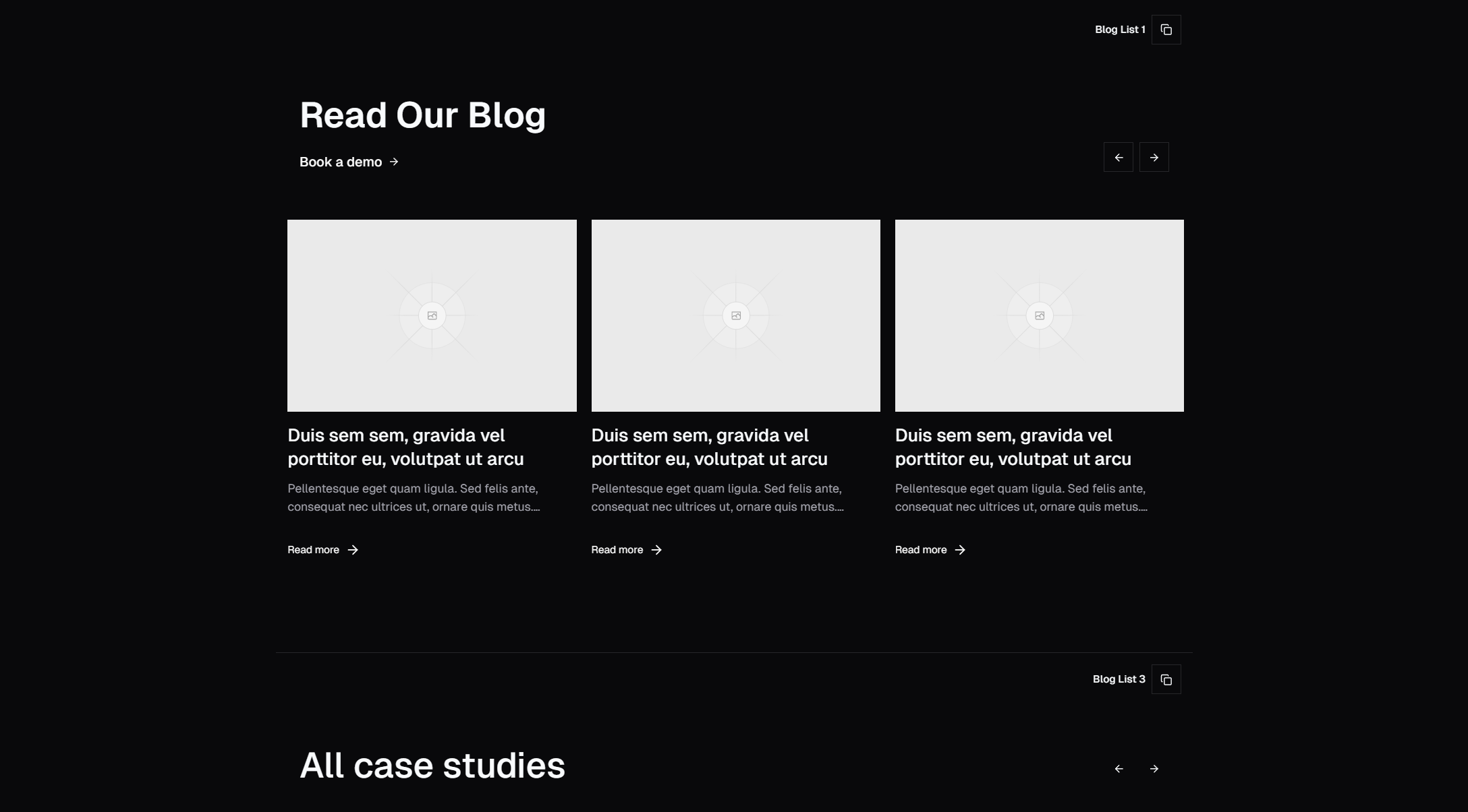
The blog list page is where visitors browse your content. The layout determines how articles are presented and how easily readers find what they're looking for. Browse the blog list collection (27 designs) and pick a layout that matches your content volume and style:
Card grid — Three-column grid with hero images, titles, and excerpts. Best for visual blogs with strong featured images
List layout — Stacked rows with thumbnails and descriptions. Efficient for text-heavy blogs with many posts
Magazine layout — Featured post hero at the top with a grid of smaller posts below. Great for blogs that publish frequently and want to highlight recent content
Minimal list — Title, date, and category only. Clean and fast for developer-focused blogs
Sidebar layout — Main content area with a category or tag sidebar for filtering
For most blogs starting out, the card grid works best. It looks professional even with just 3-4 posts, and scales naturally as your content library grows.
Copy your chosen blog list block into your blog page route:
src/app/blog/page.tsxWire the block to your getAllPosts() function. Replace the static placeholder data with your actual post array, mapping frontmatter fields to the block's expected props — title, description, image, date, category, and slug.
Step 5: Design Individual Article Pages
The article page is where readers spend the most time. This needs to feel polished. Browse the blog single collection (12 designs) and choose a layout:
Classic single column — Centered content with a max-width for comfortable reading. Headings, body text, code blocks, and images all flow naturally
With sidebar — Article content on the left, table of contents or related posts on the right. Good for long-form technical content
Full-width hero — Large hero image spanning the viewport with content below. Visually striking for featured articles
Magazine style — Multi-column layout with pull quotes and image floats. Best for editorial and storytelling content
For developer and product blogs, the classic single column with a table of contents sidebar offers the best reading experience. The table of contents auto-generates from your MDX headings and provides quick navigation for longer posts.
Set up a dynamic route for individual posts:
src/app/blog/[slug]/page.tsxThis route uses getPostBySlug() to fetch the content and renders the MDX with your chosen blog single block as the layout wrapper.
Typography Matters
Shadcn UI includes a typography plugin that styles rendered Markdown beautifully out of the box. Headings, paragraphs, lists, blockquotes, code blocks, and tables all receive consistent, readable styling. Make sure your article content area uses the prose class from Tailwind Typography:
<article className="prose prose-lg dark:prose-invert max-w-none">
  <MDXContent />
</article>
This single class handles font sizes, line heights, spacing, and responsive adjustments for every HTML element that MDX produces.
Step 6: Add Related Articles
When a reader finishes an article, related posts keep them on your site instead of bouncing back to search results. This is one of the most effective patterns for increasing time-on-site and page views per session.
Build a simple related posts function that matches by category and tags:
export function getRelatedPosts(currentSlug: string, limit = 3) {
  const current = getPostBySlug(currentSlug);
  if (!current) return [];

  const allPosts = getAllPosts().filter((p) => p.slug !== currentSlug);

  const scored = allPosts.map((post) => {
    let score = 0;
    if (post.frontmatter.category === current.frontmatter.category) {
      score += 3;
    }
    const sharedTags = post.frontmatter.tags?.filter((tag: string) =>
      current.frontmatter.tags?.includes(tag)
    );
    score += (sharedTags?.length || 0) * 2;
    return { ...post, score };
  });

  return scored.sort((a, b) => b.score - a.score).slice(0, limit);
}
This scores posts based on shared categories (weighted heavier) and shared tags, then returns the top matches. Display them at the bottom of each article page using another block from the blog list collection — a compact card grid of 3 articles works perfectly as a "Read Next" section.
Step 7: Integrate a Newsletter Signup
A blog without email capture is leaving growth on the table. Readers who subscribe become a direct channel you own — independent of search algorithm changes or social media reach.
Browse the newsletter collection (13 designs) and choose where to place it:
Inline newsletter — Placed between sections of the blog list page, usually after the first 3-6 posts. Catches readers while they're actively browsing
End-of-article newsletter — Below the article content but above related posts. Targets readers who finished the entire piece and are clearly engaged
Sticky sidebar newsletter — Follows the reader as they scroll. Persistent but not intrusive
Full-width banner newsletter — Bold section between the blog content and footer. Hard to miss
For maximum conversions, use two placements: an inline signup on the blog list page and an end-of-article signup on individual posts. The inline version catches browsers, while the end-of-article version captures your most engaged readers.
Connect the email input to your preferred email service — Resend, ConvertKit, Mailchimp, or even a simple API route that stores emails in your database. The block handles the UI; you supply the backend.
Step 8: Add Navigation
Wrap your blog in consistent site navigation. Pick a navbar from the navbar collection (17 designs) and a footer from the footer collection (21 designs).
For a blog-focused site, your navbar should include:
Logo linking to the homepage
Blog link (active state when on blog pages)
Categories dropdown if you have more than 4-5 categories
Search icon if you implement blog search
CTA button (subscribe, product link, or contact)
Place the navbar and footer in your root layout so they appear on every page, including both the blog list and individual articles.
Step 9: Implement SEO Metadata
Next.js App Router has built-in support for metadata through the generateMetadata function. Set this up for both your blog list page and individual articles:
// src/app/blog/[slug]/page.tsx
export async function generateMetadata({
  params,
}: {
  params: { slug: string };
}) {
  const post = getPostBySlug(params.slug);
  if (!post) return {};

  return {
    title: post.frontmatter.title,
    description: post.frontmatter.description,
    openGraph: {
      title: post.frontmatter.title,
      description: post.frontmatter.description,
      type: "article",
      publishedTime: post.frontmatter.publishDate,
      authors: [post.frontmatter.author.name],
      images: [post.frontmatter.heroImage],
    },
    twitter: {
      card: "summary_large_image",
      title: post.frontmatter.title,
      description: post.frontmatter.description,
      images: [post.frontmatter.heroImage],
    },
  };
}
This generates unique Open Graph and Twitter Card metadata for every post, so shared links display rich previews on social platforms.
Static Generation
Use generateStaticParams to pre-render all blog posts at build time:
export async function generateStaticParams() {
  const posts = getAllPosts();
  return posts.map((post) => ({ slug: post.slug }));
}
This ensures every article is served as static HTML — fast load times, great for SEO, and zero server cost per page view.
Step 10: Add an RSS Feed
An RSS feed lets readers subscribe through feed readers and lets aggregators discover your content. Create a route handler:
// src/app/feed.xml/route.ts
import { getAllPosts } from "@/lib/blogs";

export async function GET() {
  const posts = getAllPosts();
  const siteUrl = "https://yourdomain.com";

  const rss = `<?xml version="1.0" encoding="UTF-8"?>
<rss version="2.0" xmlns:atom="http://www.w3.org/2005/Atom">
  <channel>
    <title>Your Blog</title>
    <link>${siteUrl}/blog</link>
    <description>Your blog description</description>
    <atom:link href="${siteUrl}/feed.xml" rel="self" type="application/rss+xml"/>
    ${posts
      .map(
        (post) => `
    <item>
      <title>${post.frontmatter.title}</title>
      <link>${siteUrl}/blog/${post.slug}</link>
      <description>${post.frontmatter.description}</description>
      <pubDate>${new Date(post.frontmatter.publishDate).toUTCString()}</pubDate>
      <guid>${siteUrl}/blog/${post.slug}</guid>
    </item>`
      )
      .join("")}
  </channel>
</rss>`;

  return new Response(rss, {
    headers: { "Content-Type": "application/xml" },
  });
}
Add the feed link to your site's <head> so browsers and crawlers auto-discover it:
<link rel="alternate" type="application/rss+xml" title="RSS" href="/feed.xml" />Content Architecture Tips
A few decisions made early will save refactoring later:
Categories vs. Tags: Use categories for broad groupings (Engineering, Product, Design) and tags for specific topics (Next.js, React, CSS). Each post should have exactly one category and 2-5 tags. This gives you clean filtering on the blog list page without overwhelming readers with too many options.
Image organization: Store post images in a structured directory:
public/
  images/
    posts/
      my-post-slug/
        hero.png
        screenshot-1.png
        diagram.png
This keeps images associated with their posts and avoids a flat folder with hundreds of files.
URL structure: Use /blog/[slug] for articles. Avoid dates in URLs (/blog/2026/03/my-post) — they make URLs longer without helping SEO, and they break if you update a post's publish date.
Draft workflow: The published: true flag in frontmatter lets you commit draft posts without them appearing on the site. Set published: false for work-in-progress articles, and flip it to true when you're ready to publish.
Performance Considerations
Blog pages are perfect candidates for static generation. Since content changes infrequently, pre-rendering at build time gives you:
Sub-100ms page loads from CDN edge nodes
Zero server compute cost per page view
Perfect Lighthouse scores for performance
Reliable uptime independent of server health
If you add dynamic features like view counts or comments later, use client-side fetching for those specific elements while keeping the core content static.
For images, use Next.js <Image> component with proper width, height, and sizes attributes. This enables automatic image optimization, lazy loading, and responsive srcsets without any additional configuration.
The Result
With these 10 steps completed, you have a fully functional blog with:
MDX-powered content with rich formatting support
A responsive blog list page with category filtering
Individual article pages with reading time and table of contents
Related post recommendations to increase engagement
Newsletter signup to build your email list
Full SEO metadata and Open Graph support
An RSS feed for subscribers and aggregators
Consistent navigation with navbar and footer
All Block Categories Used
| Section | Category | Blocks Available |
| Blog List | Blog List | 27 |
| Blog Article | Blog Single | 12 |
| Newsletter | Newsletter | 13 |
| Navbar | Navbar | 17 |
| Footer | Footer | 21 |
That's 90 block options across 5 categories — all available at SERP Blocks. 60 blocks are free, with the full 1200+ block library available through a one-time Pro purchase.