E-commerce UI Components with Shadcn: A Complete Guide
Build a full e-commerce storefront with Shadcn UI blocks — product pages, category grids, shopping cart, checkout, order confirmation, reviews, and refund tracking. 149 blocks covering the entire customer journey.
SERP Blocks Team
Product
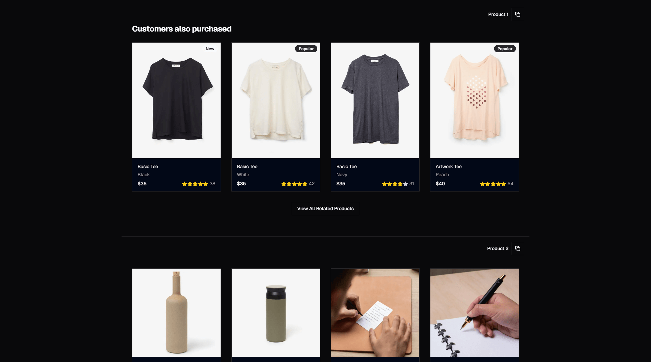
Building an e-commerce storefront is one of the most component-heavy projects in web development. Every page in the customer journey — from browsing products to completing checkout to tracking a refund — requires its own set of carefully designed UI components. A product listing page alone needs cards, filters, sorting controls, pagination, and responsive grid layouts. Multiply that across the entire shopping experience, and you are looking at weeks of frontend work before a single product goes on sale.
This guide maps the complete e-commerce customer journey to specific Shadcn UI block categories in SERP Blocks. We will cover every stage from product discovery through post-purchase, with a total of 149 purpose-built blocks across eight e-commerce-specific categories — plus dozens more from general categories that round out the storefront.
The E-commerce Customer Journey
Every online store follows the same fundamental flow:
Discovery — Customer finds your store and browses products
Evaluation — Customer views product details, reads reviews, compares options
Purchase — Customer adds to cart, enters payment, and confirms the order
Post-Purchase — Customer tracks the order, leaves reviews, or requests a refund
Each stage has distinct UI requirements. Let's walk through them.
Stage 1: Product Discovery
The discovery phase is where customers first encounter your products. The UI needs to showcase inventory clearly, support browsing and filtering, and make it easy to drill into individual products.
Product List Pages (20 Blocks)
The product list page is the backbone of any online store. The product list collection provides 20 blocks covering the major layout patterns:
Grid layouts — The standard e-commerce pattern. Three or four columns of product cards, each showing an image, title, price, and a quick-add button. Grid layouts maximize the number of products visible at once and work well for stores with strong product photography.
List layouts — Single-column rows with a larger image, full description, and more metadata visible without clicking through. List layouts work better for products that need explanation — electronics, software, professional services.
Compact grids — Tighter spacing, smaller cards, more products per page. Good for stores with large catalogs where customers browse by scrolling rather than searching.
Each product list block includes responsive breakpoints that shift from multi-column grids on desktop to single-column stacks on mobile. Getting this transition right is critical for e-commerce — over 60 percent of online shopping happens on mobile devices.
Shop Category Pages (20 Blocks)
Before customers reach product lists, they often navigate through category pages. The shop category collection gives you 20 blocks for organizing your catalog:
Category grids — Visual cards for each category with a featured image, title, and product count
Category navigation — Sidebar or top-bar filters with nested subcategories
Featured category layouts — Highlight seasonal or promoted categories with larger cards and hero-style treatments
Good category pages reduce the time between landing on the store and finding a relevant product. They serve as a map of your inventory, helping customers orient themselves before diving into specific product lists.
Hero Sections for E-commerce (81 Blocks)
E-commerce stores need strong landing pages too. The hero collection has 81 blocks, and several styles work particularly well for online stores:
Split-screen heroes with a product image on one side and a promotional headline on the other — perfect for seasonal campaigns and new arrivals
Heroes with background images showcasing lifestyle photography of products in use
Heroes with CTAs that link directly to sale pages or featured collections
Pair a hero section with a banner block (20 available) at the top of the page to promote sales, free shipping thresholds, or limited-time offers.
Stage 2: Product Evaluation
Once a customer finds a product they are interested in, the evaluation phase begins. This is where detailed product information, imagery, and social proof determine whether the item goes into the cart.
Product Detail Pages (25 Blocks)
The product detail page is the most conversion-critical page in an e-commerce store. The product collection includes 25 blocks covering:
Image gallery with thumbnails — Multiple product photos with thumbnail navigation and zoom capability. Customers want to see products from every angle, and the gallery is the primary driver of purchase confidence.
Product info panels — Title, price, variant selectors (size, color), quantity picker, and add-to-cart button arranged in a clear hierarchy.
Tabbed details — Description, specifications, shipping info, and return policy organized in tabs to keep the page scannable without hiding important information.
Related products sections — "You might also like" or "Frequently bought together" grids that increase average order value.
The layout of a product page follows a proven pattern: large image gallery on the left (or top on mobile), product information on the right, with details and related products below the fold. Every block in this collection follows that convention while offering visual variety in typography, spacing, and component styling.
Product Info Sections (15 Blocks)
For more complex products, the product info collection provides 15 additional blocks focused specifically on detailed product information:
Specification tables — Technical details in a structured format
Feature highlight sections — Key selling points with icons or illustrations
Comparison layouts — Side-by-side comparisons between product variants or models
These blocks sit below the main product section and give customers the detail they need to commit to a purchase. For electronics, furniture, or any product where specifications matter, these blocks significantly improve conversion rates.
Reviews (13 Blocks)
Reviews are the most powerful form of social proof in e-commerce. The reviews collection includes 13 blocks for:
Review summaries — Average rating, star distribution bar, and total review count at a glance
Individual review cards — Customer name, rating, date, verified purchase badge, and review text
Review with photos — Customer-submitted images alongside their written review
Review filters — Sort by rating, date, or most helpful
According to research, 93 percent of consumers say online reviews influence their purchasing decisions. A well-designed review section builds trust and answers product questions that the description might not cover. These blocks give you the complete review experience without building it from scratch.
Stage 3: The Purchase Flow
The purchase flow is where revenue happens. Every unnecessary click, confusing label, or slow-loading element in this flow costs you money. These blocks are designed to minimize friction at every step.
Shopping Cart (11 Blocks)
The shopping cart collection provides 11 blocks for the cart experience:
Full-page cart — Detailed cart view with product images, quantity adjusters, remove buttons, and an order summary sidebar with subtotal, shipping estimate, and total
Slide-out cart — A drawer that slides in from the right when an item is added, letting customers review their cart without leaving the current page
Mini cart — A compact dropdown in the header showing item count and a quick checkout link
The choice between these patterns depends on your store's browsing behavior. If customers typically buy one or two items, a slide-out cart keeps them in the shopping flow. If customers build larger orders, a full-page cart gives them the space to review and manage multiple items.
Every cart block includes line-item management — quantity updates, item removal, and real-time total calculations. They are designed to work with your state management solution of choice, whether that is React context, Zustand, Jotai, or a server-side cart API.
Payment Forms (15 Blocks)
The checkout form is the final hurdle before conversion. The payment form collection includes 15 blocks covering:
Single-page checkout — All fields on one page: shipping address, billing address, and payment information
Multi-step checkout — Separated into distinct steps (shipping, payment, review) with a progress indicator
Express checkout — Streamlined forms with auto-fill support and saved payment methods
These blocks are designed to integrate with Stripe, which handles the actual payment processing. The typical integration pattern is:
Use a SERP Blocks payment form for the UI layer
Mount Stripe Elements (card input, payment request button) inside the designated payment field area
Handle form submission by creating a Stripe PaymentIntent on your server and confirming it on the client
The block handles layout, responsive behavior, field validation, and error states. You wire up Stripe and your backend API. This separation keeps the checkout form looking polished while giving you full control over the payment logic.
Performance tip: Lazy-load the Stripe.js script. It is a 40KB library that only needs to load when the user reaches the checkout page. Use Next.js dynamic imports to load it on demand:
import dynamic from "next/dynamic";

const StripeCheckout = dynamic(() => import("@/components/stripe-checkout"), {
  loading: () => <CheckoutSkeleton />,
  ssr: false,
});
This keeps your product and category pages fast while ensuring the checkout loads quickly when needed.
Order Confirmation (10 Blocks)
After a successful payment, the order confirmation page reassures the customer and sets expectations. The order confirmation collection provides 10 blocks for:
Order summary — Order number, items purchased, quantities, and total paid
Shipping details — Delivery address, estimated delivery date, and tracking information
Next steps — Links to track the order, continue shopping, or create an account (for guest checkouts)
Email confirmation notice — Confirmation that a receipt has been sent to their email
A good order confirmation page reduces "did my order go through?" anxiety. It should display immediately after payment succeeds and contain every detail the customer needs to feel confident the transaction completed correctly.
Stage 4: Post-Purchase Experience
The customer relationship does not end at checkout. The post-purchase experience determines whether a one-time buyer becomes a repeat customer.
Refund Status (10 Blocks)
Returns and refunds are a reality of e-commerce. The refund status collection provides 10 blocks for:
Refund request forms — Reason selection, item selection, and comments
Refund status trackers — Step-by-step progress showing where the refund stands (requested, approved, processing, completed)
Refund history — Past refund records with dates, amounts, and statuses
A transparent refund process builds trust. Customers who can see exactly where their refund stands are far less likely to contact support or leave negative reviews. These blocks make refund tracking self-service.
Reviews (Revisited)
The same review blocks (13 total) that display reviews for prospective buyers also power the review submission flow. After delivery, prompt customers to leave a review using a review form block with star rating, text input, and photo upload fields.
Supporting E-commerce Categories
Beyond the core shopping flow, several general-purpose block categories fill important roles in an e-commerce storefront:
Navigation and Structure
Navbar (17 blocks) — Store navigation with category dropdowns, search bar, cart icon, and account menu
Footer (21 blocks) — Store links, payment method badges, legal pages, and social media
Gallery (25 blocks) — Lookbook-style image grids for lifestyle and brand content
Trust and Social Proof
Testimonial (40 blocks) — Customer testimonials on brand and landing pages
Logos (11 blocks) — "As seen in" press mentions or partner brand logos
Stats (10 blocks) — Display metrics like "50,000+ happy customers" or "4.9 average rating"
Marketing and Conversion
CTA (32 blocks) — Promotional banners and conversion sections
Newsletter (13 blocks) — Email signup for sales notifications and new arrivals
FAQ (21 blocks) — Shipping policies, return policies, and sizing guides
Contact (33 blocks) — Customer support forms
Content and SEO
Blog list (27 blocks) — Content marketing pages for product guides and style inspiration
Blog single (12 blocks) — Individual article layouts
Content (13 blocks) — Long-form content sections for brand storytelling
Performance Considerations for E-commerce
E-commerce sites live and die by performance. Every 100ms of additional load time reduces conversion rates by roughly 1 percent. Here are the key performance practices when building with Shadcn UI blocks:
Image optimization. Product images are the heaviest assets on any e-commerce page. Use Next.js Image component with proper width and height attributes, serve WebP format, and implement lazy loading for images below the fold. Every SERP Blocks image placeholder is designed to be swapped with Next.js Image.
Component code splitting. Not every block needs to load on every page. Use dynamic imports for heavy sections like the shopping cart drawer, payment form, and review submission modal. These components include client-side interactivity that does not need to be in the initial bundle.
Server components. Product listing pages, category pages, and product detail pages are excellent candidates for React Server Components. The product data comes from your database or CMS, renders on the server, and ships as HTML to the client. Only interactive elements like add-to-cart buttons and quantity selectors need client-side hydration.
Prefetching. Use Next.js Link component with prefetch for product cards on listing pages. When a customer hovers over a product card, the product detail page starts loading in the background. By the time they click, the page appears instantly.
Block Count Summary
Here is the full breakdown of e-commerce-relevant blocks:
| Category | Blocks | Role |
| Product | 25 | Product detail pages |
| Product List | 20 | Product browsing grids |
| Product Info | 15 | Detailed specifications |
| Shop Category | 20 | Category navigation |
| Shopping Cart | 11 | Cart management |
| Payment Form | 15 | Checkout and billing |
| Order Confirmation | 10 | Post-purchase confirmation |
| Reviews | 13 | Social proof and feedback |
| Refund Status | 10 | Returns and refund tracking |
| E-commerce total | 139 |
Add in hero sections, CTAs, navigation, testimonials, FAQ, and content blocks, and you are looking at well over 400 blocks that serve an e-commerce storefront.
Getting Started
If you are building an e-commerce store with Next.js and Shadcn UI, start with the customer journey:
Browse the product list blocks and pick a grid layout for your catalog pages
Choose a product block for your detail pages
Grab a shopping cart block and wire it up to your state management
Add a payment form block and integrate Stripe
Drop in an order confirmation block to complete the flow
SERP Blocks includes 60 free blocks to start with. When you are ready for the full e-commerce block set, a one-time Pro purchase at blocks.serp.co unlocks all 1,200+ blocks across every category. No subscription, no per-project licensing — buy once and use across every store you build.
The fastest way to launch an online store is to compose it from proven patterns. Start with blocks, customize to match your brand, and spend your development time on the logic that makes your store unique — inventory management, search, recommendations, and the features your customers actually care about.