Hero Section Design Best Practices: Layout, Copy, and CTA Placement
A comprehensive guide to hero section design — covering visual hierarchy, F-pattern reading, headline formulas, CTA button placement, responsive design, and above-the-fold optimization. Includes examples from 81 Shadcn UI hero blocks.
SERP Blocks Team
Product
The hero section is the single most important piece of UI on any website. It occupies the entire viewport on first load, carries the weight of your value proposition, and determines whether a visitor scrolls down or hits the back button. Every pixel matters.
Yet most hero sections are built on intuition rather than design principles. Developers pick a layout that "looks right," write a headline that "sounds good," and place a CTA button wherever there is space. The result is a hero that works sometimes but converts inconsistently.
This guide covers the design theory behind high-performing hero sections — the layout patterns, copywriting formulas, CTA strategies, and responsive considerations that separate great heroes from forgettable ones. Along the way, we will reference specific patterns from the 81 hero section blocks in SERP Blocks to illustrate each concept.
How Visitors Actually Read Hero Sections
Before designing anything, you need to understand how people look at web pages. Decades of eye-tracking research have established two dominant reading patterns.
The F-Pattern
On text-heavy pages, visitors read in an F-shaped pattern. They scan horizontally across the top (your headline), drop down and scan a shorter horizontal line (your subheading), then scan vertically down the left side looking for anchors. This means:
Your headline must be at the top and visually dominant.
Your subheading should sit directly below and be noticeably smaller.
Your CTA button needs to be on the left side or center — never buried on the far right.
The Z-Pattern
On pages with less text and more visual elements, the eye follows a Z-pattern: top-left to top-right, diagonally down to bottom-left, then across to bottom-right. This pattern is common in hero sections that combine a headline on the left with an image on the right.
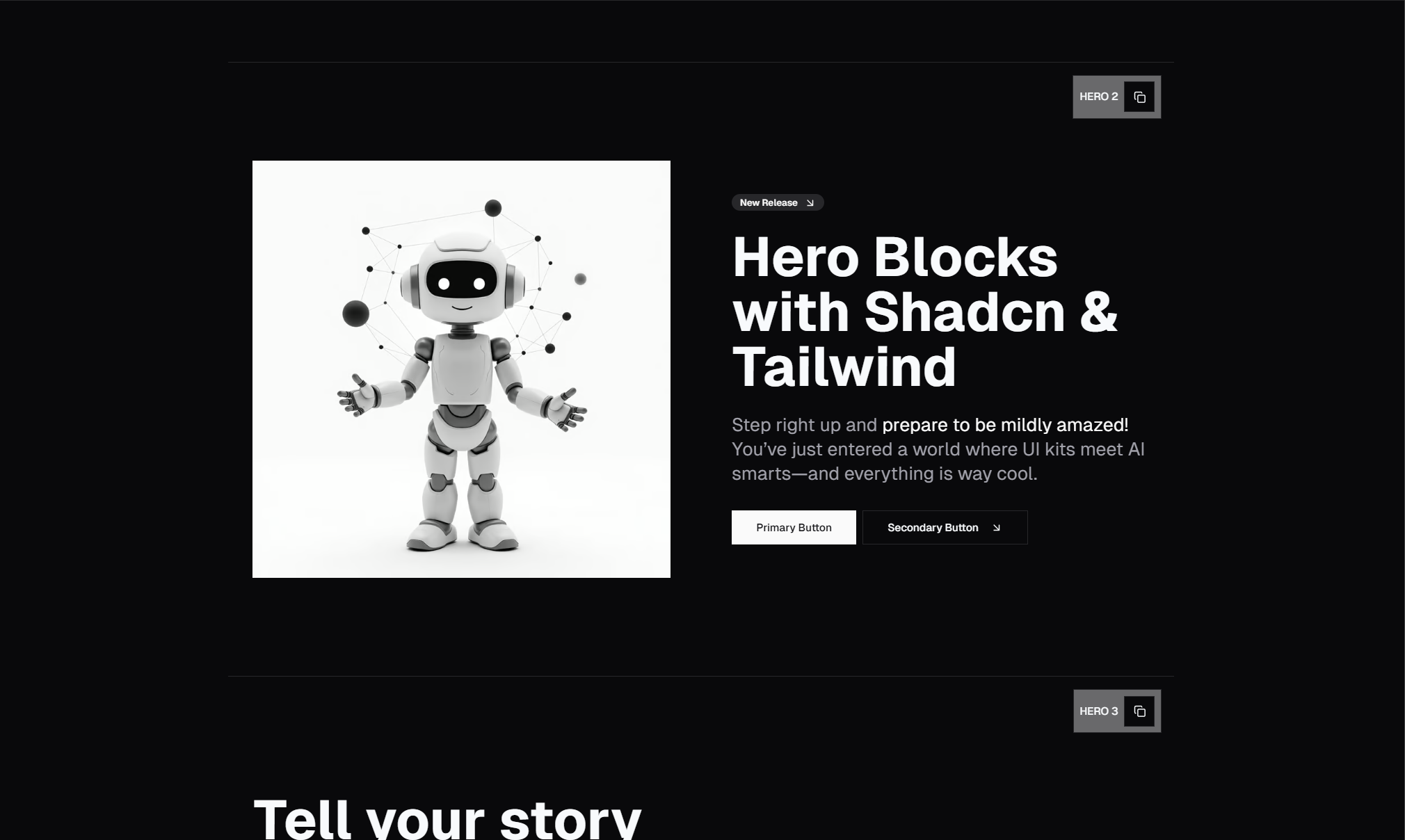
Split-screen hero layouts naturally follow the Z-pattern. The visitor reads the headline (top-left), glances at the image (top-right), drops to the subheading (bottom-left), and lands on the CTA button (bottom-right area). Several of the hero blocks in SERP Blocks use this exact layout — text on the left, product screenshot or illustration on the right, with the CTA positioned at the natural endpoint of the Z-scan.
Visual Hierarchy: The Foundation of Every Hero
Visual hierarchy is the principle that design elements should be arranged to signal their importance. In a hero section, the hierarchy should be:
Headline — Largest, boldest, most prominent
Subheading — Clearly secondary, providing context
CTA Button — High contrast, impossible to miss
Supporting elements — Images, badges, secondary links
Font Size Ratios
A common mistake is making the headline and subheading too close in size. When the size difference is too small, the hierarchy breaks down and neither element stands out. As a guideline:
Headline: 48px to 72px on desktop (text-5xl to text-7xl in Tailwind)
Subheading: 18px to 24px on desktop (text-lg to text-2xl in Tailwind)
CTA button text: 16px to 18px (text-base to text-lg)
The ratio between headline and subheading should be at least 2:1. A 64px headline with a 20px subheading creates clear separation. A 36px headline with a 24px subheading does not.
Font Weight Contrast
Size alone is not enough. Pair large headlines with bold or extra-bold weights (font-bold or font-extrabold), and keep subheadings at regular or medium weight (font-normal or font-medium). The weight difference reinforces the size hierarchy and makes the section scannable at a glance.
Color and Contrast
Your headline should be in your highest-contrast text color — typically near-black on light backgrounds or white on dark backgrounds. Subheadings should use a muted secondary color (text-muted-foreground in Shadcn UI) to visually recede. CTA buttons should use your primary brand color with white or contrasting text.
Headline Formulas That Convert
The headline is the single most read element on the entire page. Changing a headline can move conversion rates by 20% or more. Here are the formulas that consistently perform well for SaaS and product pages.
The Value Proposition Formula
[Achieve specific outcome] without [pain point]
Examples: "Build landing pages without writing CSS." "Scale your team without scaling your budget."
This formula works because it names the benefit and removes the objection in a single sentence. It tells the visitor exactly what they get and why this solution is different.
The Quantified Result Formula
[Number] [specific result] in [timeframe]
Examples: "1,200+ blocks ready to ship today." "Build your landing page in 10 minutes."
Numbers catch the eye and create specificity. Vague headlines like "Build better websites" are forgettable. "81 hero sections, copy-paste ready" is concrete.
The Question Formula
[Question that names the pain point]?
Examples: "Tired of building the same components from scratch?" "Still designing hero sections pixel by pixel?"
Questions engage visitors because they trigger an internal response. If the visitor answers "yes" in their head, they are primed to read the subheading for the solution.
The Command Formula
[Action verb] + [specific outcome]
Examples: "Ship your SaaS landing page this week." "Stop building UI from scratch."
Direct and action-oriented, command headlines create momentum. They work especially well when paired with a CTA button that echoes the same action.
Subheading Patterns
The subheading supports the headline by adding context, specificity, or a secondary benefit. It should never repeat the headline — it should expand on it.
Effective patterns:
Elaboration: Headline says what, subheading says how. "1,200+ Shadcn UI blocks" / "Copy-paste ready components for Next.js, built with Tailwind CSS and fully responsive."
Objection handling: Headline states the benefit, subheading removes friction. "Build your landing page in minutes" / "No design skills required. Just pick blocks, customize, and ship."
Audience targeting: Headline is broad, subheading narrows the audience. "The fastest way to build web UIs" / "Built for React developers who ship products, not prototypes."
Keep subheadings to 1 to 2 sentences maximum. Anything longer gets skipped.
CTA Button Placement and Design
The CTA button is where attention converts to action. Its placement, size, color, and label all affect click-through rates.
Placement Rules
Centered heroes: Place the CTA directly below the subheading, centered. This follows the natural vertical scan from headline to subheading to button.
Split-screen heroes: Place the CTA below the text on the left side. The Z-pattern reading flow means the visitor's eye will land near the CTA after scanning the image on the right.
Multiple CTAs: If you have a primary and secondary action (e.g., "Get Started" and "View Demo"), place the primary button first (left in a row or top in a stack) and make the secondary button visually lighter — an outline or ghost variant.
Button Size
Hero CTA buttons should be larger than buttons elsewhere on the page. Use Shadcn UI's size="lg" variant at minimum. For hero sections, a custom size with extra horizontal padding (px-8 or px-10) and slightly larger text creates the visual weight the button needs to stand out.
Button Label Best Practices
Generic labels like "Submit" or "Learn More" underperform. Action-specific labels that describe the outcome consistently convert better:
"Get Started Free" outperforms "Sign Up"
"Browse 1,200+ Blocks" outperforms "View Library"
"Start Building" outperforms "Get Started"
The best labels combine a verb with a benefit. They tell the visitor what will happen when they click.
Primary vs. Secondary CTAs
Most high-converting hero sections use two buttons: a primary CTA (filled, high contrast) and a secondary CTA (outline or ghost). The primary drives the main conversion action. The secondary provides an alternative for visitors who are not ready to commit — typically "View Demo," "See Examples," or "Learn More."
In SERP Blocks' 81 hero sections, you will find single-CTA heroes, dual-CTA heroes, and heroes with CTA buttons plus additional text links. Each variant is designed so the visual hierarchy clearly communicates which action is primary.
Image Selection and Placement
The visual element in your hero section — whether it is a product screenshot, illustration, abstract graphic, or video — plays a significant role in communicating what your product does.
Product Screenshots
Screenshots are the most effective visual for SaaS products because they show the actual interface. They answer the question "What does this look like?" before the visitor even clicks. Use a slightly angled browser mockup or device frame to add depth, and make sure the screenshot shows a real, populated state — never an empty dashboard.
Illustrations
Custom illustrations work well for abstract products (APIs, infrastructure, platforms) where a screenshot would not be meaningful. Keep illustrations consistent with your brand style and make sure they reinforce the headline rather than distracting from it.
Background Images and Gradients
Some hero sections use full-width background images or gradient overlays instead of discrete image elements. These create atmosphere but can compete with text readability. If you use a background image, always apply a dark overlay (bg-black/50 or similar) and use white text to maintain contrast.
No Image at All
Minimalist heroes with no image — just a headline, subheading, and CTA on a clean background — are increasingly popular. They load faster, eliminate visual distraction, and put all the focus on the copy. This approach works best when the copy is strong enough to stand alone.
Responsive Hero Design
A hero that looks great on desktop but breaks on mobile is worse than no hero at all. Mobile accounts for over 60% of web traffic, so responsive design is not optional.
Key Responsive Considerations
Font scaling: A 72px headline on desktop should scale down to 36px to 40px on mobile. Use Tailwind's responsive prefixes (text-4xl md:text-6xl lg:text-7xl) to create smooth transitions.
Layout shifts: Split-screen heroes (text left, image right) should stack vertically on mobile — text first, image second. This keeps the headline visible above the fold on smaller screens.
CTA button width: On mobile, consider making CTA buttons full-width (w-full) so they are easy to tap. Side-by-side buttons should stack vertically on small screens.
Image handling: Large hero images should be hidden on mobile (hidden md:block) or replaced with a smaller, cropped version. A hero image that pushes the headline below the fold on mobile defeats the purpose.
Padding and spacing: Desktop heroes often use generous vertical padding (py-20 or py-32). On mobile, reduce this significantly (py-12 or py-16) to keep the content tight and above the fold.
All 81 hero blocks in SERP Blocks are fully responsive out of the box. They handle font scaling, layout stacking, button resizing, and image visibility at every breakpoint.
Above-the-Fold Optimization
"Above the fold" refers to the content visible without scrolling. On desktop, this is roughly the top 600 to 800 pixels. On mobile, it is even less — around 500 to 650 pixels depending on the device.
Your hero section must fit within this space. That means:
The headline should be fully visible without scrolling on all devices.
The CTA button should be visible without scrolling on at least desktop and tablet.
On mobile, the headline and the start of the subheading should be visible, with the CTA just a short scroll away.
Avoid hero sections that are too tall. A hero with excessive padding, a large image, and a long subheading can push the CTA below the fold, which measurably reduces click-through rates.
Test your hero at common viewport sizes: 1440px (desktop), 1024px (tablet landscape), 768px (tablet portrait), and 375px (mobile). If your CTA is not visible at 768px and above, reduce padding or simplify the content.
Dark Mode Considerations
With dark mode adoption growing every year, your hero section needs to look as good in dark mode as it does in light mode. Shadcn UI's theming system makes this straightforward — use semantic color tokens (text-foreground, bg-background, text-muted-foreground) instead of hardcoded colors, and your hero will adapt automatically.
Watch out for:
Images with white backgrounds: Product screenshots with white backgrounds look wrong on dark backgrounds. Use transparent PNGs or add a subtle border/shadow.
Gradient overlays: A gradient that works on a light background may wash out on dark. Test both modes.
Button contrast: Ensure your primary CTA button has sufficient contrast against both light and dark backgrounds.
Common Hero Section Mistakes
Even experienced designers make these mistakes repeatedly:
Too many elements. A hero with a headline, subheading, two CTAs, a product image, a logo cloud, a badge, and an announcement banner is not a hero — it is a cluttered mess. Simplify ruthlessly.
Weak headline. "Welcome to Our Platform" tells the visitor nothing. Every word in the headline must earn its place.
Low-contrast CTA. A light gray button on a white background is invisible. The CTA should be the highest-contrast element after the headline.
Ignoring mobile. Testing only on your 27-inch monitor and assuming mobile "will be fine" is a recipe for a broken hero on 60% of your traffic.
Slow-loading images. A 4MB hero image that takes 3 seconds to load on a fast connection and 10 seconds on mobile data will tank your bounce rate. Compress images, use next-gen formats (WebP or AVIF), and lazy-load below-the-fold elements.
No clear hierarchy. When the headline, subheading, and CTA are all roughly the same size and weight, nothing stands out and the visitor does not know where to look.
Applying These Principles with SERP Blocks
The 81 hero blocks in SERP Blocks are designed with every principle in this guide baked in. The visual hierarchy is established. The responsive breakpoints are handled. The CTA placement follows established eye-tracking patterns. Dark mode is supported out of the box.
That does not mean you should use them without customization. The blocks provide the structure — you provide the content. Swap in your headline using the formulas above. Choose a subheading pattern that matches your positioning. Update the CTA label to describe the specific outcome. Replace the placeholder image with your own product screenshot.
The goal of pre-built blocks is not to eliminate design thinking — it is to eliminate the repetitive engineering work so you can focus on the decisions that actually affect conversion: what your headline says, what your CTA promises, and whether your hero earns the visitor's attention in those critical first 3 seconds.
Beyond hero sections, the full SERP Blocks library includes over 1,200 blocks across 50+ categories — from feature sections and pricing tables to testimonials and contact forms. Every block is built with Shadcn UI and Tailwind CSS, and 60 blocks are free to use immediately.
Conclusion
Hero section design is not guesswork. It is a discipline grounded in visual hierarchy, reading patterns, copywriting principles, and responsive engineering. The best heroes follow the F-pattern or Z-pattern, establish a clear size and weight hierarchy, use proven headline formulas, place CTA buttons where the eye naturally lands, and adapt gracefully to every screen size.
Apply these principles to your next hero section, and you will build something that does more than look good — it will convert visitors into users.