Building a Newsletter Landing Page with Shadcn UI
Build a high-converting newsletter landing page using Shadcn UI blocks — email capture forms, hero sections, social proof, lead magnets, and FAQ. Includes ConvertKit and Mailchimp integration tips.
SERP Blocks Team
Product
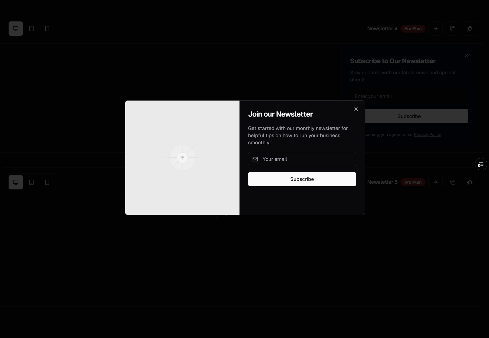
A newsletter landing page has one job: convince a visitor to hand over their email address. That sounds simple, but the page needs to do a surprising amount of work. It needs to communicate the newsletter's value in seconds, overcome the visitor's natural resistance to giving up their inbox, provide social proof that real people read and enjoy it, and make the signup process completely frictionless.
Most newsletter creators throw up a basic form with a headline and call it done. The newsletters that grow fastest invest in dedicated landing pages that treat email capture as a conversion funnel, not an afterthought. With SERP Blocks, you can build a newsletter landing page that rivals the best in the industry using pre-built components designed for exactly this purpose.
Newsletter Landing Page Structure
A high-converting newsletter landing page follows this structure:
Hero — Value proposition and primary email capture
Social proof — Subscriber count, testimonials, notable readers
Content preview — What the reader will actually receive
Lead magnet — Incentive for signing up
More testimonials — Deeper social proof
FAQ — Address objections and concerns
Final CTA — Last chance email capture
Each section maps to a block category in SERP Blocks. Let's build each one.
The Hero: Your First and Best Shot
The hero section is where most signups happen. Visitors who don't convert in the hero rarely convert at all, so this section needs to work hard. Browse the hero collection (81 designs) for a layout that prioritizes the email input.
Headline Strategy
Your hero headline should answer the question: "What will I get and why should I care?" The best newsletter headlines follow one of these patterns:
Outcome-focused: "Get smarter about AI in 5 minutes a day"
Curiosity-driven: "The trends, tools, and tactics 50,000 founders read every Monday"
Identity-based: "The newsletter for developers who ship"
Specificity-first: "3 actionable growth tactics delivered every Tuesday morning"
Avoid generic headlines like "Subscribe to our newsletter" or "Stay updated." These communicate nothing about the value the reader will receive.
Email Capture Form
The hero should include an inline email capture form — not a link to a separate signup page. The fewer clicks between "I'm interested" and "I'm subscribed," the higher your conversion rate. Look for hero designs that include:
Single-field form — Email input and submit button on one line
Minimal friction — No name field, no password, just email
Clear button text — "Subscribe free" or "Get the newsletter" beats "Submit"
Privacy reassurance — A small line like "Free. No spam. Unsubscribe anytime." directly below the form
The newsletter collection (13 designs) provides dedicated email signup components with these patterns built in. Place one inside or directly below the hero for maximum visibility.
Subscriber Count as Social Proof
If you have an impressive subscriber count, put it in the hero. "Join 25,000+ subscribers" immediately signals that other people have made the decision to sign up and found it worthwhile. Even modest numbers work if framed well — "Trusted by 2,000 product managers" is more compelling than a raw number because it identifies the audience.
Social Proof Section
Below the hero, a dedicated social proof section reinforces the signup decision for visitors who didn't convert immediately. Browse the testimonial collection (40 designs) for layouts that work with newsletter-style proof:
Subscriber Testimonials
Collect testimonials from your readers and display them prominently. The best newsletter testimonials:
Name a specific benefit: "I found my last two clients through links shared in this newsletter"
Come from recognizable people: Founders, authors, or industry figures carry more weight
Include real photos: Headshots make testimonials feel authentic
Mention frequency positively: "The only newsletter I open every single time" signals high-quality content
Display 3-6 testimonials in a grid layout or a scrolling carousel. The grid works better for newsletters with strong, concise testimonials. The carousel works better when you have many testimonials and want to show volume.
Logo Cloud for Notable Readers
If your subscribers include people from well-known companies, a logo cloud provides instant credibility. The logos collection (11 designs) offers scrolling marquees, static grids, and grayscale-with-hover effects. A line like "Read by teams at" followed by recognizable company logos does more for trust than paragraphs of copy.
Metrics That Matter
Display concrete numbers that communicate newsletter quality:
Open rate: "55% average open rate" (industry average is around 20%, so anything above 40% is impressive)
Subscriber count: Total subscribers or growth rate
Issues published: "200+ issues and counting" signals consistency
Community size: If you have a Discord, Slack, or community alongside the newsletter
Content Preview Section
Visitors want to know what they're signing up for before they commit. A content preview section shows them exactly what arrives in their inbox.
Sample Issue Display
Show a visual preview of an actual newsletter issue. This could be:
Screenshot of a recent issue displayed in an email client mockup
Excerpted content — A few paragraphs from a recent issue formatted as a card
Table of contents — Section titles from the last 3-4 issues to show topic range
Archive link — A link to browse past issues so visitors can read before subscribing
Use the content collection (13 designs) for layouts that present newsletter content in an attractive, readable format. These blocks work well for displaying excerpted articles, content summaries, and editorial layouts.
What to Expect
A short, bulleted section that sets clear expectations:
Frequency: "Every Tuesday and Friday morning"
Length: "5-minute read"
Content type: "Curated links, original analysis, and one actionable takeaway"
Tone: "No fluff, no filler, no sponsored content"
Setting expectations reduces the perceived risk of subscribing. The visitor knows exactly what they're getting and can evaluate whether it's worth their inbox space.
Lead Magnet Section
A lead magnet — a free resource offered in exchange for an email address — can significantly boost conversion rates. Common newsletter lead magnets include:
PDF guide or ebook related to the newsletter topic
Template or toolkit the reader can use immediately
Exclusive report with original data or research
Email course — A 5 or 7-day drip sequence delivering structured content
Swipe file — A curated collection of examples (headlines, emails, designs, etc.)
Presenting the Lead Magnet
Use a CTA section (32 designs) to present the lead magnet as a compelling offer. The CTA block should include:
Visual preview of the lead magnet (PDF cover, template screenshot)
Clear title describing what the resource is
Bullet points listing what the reader will learn or get
Email capture form — Same single-field signup, but with CTA text like "Get the free guide"
Value framing — "Normally $29, free for subscribers" or "The playbook I used to grow from 0 to 10,000 subscribers"
The lead magnet CTA should feel like a bonus, not the primary reason to subscribe. The newsletter itself is the product; the lead magnet removes the last bit of friction.
Deeper Social Proof
For visitors still scrolling, add a second testimonial section lower on the page. Browse the testimonial collection (40 designs) for a different layout than the one used above — if you used a grid earlier, use a spotlight or carousel here.
This section can include:
Longer testimonials with more detail about specific value received
Before/after stories — "Before subscribing, I spent hours finding good resources. Now they come to me."
Screenshots of reader replies — Authentic email responses from real readers praising the content
Social media mentions — Tweets or LinkedIn posts where people recommend the newsletter
Repetition of social proof throughout the page is intentional. Each testimonial addresses the visitor's uncertainty from a different angle. The first batch says "people like this newsletter." The second batch says "here's the specific impact it has."
FAQ Section
A FAQ section directly addresses the objections that prevent signups. Browse the FAQ collection (21 designs) for accordion, categorized, or inline FAQ layouts.
Common Newsletter FAQ Questions
Cover these objections explicitly:
"How often will you email me?" — State the exact frequency. "Every Tuesday morning at 8am ET."
"Is it really free?" — "Yes. The newsletter is 100% free. We may offer optional premium content in the future, but the core newsletter will always be free."
"Can I unsubscribe?" — "Instantly, with one click. Every email includes an unsubscribe link."
"Will you sell my email?" — "Never. Your email is used only to send you the newsletter."
"What makes this different from other newsletters on [topic]?" — This is your chance to differentiate with a specific, honest answer.
"Who writes this?" — Brief author bio with credentials. People subscribe to people, not brands.
Each of these questions represents a real objection sitting in the visitor's mind. Answering them proactively removes barriers to signup.
Final CTA Section
For visitors who scrolled through the entire page, a final email capture section closes the loop. Browse the CTA collection (32 designs) and the newsletter collection (13 designs) for a bold, visually distinct final signup block.
This final CTA should:
Repeat the core value proposition in a fresh way
Include the email form again — don't make them scroll back up
Add urgency or scarcity if genuine — "Join before Friday to get this week's issue" or "Next issue drops tomorrow"
Use a contrasting background — A dark section or accent color that visually separates it from the rest of the page
The final CTA catches the visitors who needed the full page of content, proof, and answers before feeling ready to subscribe.
Email Platform Integration
Once the UI is built, you need to connect the signup forms to an email platform. Here's how to integrate with the most popular options.
ConvertKit Integration
ConvertKit provides a straightforward API for adding subscribers:
async function subscribe(email: string) {
  const response = await fetch(
    `https://api.convertkit.com/v3/forms/${FORM_ID}/subscribe`,
    {
      method: "POST",
      headers: { "Content-Type": "application/json" },
      body: JSON.stringify({
        api_key: process.env.CONVERTKIT_API_KEY,
        email: email,
      }),
    }
  );
  return response.json();
}
Create a Next.js API route or Server Action that calls this function. Your form component submits to this endpoint, and the subscriber is added to your ConvertKit form with any tags you specify.
Mailchimp Integration
Mailchimp uses a similar pattern with their Marketing API:
async function subscribe(email: string) {
  const response = await fetch(
    `https://${DC}.api.mailchimp.com/3.0/lists/${LIST_ID}/members`,
    {
      method: "POST",
      headers: {
        Authorization: `Bearer ${process.env.MAILCHIMP_API_KEY}`,
        "Content-Type": "application/json",
      },
      body: JSON.stringify({
        email_address: email,
        status: "pending", // Double opt-in
      }),
    }
  );
  return response.json();
}
Replace ${DC} with your Mailchimp data center (found in your API key, e.g., us21). The "pending" status triggers double opt-in, which is recommended for GDPR compliance and list quality.
Form UX Best Practices
Regardless of which email platform you use, follow these form patterns:
Inline validation — Show errors immediately if the email format is invalid
Loading state — Disable the button and show a spinner during submission
Success state — Replace the form with a confirmation message ("Check your inbox to confirm")
Error handling — Display a clear message if the API call fails, with a retry option
Duplicate handling — If the email is already subscribed, show a friendly message instead of an error
Optimization Tips
Above the Fold
The email capture form must be visible without scrolling on both desktop and mobile. This is non-negotiable. If visitors have to scroll to find the signup form, you lose a significant percentage of potential subscribers.
Page Speed
Newsletter landing pages should load in under 2 seconds. Every second of delay reduces conversions. Optimize by:
Using Next.js static generation — the page content doesn't change often
Compressing testimonial photos with the Next.js
<Image>componentMinimizing JavaScript — most of the page is static content
Lazy loading below-the-fold sections
Mobile Optimization
Over half of newsletter signups happen on mobile devices. Ensure:
The email input is large enough to tap easily (minimum 44px height)
The submit button is full-width on mobile
Testimonial grids collapse to a single column
The FAQ accordion works with touch interaction
A/B Testing
Once the page is live, test these elements:
Headline variations — Test different value propositions
CTA button text — "Subscribe free" vs. "Get the newsletter" vs. "Join 25,000 readers"
Social proof placement — Subscriber count in hero vs. below hero
Lead magnet presence — Test with and without to see if it moves the needle
Form fields — Email only vs. email + first name (fewer fields almost always wins)
Complete Newsletter Landing Page Block Summary
| Section | Category | Blocks Available |
| Hero | Hero | 81 |
| Email Capture | Newsletter | 13 |
| Testimonials | Testimonial | 40 |
| Lead Magnet CTA | CTA | 32 |
| Content Preview | Content | 13 |
| FAQ | FAQ | 21 |
| Logo Cloud | Logos | 11 |
| Footer | Footer | 21 |
That's 232 block options across 8 categories — everything you need to build a newsletter landing page that converts. All available at SERP Blocks with 60 free blocks and the full 1200+ block library through a one-time Pro purchase.