React Testimonial Components: 40+ Beautiful Examples
Explore 40+ React testimonial components — carousels, grids, star ratings, video testimonials, and more. Built with Tailwind CSS and ready to drop into any React or Next.js project.
SERP Blocks Team
Product
Social proof is not a nice-to-have. It is the single most effective element you can add to a landing page to increase conversion rates. When a visitor reads a genuine testimonial from someone like them — someone who faced the same problem, tried the same alternatives, and chose your product — the perceived risk of purchasing drops dramatically.
But building a testimonial section in React that actually looks good takes more time than most developers expect. Layout decisions, responsive behavior, image handling, animation, and accessibility all add up. That's why we built 40 complete testimonial section designs in the SERP Blocks testimonial collection — each one a full-width, production-ready React component you can copy into your project and populate with your own content.
This guide covers the major approaches to testimonial components in React, the psychology behind effective social proof, and practical advice for collecting and displaying testimonials that convert.
Approaches to Testimonial Components in React
Static Grid Components
The simplest and most common approach: a grid of testimonial cards rendered from an array of data. Each card contains a quote, author name, role, company, and optionally a photo or star rating. The grid uses CSS Grid or Flexbox for layout and stacks responsively on smaller screens.
A basic React testimonial grid component looks like this in structure: a TestimonialSection wrapper that maps over a testimonials array and renders a TestimonialCard for each item. The grid container uses Tailwind's grid grid-cols-1 md:grid-cols-2 lg:grid-cols-3 gap-6 for responsive columns.
This approach is fast to implement, SEO-friendly (all content is in the DOM on load), and easy to maintain. It works best when you have 3 to 9 strong testimonials.
The 40 testimonial blocks in the SERP Blocks library include multiple grid variants — 2-column, 3-column, masonry-style, and asymmetric layouts — so you can match the grid density to the amount of social proof you have available.
Carousel Components
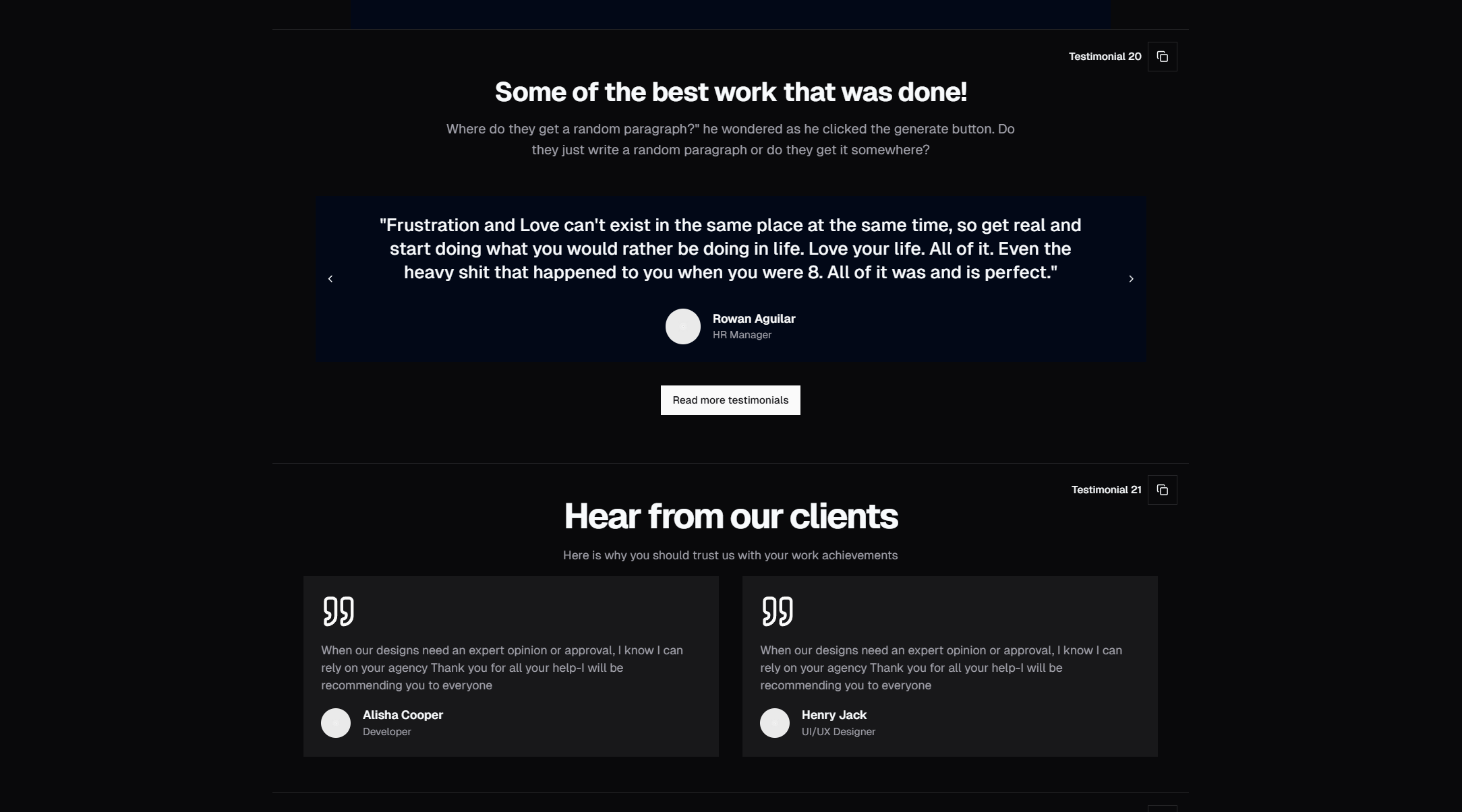
When you have more testimonials than comfortably fit in a grid, a carousel lets visitors browse through them one or a few at a time. Carousels add visual interest through motion and let you showcase 10, 20, or even 50 testimonials without overwhelming the page.
In React, testimonial carousels are typically built with a library like Embla Carousel or Swiper, or with custom scroll-snap CSS. The component manages active slide state, renders navigation arrows or dot indicators, and handles touch gestures for mobile.
Key considerations for React testimonial carousels:
Auto-play with pause: Auto-advancing slides keep the section dynamic, but should pause on hover or focus so visitors can read at their own pace.
Keyboard navigation: Arrow keys should move between slides for accessibility.
Lazy loading images: If each slide includes an author photo, lazy-load offscreen images to avoid blocking page render.
Reduced motion: Respect
prefers-reduced-motionby disabling animations for visitors who have that setting enabled.
The SERP Blocks collection includes carousel variants with single-slide, multi-slide, and fade-transition behaviors, all with touch support and accessibility handled.
Masonry Layout Components
Masonry layouts — where cards have variable heights based on content length — create an organic, Pinterest-style appearance. This works well for testimonials because real quotes naturally vary in length. Rather than truncating long quotes or padding short ones, a masonry layout lets each testimonial take exactly the space it needs.
In React, masonry layouts can be implemented with CSS columns (columns-1 md:columns-2 lg:columns-3 in Tailwind), CSS Grid with grid-auto-rows: min-content, or JavaScript-based masonry libraries. The CSS columns approach is the simplest and works well for testimonial cards.
Masonry layouts are visually engaging but require careful responsive design. On mobile, a single-column masonry layout is just a stack — the masonry effect only becomes visible at tablet widths and above.
Marquee/Scrolling Ticker Components
An infinite horizontal scroll of testimonial cards that moves automatically. This pattern — sometimes called a "testimonial ticker" or "marquee" — creates a sense of abundance and momentum. The continuous stream of quotes implies that there are too many satisfied customers to display statically.
In React, this is built with CSS animation (@keyframes marquee with translateX) on a container that holds two copies of the testimonial list, creating the seamless infinite loop. The animation pauses on hover so visitors can read individual quotes.
This pattern works especially well in the "logos + testimonials" combo: a row of client logos scrolls above or below a row of scrolling testimonial cards, reinforcing breadth of adoption.
Single Quote Spotlight Components
Sometimes one testimonial is worth more than a dozen. A single-quote spotlight fills an entire section with one powerful endorsement — large typography, prominent author photo, and plenty of whitespace. This is the testimonial equivalent of a pull quote in editorial design.
Use a spotlight component for your most impressive testimonial — ideally from a recognizable person or company. Place it immediately after your hero section or feature section for maximum visibility.
In terms of React structure, this is the simplest component: no mapping, no carousel logic, just a single testimonial object rendered in a centered layout with large text. But the design choices matter enormously — font size, line height, letter spacing, and photo sizing all need to be calibrated for impact.
Social Proof Psychology
Understanding why testimonials work helps you choose the right component and write better testimonial content.
The Bandwagon Effect
People are more likely to take an action when they see others taking that same action. Aggregate numbers ("Trusted by 10,000+ teams") and dense testimonial grids trigger this effect. The more testimonials visible at once, the stronger the bandwagon signal.
This is why grid layouts with 6 or 9 visible testimonials outperform single-quote layouts for triggering the bandwagon effect. Visitors don't need to read every quote — the visual density communicates volume.
Authority Bias
A testimonial from a VP at a Fortune 500 company carries more weight than an anonymous "Verified Buyer." People defer to authority, and in business contexts, authority comes from title, company, and recognizable brands.
Design your testimonial cards to prominently feature the author's title and company. If the company has a recognizable logo, include it. The logo does work that text alone cannot — it provides instant visual recognition.
SERP Blocks testimonial designs include variants with company logos, role badges, and company size indicators, all designed to maximize perceived authority.
Similarity Bias
People are most influenced by testimonials from people who are similar to them. A startup founder is more persuaded by another startup founder's experience than by an enterprise CTO's endorsement.
This has design implications: if you serve multiple audience segments, use a testimonial section that lets you show different testimonials to different segments. At minimum, choose testimonials that represent your primary audience and place them prominently.
Specificity Equals Credibility
Vague praise ("Great product!") is ignored. Specific outcomes ("We reduced onboarding time from 3 weeks to 2 days") are believed. The more specific a testimonial is — concrete numbers, named tools replaced, measurable outcomes — the more credible it feels.
Design your testimonial cards to give specific numbers visual prominence. Some SERP Blocks variants lead with a highlighted metric ("47% increase in conversions") above the testimonial text, immediately communicating a concrete result before the visitor reads the full quote.
Collecting Testimonials That Convert
The best testimonial component in the world can't compensate for weak testimonials. Here's how to collect quotes that actually drive conversions.
Ask Specific Questions
Don't ask "Can you write us a testimonial?" Instead, ask targeted questions:
"What was your biggest hesitation before purchasing?"
"What specific result have you seen since using our product?"
"What would you tell someone who is on the fence about signing up?"
"What did you use before, and how does this compare?"
These questions produce testimonials with narrative structure and specific details — exactly what makes social proof persuasive.
Time Your Requests
Ask for testimonials at moments of success. After a user completes onboarding, hits a milestone, or has a positive support interaction — these are the moments when enthusiasm is highest and the experience is fresh.
Automated email sequences triggered by product milestones consistently outperform batch "please review us" emails.
Capture Video When Possible
Video testimonials are significantly more persuasive than text. Viewers can read body language, hear vocal tone, and judge sincerity in ways that text doesn't allow. Even a 30-second phone-recorded clip from a genuine customer outperforms a polished paragraph.
The SERP Blocks collection includes testimonial sections designed for video — embedded players with fallback quote text, thumbnail overlays with play buttons, and responsive video containers.
Get Permission for Details
The more context you can include (full name, title, company name, headshot, company logo), the more credible the testimonial. Always get explicit permission to use these details. Many companies have brand guidelines that restrict logo usage, so ask early.
Design Best Practices for React Testimonial Components
Typography
Testimonial text should be larger than body copy. These are the most important words on your page — don't render them in 14px. Use text-lg or text-xl in Tailwind for the quote text, with text-sm or text-base for the author attribution.
Large quote marks (either as oversized typography or as a subtle background element) are a visual convention that immediately signals "this is a testimonial" without requiring a label.
Photos and Avatars
Real photos dramatically outperform placeholder avatars or initials. If you have real headshots, use them at a visible size — w-12 h-12 minimum for grid cards, w-16 h-16 or larger for spotlight layouts. Round avatars (rounded-full) are the convention.
In React, use the next/image component (for Next.js) or standard img tags with width/height attributes to prevent layout shift during image loading. The Shadcn Avatar component handles fallback states elegantly — showing initials when an image fails to load.
Whitespace
Testimonial sections need generous padding. The quotes should breathe. Cramped testimonials feel like fine print, which is the opposite of the trust signal you're trying to create. Use py-16 md:py-24 on the section container and p-6 md:p-8 on individual cards.
Color and Contrast
Testimonial sections often use a contrasting background color to visually separate them from surrounding content. A bg-muted or bg-primary/5 background makes the section feel distinct and draws the eye. In dark mode, a slightly lighter surface color (bg-card or bg-muted) achieves the same separation.
Accessibility
Every testimonial component should include:
Proper heading hierarchy (an h2 for the section title)
Alt text on author photos
Sufficient color contrast for quote text and author names
aria-labelon carousel navigation controlsrole="region"witharia-label="Customer testimonials"on the section container
Where to Place Testimonials on Your Page
Testimonial placement is as important as testimonial design. The most effective positions:
After the hero section — Immediately validate the headline claim with social proof. Pair with hero sections (81 blocks available) for a strong opening.
After the feature section — Once you've explained what the product does, let customers confirm it. Feature sections (132 blocks) pair naturally with testimonials.
Before pricing — Trust reduces price sensitivity. Place your strongest testimonials directly above the pricing section (21 blocks).
Near the final CTA — One last trust signal before the visitor commits. Combine with CTA sections (32 blocks) for the closing push.
On dedicated case study pages — Detailed testimonials with full context work as standalone content that attracts organic search traffic.
Combining Testimonials with Other Blocks
A complete landing page is built from complementary sections. With SERP Blocks, you can assemble full pages by combining testimonial blocks with:
Contact forms (33 blocks) — Let convinced visitors reach out immediately
FAQ sections (21 blocks) — Answer remaining objections after social proof
About sections (32 blocks) — Build brand credibility alongside customer credibility
Newsletter sections (13 blocks) — Capture leads who aren't ready to purchase yet
The full SERP Blocks library includes 1200+ blocks across 50+ categories. 60 blocks are free, with the complete collection available through a one-time Pro purchase — no subscriptions, no recurring charges.
Technical Considerations
Performance
Testimonial sections with images can impact page performance if not optimized. Lazy-load author photos that are below the fold. Use modern image formats (WebP or AVIF) and appropriate sizes — a 48x48 avatar doesn't need a 400x400 source image.
For carousel components, render only the visible slides plus one buffer slide on each side. Don't render all 20 slides in the DOM if only 3 are visible.
SEO
Testimonial content contributes to page relevance signals. Render testimonials server-side (or use static generation) rather than client-side-only rendering. This ensures search engines see the testimonial text during crawling.
Consider adding structured data (Review or AggregateRating schema) to your testimonial section. This can result in rich snippets in search results — star ratings appearing below your page listing.
State Management
For interactive testimonial components (carousels, filtered views, expandable quotes), keep state local to the component. Testimonial sections are self-contained — they don't need global state management. A simple useState for the active slide index or expanded quote ID is sufficient.
All 40 testimonial blocks in the SERP Blocks library are built as self-contained React components with no external state dependencies, making them easy to drop into any React or Next.js project.