20 Banner & Announcement Bar Components for Next.js
Browse 20 banner and announcement bar designs for React and Next.js — top-of-page alerts, promo banners, cookie consent bars, dismissible notifications, and sticky headers. Built with Shadcn UI and Tailwind CSS.
SERP Blocks Team
Product
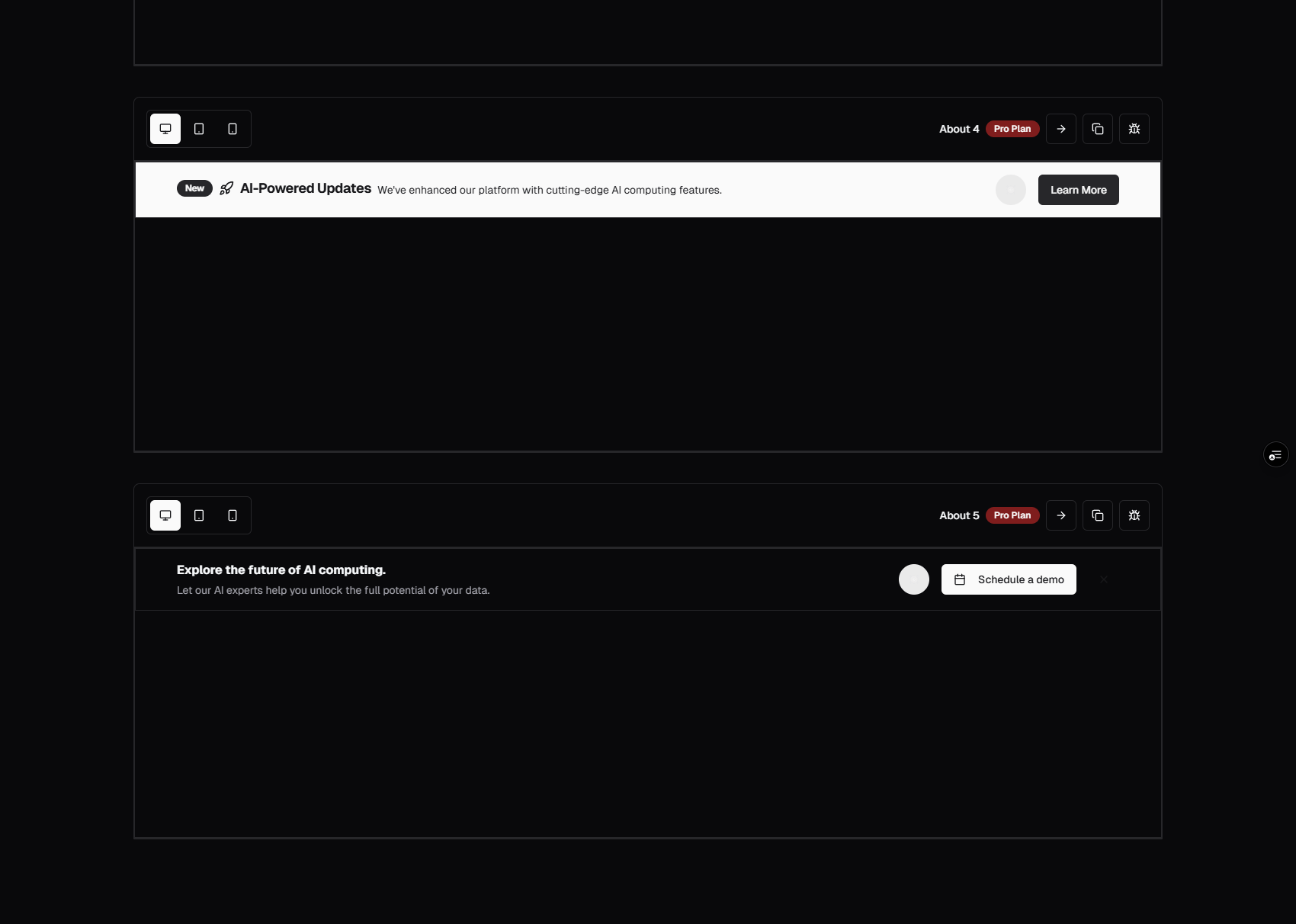
Banners and announcement bars sit at the very top of the page — the first element a visitor sees. They carry urgent messages, time-sensitive offers, product updates, and legal notices. Despite being one of the simplest UI elements (a strip of color with a line of text), banners have an outsized impact on conversion rates. A well-timed promotional banner can drive thousands of clicks. A poorly implemented cookie consent bar can tank your bounce rate.
The SERP Blocks banner collection includes 20 banner and announcement bar designs — from minimal text strips to rich, multi-element promotional bars with countdowns, CTAs, and dismiss functionality.
Why Banners Deserve More Attention
Most developers treat banners as disposable elements — a quick div with some inline styles slapped above the header. But banners occupy the most valuable screen real estate on your site. They load first, appear above the fold on every device, and are the first element to establish visual tone.
Consider the use cases:
Product launches — Announce a new feature or version to every visitor
Promotional offers — Flash sales, discount codes, limited-time deals
System status — Maintenance windows, outage notices, degraded performance alerts
Legal compliance — GDPR cookie consent, terms of service updates
Event promotion — Webinars, conferences, product demos
Content marketing — New blog post, case study, or report announcement
Each of these requires a different visual treatment, interaction pattern, and persistence behavior. A cookie consent banner must remain visible until the user acts. A promotional banner should be dismissible. A system status alert should be prominent and non-dismissible during an active incident.
Banner Layout Patterns
Simple Text Banners
A single line of text centered in a colored strip. No buttons, no icons — just the message. This is the most lightweight pattern and works for announcements that don't require user action: "We've raised our Series B" or "Version 3.0 is live."
Simple text banners are effective because they're unobtrusive. They add context without demanding attention. Use them for informational messages where the goal is awareness, not clicks.
Variants include:
Solid background — Bold color that contrasts with the page header
Gradient background — Subtle gradient for visual interest without overwhelming
With link — The entire banner text is a link, or a "Learn more" link follows the text
Minimal border — White or light background with a bottom border to separate from the header
Banners with CTA Buttons
A text message paired with one or two action buttons — "Get 20% off" with a "Shop Now" button, or "Try our new feature" with "Learn More" and "Dismiss." This is the standard pattern for promotional and engagement banners.
CTA banners balance information with action. The text explains the offer or announcement, and the button provides a clear next step. Two-button variants add a secondary action (usually dismiss or "remind me later") so visitors who aren't interested can clear the banner.
Design considerations:
Button color should contrast with the banner background
Keep button text short — 2-3 words maximum
If using two buttons, make the primary action visually dominant
On mobile, stack buttons vertically or use a single button to save horizontal space
Dismissible Banners
Banners with a close button (typically an X icon) that allows visitors to hide the banner. Dismissal state can be stored in local storage, a cookie, or session storage so the banner doesn't reappear on subsequent page loads.
Persistence strategy matters:
Session storage — Banner reappears on the next visit (good for recurring promotions)
Local storage — Banner stays hidden until you change the banner content or clear the key
Cookie with expiry — Banner reappears after a set number of days (good for time-based campaigns)
Most of the 20 SERP Blocks banner designs include dismiss functionality with configurable persistence.
Sticky Banners
Banners that remain fixed to the top or bottom of the viewport as the user scrolls. Sticky banners ensure the message stays visible regardless of scroll position — useful for critical notices, active promotions, or system alerts.
Sticky banners require careful implementation:
They must not overlap other fixed elements (navbars, floating action buttons)
They should account for
scroll-padding-topso anchor links don't get hidden behind the bannerOn mobile, sticky banners consume significant vertical space — consider auto-dismissing after a set time or making them collapsible
Countdown Banners
Promotional banners with a live countdown timer — "Sale ends in 2h 14m 30s." Countdown banners create urgency and are one of the highest-converting banner patterns for e-commerce and SaaS.
Countdown implementation should:
Use a real deadline (not a fake countdown that resets on page load)
Show days, hours, minutes, and seconds
Handle timezone differences correctly
Display a fallback message when the countdown expires ("Sale has ended")
Use
requestAnimationFrameorsetIntervalwith proper cleanup to avoid memory leaks
Multi-Line Banners
Banners with a headline, description, and optional action buttons — essentially a compact marketing block. Multi-line banners are more attention-grabbing than single-line variants and work for major announcements that need supporting context.
These banners walk the line between a banner and a hero section. They're appropriate for product launches, major company announcements, or high-value promotions where you want to say more than a single sentence.
Cookie Consent Banners
Banners specifically designed for GDPR, CCPA, and other privacy regulation compliance. These appear at the bottom or top of the page and require explicit user action — "Accept All," "Reject All," or "Manage Preferences."
Cookie consent banners have specific requirements:
They must be visible and accessible
They must not be pre-checked (consent must be affirmative)
They must allow granular control (analytics vs. marketing vs. necessary cookies)
They must store the consent decision and not show again until consent expires
For dedicated cookie consent components with preference management modals, see the SERP Blocks cookie collection — 10 designs covering consent bars, preference panels, and compliance-focused implementations.
Conversion Optimization for Banners
A/B Testing Banner Copy
Banners are one of the easiest elements to A/B test because they're isolated, high-visibility, and have clear success metrics (click-through rate, dismiss rate, conversion rate).
What to test:
Headline copy — "20% Off Everything" vs. "Save Up to 20% Today" vs. "Flash Sale: 20% Off"
CTA text — "Shop Now" vs. "Get the Deal" vs. "Claim Your Discount"
Urgency language — "Limited time" vs. "Ends tonight" vs. a countdown timer
Color treatment — Brand color vs. contrasting color vs. gradient
Position — Top of page vs. bottom of page vs. inline after the hero
Run tests for at least one full week to account for day-of-week variation. Aim for statistical significance before drawing conclusions — most banner A/B tests need at least 1,000 visitors per variant.
Banner Fatigue and Frequency
Visitors develop banner blindness when the same message appears repeatedly. Rotate banner content on a schedule — weekly for promotions, immediately after major announcements. Use targeting rules to show different banners to different segments:
New visitors — Welcome message, introductory offer
Returning visitors — Product updates, new content
Cart abandoners — Discount code, free shipping reminder
Logged-in users — Feature announcements, account-specific notices
Measuring Banner Performance
Track these metrics for every banner:
Impression rate — How many visitors see the banner (some may have ad blockers or arrive via deep links)
Click-through rate (CTR) — Clicks on the CTA divided by impressions
Dismiss rate — How quickly visitors close the banner
Time to dismiss — How long the banner stays visible before being closed (indicates whether visitors read it)
Conversion rate — Downstream conversions attributed to the banner click
A healthy promotional banner has a 2-5% CTR. Anything above 5% is exceptional. If your dismiss rate exceeds 80% within the first 3 seconds, the banner is likely annoying rather than engaging.
GDPR Cookie Consent Best Practices
Cookie consent is not optional in the EU, UK, Brazil, and an increasing number of jurisdictions. Getting it wrong carries real fines — GDPR penalties can reach 4% of global revenue.
Requirements for Compliance
No pre-selected checkboxes — All non-essential cookie categories must be opt-in
Granular control — Visitors must be able to accept or reject individual cookie categories
Equal prominence — The "Reject" button must be as easy to find as "Accept"
No cookie walls — You cannot block access to content until the visitor accepts cookies (in most EU jurisdictions)
Consent records — Store a log of when and what the visitor consented to
Easy withdrawal — Visitors must be able to change their preferences at any time
Cookie Categories
Standard cookie consent implementations group cookies into:
Necessary — Session management, security, accessibility preferences (no consent required)
Analytics — Google Analytics, Mixpanel, Hotjar (consent required)
Marketing — Ad pixels, retargeting, cross-site tracking (consent required)
Functional — Language preferences, saved settings, personalization (consent recommended)
The SERP Blocks cookie collection includes 10 designs with built-in category management, preference modals, and consent storage patterns.
Technical Implementation Notes
Layout Shift Prevention
Banners that appear after page load cause layout shift — the entire page content jumps down when the banner renders. This hurts Core Web Vitals (specifically CLS) and creates a jarring user experience.
Prevent layout shift by:
Reserving space — Render the banner container on the server with a fixed height, then populate content client-side
Using CSS containment —
contain: layouton the banner containerRendering server-side — If the banner is the same for all visitors, render it in the initial HTML
Animating from off-screen — Slide the banner in from the top instead of inserting it into the document flow
Z-Index Management
Banners sit above the page content but below modal overlays and dropdowns. Establish a z-index scale:
Banner:
z-50Navigation:
z-40Dropdown menus:
z-50orz-60Modal overlays:
z-[100]
Tailwind CSS makes z-index management straightforward with utility classes. All 20 SERP Blocks banner designs use consistent z-index values that work with standard Shadcn UI component layering.
Accessibility
Banners must be accessible:
Use
role="banner"orrole="alert"depending on the banner type (informational vs. urgent)Dismiss buttons need
aria-label="Dismiss banner"or equivalentCookie consent banners should trap focus until the user makes a selection
Color contrast ratios must meet WCAG AA standards (4.5:1 for normal text, 3:1 for large text)
Countdown timers should include
aria-live="polite"so screen readers announce updates without interrupting
Mobile Considerations
On mobile viewports (< 640px):
Banner text should truncate or wrap gracefully
CTA buttons may need to stack vertically
Dismiss buttons need adequate touch targets (minimum 44x44px)
Sticky banners should not consume more than 10-15% of viewport height
Consider showing a condensed version of the banner on mobile
Banners in the Context of a Full Page
Banners work alongside other page-level elements. The typical stack from top to bottom:
Banner/announcement bar — The persistent message
Navigation header — Logo, menu, auth buttons
Hero section — Primary page content
This layering means banners need to coordinate visually with your navigation. If your navbar is dark, a dark banner creates visual merging. Use contrasting colors or a subtle separator.
For navigation components that pair well with banners, browse the SERP Blocks navbar collection — 17 designs covering sticky headers, mega menus, and mobile drawers.
Related Block Categories
Banner components often combine with:
| Section | Category | Count |
| Cookie Consent | Cookie | 10 |
| Navigation | Navbar | 17 |
| Call to Action | CTA | 32 |
| Newsletter | Newsletter | 13 |
| Hero Sections | Hero | 81 |
SERP Blocks includes 1200+ total blocks across 50+ categories. 60 are free, with the full library available through a one-time Pro purchase.