27 Blog List Layouts for Next.js with Shadcn UI
Browse 27 blog list layouts for React and Next.js — grid, masonry, featured post, minimal, and magazine-style designs. Built with Shadcn UI and Tailwind CSS for content-driven websites.
SERP Blocks Team
Product
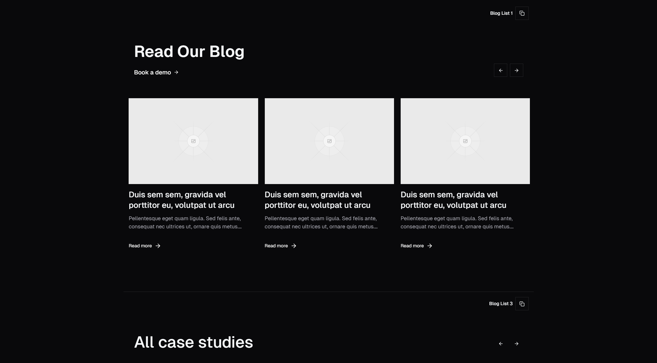
A blog is one of the highest-leverage pages on any website. It drives organic traffic, builds authority, and gives visitors a reason to come back. But the blog list page — the index where readers browse and choose what to read — is often treated as a throwaway layout. A plain vertical stack of titles with dates. No visual hierarchy, no engagement hooks, no reason to scroll.
The SERP Blocks blog list collection includes 27 blog list layouts that go far beyond the default. Grid layouts, masonry designs, featured post highlights, minimal text-forward styles, and magazine-inspired formats — each one built with Shadcn UI and Tailwind CSS for React and Next.js projects.
Why Blog List Design Matters
Your blog list page is a conversion point. Visitors land here from search results, social links, or internal navigation, and they make a split-second decision: is there something worth reading? The layout directly influences that decision.
A well-designed blog list page does three things:
Surfaces the best content first — Featured post sections and editorial hierarchies put your strongest articles in front of readers immediately.
Encourages browsing — Attractive card layouts with thumbnail images, excerpt previews, and category tags invite readers to explore beyond the first article.
Supports scanning — Clean typography, consistent spacing, and clear visual grouping let visitors scan 10-20 posts in seconds and find what's relevant.
Poor blog list design, on the other hand, buries good content. When every post looks identical and there's no visual distinction between a pillar article and a minor update, readers have no signal about what's worth their time.
Blog List Layout Patterns
Grid Layouts
The most versatile pattern: blog post cards arranged in a responsive grid. Each card typically includes a thumbnail image, title, excerpt, author, date, and category tag. Grid layouts scale naturally — 6 posts fill two rows, 12 fill four, and pagination handles the rest.
Grid variants include:
3-column grid — The standard for most blogs. Cards are large enough for readable excerpts while fitting multiple posts per row on desktop.
4-column grid — More compact cards with shorter excerpts. Works well for blogs with frequent publishing schedules where you want to show more posts above the fold.
2-column grid — Larger cards with longer excerpts and bigger thumbnails. Effective for longform content blogs where each post deserves more visual real estate.
Mixed-width grid — Some cards span two columns while others take one. Creates visual variety without requiring manual curation.
Grid layouts collapse to single-column on mobile, with each card stacking vertically. All 27 SERP Blocks blog list designs handle this responsive behavior automatically.
Featured Post Layouts
A hero-sized card for the latest or most important post, followed by a grid of remaining posts below. This pattern creates an immediate focal point and tells readers "start here." Featured post layouts are common on media sites, startup blogs, and any publication that wants editorial control over what readers see first.
Variants include:
Full-width featured hero — The featured post spans the entire width with a large image, title, and excerpt. Remaining posts appear in a 3-column grid below.
Side-by-side featured — The featured post takes two-thirds of the width, with 2-3 smaller post cards stacked in the remaining third.
Featured with category tabs — The featured post changes based on which category tab is selected, giving each content area its own highlight.
Featured layouts work especially well when your blog covers multiple topics. You can feature the best post from each category rather than defaulting to the most recent.
Masonry Layouts
Cards with varying heights arranged in a masonry (Pinterest-style) grid. The height differences come from varying excerpt lengths, image aspect ratios, or content types. Masonry layouts feel organic and dynamic — they break the rigidity of uniform grids and create visual interest through asymmetry.
Masonry is particularly effective for:
Blogs with mixed content types (long articles, short updates, image posts)
Publications that want a magazine-style editorial feel
Portfolios disguised as blogs where visual variety is a feature
The implementation uses CSS columns or a JavaScript masonry library. CSS-only approaches are simpler but don't guarantee optimal card distribution. JavaScript solutions (like the masonry layout algorithm) produce better visual results at the cost of a small runtime dependency.
Minimal / Text-Forward Layouts
No thumbnail images. Just titles, dates, excerpts, and tags in a clean vertical list. This pattern works for developer blogs, documentation journals, and any context where the content speaks for itself and images would be filler.
Minimal layout variants include:
Simple list — Title and date on a single line, stacked vertically
List with excerpts — Title, date, and a one-line excerpt
List with tags — Title, date, and category/tag pills
Bordered list — Each post separated by a horizontal rule for clear visual boundaries
Minimal layouts load faster (no images to fetch), are easier to scan, and put zero friction between the reader and the content. They're the right choice when your audience visits specifically to read, not to browse.
Magazine / Editorial Layouts
Multi-section layouts that combine different card sizes and arrangements into a newspaper or magazine-style page. A large featured article at the top, a row of medium cards below it, a sidebar with recent posts, and a grid of older content at the bottom.
Magazine layouts require more posts to fill effectively — plan for at least 8-10 posts visible on the page. They work best for content-heavy sites with daily or weekly publishing schedules.
Card Variants
Across all layout patterns, individual post cards come in several styles:
Image-top cards — Thumbnail above, text below. The most common blog card pattern.
Image-left cards — Horizontal card with thumbnail on the left and text on the right. Compact and scannable.
Overlay cards — Text overlaid on a darkened background image. High visual impact but requires careful contrast handling.
Borderless cards — No card borders or backgrounds. The content floats directly on the page background for a clean, modern look.
Cards with author info — Avatar, author name, and read time included alongside the date.
Pairing Blog Lists with Single Post Layouts
A blog list page is only half the equation. When a reader clicks through, they need a single post layout that delivers on the promise the list page made. The SERP Blocks blog single collection includes 12 single blog post layouts designed to pair with the list layouts.
Consistency between list and single layouts matters:
Typography — If your list cards use a serif font for titles, your single post should use the same serif for the article headline.
Author treatment — If the list shows author avatars, the single post should include a full author bio section.
Category/tag display — Tags visible on list cards should be present and clickable on the single post page.
Navigation — "Previous / Next" post navigation on single pages should use the same visual style as list cards.
Together, the 27 blog list layouts and 12 single post layouts give you 39 blog-related blocks to build a complete content experience.
Blog UX Best Practices
Pagination vs. Infinite Scroll
Two approaches to loading more posts:
Pagination (numbered pages or "Load More" button) gives readers a sense of position and progress. They know how much content exists and where they are in the list. Pagination also preserves URL state — page 3 has a distinct URL that's shareable and bookmarkable.
Infinite scroll loads more posts as the reader scrolls down. It reduces friction (no click required) but can feel disorienting. Readers lose their position, and there's no way to reach your footer. Infinite scroll works for casual browsing but frustrates readers who are trying to find a specific post.
For most blogs, pagination with 9-12 posts per page strikes the right balance. Show enough content to fill the viewport, then let readers choose to see more.
Category and Tag Filtering
For blogs with diverse content, filtering by category or tag lets readers narrow to their interests. Filtering can be implemented as:
Tabs at the top of the blog list (All, Engineering, Product, Design)
Sidebar filters with checkboxes for multiple tags
URL-based categories (/blog/engineering, /blog/product) for SEO benefits
Search with autocomplete for finding specific topics
URL-based categories have the strongest SEO value because each category page can be indexed separately and rank for category-specific keywords.
Excerpt Length and Truncation
How much of each post to show in the list view:
No excerpt — Title and metadata only. Cleanest but gives readers nothing to evaluate.
1-line excerpt — 15-20 words. Enough to hint at the topic without spoiling the content.
2-3 line excerpt — 40-60 words. The sweet spot for most blogs. Readers can evaluate relevance without scrolling past.
Full first paragraph — 80-120 words. Appropriate for text-forward layouts with fewer posts per page.
Truncate excerpts at word boundaries, not character counts. Nobody wants to read "In this article we'll explore the best practic..." — cut at a natural stopping point.
Image Optimization
Blog list pages can load dozens of images simultaneously. Without optimization, this kills performance:
Lazy loading — Use
loading="lazy"on thumbnail images so off-screen images don't load until the reader scrolls to them.Responsive images — Serve different image sizes based on viewport width. A 400px card doesn't need a 1200px image.
Aspect ratio containers — Reserve space for images before they load to prevent layout shift (CLS). Use Tailwind's
aspect-ratioutility or explicit width/height attributes.Placeholder blur — Show a blurred low-resolution preview while the full image loads. Next.js Image component supports this natively with the
placeholder="blur"prop.
Reading Time Estimates
Displaying estimated reading time (e.g., "5 min read") on blog list cards helps readers decide what to read based on their available time. Calculate reading time at build time using word count divided by average reading speed (200-250 words per minute).
Reading time is particularly useful for blogs with varied content lengths — it sets expectations so readers don't click a post expecting a quick read and find a 4,000-word deep dive.
Content Architecture for Blog Pages
URL Structure
Choose a URL structure early and stick with it:
/blog/post-slug— Simple and flat. Works for most blogs./blog/category/post-slug— Adds category context. Better for SEO if categories are meaningful./blog/2026/03/post-slug— Date-based. Common for news sites, but dates make content look stale.
For Next.js, the file-based routing in the App Router makes implementing these patterns straightforward. Dynamic routes with [slug] segments handle both list and single post pages.
Metadata and SEO
Each blog list page should include:
Unique title and meta description — "Blog | Your Site" is the minimum. Category pages should use "Engineering Blog | Your Site."
Canonical URL — Paginated pages should point to page 1 as the canonical, or use
rel="next"/rel="prev"for paginated series.Open Graph tags — So blog list pages look good when shared on social platforms.
JSON-LD structured data — Blog posting schema for individual posts, item list schema for the list page.
RSS Feeds
If your blog exists, it should have an RSS feed. Many developers and technical readers still use RSS readers. Generating an RSS feed from your blog post data takes minimal effort in Next.js — render XML at build time from the same content source that powers your blog pages.
Related Block Categories
Blog pages combine with several other block types to create a complete content experience:
| Section | Category | Count |
| Blog List | Blog List | 27 |
| Blog Single | Blog Single | 12 |
| Newsletter Signup | Newsletter | 13 |
| Navigation | Navbar | 17 |
| Footer | Footer | 21 |
| Content Sections | Content | 13 |
SERP Blocks includes 1200+ total blocks across 50+ categories. 60 are free, with the full library available through a one-time Pro purchase.