20 Careers Page Components for Job Listings and Applications
Browse 20 careers page components for React and Next.js — job cards, department filters, application forms, benefits sections, and culture showcases. Built with Shadcn UI and Tailwind CSS.
SERP Blocks Team
Product
Your careers page is your most important recruiting tool. Every candidate who applies through a job board, clicks a link from LinkedIn, or hears about your company from a friend will eventually land on your careers page. What they find there determines whether they apply or move on.
Most careers pages fall into one of two extremes: either a bare list of job titles linking to an ATS portal, or an over-designed marketing page that buries the actual job listings under layers of stock photography and corporate messaging. The best careers pages strike a balance — they sell the opportunity while making it effortless to find and apply for the right role.
The SERP Blocks careers collection includes 20 careers page components covering every section you need, from job cards and department filters to application forms and benefits displays.
Careers Page Sections
Job Cards
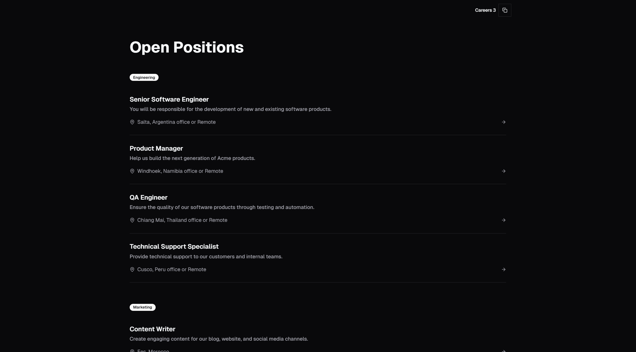
The core element of any careers page: individual cards that display open positions. Each card surfaces the information candidates need to decide whether a role is worth exploring — title, department, location, employment type, and salary range when listed.
Job card variants include:
Compact list — Title, department, and location in a single row. Efficient for companies with many openings. Clicking expands or links to the full job description
Detailed cards — Bordered cards with role title, team, location, a short description, and tags for attributes like "Remote" or "Full-time"
Featured cards — Highlighted positions (urgent hires or leadership roles) with larger styling, a description excerpt, and a prominent apply button
Minimal rows — Clean table-like rows with sortable columns, efficient for enterprise-scale job boards with dozens of openings
Good job cards answer three questions instantly: What is the role? Where is it? Is it worth clicking? Candidates scanning a careers page decide within seconds whether to dig deeper, so the card needs to front-load the most relevant information.
Department Filters
When you have openings across multiple teams, unfiltered job lists become unwieldy. Department filters let candidates narrow listings to their area — Engineering, Design, Product, Marketing, Sales, Operations, Customer Support.
Filter patterns include:
Horizontal tab bar — Department names as tabs across the top of the listing. Clicking a tab filters instantly. Works for 4-8 departments
Dropdown select — A select input for department, sometimes combined with location and role type filters. Better for 8+ departments or when combining multiple filter dimensions
Sidebar filters — A vertical filter panel alongside the job list, similar to ecommerce product filters. Supports checkboxes for multiple simultaneous selections
Tag-based filters — Clickable tags for department, location, and role type. Multiple tags can be active at once
Client-side filtering works for most careers pages — you're typically displaying 10-100 positions, well within the range where filtering in the browser is instant. For enterprise job boards with thousands of listings, server-side filtering with pagination becomes necessary.
Application Forms
The application form is where conversion happens. A candidate who has read the job description and decided to apply hits the form — and this is where many careers pages lose them. Long forms, mandatory cover letters, account creation requirements, and broken file upload fields all kill applications.
Application form patterns include:
Minimal form — Name, email, resume upload, and an optional message. Four fields, thirty seconds to complete. This maximizes application volume
Structured form — Sections for personal info, work experience, education, and links (LinkedIn, portfolio, GitHub). More data per applicant but higher drop-off
Multi-step form — The application broken into 2-3 steps with a progress indicator. Each step feels manageable. Candidates who complete step one are likely to finish
Modal form — Application form in a dialog overlay, keeping the candidate on the careers page. Reduces context-switching
The best application forms ask for the minimum viable information. If you need more detail, collect it after the initial application — during the screening call or as a follow-up form sent to qualified candidates.
File upload is critical. Resume uploads should accept PDF, DOC, and DOCX at minimum. Show a progress indicator for the upload, display the filename after upload, and allow re-upload if the wrong file was selected. Shadcn UI's file input primitives handle the UI, and server actions in Next.js handle the upload processing.
Benefits Sections
Benefits sell the role beyond the job description. Compensation gets candidates interested; benefits and perks get them excited. A well-designed benefits section covers the categories candidates care about most.
Benefits display patterns include:
Icon grid — A grid of benefit items, each with an icon, title, and one-line description. Covers 8-16 benefits in a scannable format
Category cards — Benefits grouped into categories (Health, Financial, Work-Life, Growth) with detailed descriptions per category
Comparison table — Tabular view comparing benefits across plan tiers or office locations
Feature list with descriptions — Vertical list of benefits with paragraph-length explanations
Common benefit categories to highlight:
Health — Medical, dental, vision, mental health support
Financial — Salary, equity, 401(k) match, bonuses
Work-life — Remote/hybrid options, flexible hours, PTO policy, parental leave
Growth — Learning budgets, conference attendance, mentorship, career paths
Perks — Equipment budget, office amenities, team events, wellness programs
Culture Showcases
The culture section answers the question every candidate asks: "What is it actually like to work here?" This goes beyond listing values on a wall — it shows candidates the day-to-day reality.
Culture showcase patterns include:
Photo gallery — Real photos of the team, office, events, and work-in-progress. Authenticity matters more than polish — avoid stock photos
Values grid — Company values displayed as cards with icons and descriptions. Each value includes a concrete example of how it manifests
Employee quotes — Short testimonials from current team members about their experience. Include name, role, and photo for credibility
Video embed — A culture video or day-in-the-life content embedded in the section
Stats and figures — Team size, countries represented, average tenure, employee satisfaction scores
Culture sections pair naturally with team sections (23 blocks). While team sections show who works at the company, culture sections show how they work.
Location and Office Sections
For companies with physical offices or hybrid arrangements, a location section helps candidates understand where they'd work. This is especially important for multi-office companies and roles with specific location requirements.
Location patterns include:
Map with office markers — Interactive or static map showing office locations
Office cards — A card per office with address, photos, and available roles at that location
Remote-first messaging — For distributed companies, a section explaining the remote work setup, time zone expectations, and how the team stays connected
Career Path and Growth Sections
Ambitious candidates want to know where a role leads. Growth sections show career progression within the company — engineering ladders, management tracks, and cross-functional mobility.
This section type addresses a common candidate concern: "If I join, will I still be doing the same thing in three years?" Showing clear progression paths reduces this worry.
Employer Branding on Careers Pages
Your careers page is a branding exercise as much as a functional tool. The design, copy, and content choices signal what kind of company you are.
Tone and Voice
The writing on your careers page should match your company's actual communication style. If your team communicates casually in Slack, don't write careers page copy in corporate-speak. If your company is formal and process-driven, don't try to sound like a startup.
Candidates notice tone mismatches. A "we're a fun, casual team" message on a page that looks like it was designed by a committee tells candidates the company isn't self-aware about its culture.
Visual Design
The careers page should look like it belongs to the same brand as the rest of your site. Use the same typography, color palette, and component style. A careers page that looks like a different website breaks trust.
Using Shadcn UI and Tailwind CSS across your entire site ensures visual consistency. The same button styles, card patterns, and spacing system that appear on your marketing pages carry through to your careers page.
Photography
Real photos outperform stock photos on careers pages. Candidates can tell the difference, and stock photos actively hurt credibility. If you don't have professional team photos, casual photos from team events, office candids, or remote work setups are better than polished stock images.
ATS Integration
Most companies manage job listings through an Applicant Tracking System — Greenhouse, Lever, Ashby, Workable, or similar. Your careers page needs to pull listings from the ATS and submit applications back to it.
API-Based Integration
Modern ATS platforms provide APIs to:
Fetch job listings — Pull active positions with title, department, location, and description
Submit applications — POST candidate data and resume attachments
Sync status — Optionally display application status to candidates who log in
For Next.js applications, the typical pattern is:
A server component or API route fetches jobs from the ATS API at build time or on request
The careers page renders job cards from the API response
Application forms submit to an API route that forwards data to the ATS
Confirmation is shown to the candidate after successful submission
Embed-Based Integration
Some ATS platforms offer embeddable job boards — iframes or JavaScript widgets that render job listings and application forms within your page. This is simpler to implement but harder to customize visually.
The SERP Blocks careers components use native React components rather than embeds, giving you full control over styling and behavior. You connect them to your ATS through API routes.
No-ATS Approach
Smaller companies and startups often don't need a full ATS. For teams with a handful of open positions, the careers page can list roles statically, and the application form can submit to an email address, a Google Form, Airtable, or Notion database.
This approach works for companies hiring 1-5 people at a time. Once you're managing 10+ active openings and receiving hundreds of applications, an ATS becomes worth the investment.
Mobile Job Application UX
Over 60% of job seekers browse openings on mobile. Many also apply on mobile, especially for non-technical roles. Your careers page needs to work flawlessly on phones.
Mobile Browsing
Job cards should stack vertically in a single column
Filters should collapse into a dropdown or expandable panel
Department tabs should scroll horizontally if they overflow
Job descriptions should be readable without pinching to zoom
Mobile Applications
File upload must work on mobile browsers (camera capture and file picker)
Form fields should use appropriate input types (email, tel, url) for mobile keyboards
The form should not require horizontal scrolling
Auto-save or draft functionality prevents data loss if the candidate switches apps
Touch Targets
Interactive elements — buttons, links, filter chips, tab items — need adequate touch target size. The minimum recommended size is 44x44 pixels. Cramped interfaces that work with a mouse cursor fail on touchscreens.
All 20 SERP Blocks careers components are fully responsive and tested across mobile viewports.
Careers Page SEO
Job listings are search-worthy content. Candidates search for "[company name] careers", "[role title] jobs at [company]", and "[location] [role] openings". Your careers page should rank for these queries.
Job Posting Schema
Google supports JobPosting structured data, which can surface your listings in Google's job search experience. Each listing should include:
Job title
Hiring organization
Job location (or "remote")
Date posted
Description
Salary range (when available)
Employment type (full-time, part-time, contract)
Implementing this schema as JSON-LD alongside your careers components increases visibility in search results.
Individual Job Pages
Each open position should have its own URL rather than existing only as an expandable section on a single page. Individual pages are indexable, shareable, and provide a better candidate experience. Candidates can bookmark a specific role, share it with a friend, or return to it later.
Content Beyond Listings
Careers pages that include culture content, benefits information, and employee testimonials rank better than pages with only job listings. The additional content provides more keyword coverage and keeps visitors on the page longer, both of which are positive SEO signals.
Careers Pages in Context
A careers page rarely stands alone. It connects to several other sections of your site:
About Pages
Candidates want company context before applying. Link from the careers page to your about sections (32 blocks) for company story, mission, and history.
Team Sections
Showing the team alongside open positions helps candidates picture themselves at the company. The team collection (23 blocks) includes layouts for department teams, leadership, and full company views.
Contact Pages
Candidates with questions about a role should be able to reach someone. Link to your contact sections (33 blocks) or include a direct recruiter contact on the careers page.
FAQ Sections
Address common candidate questions — interview process, visa sponsorship, remote policy, relocation assistance. A FAQ section (21 blocks) at the bottom of the careers page reduces recruiter email volume and improves the candidate experience.
Related Block Categories
Careers pages combine with:
| Section | Category | Count |
| Team Members | Team | 23 |
| Company Story | About | 32 |
| Get in Touch | Contact | 33 |
| Common Questions | FAQ | 21 |
| Company Stats | Stat | 10 |
| Company History | Timeline | 10 |
| Photo Gallery | Gallery | 25 |
SERP Blocks includes 1200+ total blocks across 50+ categories. 60 are free, with the full library available through a one-time Pro purchase.