React Error Pages: Creative 404 and 500 Designs
Browse 11 error page components for React and Next.js — creative 404 not found pages, 500 server error screens, 403 forbidden states, and maintenance mode layouts. Built with Shadcn UI and Tailwind CSS with navigation recovery patterns.
SERP Blocks Team
Product
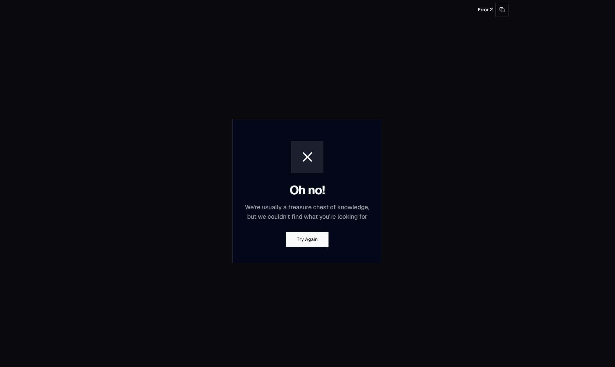
Every website has error pages. Every website needs them. And almost every website treats them as the lowest-priority design task — a plain white screen with "404 Not Found" in default browser font, shipped on the last day before launch because someone remembered it existed. This is a missed opportunity. Error pages are not dead ends. They are crossroads where a confused or frustrated visitor decides whether to stay on your site or leave.
The data is clear: a well-designed 404 page recovers 10-25 percent of visitors who would otherwise bounce. That means for every thousand visitors who hit a broken link, a good error page brings back one hundred to two hundred fifty people who were about to leave. A generic error page recovers almost none of them.
The SERP Blocks error collection includes 11 error page components built with Shadcn UI and Tailwind CSS. 404 not found pages, 500 server error screens, 403 forbidden states, and maintenance mode layouts — each designed to keep visitors on your site and guide them toward working content.
Error Page Types
Not all errors are the same, and the page design should reflect what went wrong and what the visitor can do about it. A 404 means the content does not exist at this URL. A 500 means something broke on the server. A 403 means the content exists but the visitor does not have permission. Each scenario demands a different message, a different tone, and different recovery options.
404 Not Found
The most common error page. Visitors land here when they follow an outdated link, mistype a URL, click a bookmark to a page that has been moved, or follow a link from an external site that was never updated after a site redesign.
The 404 page has one job: prevent the visitor from leaving. Every design decision should serve that goal.
What a good 404 page includes:
A clear, human-readable message — "This page does not exist" or "We could not find what you are looking for." Avoid technical jargon. "Error 404: Resource Not Found" means nothing to most visitors.
An illustration or graphic — A custom illustration related to your brand. A lost astronaut floating in space. A compass pointing nowhere. A broken treasure map. The illustration serves two purposes: it softens the frustration of hitting a dead end, and it signals that this is a designed experience, not a system failure.
A search bar — Let visitors search for what they were looking for. If someone arrived via a broken link to "/blog/react-hooks-guide," a search bar lets them type "react hooks" and find the current version of that content. The search bar is the single most effective recovery element on a 404 page.
Popular or suggested links — A curated list of your most-visited pages, recent blog posts, or product categories. When visitors do not know exactly what they were looking for, suggested links give them somewhere productive to go.
A home page link — A prominent button to return to the homepage. This is the fallback recovery option when search and suggested links do not apply.
What a good 404 page does not include:
A bare HTTP status code — "404" alone is meaningless to most visitors. If you display the status code, accompany it with a plain-language explanation.
Blame language — "You entered an invalid URL" shifts blame to the visitor. The page they wanted might have been moved, deleted, or never properly linked. It is not their fault.
A dead end — No navigation, no links, no search. If the only option is the browser's back button, you have failed.
500 Internal Server Error
The 500 page appears when something goes wrong on the server — an unhandled exception, a database timeout, a deployment issue, an out-of-memory crash. Unlike a 404, the visitor did nothing wrong. The problem is entirely on your end.
The 500 page should communicate three things:
Something went wrong on our side — Acknowledge the problem. "Something went wrong" or "Our servers are having trouble" is honest without being alarming.
We are aware (or will be) — "Our team has been notified" reassures the visitor that the issue is being addressed. If you have automated error monitoring (Sentry, Datadog, etc.), this statement is true. If you do not, set up monitoring before making this claim.
Here is what you can do — "Try refreshing the page" is the first suggestion because many 500 errors are transient. "Come back in a few minutes" is the second. A link to your status page (if you have one) lets technically inclined visitors check whether it is a known outage.
The tone of a 500 page should be apologetic without being dramatic. "We are experiencing technical difficulties" is better than "CATASTROPHIC SERVER FAILURE." Humor can work here — "Our hamsters stopped running on their wheels" — but only if it matches your brand voice. A banking application should not joke about server errors.
500 pages should avoid:
Stack traces or error details — Never expose technical error information to end users. It is confusing for non-technical visitors and a security risk because it reveals implementation details to potential attackers.
Login forms or dynamic content — The server is broken. Do not rely on server-side rendering for the 500 page. It should be a static HTML file that loads without any server-side processing.
Complex navigation — Your header and footer components might depend on API calls that are also failing. The 500 page should be self-contained with hardcoded links rather than dynamically rendered navigation.
403 Forbidden
The 403 page appears when the visitor's request is understood but the server refuses to fulfill it. The content exists, but the visitor does not have permission to access it. This typically happens when:
A logged-out visitor tries to access an authenticated page
A user without admin privileges tries to access an admin panel
An IP-restricted resource is accessed from an unauthorized network
A geo-blocked page is accessed from a restricted region
The 403 page needs to differentiate between "you need to log in" and "you genuinely cannot access this." For authentication issues, the page should redirect to login or display a login prompt. For permission issues, the page should explain why access is denied and suggest alternatives.
Authentication-related 403 patterns:
Login redirect — Automatically redirect to the login page with a return URL parameter so the visitor lands on the intended page after authentication. This is the most common pattern and the most user-friendly.
Inline login prompt — Display a login form directly on the 403 page. "You need to sign in to view this content" with email and password fields below. This avoids the jarring experience of a full-page redirect.
Upgrade prompt — For SaaS applications where the content is behind a higher-tier paywall: "This feature is available on the Pro plan. Upgrade to access it." Include a clear explanation of what the feature does and a link to pricing.
Maintenance Mode
Maintenance pages appear during planned downtime — database migrations, major deployments, infrastructure upgrades. Unlike error pages that indicate something went wrong, maintenance pages indicate that something is intentionally happening.
Effective maintenance pages include:
Expected duration — "We will be back by 3:00 PM EST" or "Maintenance typically takes 30-60 minutes." Giving visitors a time estimate prevents them from repeatedly refreshing and reduces support inquiries.
Progress indicators — A progress bar or status update that refreshes automatically. Even an approximate progress indicator ("50% complete") reduces visitor anxiety.
Alternative contact methods — If your support system is also down, provide an email address or phone number. Visitors who need urgent help should not be completely cut off.
Auto-refresh — The maintenance page should automatically check whether the site is back online. A meta refresh tag or a JavaScript interval that pings a health endpoint can redirect visitors to the live site as soon as maintenance completes, without requiring a manual refresh.
Countdown timer — If the maintenance window has a defined end time, a countdown timer provides a clear visual answer to "when will this be over?" This reduces the urge to refresh repeatedly.
Creative 404 Design Patterns
The 404 page is the one error page where creativity is not just welcome — it is expected. A memorable 404 page can turn a frustrating dead end into a positive brand moment. Some of the most shared and discussed web design examples are 404 pages.
Illustration-Driven 404 Pages
A custom illustration as the centerpiece of the 404 page. The illustration relates to the concept of "lost" or "not found" in a way that connects to the brand identity.
Common illustration themes:
Space and exploration — A lost astronaut, an empty planet, a telescope pointing at nothing. Works well for tech companies and startups. The metaphor is intuitive: the visitor is exploring unfamiliar territory and the page they wanted is not here.
Maps and navigation — A broken compass, a treasure map with an X that leads nowhere, a GPS showing "recalculating." Navigation metaphors reinforce the idea that the visitor is simply in the wrong place, not that something is broken.
Nature and adventure — A hiker at a dead-end trail, a boat in uncharted waters, a door that opens to a brick wall. These illustrations work for brands with an outdoor, adventure, or travel identity.
Abstract and geometric — Glitchy shapes, fragmented patterns, or deconstructed typography. Suitable for design agencies, creative studios, and tech brands with a minimal aesthetic.
The illustration should be accompanied by minimal text. The visual does the emotional work (softening frustration, creating a moment of amusement), and the text does the functional work (explaining what happened, offering recovery paths).
Interactive 404 Pages
404 pages with interactive elements that engage the visitor beyond passive reading. Interactive 404 pages are memorable, shareable, and — most importantly — they keep visitors on the site longer, which increases the chance they will recover by clicking through to live content.
Interactive patterns include:
Mini games — A simple browser game (click to catch falling objects, a snake game, a typing challenge) embedded in the 404 page. The visitor plays the game and then follows a link to the homepage or suggested content. This pattern is most appropriate for gaming companies, entertainment brands, and developer-focused sites.
Animated illustrations — Illustrations with scroll-triggered or hover-triggered animations. A character that reacts to the cursor position, or a scene that changes as the visitor scrolls. Motion captures attention and extends time on page.
Search with live suggestions — An oversized search bar with real-time autocomplete suggestions. As the visitor types, matching pages appear below the input. This transforms the 404 from a dead end into a discovery tool.
Minimalist 404 Pages
Not every brand wants an elaborate 404 page. For enterprise applications, professional services, and B2B platforms, a clean and understated 404 page is more appropriate than a playful illustration.
Minimalist 404 patterns:
Typography-focused — A large "404" in the brand's display font, a one-line explanation, and a single "Go Home" button. No illustration, no suggested links, no search bar. The simplicity communicates efficiency and professionalism.
Brand-colored backgrounds — The 404 page uses the brand's primary color as a full-page background with white text. Visually distinct from the rest of the site, which signals "this is not a normal page" without needing an illustration.
Single recovery action — Instead of offering multiple recovery paths (search, popular links, home button), a minimalist 404 presents one clear action: "Return to Dashboard" or "Go to Homepage." Reducing choices reduces cognitive load.
Next.js Error Page Implementation
Next.js provides specific file conventions for error handling that align with the error page components in the collection.
The not-found.tsx File
In the Next.js App Router, creating a not-found.tsx file in the app directory defines the global 404 page. This file exports a default React component that renders when notFound() is called or when no route matches the requested URL.
// app/not-found.tsx
export default function NotFound() {
  return (
    <div className="flex min-h-screen flex-col items-center justify-center">
      <h1 className="text-6xl font-bold">404</h1>
      <p className="mt-4 text-xl text-muted-foreground">
        This page does not exist.
      </p>
      <a href="/" className="mt-8 text-primary hover:underline">
        Return home
      </a>
    </div>
  );
}
You can also create not-found.tsx files in nested route segments. A not-found.tsx inside app/blog/ handles 404s specifically for blog routes, allowing different 404 designs for different sections of your site. The blog 404 might suggest recent posts, while the product 404 suggests popular products.
This is where the 11 error blocks from the collection become practical. Drop a SERP Blocks error component into your not-found.tsx file, customize the copy and links, and you have a polished 404 page in minutes instead of hours.
The error.tsx File
The error.tsx file handles runtime errors in a route segment. When a server component throws an unhandled error, Next.js renders the nearest error.tsx boundary. This is the equivalent of a 500 error page for server-side rendering failures.
"use client";

export default function Error({
  error,
  reset,
}: {
  error: Error & { digest?: string };
  reset: () => void;
}) {
  return (
    <div className="flex min-h-screen flex-col items-center justify-center">
      <h1 className="text-4xl font-bold">Something went wrong</h1>
      <p className="mt-4 text-muted-foreground">
        We are working to fix this issue.
      </p>
      <button
        onClick={() => reset()}
        className="mt-8 rounded-md bg-primary px-4 py-2 text-primary-foreground"
      >
        Try again
      </button>
    </div>
  );
}
Key details about error.tsx:
It must be a Client Component — The
"use client"directive is required because theresetfunction uses client-side state to re-render the route segment.The
resetfunction — Callingreset()attempts to re-render the route segment. If the error was transient (a network timeout, a momentary database issue), the re-render may succeed. The error page should always offer this retry option.The
error.digestproperty — A hashed identifier for the error that is safe to log or display. Unlike the full error message, the digest does not expose implementation details.Nested boundaries — Like
not-found.tsx, error boundaries can be nested. Anerror.tsxinapp/dashboard/catches errors from dashboard routes while letting other sections use the root error boundary. This allows dashboard-specific error recovery (like "Return to Dashboard") while other sections use generic recovery.
The global-error.tsx File
The root error.tsx cannot catch errors thrown by the root layout itself. For root layout errors, Next.js uses global-error.tsx. This file renders as a complete HTML document because the root layout (which normally provides the <html> and <body> tags) has failed.
"use client";

export default function GlobalError({
  error,
  reset,
}: {
  error: Error & { digest?: string };
  reset: () => void;
}) {
  return (
    <html>
      <body className="flex min-h-screen items-center justify-center">
        <div className="text-center">
          <h1 className="text-4xl font-bold">Something went wrong</h1>
          <button onClick={() => reset()} className="mt-8">
            Try again
          </button>
        </div>
      </body>
    </html>
  );
}
The global-error.tsx must be self-contained — no shared layout components, no context providers, no navigation components that might depend on the broken layout. Keep it simple: a message, a retry button, and a home link.
Reducing Bounce Rate from Error Pages
A visitor who hits an error page is already at risk of leaving. Every element on the error page should work to reduce that bounce rate.
Navigation Preservation
The single most effective way to reduce bounce rate from error pages is to keep your site navigation visible. When the header and footer are present on the error page, visitors can navigate to any section of your site without relying on the recovery links embedded in the error content.
The navbar collection (17 blocks) and footer collection (21 blocks) provide navigation components that should appear on every page — including error pages. The navbar gives visitors access to main sections, search, and account functions. The footer provides secondary navigation, contact information, and social links.
For 500 errors where server-side rendering may be compromised, use statically rendered versions of your navigation that do not depend on API calls or dynamic data. Hardcode the navigation links in the error page template rather than importing your standard header component that might also fail.
Search Prominence
On a 404 page, the search bar should be the most prominent interactive element — larger than your standard header search, centered on the page, with placeholder text that suggests what to search for. "Search for articles, products, or pages..." is more helpful than just "Search."
Auto-suggest results in the search bar are particularly valuable on error pages because visitors may not know the exact title of the content they were looking for. Typing the first few characters of a topic and seeing matching suggestions bridges the gap between the broken URL and the content that replaced it.
Smart Link Suggestions
Instead of showing the same generic "popular pages" on every 404, use the broken URL to suggest relevant alternatives. If the URL is /blog/react-hooks-tutorial, suggest blog posts about React. If the URL is /products/wireless-headphones, suggest the headphone category page.
URL-based suggestions can be implemented with:
Path segment matching — Parse the URL path and match segments against your content taxonomy.
/blog/*suggests blog posts./products/*suggests product categories.Keyword extraction — Extract keywords from the URL slug and use them to query your content database. The slug
react-hooks-tutorialyields "react," "hooks," and "tutorial" — enough to find relevant alternatives.Redirect mapping — Maintain a map of old URLs to new URLs. When a known old URL is requested, redirect automatically (301) rather than showing a 404. For URLs that do not have a direct mapping, fall back to keyword-based suggestions.
Hero Section Recovery
For marketing sites where the 404 page might be a visitor's first impression (they followed a broken link from social media or an external blog), consider incorporating elements from your hero collection (81 blocks) into the error page design. A hero-style 404 page with your value proposition, a call to action, and a brief explanation of the error transforms a dead end into a landing page.
This approach works because visitors who arrive via external links often do not know what your site offers. A standard 404 with "Page not found — go home" gives them no reason to stay. A hero-style 404 that says "The page you were looking for has moved, but here is what we do..." gives them a reason to explore.
Error Monitoring and Analytics
Error pages are a diagnostic tool. Tracking which error pages are visited and how frequently reveals problems across your site.
404 Monitoring
Track every 404 hit with the following data:
The requested URL — Which URLs are generating 404 errors? If a specific URL gets dozens of 404 hits per day, there is a broken link somewhere that needs fixing.
The referrer — Where did the visitor come from? A 404 referred from your own site means you have an internal broken link. A 404 referred from an external site means someone else is linking to a URL that does not exist.
The recovery action — Did the visitor search, click a suggested link, go home, or leave? This data tells you whether your 404 page recovery elements are working.
Common patterns in 404 data:
Post-redesign spikes — A site redesign that changes URL structures without proper redirects will generate a flood of 404s from existing links and search engine indexes. Set up 301 redirects for all changed URLs.
Crawl bot 404s — Search engine crawlers may request URLs from old sitemaps or expired links in their index. These 404s are normal and will resolve as search engines recrawl your site.
Typo patterns — If your analytics show repeated 404s for slight variations of real URLs (
/contctinstead of/contact), consider implementing fuzzy URL matching or common typo redirects.
500 Error Tracking
500 errors require immediate attention because they indicate server-side failures. Integrate error tracking tools (Sentry, Bugsnag, Datadog) to capture:
The full error stack trace — For debugging. This is logged server-side, never displayed to users.
Request context — The URL, HTTP method, headers, and authenticated user (if applicable). Context helps reproduce the error.
Frequency and patterns — Is this a one-time error or a recurring issue? Does it happen for all users or only specific ones? Does it correlate with traffic spikes?
Set up alerts for 500 error rate thresholds. A baseline rate of 0.01 percent is normal. A sudden spike to 1 percent indicates a deployment issue or infrastructure problem that needs immediate investigation.
Related Block Categories
Error pages integrate with navigation and layout components to maintain a consistent site experience:
| Section | Category | Count |
| Error Pages | Error | 11 |
| Hero Sections | Hero | 81 |
| Navigation Bars | Navbar | 17 |
| Footers | Footer | 21 |
| Login Pages | Login | 17 |
SERP Blocks includes 1200+ total blocks across 50+ categories. 60 are free, with the full library available through a one-time Pro purchase.