21 Footer Designs: Modern Footer Components for React
Browse 21 footer designs for React and Next.js — mega footers, minimal, newsletter-integrated, multi-column layouts. Built with Shadcn UI and Tailwind CSS for modern web applications.
SERP Blocks Team
Product
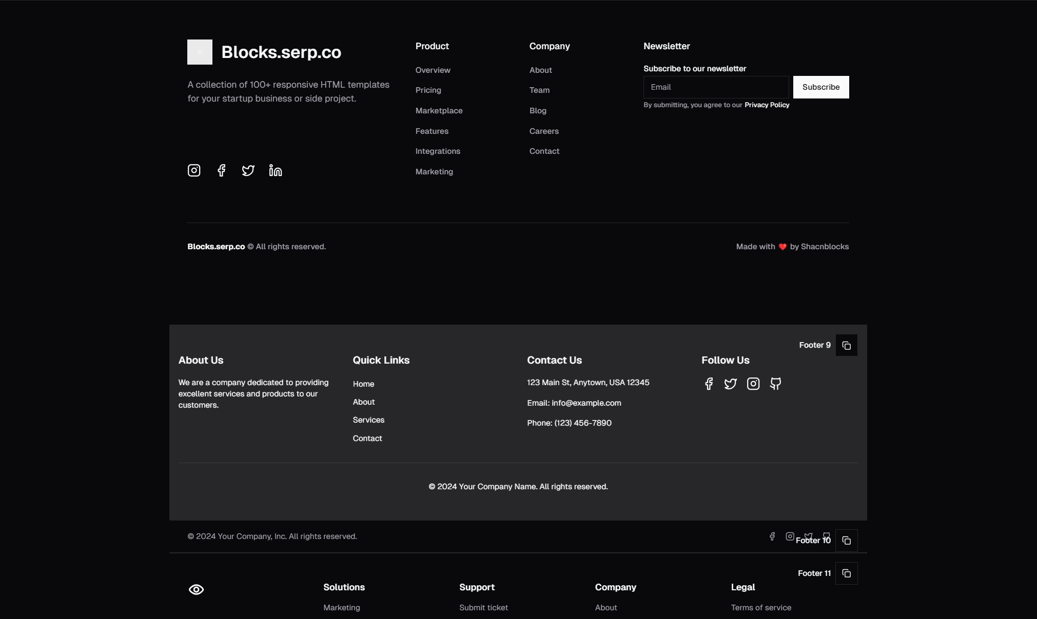
The footer is the last thing your visitors see before they leave your site — or the thing that convinces them to stay. Footers handle critical business functions: navigation fallback, legal compliance, social proof, newsletter capture, and SEO-relevant internal linking. Despite all this, footers are routinely copy-pasted from old projects or thrown together in the final hour of development.
The SERP Blocks footer collection includes 21 footer designs — from minimal single-line footers to mega footers with multiple navigation columns, newsletter signups, and social integrations. Every design is built with Shadcn UI and Tailwind CSS, ready to drop into any React or Next.js project.
Why Footer Design Deserves More Attention
Footers are one of the highest-impact sections on any website, yet they receive the least design consideration. Here is why that is a mistake.
Navigation Safety Net
Not every visitor finds what they need from your primary navigation. When someone scrolls to the bottom of a page without clicking, the footer is your last chance to direct them somewhere useful. Research consistently shows that footer links receive significant click-through rates, particularly on mobile devices where header navigation is collapsed behind hamburger menus.
A well-organized footer with clear link groupings serves as a site map that visitors actually use. Categories like "Product," "Company," "Resources," and "Support" help users self-select their path without scrolling back up or hunting through menus.
SEO and Internal Linking
Footers appear on every page of your site. That means every link in your footer gets repeated across your entire domain. Search engines use internal links to discover pages and distribute authority throughout your site structure. A footer with thoughtful internal links helps ensure that important pages — pricing, documentation, case studies — get indexed and ranked.
This does not mean you should stuff your footer with 50 links. Google's guidelines favor natural, useful navigation. A well-structured footer with 15-25 relevant links is far more effective than a wall of text links designed purely for crawlers.
Legal Compliance
Privacy policies, terms of service, cookie preferences, GDPR consent management — these are legal requirements in many jurisdictions, and the footer is the conventional location for these links. Users and regulators expect to find compliance-related links in the footer. Putting them anywhere else creates friction and can raise red flags during compliance audits.
Footer Layout Patterns
Multi-Column Navigation Footer
The most common footer pattern on the web: a logo and tagline on the left, with 3-5 columns of categorized links filling the remaining space. Below that, a bottom bar with copyright text and secondary links (privacy policy, terms).
This pattern works because it mirrors how users scan — logo for brand recognition, then columns for quick access to key sections. The column headers act as category labels, letting visitors jump to the right group without reading every link.
Variants include:
4-column layout — The default for most SaaS and product websites. Categories like Product, Resources, Company, Legal.
5-column layout — For larger sites with more sections. Adds a column for integrations, partners, or developer resources.
3-column layout — Tighter, cleaner footers for smaller sites or those with fewer pages.
Uneven columns — The first column (usually brand/description) takes more width, remaining columns share the rest equally.
Mega Footer
Mega footers expand the multi-column pattern with additional content: featured blog posts, product screenshots, customer logos, trust badges, or embedded maps. These footers function almost as a standalone landing page section.
Mega footers are common on enterprise and e-commerce sites where there is a large amount of information to surface. They work well when visitors need multiple paths to conversion — browsing products, reading case studies, contacting sales, or checking documentation.
Key elements in mega footers:
Company description and mission statement
Multiple navigation column groups
Newsletter signup form
Social media icon links
Trust badges or certification logos
App store download buttons
Contact information (address, phone, email)
Minimal Footer
A single line or a compact two-line footer with copyright text, a few essential links, and possibly social icons. Minimal footers work for focused landing pages, single-product sites, and applications where the footer should not distract from the primary content.
Minimal does not mean incomplete. A minimal footer should still include:
Copyright notice with current year
Privacy policy and terms links
At least a contact link or email
Footer with Newsletter Signup
An email capture form built directly into the footer. This is one of the highest-converting placements for newsletter signups because visitors who scroll to the bottom of your page have already consumed your content and demonstrated interest.
Newsletter footer variants include:
Inline input — Email field and submit button on a single line, integrated into the footer layout
Stacked input — Headline text above the input field, with a description of what subscribers receive
Full-width banner — A distinct section within the footer devoted entirely to the newsletter CTA, often with a contrasting background color
Footer with Social Proof
Footers that include customer logos, review scores, award badges, or certification marks. These elements reinforce trust at the exact moment a visitor is deciding whether to stay or leave.
Common social proof elements in footers:
"Trusted by 10,000+ companies" with logo grid
Star ratings from G2, Capterra, or Trustpilot
Security certification badges (SOC 2, ISO 27001)
Payment method icons for e-commerce sites
Responsive Footer Design
Footer responsiveness is more nuanced than most sections. A 4-column layout on desktop cannot simply stack into a single column on mobile without consideration — that creates an excessively long footer that pushes important links far down the page.
Mobile Footer Strategies
Accordion columns: On mobile, each column header becomes a tappable accordion that expands to reveal its links. This keeps the footer compact while preserving all navigation options. Shadcn UI's Accordion component works perfectly here.
Priority ordering: Reorder columns on mobile so the most important links appear first. On desktop, your logo column might come first. On mobile, the "Product" or "Support" column might be more useful at the top.
Simplified mobile footer: Show fewer links on mobile, keeping only the essentials — contact, support, privacy, terms. Users on mobile are less likely to browse your footer for discovery; they are more likely looking for a specific action.
Grid to stack: Use Tailwind's responsive grid classes to transition from multi-column to stacked layouts. A grid-cols-4 md:grid-cols-2 sm:grid-cols-1 progression works well.
Dark and Light Mode
Footers often use a contrasting color scheme from the rest of the page — a dark footer on a light site, for example. This visual separation signals "end of content" and gives the footer its own identity. All 21 footer designs in the SERP Blocks collection support dark mode through Tailwind CSS's dark variant classes.
Footer UX Best Practices
Keep Link Groups Logical
Group links by user intent, not by internal company structure. Your visitors do not care that "Blog" lives under the marketing team and "Docs" lives under engineering. Both are resources, so they belong in the same column.
Recommended groupings:
Product — Features, pricing, integrations, changelog, status page
Resources — Blog, documentation, tutorials, case studies, webinars
Company — About, careers, press, contact, partners
Legal — Privacy policy, terms of service, cookie settings, GDPR
Avoid Redundant Links
If your header navigation already includes a prominent link to pricing, you do not need to feature pricing prominently in the footer unless it serves a different user journey. Footer links should complement header navigation, not duplicate it entirely.
Use Descriptive Link Text
"Resources" is better than "More." "Developer Docs" is better than "Docs." "Contact Sales" is better than "Contact." Clear, descriptive link text helps both users and search engines understand where each link leads.
Include a Call to Action
The best footers include at least one clear CTA — "Start Free Trial," "Get a Demo," "Subscribe to Newsletter." A footer without a CTA is a missed opportunity for conversion. Place the CTA where it stands out visually, often as a button rather than a text link.
Building Footers with Shadcn UI and Tailwind CSS
Shadcn UI components that commonly appear in footers include:
Separator — Visual dividers between footer sections
Input and Button — For newsletter signup forms
Accordion — For collapsible mobile footer navigation
NavigationMenu — For structured link groups
Tailwind CSS handles the layout and responsive behavior. A typical footer structure uses CSS Grid for the column layout, Flexbox for individual column content, and Tailwind's responsive prefixes for mobile adaptation.
Performance Considerations
Footers load on every page, so they directly affect your Core Web Vitals across your entire site. Keep footer images optimized (SVG for logos and icons), minimize JavaScript (a static footer rarely needs interactivity beyond accordion toggles on mobile), and ensure footer fonts are the same as the rest of your site to avoid additional font loading.
Lazy loading footer content is generally unnecessary because the footer is below the fold. However, if your footer includes embedded maps or heavy third-party widgets, consider lazy loading those specific elements.
Pairing Footers with Other Sections
Footers work best as part of a cohesive page structure. Pair your footer with complementary sections from the SERP Blocks library:
Navbar components — Your header navigation should complement, not duplicate, your footer navigation. Use consistent link groupings and naming across both.
Newsletter sections — If you want a more prominent newsletter signup above the footer, use a dedicated newsletter section and keep the footer version minimal.
CTA sections — Place a strong CTA section directly above the footer for a final conversion push before visitors reach the end of the page.
Contact form designs — Link to your contact page from the footer, or embed a simplified contact form directly in the footer for quick inquiries.
Choosing the Right Footer for Your Project
With 21 footer designs available, selecting the right one depends on your site type and content volume.
For SaaS products: Multi-column navigation footer with 4 columns. Include product links, resource links, company links, and legal links. Add a newsletter signup if you have an active content marketing program.
For e-commerce stores: Mega footer with payment method icons, shipping information, customer service links, and trust badges. The product list blocks and shopping cart components pair well with e-commerce footers.
For landing pages: Minimal footer with copyright, privacy, and terms. The page should drive action through the main content and CTA sections, not through the footer.
For portfolios: Clean footer with social links, contact email, and copyright. The portfolio blocks collection includes designs that match this footer style.
For documentation sites: Footer with organized link columns matching your documentation categories, plus links to community resources (Discord, GitHub, forum).
Browse all 21 footer designs in the SERP Blocks footer collection. Every component ships with code for React, Next.js, Vue, and Astro, styled with Tailwind CSS and built on Shadcn UI primitives. Copy the code, customize the content, and deploy — no package installation required.