Shadcn UI Form Handling: React Hook Form + Zod Validation
A complete guide to building validated forms with Shadcn UI, React Hook Form, and Zod. Learn schema-based validation, error display, and server action submission using real contact and login form patterns.
SERP Blocks Team
Product
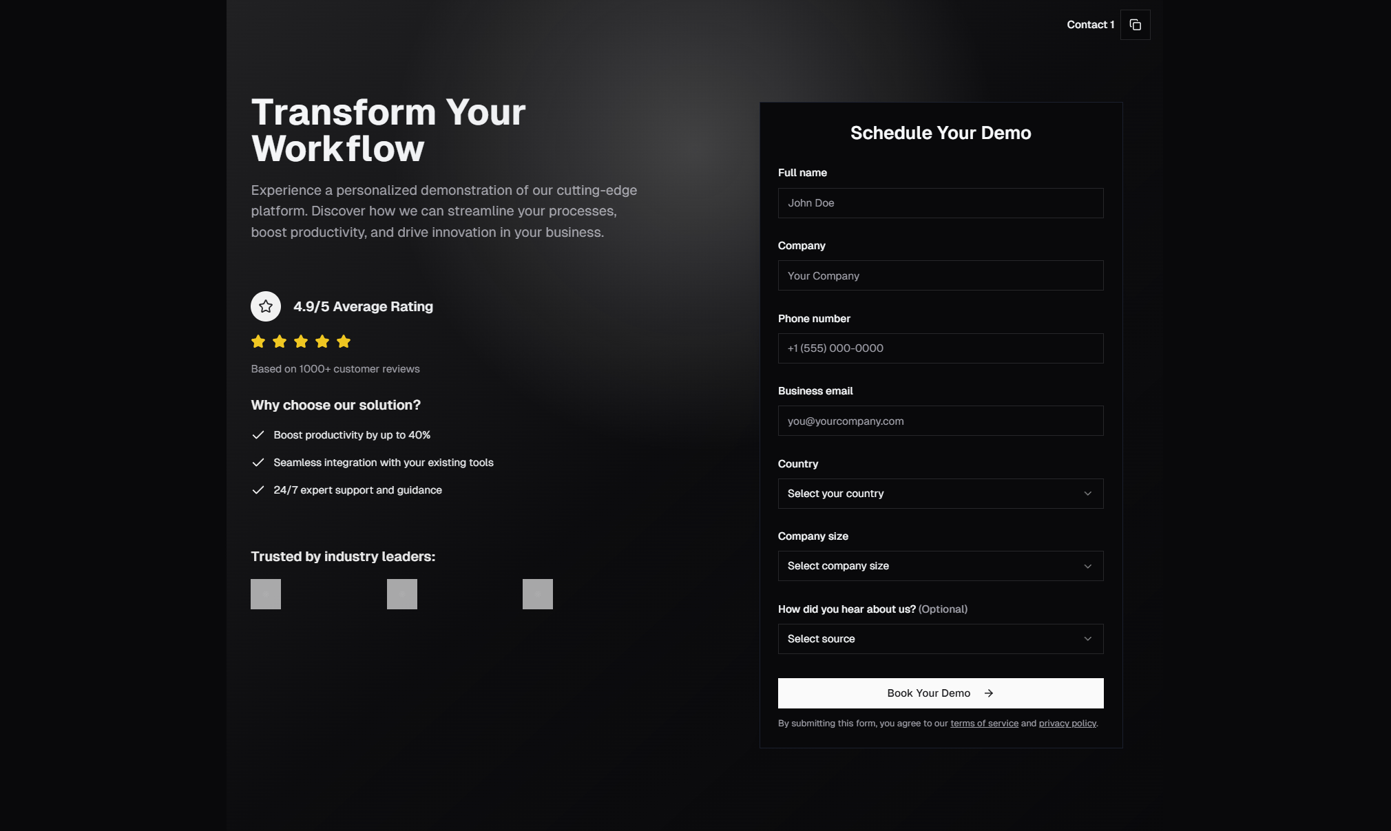
Forms are the backbone of web applications. Login pages, contact forms, checkout flows, settings panels — every meaningful user interaction eventually passes through a form. Getting form handling right means balancing developer experience, user experience, and data integrity all at once.
Shadcn UI's form components are built on top of React Hook Form and designed to work seamlessly with Zod for schema-based validation. This combination has become the standard approach in the React and Next.js ecosystem, and for good reason: it gives you type-safe validation, minimal re-renders, accessible error messages, and full control over every aspect of the form behavior.
This guide walks through the entire setup from scratch — installing the dependencies, creating Zod schemas, wiring up React Hook Form with Shadcn components, displaying validation errors, and handling submission with Next.js server actions.
Why This Stack Works
Before jumping into code, it's worth understanding why React Hook Form + Zod + Shadcn UI has become the dominant pattern.
React Hook Form manages form state using uncontrolled components and refs under the hood. This means your form inputs don't trigger re-renders on every keystroke — only when validation runs or the form submits. For forms with many fields (like the multi-section contact forms you see in production apps), this performance advantage matters.
Zod provides runtime type validation with full TypeScript inference. You define a schema once and get both the runtime validation logic and the TypeScript type from the same source. No more keeping your validation rules and TypeScript interfaces in sync manually.
Shadcn UI's Form components wrap React Hook Form's Controller and FormProvider patterns into clean, composable components — Form, FormField, FormItem, FormLabel, FormControl, FormDescription, and FormMessage. They handle accessibility attributes (like linking error messages to inputs via aria-describedby) automatically.
Setting Up the Dependencies
Assuming you already have a Next.js project with Shadcn UI initialized, add the form component and its peer dependencies:
npx shadcn@latest add formThis installs react-hook-form, @hookform/resolvers, and zod automatically, and copies the Form component files into your project. If you also need specific input components, add those too:
npx shadcn@latest add input label select textarea checkboxAfter running these commands, you'll have the component source files in your components/ui directory — fully editable, no black-box dependencies.
Building a Contact Form with Zod Validation
Contact forms are one of the most common form patterns on the web. The SERP Blocks contact collection includes 33 different contact form designs — from simple single-column layouts to split-screen designs with maps and business info. Let's build the validation layer that could power any of them.
Step 1: Define the Zod Schema
Create your validation schema in a separate file so it can be shared between client and server:
// lib/schemas/contact.ts
import { z } from "zod";

export const contactFormSchema = z.object({
  name: z
    .string()
    .min(2, "Name must be at least 2 characters")
    .max(100, "Name must be under 100 characters"),
  email: z
    .string()
    .email("Please enter a valid email address"),
  subject: z
    .string()
    .min(1, "Please select a subject"),
  message: z
    .string()
    .min(10, "Message must be at least 10 characters")
    .max(2000, "Message must be under 2000 characters"),
});

export type ContactFormValues = z.infer<typeof contactFormSchema>;
Notice the z.infer at the bottom — this derives the TypeScript type directly from the schema. The ContactFormValues type is fully typed as:
{
  name: string;
  email: string;
  subject: string;
  message: string;
}
No manual interface required. If you add or change a field in the schema, the type updates automatically.
Step 2: Create the Form Component
Here's the complete contact form component using Shadcn UI's Form primitives:
"use client";

import { zodResolver } from "@hookform/resolvers/zod";
import { useForm } from "react-hook-form";
import { Button } from "@/components/ui/button";
import {
  Form,
  FormControl,
  FormField,
  FormItem,
  FormLabel,
  FormMessage,
} from "@/components/ui/form";
import { Input } from "@/components/ui/input";
import { Textarea } from "@/components/ui/textarea";
import {
  Select,
  SelectContent,
  SelectItem,
  SelectTrigger,
  SelectValue,
} from "@/components/ui/select";
import { contactFormSchema, type ContactFormValues } from "@/lib/schemas/contact";

export function ContactForm() {
  const form = useForm<ContactFormValues>({
    resolver: zodResolver(contactFormSchema),
    defaultValues: {
      name: "",
      email: "",
      subject: "",
      message: "",
    },
  });

  async function onSubmit(values: ContactFormValues) {
    // values is fully typed and validated at this point
    console.log(values);
  }

  return (
    <Form {...form}>
      <form onSubmit={form.handleSubmit(onSubmit)} className="space-y-6">
        <FormField
          control={form.control}
          name="name"
          render={({ field }) => (
            <FormItem>
              <FormLabel>Name</FormLabel>
              <FormControl>
                <Input placeholder="Your name" {...field} />
              </FormControl>
              <FormMessage />
            </FormItem>
          )}
        />

        <FormField
          control={form.control}
          name="email"
          render={({ field }) => (
            <FormItem>
              <FormLabel>Email</FormLabel>
              <FormControl>
                <Input type="email" placeholder="you@example.com" {...field} />
              </FormControl>
              <FormMessage />
            </FormItem>
          )}
        />

        <FormField
          control={form.control}
          name="subject"
          render={({ field }) => (
            <FormItem>
              <FormLabel>Subject</FormLabel>
              <Select onValueChange={field.onChange} defaultValue={field.value}>
                <FormControl>
                  <SelectTrigger>
                    <SelectValue placeholder="Select a subject" />
                  </SelectTrigger>
                </FormControl>
                <SelectContent>
                  <SelectItem value="general">General Inquiry</SelectItem>
                  <SelectItem value="support">Support</SelectItem>
                  <SelectItem value="billing">Billing</SelectItem>
                  <SelectItem value="partnership">Partnership</SelectItem>
                </SelectContent>
              </Select>
              <FormMessage />
            </FormItem>
          )}
        />

        <FormField
          control={form.control}
          name="message"
          render={({ field }) => (
            <FormItem>
              <FormLabel>Message</FormLabel>
              <FormControl>
                <Textarea
                  placeholder="Tell us what you need..."
                  className="min-h-[120px]"
                  {...field}
                />
              </FormControl>
              <FormMessage />
            </FormItem>
          )}
        />

        <Button type="submit" className="w-full">
          Send Message
        </Button>
      </form>
    </Form>
  );
}
The key pattern here is the FormField render prop. Each field gets:
FormLabel— automatically linked to the input viahtmlForFormControl— wraps the actual input and passes necessary propsFormMessage— displays validation errors when they exist, hidden when the field is valid
Step 3: Understanding the Validation Flow
When a user clicks "Send Message," here's what happens:
form.handleSubmitintercepts the native form submissionReact Hook Form runs the Zod resolver against all field values
If validation fails, errors are set on the corresponding fields and
FormMessagecomponents render the error stringsIf validation passes, your
onSubmitfunction receives the fully validated and typed dataThe form never submits invalid data to your handler
By default, React Hook Form validates on submit. You can change this to validate on blur or on change:
const form = useForm<ContactFormValues>({
  resolver: zodResolver(contactFormSchema),
  mode: "onBlur", // validates when user leaves a field
  // or: mode: "onChange" — validates on every keystroke
  defaultValues: {
    name: "",
    email: "",
    subject: "",
    message: "",
  },
});
For contact forms, onBlur is usually the best balance — users get feedback after filling each field without the distraction of real-time validation on every keystroke.
Building a Login Form
Login and authentication pages are another critical form pattern. The SERP Blocks login collection includes 17 login page designs — centered cards, split layouts, forms with social auth buttons, and more. Here's how the validation side works.
Login Schema
// lib/schemas/auth.ts
import { z } from "zod";

export const loginFormSchema = z.object({
  email: z
    .string()
    .email("Please enter a valid email address"),
  password: z
    .string()
    .min(8, "Password must be at least 8 characters"),
});

export type LoginFormValues = z.infer<typeof loginFormSchema>;

export const signUpFormSchema = z
  .object({
    name: z.string().min(2, "Name must be at least 2 characters"),
    email: z.string().email("Please enter a valid email address"),
    password: z
      .string()
      .min(8, "Password must be at least 8 characters")
      .regex(
        /^(?=.*[a-z])(?=.*[A-Z])(?=.*\d)/,
        "Password must include uppercase, lowercase, and a number"
      ),
    confirmPassword: z.string(),
  })
  .refine((data) => data.password === data.confirmPassword, {
    message: "Passwords don't match",
    path: ["confirmPassword"],
  });

export type SignUpFormValues = z.infer<typeof signUpFormSchema>;
The sign-up schema demonstrates two important Zod features:
Regex validation — the password field uses
.regex()to enforce complexity rulesCross-field validation with
.refine()— theconfirmPasswordfield is validated against thepasswordfield. Thepathoption tells Zod which field to attach the error to
These patterns apply to the 11 sign up page designs in SERP Blocks as well.
Login Form Component
"use client";

import { zodResolver } from "@hookform/resolvers/zod";
import { useForm } from "react-hook-form";
import { Button } from "@/components/ui/button";
import {
  Form,
  FormControl,
  FormField,
  FormItem,
  FormLabel,
  FormMessage,
} from "@/components/ui/form";
import { Input } from "@/components/ui/input";
import { loginFormSchema, type LoginFormValues } from "@/lib/schemas/auth";

export function LoginForm() {
  const form = useForm<LoginFormValues>({
    resolver: zodResolver(loginFormSchema),
    defaultValues: {
      email: "",
      password: "",
    },
  });

  async function onSubmit(values: LoginFormValues) {
    // Handle authentication
  }

  return (
    <Form {...form}>
      <form onSubmit={form.handleSubmit(onSubmit)} className="space-y-4">
        <FormField
          control={form.control}
          name="email"
          render={({ field }) => (
            <FormItem>
              <FormLabel>Email</FormLabel>
              <FormControl>
                <Input type="email" placeholder="you@example.com" {...field} />
              </FormControl>
              <FormMessage />
            </FormItem>
          )}
        />

        <FormField
          control={form.control}
          name="password"
          render={({ field }) => (
            <FormItem>
              <FormLabel>Password</FormLabel>
              <FormControl>
                <Input type="password" placeholder="Enter your password" {...field} />
              </FormControl>
              <FormMessage />
            </FormItem>
          )}
        />

        <Button type="submit" className="w-full">
          Sign In
        </Button>
      </form>
    </Form>
  );
}
Handling Submission with Server Actions
In Next.js 15, server actions are the recommended way to handle form submissions that need to interact with a database or external API. Here's how to wire up a Shadcn form to a server action while keeping client-side validation intact.
The Server Action
// app/actions/contact.ts
"use server";

import { contactFormSchema, type ContactFormValues } from "@/lib/schemas/contact";

export async function submitContactForm(data: ContactFormValues) {
  // Always re-validate on the server — never trust client data
  const parsed = contactFormSchema.safeParse(data);

  if (!parsed.success) {
    return {
      success: false,
      errors: parsed.error.flatten().fieldErrors,
    };
  }

  // Now parsed.data is validated and typed
  try {
    // Save to database, send email, call API, etc.
    await saveContactSubmission(parsed.data);

    return { success: true };
  } catch (error) {
    return {
      success: false,
      errors: { _form: ["Something went wrong. Please try again."] },
    };
  }
}
The critical pattern here is re-validating with the same Zod schema on the server. Because the schema is defined in a shared file (lib/schemas/contact.ts), you use the exact same validation rules on both client and server. The client validation provides instant feedback; the server validation provides security.
Connecting the Client Form to the Server Action
Update the onSubmit handler to call the server action and handle the response:
import { submitContactForm } from "@/app/actions/contact";
import { useTransition } from "react";
import { toast } from "sonner";

export function ContactForm() {
  const [isPending, startTransition] = useTransition();

  const form = useForm<ContactFormValues>({
    resolver: zodResolver(contactFormSchema),
    defaultValues: {
      name: "",
      email: "",
      subject: "",
      message: "",
    },
  });

  async function onSubmit(values: ContactFormValues) {
    startTransition(async () => {
      const result = await submitContactForm(values);

      if (result.success) {
        toast.success("Message sent successfully!");
        form.reset();
      } else if (result.errors) {
        // Map server errors back to form fields
        Object.entries(result.errors).forEach(([field, messages]) => {
          if (field === "_form") {
            toast.error(messages?.[0]);
          } else {
            form.setError(field as keyof ContactFormValues, {
              message: messages?.[0],
            });
          }
        });
      }
    });
  }

  return (
    <Form {...form}>
      <form onSubmit={form.handleSubmit(onSubmit)} className="space-y-6">
        {/* ...form fields... */}

        <Button type="submit" className="w-full" disabled={isPending}>
          {isPending ? "Sending..." : "Send Message"}
        </Button>
      </form>
    </Form>
  );
}
Key points in this pattern:
useTransitiontracks the pending state of the server action so you can disable the button and show loading textIf the server returns field-level errors,
form.setErrormaps them back to the correct fields andFormMessagedisplays them automaticallyGeneral form errors (like a database failure) use
toastfor a global notificationform.reset()clears all fields on success
Advanced Zod Patterns for Forms
Conditional Validation
Sometimes fields are only required based on other field values. For example, a contact form that asks for a phone number only if the user selects "Phone" as their preferred contact method:
const contactSchema = z
  .object({
    contactMethod: z.enum(["email", "phone"]),
    email: z.string().email().optional(),
    phone: z.string().optional(),
  })
  .refine(
    (data) => {
      if (data.contactMethod === "email") return !!data.email;
      if (data.contactMethod === "phone") return !!data.phone;
      return true;
    },
    {
      message: "Please provide your contact info",
      path: ["email"], // or dynamically determine path
    }
  );
Array Fields
For forms with dynamic lists — like adding multiple team members or line items — use z.array() in the schema and useFieldArray from React Hook Form:
const orderSchema = z.object({
  items: z
    .array(
      z.object({
        name: z.string().min(1, "Item name is required"),
        quantity: z.number().min(1, "Quantity must be at least 1"),
        price: z.number().min(0, "Price must be positive"),
      })
    )
    .min(1, "At least one item is required"),
});
This kind of schema backs the more complex form patterns you find in payment form designs (15 blocks) and order confirmation pages (10 blocks) in SERP Blocks.
Custom Error Messages with Context
Zod lets you customize error messages at every level:
const schema = z.object({
  age: z
    .number({
      required_error: "Age is required",
      invalid_type_error: "Age must be a number",
    })
    .min(18, "You must be at least 18 years old")
    .max(120, "Please enter a valid age"),
});
Handling Form State and UX Details
Showing a Loading State
Always disable the form during submission and provide visual feedback:
<Button type="submit" disabled={isPending}>
  {isPending ? (
    <>
      <Loader2 className="mr-2 h-4 w-4 animate-spin" />
      Submitting...
    </>
  ) : (
    "Submit"
  )}
</Button>
Resetting the Form
After successful submission:
form.reset(); // resets to defaultValues
// or reset to specific values:
form.reset({ name: "", email: "", subject: "", message: "" });
Watching Field Values
If you need to react to field changes (like showing a character count for the message field):
const messageValue = form.watch("message");

// In JSX:
<p className="text-sm text-muted-foreground">
  {messageValue?.length || 0} / 2000 characters
</p>
Setting Field Values Programmatically
Useful for "fill from profile" buttons or pre-populating from URL params:
form.setValue("email", user.email, { shouldValidate: true });Putting It All Together
The React Hook Form + Zod + Shadcn UI pattern handles everything from a two-field login form to a multi-step checkout with dynamic line items. The approach is always the same:
Define a Zod schema for your form data
Create a form with
useFormandzodResolverUse Shadcn
FormFieldcomponents with the render prop patternHandle submission with a server action that re-validates server-side
Map server errors back to form fields with
form.setError
If you want to skip the form-building phase and start with production-ready designs, SERP Blocks includes over 1,200 blocks across 50+ categories. The 33 contact form designs, 17 login pages, 11 sign up pages, 15 payment forms, and 10 forgot password pages all follow the patterns covered in this guide — with the markup, layout, and styling already done. You get the visual design out of the box, then wire in your Zod schemas and server actions to match your backend.
60 blocks are free to use. The full Pro library is a one-time purchase with lifetime access to every block and every future addition.