25 Gallery Components: Image Grids, Lightboxes & Masonry
Browse 25 gallery components for React and Next.js — image grids, masonry layouts, lightbox viewers, carousel galleries, and portfolio showcases. Built with Shadcn UI and Tailwind CSS.
SERP Blocks Team
Product
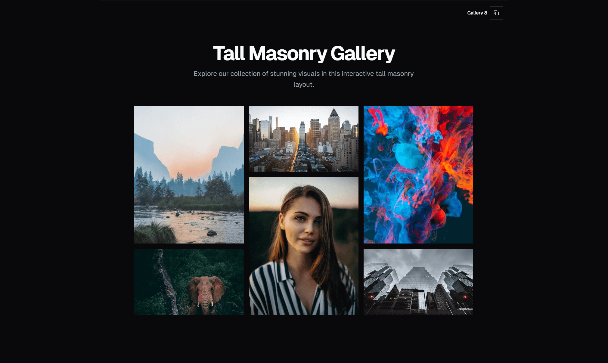
Galleries are deceptively hard to build well. A basic grid of images takes five minutes. A gallery that handles varying aspect ratios, loads performantly, opens into a smooth lightbox, and looks good on every screen size — that takes real engineering. And most React gallery libraries are either bloated, poorly maintained, or locked into styling decisions that fight your design system.
The SERP Blocks gallery collection includes 25 gallery components built with Shadcn UI and Tailwind CSS. Image grids, masonry layouts, lightbox viewers, carousel galleries, and filterable portfolio showcases — each one designed to slot into a Next.js project without external dependencies or conflicting styles.
Gallery Layout Patterns
Standard Image Grid
The foundational gallery pattern: images arranged in a uniform grid with equal-sized cells. Each image is cropped to fit the same aspect ratio (typically 1:1 square or 4:3 landscape), creating a clean, orderly appearance.
Grid variants include:
2-column grid — Large images, maximum visual impact. Works for portfolios with fewer, high-quality shots.
3-column grid — The most common gallery layout. Balances image size with quantity per row.
4-column grid — Compact grid for large image collections. Thumbnails are smaller but you can show 12-16 images above the fold.
Responsive column count — 1 column on mobile, 2 on tablet, 3-4 on desktop. The number of columns adapts to available space rather than staying fixed.
Standard grids enforce uniform aspect ratios through CSS object-fit: cover, which crops images to fill their container. This means every image fits perfectly regardless of its original dimensions, but some cropping occurs. For images where cropping is unacceptable (artwork, infographics, screenshots), use masonry layouts instead.
Masonry Layouts
Images arranged in columns where each image maintains its original aspect ratio. Tall images take more vertical space, wide images take less. The result is a staggered, Pinterest-style layout where columns fill independently based on image heights.
Masonry layouts are ideal for:
Photography portfolios — Where cropping would ruin composition
Mixed-media galleries — Combining landscape, portrait, and square images
User-generated content — Where image dimensions are unpredictable
Art showcases — Where every pixel of the original work matters
Implementation approaches:
CSS columns — The simplest masonry implementation. Set column-count: 3 and images flow top-to-bottom within each column. The downside: reading order is column-first (top to bottom, then left to right), which can feel unintuitive if the gallery has a meaningful sequence.
CSS Grid with grid-row: span — More control over placement. Each image calculates its span based on aspect ratio. Reading order follows the source HTML. More complex to implement but produces better results.
JavaScript masonry — Libraries like masonry-layout or a custom implementation that calculates absolute positions for each image. The most flexible option but requires JavaScript execution and careful handling of image load events.
The SERP Blocks masonry gallery components use CSS-based approaches for zero-JavaScript rendering, with optional JavaScript enhancement for optimal image distribution.
Lightbox Galleries
Any gallery layout paired with a lightbox — a full-screen overlay that opens when you click an image, displaying it at maximum size with navigation controls to move between images.
Lightbox features include:
Full-screen overlay — Dark backdrop with the image centered at maximum resolution
Navigation arrows — Previous/next controls to browse images without closing the lightbox
Keyboard navigation — Arrow keys for previous/next, Escape to close
Swipe gestures — Touch swipe on mobile for previous/next navigation
Image counter — "3 of 25" indicator showing position in the gallery
Caption display — Title and description shown below the image in the lightbox
Zoom — Click or pinch to zoom into image details
Close button — Explicit close control plus click-outside-to-close behavior
Lightbox galleries are essential when images need to be viewed at full resolution. Thumbnail grids show the collection, the lightbox shows the detail. This two-level viewing pattern is the standard for photography sites, real estate listings, product image galleries, and design portfolios.
The lightbox components use Shadcn UI's Dialog primitive as the overlay foundation, which means focus management, keyboard handling, and scroll locking work correctly out of the box through Radix UI's accessible dialog implementation.
Carousel Galleries
Images displayed one at a time (or a few at a time) in a horizontally scrollable container with navigation controls. Carousels are useful when you want to give each image individual attention rather than showing the entire collection at once.
Carousel variants include:
Single-image carousel — One image fills the container, with previous/next buttons. Maximum visual impact per image.
Multi-image carousel — 3-4 images visible at once, with the ability to scroll through more. Balances individual attention with collection context.
Thumbnail carousel — Large main image with a row of thumbnails below. Click a thumbnail to show that image as the main view. Common on e-commerce product pages.
Auto-advancing carousel — Images cycle automatically on a timer, with pause-on-hover. Use sparingly — auto-advancing can feel intrusive if the timing is wrong.
Carousel components use Shadcn UI's Carousel (built on Embla Carousel) for smooth scrolling, touch support, and accessibility. Embla handles the physics of scroll snapping, drag behavior, and momentum — all the details that make a carousel feel native rather than janky.
Filterable Galleries
Galleries with category filters that let viewers narrow the image collection by type, project, medium, or any other taxonomy. Click a filter and the gallery animates to show only matching images.
Filtering is essential for:
Portfolio sites — Filter by project type (branding, web design, photography)
Product galleries — Filter by color, style, or collection
Event photography — Filter by event, date, or photographer
Stock photography — Filter by category, orientation, or mood
Filter animation patterns:
Fade and reflow — Non-matching images fade out, remaining images reposition to fill gaps. Smooth but can cause layout shift.
Instant swap — Gallery re-renders immediately with filtered results. No animation, but no layout jank either.
Scale transition — Non-matching images shrink to zero while matching images slide into position.
Mixed / Asymmetric Layouts
Gallery layouts that intentionally break the uniform grid. Some images are large, some are small. Some span two columns, some span two rows. The arrangement creates visual hierarchy — certain images are emphasized by size while others play a supporting role.
Asymmetric layouts are effective for:
Featured image galleries — One hero image surrounded by smaller supporting shots
Before/after comparisons — Side-by-side images at different sizes
Storytelling galleries — Where image sequence and emphasis tell a narrative
Editorial layouts — Magazine-style image arrangements that feel curated rather than automated
Performance: Lazy Loading and Responsive Images
Gallery pages are image-heavy by nature. A 25-image gallery at full resolution could easily total 50MB of data. Without performance optimization, galleries are the single fastest way to destroy your Core Web Vitals.
Lazy Loading
Only load images that are visible in the viewport. Images below the fold load as the user scrolls to them.
Native lazy loading — Add loading="lazy" to your <img> tags. Browsers handle the rest. No JavaScript required, supported in all modern browsers. This is the minimum viable approach and works for most galleries.
Intersection Observer — For more control over when images load (e.g., start loading when an image is 200px from the viewport rather than when it enters), use the Intersection Observer API. This gives you a buffer zone so images are loaded before they scroll into view, eliminating the flash of empty space.
Next.js Image component — If you're using Next.js, the <Image> component handles lazy loading automatically, plus adds responsive sizing, format optimization (WebP/AVIF), and blur-up placeholders. For gallery components in a Next.js project, this is the strongest approach.
Responsive Image Sizing
Serve different image sizes based on the viewer's screen:
srcsetandsizesattributes — Tell the browser which image file to fetch based on viewport width and display density. A mobile viewer on a 375px screen doesn't need a 2400px-wide image.Art direction with
<picture>— Serve different crops for different screen sizes. A wide landscape hero image on desktop can switch to a tighter crop on mobile.CDN-based resizing — Services like Cloudflare Image Resizing, Imgix, or Cloudinary can generate sized variants on the fly from a single source image. Upload once, serve at any size via URL parameters.
Image Format Optimization
Modern formats dramatically reduce file sizes:
WebP — 25-35% smaller than JPEG at equivalent quality. Supported in all modern browsers.
AVIF — 50% smaller than JPEG in many cases. Support is growing but not universal.
Progressive JPEG — Loads a blurry preview first, then sharpens. Better perceived performance than standard JPEG, which loads top-to-bottom.
Next.js Image handles format negotiation automatically — it serves AVIF to browsers that support it, WebP to those that don't, and falls back to the original format for older browsers.
Placeholder Strategies
What to show while images are loading:
Blur-up — A tiny, blurred version of the image shown as a placeholder. Creates a smooth transition as the full image loads. Next.js supports this with
placeholder="blur".Dominant color — A solid color matching the image's dominant hue. Lighter than blur-up (no placeholder image to load) and still prevents layout shift.
Skeleton — A gray pulsing rectangle in the image's place. Generic but effective for preventing content shift.
Aspect ratio box — An empty container with the correct aspect ratio. Prevents layout shift without any visual placeholder. The simplest approach.
Use Cases
Photography Portfolios
Photographers need galleries that showcase their work without interference. Masonry layouts preserve original compositions, lightboxes let clients view full-resolution files, and category filters organize work by shoot type.
Combine gallery blocks with portfolio blocks (20 designs) for a complete photographer website. Portfolio blocks add project descriptions, client info, and case study layouts around the images.
E-Commerce Product Images
Product galleries need thumbnail navigation, zoom capability, and variant switching. The carousel gallery pattern with thumbnail strip handles the core product image experience — main image, click thumbnails to switch, zoom on hover or click.
Pair with product info blocks (15 designs) for complete product pages that include image gallery, description, pricing, and add-to-cart.
Real Estate Listings
Property galleries often include 20-40 images per listing. A grid gallery with lightbox lets potential buyers scan all photos quickly and view any image at full size. Category filters can separate interior, exterior, floor plans, and neighborhood shots.
Event and Wedding Photography
Event galleries may contain hundreds of images. Lazy loading is non-negotiable at this scale. Filterable galleries let guests find photos by ceremony, reception, portraits, or candid moments.
Design and Creative Portfolios
Designers need galleries that feel intentional, not algorithmic. Asymmetric and mixed layouts let you curate image placement, emphasizing your best work while supporting it with process shots and details.
The SERP Blocks portfolio collection (20 blocks) provides dedicated portfolio layouts, but gallery blocks are equally useful when the work is image-first.
Accessibility Considerations
Galleries present specific accessibility challenges:
Alt text — Every image needs descriptive alt text. For decorative images in a portfolio, alt text should describe the content, not just say "portfolio image 3."
Keyboard navigation — Users must be able to navigate the gallery and open lightboxes using only a keyboard. Tab to focus an image, Enter to open lightbox, arrow keys to navigate, Escape to close.
Reduced motion — Gallery animations (filter transitions, lightbox opening) should respect
prefers-reduced-motion. Users who experience motion sickness should get instant state changes instead of animations.Focus management — When a lightbox opens, focus moves to the lightbox. When it closes, focus returns to the image that triggered it. This prevents keyboard users from losing their place.
All SERP Blocks gallery components handle these accessibility requirements through Shadcn UI's accessible primitives.
Related Block Categories
Gallery sections combine naturally with several other block types:
| Section | Category | Count |
| Image Gallery | Gallery | 25 |
| Portfolio Showcase | Portfolio | 20 |
| Product Images | Product Info | 15 |
| Hero with Images | Hero | 81 |
| Team Photos | Team | 23 |
| Testimonials | Testimonial | 40 |
SERP Blocks includes 1200+ total blocks across 50+ categories. 60 are free, with the full library available through a one-time Pro purchase.