17 Login & Authentication Page Designs with Shadcn UI
Browse 38 authentication UI blocks — 17 login pages, 11 sign-up forms, and 10 forgot password screens. Built with Shadcn UI and Tailwind CSS for React and Next.js, covering social login, OTP, magic link, and multi-step auth flows.
SERP Blocks Team
Product
Authentication pages are the gateway to every application. They are the first branded experience your users encounter after deciding to sign up, and they are the screen returning users see most often. A poorly designed login page creates friction, erodes trust, and drives abandonment. A well-designed one feels invisible — users get through it without thinking.
The SERP Blocks library includes 38 authentication blocks that cover the complete auth flow: 17 login pages, 11 sign-up forms, and 10 forgot password screens. Every block is built with Shadcn UI components and Tailwind CSS, ready to drop into any React or Next.js project.
This post walks through the design patterns, explains when to use each variant, and covers authentication UX best practices that apply regardless of which auth provider you use on the backend.
Why Authentication UI Deserves Serious Design Attention
Authentication screens are easy to treat as an afterthought. The logic lives on the backend, so teams often throw together a quick form and move on. But the numbers tell a different story.
Studies consistently show that 20-40% of users who reach a sign-up page never complete the process. The most common reasons are:
Too many form fields — every additional field reduces conversion
No social login options — users increasingly expect to sign in with Google, GitHub, or Apple
Unclear error states — users give up when they cannot figure out what went wrong
Missing password requirements — nothing is more frustrating than submitting a password only to learn it needed a special character
No visual trust signals — users hesitate to enter credentials on pages that look unpolished
The design of your authentication pages directly affects your sign-up conversion rate, and every percentage point matters.
The 17 Login Page Designs
The login collection in SERP Blocks covers every common login pattern. Each block includes proper form validation structure, accessible label/input pairing, and responsive layouts that work on desktop and mobile.
Centered Card Login
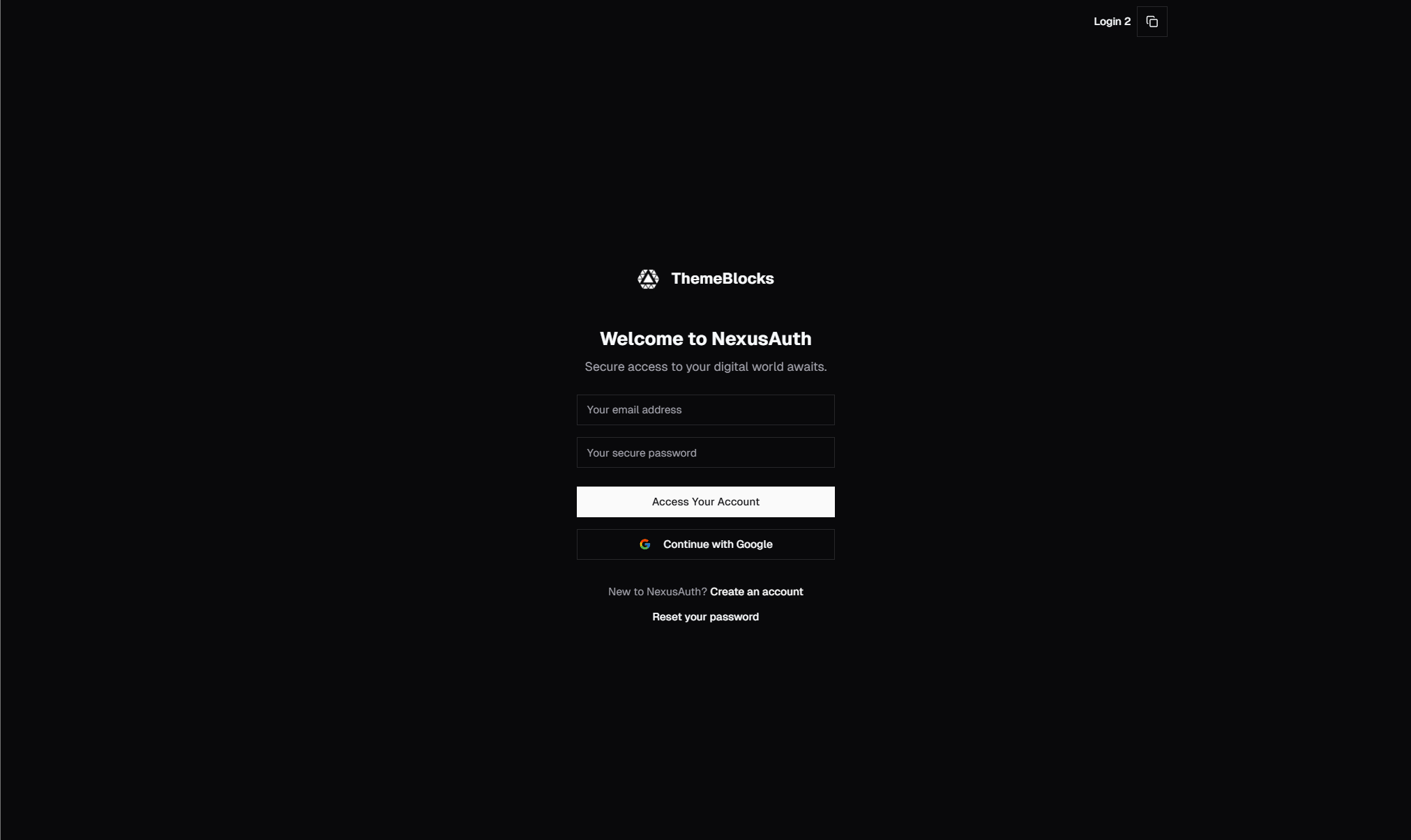
The most common and universally effective pattern. A single card centered on the page with email/password fields, a submit button, and links to sign-up and forgot password pages. Clean, focused, and distraction-free.
This pattern works because it removes everything except the task at hand. There is no navigation bar, no sidebar, no competing content. The user's attention goes exactly where it needs to go.
Best for: SaaS applications, developer tools, internal dashboards, and any product where returning users log in frequently.
Split-Screen Login
The page divides into two sections — the login form on one side and a branded visual on the other. The visual side can hold a product screenshot, testimonial, illustration, or gradient with a tagline. This layout gives you room to reinforce your brand and value proposition while the user fills in their credentials.
Split-screen login pages are popular with consumer products and marketing-heavy SaaS tools because they turn a functional screen into a branding opportunity.
Best for: Consumer apps, e-commerce platforms, and products where brand impression matters at every touchpoint.
Login with Social Providers
Login forms with social authentication buttons — Google, GitHub, Apple, Microsoft, Twitter, or any combination. These can appear as the primary authentication method (social buttons above the form) or as an alternative (social buttons below the traditional form, separated by an "or" divider).
Social login reduces friction dramatically. Users avoid creating yet another password, and you benefit from pre-verified email addresses. Our blocks include variants with different button styles:
Icon-only social buttons in a horizontal row
Full-width social buttons with provider names
Social buttons with a separator dividing them from the email/password form
Social-only login (no email/password option at all)
Best for: Consumer applications, developer tools (GitHub login), and any product targeting users who already have Google Workspace accounts.
Login with OTP / Verification Code
Instead of a password field, the user enters their email or phone number and receives a one-time code. The interface transitions to a code input screen with individual digit fields — typically 4 to 6 digits. This is passwordless authentication, and it is increasingly popular because it eliminates the password entirely.
Our OTP blocks use Shadcn UI's InputOTP component, which handles auto-focus between digit fields, paste support for codes copied from email or SMS, and keyboard navigation.
Best for: Mobile-first applications, fintech products, and any service where security is a primary concern.
Magic Link Login
A single email input field with a submit button. The user enters their email, receives a login link, and clicks it to authenticate. No password, no code — just an email. The confirmation screen tells the user to check their inbox and includes a "resend" option.
Magic link authentication is growing in popularity because it shifts the security burden to the email provider. If your users already trust their email security, magic link login is a smooth experience.
Best for: Low-friction products, newsletter platforms, community tools, and products where users log in infrequently.
Login with Two-Factor Authentication
Multi-step login flows where the user enters their credentials on the first screen and then verifies with a second factor on the next screen. The second factor can be a TOTP code from an authenticator app, an SMS code, or a hardware key prompt.
These blocks handle the transition between steps with clear progress indication so the user understands where they are in the process.
Best for: Enterprise applications, fintech, healthcare, and any product that handles sensitive data.
Branded Login with Background
Full-screen background images or gradients with the login form overlaid in a card or positioned to one side. These create an immersive, premium feel that works well for lifestyle brands, creative tools, and consumer products.
Best for: Creative platforms, lifestyle brands, and products where visual identity is central to the experience.
The 11 Sign-Up Form Designs
The sign-up collection mirrors many of the same layout patterns as login — centered card, split-screen, social providers — but with important differences in form structure and UX considerations.
Single-Step Sign-Up
All fields on one screen: name, email, password, and a submit button. Optionally includes a "confirm password" field, terms of service checkbox, and newsletter opt-in. This is the fastest path to conversion and works well when you need minimal information to create an account.
Multi-Step Sign-Up
The sign-up process broken into two or three steps — account credentials first, then profile information, then preferences or onboarding. Multi-step forms feel less overwhelming than a single long form, and they let you collect the critical information (email and password) on the first step before asking for optional details.
Our multi-step blocks include progress indicators (step dots, numbered steps, or progress bars) so users know how many steps remain.
Sign-Up with Password Strength Indicator
Forms that show real-time feedback on password strength as the user types. A visual meter displays strength from weak to strong, and inline hints show which requirements are met (minimum length, uppercase letter, number, special character).
Password strength indicators significantly reduce failed submissions. Users see exactly what is needed before they hit the submit button rather than getting an error after the fact.
Sign-Up with Role or Plan Selection
Forms that include a role selector (e.g., "I'm a developer" / "I'm a designer" / "I'm a manager") or a plan selector (Free / Pro / Enterprise) as part of the sign-up flow. This pattern is useful when you need to segment users at registration to customize their onboarding experience.
The 10 Forgot Password Screens
The forgot password collection covers the complete password reset flow — from the initial email input through the confirmation screen to the new password form.
Email Input Screen
A simple form asking for the email address associated with the account. Clean, focused, and with clear instructions. The key UX detail here is what happens after submission — our blocks include the confirmation state that tells the user to check their inbox, with a "resend email" option and a "back to login" link.
Reset Code Entry
After receiving the reset email, users enter a verification code before setting a new password. This adds a security layer over simple email links and uses the same OTP input pattern as the login OTP blocks.
New Password Form
The final step where users enter their new password. Includes a password strength indicator, confirm password field, and clear success state that redirects to login.
Authentication UX Best Practices
Regardless of which layout you choose, these principles apply to every authentication flow:
Keep Fields to an Absolute Minimum
Every field you add to a sign-up form reduces your conversion rate. Ask yourself whether each piece of information is truly needed at registration or whether it can be collected later during onboarding. Name can often wait. Phone number can definitely wait. The only things you need at sign-up are an identifier (email) and a credential (password or social token).
Always Offer Social Login
In 2026, not offering social login is leaving conversions on the table. Users have strong accounts with Google, Apple, and GitHub, and they prefer using them. Social login eliminates the password creation step, auto-fills profile information, and provides a verified email address.
At minimum, offer Google login. If your audience is developers, add GitHub. If you target consumers, add Apple.
Show Password Toggle
A simple eye icon that toggles password visibility between dots and plain text. This small feature dramatically reduces login failures caused by typos, especially on mobile devices where typing accuracy is lower. Every login and sign-up form should include this.
Handle Errors Inline
Do not show error messages in a toast notification or at the top of the page. Show them directly below the field that has the error. "Invalid email format" should appear under the email field. "Password must be at least 8 characters" should appear under the password field. Users should never have to scan the page to find what went wrong.
Use Loading States on Submit Buttons
When the user clicks "Sign In" or "Create Account," the button should immediately show a loading spinner and become disabled. This prevents double submissions and gives the user visual confirmation that their action was received. Our blocks include loading state variants for every submit button.
Implement Proper Tab Order
Users who navigate with keyboards (and there are more of them than you think) should be able to tab through your form in a logical order: email, password, submit button. Shadcn UI components handle this correctly by default, but custom layouts can accidentally break tab order. Test it.
Remember the Return URL
When a user is redirected to login because they tried to access a protected page, store the original URL and redirect them back after successful authentication. Nothing is more frustrating than logging in and landing on the dashboard when you were trying to reach a specific settings page.
Security Considerations for Auth UI
Authentication UI is not just a design problem — it is a security surface. A few things to keep in mind:
Never Reveal Account Existence
When a user enters an incorrect email on the login page, do not show "No account found with this email." This tells attackers which emails are registered. Instead, show a generic message: "Invalid email or password." Apply the same principle to forgot password — always show "If an account exists, we sent a reset email" regardless of whether the email is registered.
Rate Limit Login Attempts
After several failed login attempts, introduce a delay or CAPTCHA challenge. This is a backend concern, but your UI should support it — show a clear message when rate limiting kicks in, and display CAPTCHA when required.
Prevent Credential Stuffing with CAPTCHA
If your product is a target for automated attacks, include an invisible CAPTCHA (like reCAPTCHA v3 or Cloudflare Turnstile) on login and sign-up forms. Our blocks are designed to accommodate CAPTCHA widgets without breaking the layout.
Support Password Managers
Ensure your form inputs have correct type, name, and autocomplete attributes so password managers can auto-fill credentials. The email field should have autocomplete="email", the password field should have autocomplete="current-password" on login and autocomplete="new-password" on sign-up. This is a small detail that makes a big difference for users who rely on password managers.
Putting It All Together
The 38 authentication blocks in SERP Blocks cover every screen in the auth flow. You can mix and match patterns — use a split-screen login with social providers, pair it with a multi-step sign-up form, and add a magic link option for returning users.
All blocks support dark mode, are fully responsive, and use Shadcn UI components that you own and can customize. They work with any auth backend — NextAuth, Clerk, Supabase Auth, Firebase Auth, or your own custom solution. The blocks handle the UI; you wire up the logic.
With 1,200+ blocks across 50+ categories and 60 free blocks to get started, SERP Blocks gives you a complete UI toolkit for building production-ready applications. Authentication is just the beginning — pair your login pages with dashboard blocks, onboarding flows, and account settings to build the complete post-authentication experience.
Browse the full login collection, sign-up collection, and forgot password collection at blocks.serp.co.