13 Modal & Dialog Components: Shadcn UI Examples
Browse 13 modal and dialog components for React and Next.js — confirmation dialogs, form modals, lightbox overlays, multi-step wizards, and command palettes. Built with Shadcn UI and Tailwind CSS with full accessibility support.
SERP Blocks Team
Product
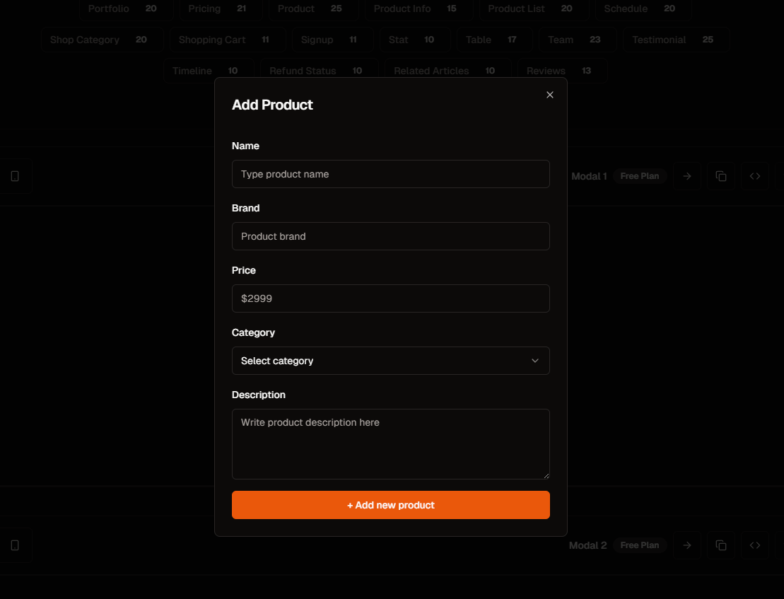
Modals are the most misused component in web development. They interrupt user flow, demand immediate attention, and create accessibility nightmares when implemented poorly. They are also completely unavoidable. Confirmations, forms, image previews, onboarding flows, notifications — modals handle interactions that need focused attention without losing the context of the underlying page.
The SERP Blocks modal collection includes 13 modal and dialog components built with Shadcn UI and Tailwind CSS. Confirmation dialogs, form modals, image lightboxes, multi-step wizards, notification modals, and command palette overlays — each one built on Radix UI's Dialog primitive for correct accessibility behavior out of the box.
When to Use a Modal
Before reaching for a modal, ask whether the interaction truly requires one. Modals should be used when:
The action is destructive or irreversible — Deleting an account, canceling a subscription, removing data. Confirmation dialogs prevent accidental destructive actions.
The form is short and contextual — A quick edit, a brief feedback form, a single-field input. The user should not leave the current page for a 30-second interaction.
Full attention is required — Image previews, video players, or content that benefits from a distraction-free overlay.
The flow is multi-step but self-contained — A wizard that collects information across 2-4 steps, then returns the user to the original page.
Modals should not be used for:
Long forms — If the form has more than 5-6 fields, use a dedicated page instead. Modals are not designed for extensive data entry.
Primary content — If the modal content is the reason the user visited the page, it should not be hidden behind a trigger. Show it directly.
Stacked modals — Opening a modal from within a modal is almost always a sign that you need a different UI pattern. Nested modals confuse users and break accessibility.
Modal Component Patterns
Confirmation Dialogs
The most common modal pattern: a brief message asking the user to confirm or cancel an action. Confirmation dialogs include a title, description, and two buttons — typically "Cancel" and a primary action button ("Delete," "Confirm," "Continue").
Design considerations for confirmation dialogs:
Destructive actions get red buttons — If the confirmed action deletes data or cannot be undone, the primary button should be styled as destructive (red background or red text) to signal danger.
The cancel button should be easy to reach — Place it on the left (in LTR layouts) or make it the default focused element. The safe option should be the path of least resistance.
Be specific in the title — "Are you sure?" is useless. "Delete project 'Portfolio Site'?" tells the user exactly what will happen.
Include consequences in the description — "This will permanently delete all files, comments, and history associated with this project. This action cannot be undone."
Confirmation dialogs are built on Shadcn UI's AlertDialog component, which differs from the standard Dialog in one critical way: AlertDialog prevents dismissal by clicking the backdrop or pressing Escape. The user must explicitly choose Confirm or Cancel. This is intentional — destructive confirmations should not be accidentally dismissed.
Form Modals
A modal containing a form — login, contact, feedback, edit profile, quick settings. Form modals let users complete short interactions without navigating away from their current context.
Form modal patterns include:
Single-field modals — Email subscription, quick rename, URL input. One field, one button, zero friction. The newsletter collection (13 blocks) provides email capture patterns that work as standalone sections or within modal overlays.
Multi-field modals — Contact forms, feedback forms, profile edits. 3-5 fields with a submit button. Keep it concise — if you need more than 5 fields, consider a dedicated page.
Edit modals — Pre-populated forms that open when a user clicks "Edit" on an existing record. The modal shows current values and lets the user modify them in place.
Quick-add modals — "New project," "Add task," "Create note." Fast creation flows that let users add items to a list without leaving the list view.
Form modals need careful attention to form state. When a user fills out a form modal and accidentally clicks the backdrop to close it, their input is lost. Good form modals either prevent backdrop-dismiss when the form has unsaved changes, or show a secondary confirmation ("You have unsaved changes. Discard?") before closing.
The contact collection (33 blocks) includes full-page contact forms, but many of the same form patterns work within modal containers for inline contact interactions.
Image Lightbox Modals
Full-screen overlays for viewing images at maximum resolution. Lightbox modals open when a user clicks a thumbnail, displaying the image at full size with a dark backdrop and close controls.
Lightbox features:
Full-viewport display — The image fills the screen, centered with appropriate padding. Portrait images fill the height, landscape images fill the width.
Navigation controls — Previous/next arrows for browsing through a collection. Keyboard arrow keys and swipe gestures provide the same navigation.
Zoom interaction — Click or pinch to zoom into the image. Double-click to toggle between fit-to-screen and actual-size views.
Caption and metadata — Title, description, camera settings, date — displayed below or beside the image without obscuring it.
Background click to close — Clicking the dark backdrop closes the lightbox. The close button provides an explicit alternative.
Lightbox modals differ from standard dialogs in their visual treatment. Standard dialogs are centered cards with white backgrounds. Lightbox modals are full-screen overlays with dark (often near-black) backdrops designed to maximize contrast with the displayed image.
Multi-Step Wizard Modals
A modal that guides users through a sequence of steps — onboarding flows, setup wizards, multi-page forms. Each step occupies the modal body, with Back/Next navigation at the bottom and a progress indicator showing the current position.
Wizard modal patterns include:
Linear wizards — Step 1, Step 2, Step 3, Done. Each step must be completed before advancing. A progress bar or step indicator shows how far along the user is.
Branching wizards — The path changes based on user choices. Selecting "Individual" on step 1 leads to different questions than selecting "Business." The progress indicator adapts to show the remaining steps for the chosen path.
Summary and confirm wizards — Steps collect information, the final step shows a summary of everything entered, and a confirm button commits the action. This pattern reduces errors by giving users a chance to review before submitting.
Wizard modals should always include:
A progress indicator — Users need to know where they are and how much remains. Step dots, a progress bar, or "Step 2 of 4" text all work.
Back navigation — Every step after the first needs a Back button. Users should be able to review and correct previous entries.
State persistence — If a user goes back, their previous entries should be preserved. Re-entering data is frustrating and unnecessary.
Notification and Alert Modals
Modals that deliver important information — success confirmations, error messages, system alerts, or promotional announcements. Unlike confirmation dialogs, notification modals usually have a single dismiss action rather than a choice between two options.
Notification patterns:
Success modals — "Payment successful," "Account created," "Message sent." Include a checkmark icon, a brief congratulatory message, and a primary action ("Go to Dashboard," "View Order").
Error modals — "Payment failed," "Upload error," "Session expired." Include an error icon, a clear description of what went wrong, and suggested next steps. Never show a raw error message to users.
Warning modals — "Your session expires in 5 minutes," "Storage is 90% full." Warnings inform without forcing immediate action. Include a dismiss option and an action option ("Extend Session," "Upgrade Storage").
Announcement modals — New feature introductions, promotional offers, or policy updates. These should be dismissible and should not block critical functionality. Use sparingly — users quickly develop banner blindness for modals that appear on every visit.
Command Palette Modals
A search-driven modal opened with a keyboard shortcut (typically Cmd+K or Ctrl+K). The command palette provides a text input that searches across actions, pages, and content. Results appear as a list below the input, navigable with arrow keys.
Command palette characteristics:
Keyboard-first design — Opened with a shortcut, navigated with arrow keys, activated with Enter. Mouse interaction is supported but secondary.
Fuzzy search — Typing "set dar" should match "Settings > Dark Mode." Fuzzy matching tolerates typos and partial queries.
Categorized results — Results grouped under headings: Pages, Actions, Recent, Settings. This helps users orient within the results list.
Recent and frequent items — Before the user types anything, show recently accessed pages or frequently used actions. This makes the command palette useful as a quick-launch tool even without searching.
Command palettes have become a standard interaction pattern in developer tools, SaaS applications, and documentation sites. They dramatically reduce navigation time for power users who prefer typing to clicking.
Accessibility Deep Dive
Modals are one of the most accessibility-sensitive components in web development. A poorly implemented modal can trap keyboard users, confuse screen readers, and make the entire application unusable for assistive technology users. Here is what correct modal accessibility requires.
Focus Trapping
When a modal opens, keyboard focus must be trapped inside it. Pressing Tab should cycle through the focusable elements within the modal (inputs, buttons, links) without ever reaching the content behind the modal. When the last focusable element is reached, Tab should loop back to the first focusable element.
Focus trapping prevents a critical problem: keyboard users tabbing out of the modal into the obscured background content. If focus escapes the modal, the user cannot see what they are interacting with, and they have no clear way to return to the modal.
Radix UI's Dialog primitive, which underlies Shadcn UI's Dialog component, handles focus trapping automatically. When the dialog opens, focus moves to the first focusable element. Tab cycles through dialog content only. When the dialog closes, focus returns to the trigger element.
Escape Key Handling
Pressing the Escape key should close the modal. This is a universal convention that assistive technology users rely on. Every modal must respond to Escape unless there is a compelling reason not to (such as AlertDialog, where accidental dismissal of a destructive confirmation must be prevented).
The Escape key handler should:
Close the modal immediately
Return focus to the element that triggered the modal
Not propagate to parent elements (preventing Escape from closing multiple layers simultaneously)
Screen Reader Announcements
When a modal opens, screen readers need to announce it. The WAI-ARIA dialog pattern requires:
role="dialog"— Identifies the element as a dialog to assistive technology.aria-modal="true"— Indicates that the dialog is modal (background content is inert).aria-labelledby— Points to the modal's title element, so screen readers announce the dialog's purpose when it opens.aria-describedby— Points to the modal's description element, providing additional context.
When the modal opens, screen readers should announce: "[Dialog Title]. [Dialog Description]." This tells the user what the modal is for and what action is expected.
Background content must be marked as inert (via the inert attribute or aria-hidden="true") so screen readers do not read content behind the modal. Radix UI handles this by adding aria-hidden to all sibling elements of the dialog portal.
Scroll Locking
When a modal is open, the background page should not scroll. Scroll locking prevents the disorienting experience of the page shifting behind the modal overlay. On mobile devices, scroll locking is particularly important because accidental scroll-through (scrolling the background while trying to scroll modal content) is a common problem.
Shadcn UI's Dialog component applies scroll locking automatically by adding overflow: hidden to the document body when the dialog opens and removing it when the dialog closes.
Animation Patterns
Modal animations affect perceived quality. An instant-appearing modal feels jarring. A smoothly animated modal feels intentional and polished.
Opening Animations
Common modal open animations:
Fade in — The modal fades from transparent to opaque. Simple and universally appropriate. Duration: 150-200ms.
Scale up — The modal starts at 95% scale and 0 opacity, then scales to 100% with full opacity. This subtle zoom-in draws attention to the modal appearing. Duration: 200-250ms.
Slide up — The modal slides up from below the viewport (or from a lower position). Common on mobile where modals function as bottom sheets. Duration: 200-300ms.
Backdrop fade — The dark overlay fades in independently from the modal content. The backdrop appears first (100ms), then the modal content animates in (200ms). This layered timing feels more sophisticated.
Closing Animations
Closing animations should be faster than opening animations. Users closing a modal want to return to their context quickly. A 200ms opening animation should have a 150ms closing counterpart.
Reduced Motion
Users with vestibular disorders can experience nausea, dizziness, or disorientation from animations. The prefers-reduced-motion media query indicates when a user has requested minimal motion. When active, modals should:
Replace fade/scale/slide animations with instant state changes
Remove transition delays
Keep backdrop opacity changes (these are generally tolerable) but eliminate movement
All SERP Blocks modal components respect prefers-reduced-motion automatically.
Mobile Modal Behavior
Modals on mobile devices present unique challenges that desktop implementations do not encounter.
Bottom Sheet Pattern
On mobile, centered modals waste screen space and place content far from the user's thumb. Bottom sheets — modals that slide up from the bottom of the screen — are more natural on touch devices. The content starts near the bottom where thumbs can reach, and the modal height adjusts to content.
Bottom sheet behaviors include:
Drag to dismiss — Swipe the modal downward to close it. A drag handle at the top indicates this interaction is available.
Snap points — The modal can rest at different heights. Half-screen for a short form, full-screen for lengthy content. Dragging between snap points lets users control how much screen the modal occupies.
Overflow scroll — When modal content exceeds the visible area, scrolling within the modal should work naturally without triggering the drag-to-dismiss gesture.
Viewport Considerations
Mobile modals need to account for:
Virtual keyboard — When an input inside a modal receives focus, the virtual keyboard appears and reduces available viewport height. The modal must reposition to keep the focused input visible above the keyboard.
Safe areas — On devices with notches or rounded corners, modal content should respect
env(safe-area-inset-*)to avoid being obscured.Orientation changes — If a user rotates their device while a modal is open, the modal should adapt gracefully without losing state or breaking layout.
Common Integration Patterns
Login and Authentication Modals
Instead of redirecting users to a separate login page, authentication modals let users sign in without losing their place. A "Sign In" button in the header opens a modal with email/password fields, social login buttons, and a link to registration.
The login collection (17 blocks) provides complete authentication layouts. Several of these patterns work within modal containers for inline authentication flows — particularly useful for e-commerce sites where requiring login before checkout should feel seamless rather than disruptive.
Contact and Feedback Modals
A floating "Contact Us" or "Feedback" button that opens a form modal. This pattern is common in SaaS applications where user feedback should be available on every page without dedicating screen space to a persistent form.
The contact collection (33 blocks) includes compact form layouts specifically designed for modal contexts — shorter forms with fewer fields that respect the spatial constraints of a dialog overlay.
Newsletter Subscription Modals
Email capture modals triggered by scroll depth, exit intent, or a deliberate click. When done respectfully (not on page load, not blocking content, easily dismissible), newsletter modals convert well because they demand attention at a moment of engagement.
The newsletter collection (13 blocks) provides email capture layouts ranging from single-field inputs to modals with benefit lists and social proof. The key is offering clear value — "Get weekly React tips" converts better than "Subscribe to our newsletter."
Implementation Best Practices
Portal Rendering
Modals should render through a React portal to the document body, not inline within the component tree. Portal rendering ensures the modal appears above all other content regardless of parent z-index contexts, overflow: hidden containers, or stacking context conflicts.
Shadcn UI's Dialog component uses Radix UI's Portal, which appends the dialog to document.body automatically.
State Management
Modal open/close state should be managed carefully:
URL-synced modals — For modals that represent distinct states (editing a specific item, viewing a specific image), sync the modal state with the URL using query parameters. This lets users share links to modal states and use the browser's back button to close modals.
Controlled vs. uncontrolled — Simple modals (confirmation, alerts) can be uncontrolled — the Dialog component manages its own open state. Complex modals (forms, wizards) should be controlled — the parent component manages the open state and can programmatically open or close the modal based on business logic.
Lazy Loading
Modals that contain heavy content (image galleries, code editors, rich text editors) should lazy-load that content. The modal markup mounts on first open, not on page load. This keeps the initial page bundle small and avoids initializing components the user may never see.
Related Block Categories
Modal components integrate with several other block categories:
| Section | Category | Count |
| Modal & Dialog | Modal | 13 |
| Login Forms | Login | 17 |
| Contact Forms | Contact | 33 |
| Newsletter | Newsletter | 13 |
| Cookie Consent | Cookie | 10 |
| Onboarding | Onboarding | 12 |
SERP Blocks includes 1200+ total blocks across 50+ categories. 60 are free, with the full library available through a one-time Pro purchase.