17 Navbar Components: Responsive Navigation for React Apps
Browse 17 navbar components for React and Next.js — sticky headers, transparent navbars, mega menus, mobile drawers. Built with Shadcn UI and Tailwind CSS for responsive navigation.
SERP Blocks Team
Product
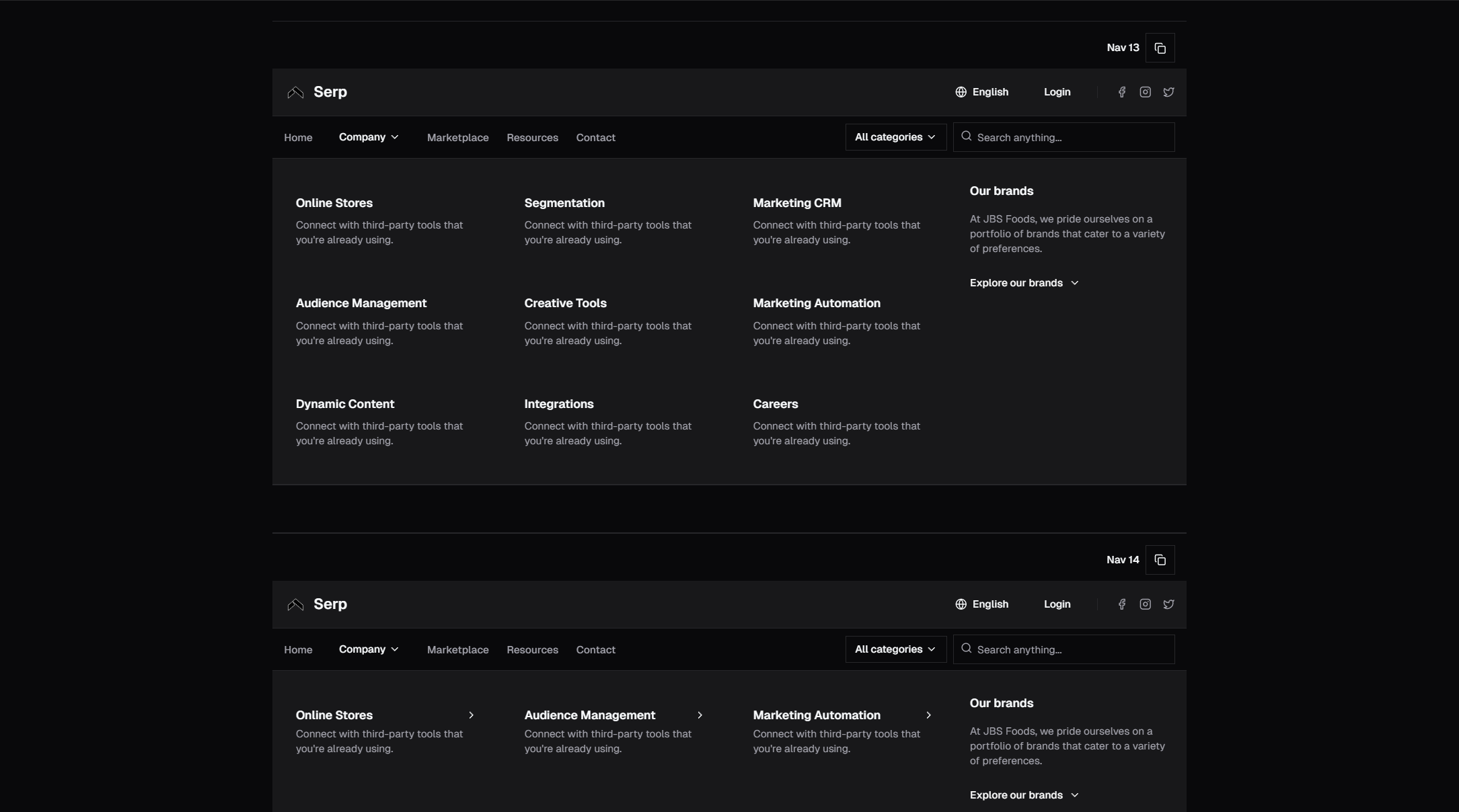
The navbar is the single most important UI component on any website. It is present on every page, it defines the primary user journey, and it is the first interactive element visitors encounter. A poorly built navbar creates friction across your entire application. A well-built one makes everything else easier.
The SERP Blocks navbar collection includes 17 navbar components covering every navigation pattern — sticky headers, transparent overlays, mega menus, mobile drawers, centered layouts, and authentication-aware variants. All built with Shadcn UI and Tailwind CSS, ready for React and Next.js projects.
Why Navbar Quality Matters More Than Any Other Component
Your navbar appears on every single page. If it renders slowly, every page is slow. If it shifts layout during load, every page has layout shift. If it is inaccessible, your entire site is inaccessible. No other component has this kind of multiplied impact on user experience and Core Web Vitals.
Beyond performance, the navbar defines information architecture. How you organize navigation links determines how visitors understand your product. Clear navigation groupings signal what your product does, who it is for, and where to find specific information. Confusing navigation creates confusion about your product itself.
Navbar Layout Patterns
Standard Horizontal Navbar
Logo on the left, navigation links in the center or right, and a CTA button (Sign Up, Get Started, Contact) on the far right. This is the default pattern for good reason — it matches the left-to-right reading flow and places the most important action in a visually prominent position.
Variants include:
Logo left, links center, CTA right — The most balanced layout. Works for sites with 4-7 primary links.
Logo left, links right — Compact layout for sites with fewer links. The CTA blends into the link group or sits at the end.
Logo center, links split — Links divided on either side of a centered logo. Common for brands where the logo is the primary visual anchor.
Sticky Navbar
A navbar that remains fixed at the top of the viewport as the user scrolls. Sticky navbars keep navigation accessible at all times, which is critical for long-form content pages, documentation, and single-page applications.
Implementation considerations:
Always sticky — The navbar is fixed from page load. Simple, predictable, and the most common approach.
Sticky on scroll up — The navbar hides when scrolling down and reappears when scrolling up. This preserves screen real estate on mobile while keeping navigation one scroll-reversal away. Requires a scroll direction listener in JavaScript.
Sticky with style change — The navbar starts transparent or minimal and gains a background color, shadow, or reduced height after scrolling past a threshold. This creates a smooth visual transition from hero section to content.
For sticky-on-scroll-up behavior in React, track the scroll position with useEffect and compare with the previous position stored in a useRef. Avoid using scroll event listeners directly on the window without throttling — use requestAnimationFrame or an IntersectionObserver for better performance.
Transparent Navbar
A navbar with a transparent background that overlays the hero section or a full-bleed image. The nav links and logo appear directly on top of the hero content. On scroll, the navbar transitions to a solid background.
Transparent navbars create a dramatic, immersive first impression. They work exceptionally well with hero sections that use full-width images or gradients. The SERP Blocks library includes 81 hero section designs, many of which are designed to pair with transparent navbar overlays.
Key design considerations for transparent navbars:
Text contrast — Ensure nav links are readable against the hero background. White text on a dark hero is the most reliable combination. For light hero backgrounds, use dark text or add a subtle gradient overlay to the hero.
Scroll transition — The transition from transparent to solid should be smooth. A CSS transition on the background-color property handles this cleanly.
Mobile behavior — When the mobile menu opens, switch to a solid background immediately. A transparent mobile menu over content is almost always unreadable.
Mega Menu Navbar
A navbar where hovering over or clicking a top-level link reveals a large dropdown panel with multiple columns of sub-links, descriptions, and sometimes images or icons. Mega menus are essential for sites with deep information architecture — e-commerce stores, enterprise SaaS platforms, documentation sites.
Mega menu structure typically includes:
Column groups — Sub-links organized into 2-4 columns, each with a group heading
Featured items — A highlighted section with an image, description, and CTA for a promoted page
Quick links — A row of popular or recently updated pages at the bottom of the panel
Building accessible mega menus requires careful attention to keyboard navigation. The dropdown should open on hover for mouse users and on click/Enter for keyboard users. Arrow keys should navigate between items within the dropdown. Escape should close it and return focus to the trigger link. Shadcn UI's NavigationMenu component handles much of this through Radix UI's primitives.
Mobile Drawer Navigation
On screens below your responsive breakpoint (typically 768px or 1024px), the navbar collapses into a hamburger icon that opens a full-height side drawer or a full-screen overlay with vertically stacked navigation links.
Mobile drawer patterns include:
Slide-in drawer — A panel slides in from the left or right edge, pushing or overlaying the main content. Includes close button and vertically stacked links.
Full-screen overlay — The menu takes over the entire viewport with large, tappable link targets. Often includes animations for link items (staggered fade-in).
Bottom sheet — The menu slides up from the bottom of the screen, following the mobile pattern popularized by maps and ride-share apps.
Dropdown panel — The menu slides down from the navbar, pushing content below it. Simpler than a drawer but can feel jarring with long link lists.
Shadcn UI's Sheet component is the ideal foundation for mobile drawer navigation. It provides the slide-in animation, backdrop overlay, close button, and focus trapping that accessible drawers require.
Centered Navbar
All elements — logo, links, and CTA — are centered horizontally. This pattern creates a symmetrical, balanced look that works well for creative portfolios, editorial sites, and brands with strong visual identity.
Centered navbars typically have fewer links (3-5) since horizontal space is shared equally on both sides of center. For sites with more navigation items, consider a centered logo with links on either side.
Navbar Performance Optimization
Because the navbar renders on every page, its performance characteristics are amplified across your entire site. Here are the specific optimizations that matter most.
Avoiding Layout Shift
Layout shift in the navbar is one of the most damaging CLS (Cumulative Layout Shift) issues because it affects every page. Common causes:
Web fonts loading late — The navbar text renders in a fallback font, then shifts when the custom font loads. Fix this by using
font-display: swapwith a size-matched fallback font, or by preloading your primary font.Dynamic content loading — A "Sign In" button that changes to a user avatar after authentication state resolves. Fix this by reserving the correct space with a skeleton or fixed-width container.
Image logos without dimensions — The logo image loads and pushes nav links to the right. Always specify
widthandheightattributes on your logo image, or use an SVG with explicit dimensions.
Reducing JavaScript
A static navbar with simple hover dropdowns does not need JavaScript for the desktop layout. CSS-only hover states using Tailwind's group-hover and peer utilities can handle dropdown visibility. Reserve JavaScript for:
Mobile drawer open/close state
Scroll-direction detection for sticky behavior
Authentication state management
Active link highlighting based on current route
Server Components in Next.js
In Next.js App Router, render the navbar as a Server Component by default. Only extract the interactive pieces — mobile menu toggle, dropdown triggers, user menu — into Client Components. This reduces the JavaScript bundle sent to the browser for every page load.
A common pattern: the navbar layout, logo, and static links render as a Server Component. A MobileMenuButton Client Component handles the hamburger toggle. A UserMenu Client Component handles authentication state. Everything else is server-rendered HTML with zero client-side JavaScript.
Accessibility Best Practices
Navigation accessibility is not optional — it is a legal requirement in many jurisdictions and a practical necessity for a significant portion of your users. Here are the specific accessibility patterns that every navbar must implement.
Keyboard Navigation
Every interactive element in the navbar must be reachable and operable with the keyboard alone:
Tab order — Links and buttons should follow a logical tab order (left to right, top to bottom)
Enter/Space — Activate buttons and links
Escape — Close any open dropdown or mobile menu
Arrow keys — Navigate within dropdown menus
Home/End — Jump to first/last item in a dropdown (optional but helpful)
ARIA Landmarks and Labels
The navbar should be wrapped in a <nav> element with an aria-label like "Main navigation." If your page has multiple <nav> elements (main nav, footer nav, breadcrumbs), each needs a unique aria-label so screen reader users can distinguish them.
For mobile menus, use aria-expanded on the hamburger button to communicate whether the menu is open or closed. Use aria-controls to link the button to the menu panel. Use aria-hidden on the menu panel when it is closed so screen readers do not announce hidden content.
Focus Management
When the mobile menu opens, focus should move to the first interactive element inside the menu (typically the close button or first link). When the menu closes, focus should return to the hamburger button that opened it. This focus trapping prevents keyboard users from getting lost behind an open menu overlay.
Shadcn UI's Sheet component handles focus management automatically through Radix UI's focus trapping utilities. If you are building a custom mobile menu, use the useFocusTrap pattern or Radix's FocusScope component.
Skip Navigation Link
A "Skip to main content" link should be the first focusable element on the page, appearing visually only on keyboard focus. This allows keyboard and screen reader users to bypass the navbar entirely and jump to the page content. Without a skip link, keyboard users must tab through every navbar link on every page load.
Implementation in Tailwind:
<a href="#main-content" className="sr-only focus:not-sr-only focus:absolute focus:top-4 focus:left-4 focus:z-50 focus:px-4 focus:py-2 focus:bg-background focus:text-foreground focus:rounded-md">
  Skip to main content
</a>
Mobile-First Navigation Design
With over 60% of web traffic coming from mobile devices, the mobile navigation experience is not a secondary concern — it is the primary one. Design the mobile navigation first, then adapt it for larger screens.
Touch Target Sizing
Mobile nav links need a minimum touch target of 44x44 pixels (Apple's Human Interface Guidelines) or 48x48 pixels (Google's Material Design). This means adequate padding on links, not just the text size. A 14px link with 12px vertical padding meets the minimum; a 14px link with 4px padding does not.
Thumb Zone Optimization
On mobile, the most accessible screen area is the bottom third — the natural resting position of the thumb. Consider placing the mobile menu trigger and primary actions within this zone. Bottom navigation bars (common in native apps) are increasingly appearing in web applications for this reason.
Reduced Navigation Items
Mobile screens cannot display 8 navigation links effectively. Prioritize the 4-5 most important links for the mobile navbar, and group secondary links under a "More" menu or within the drawer. The mobile drawer can contain the full navigation tree, but the visible navbar should be focused.
Pairing Navbars with Other Components
A cohesive navigation experience extends beyond the navbar. Consider how your navbar works with these related components from the SERP Blocks library:
Footer components — Your 21 footer options should mirror the navbar's link structure. Consistent naming and grouping across header and footer navigation helps users build a mental model of your site.
Hero sections — Transparent navbars pair with hero sections. The 81 hero designs in the library include options designed for navbar overlay.
Login components — Authentication-aware navbars link to login pages. The 17 login designs match the visual style of the navbar components.
Admin sidebar blocks — For authenticated dashboard experiences, the navbar transitions to a sidebar navigation. The 10 admin sidebar designs complement the navbar collection.
Choosing the Right Navbar for Your Project
For SaaS marketing sites: Sticky navbar with transparent-to-solid scroll transition. Include logo, 4-5 primary links, and a prominent CTA button. Use a mega menu if you have multiple product lines.
For e-commerce stores: Standard horizontal navbar with mega menu dropdowns for product categories. Include search, cart icon with item count, and account menu. The shopping cart components and product list blocks integrate with this pattern.
For documentation sites: Sticky navbar with search prominently featured. Include version selector and a link to the GitHub repository. Use breadcrumbs below the navbar for section context.
For portfolios: Minimal centered navbar with 3-4 links (Work, About, Contact). Transparent variant works well with full-bleed portfolio blocks.
For dashboards: Compact navbar with user menu, notifications, and search. Pair with an admin sidebar for the primary navigation in authenticated views.
Browse all 17 navbar components in the SERP Blocks navbar collection. Every component includes code for React, Next.js, Vue, and Astro, styled with Tailwind CSS and built on Shadcn UI primitives. Copy the code, adjust the links and branding, and ship.