13 Newsletter Signup Components That Grow Your Email List
Browse 13 newsletter signup components for React and Next.js — inline forms, popup modals, slide-in panels, footer-embedded captures, and full-page signups. Built with Shadcn UI and Tailwind CSS.
SERP Blocks Team
Product
Email remains the highest-ROI marketing channel in 2026. Social algorithms change, ad costs rise, and SEO traffic fluctuates — but your email list is yours. Every subscriber represents a direct line of communication that no platform can take away.
The problem is that most newsletter signup forms are an afterthought. A single input field jammed into the footer, no compelling reason to subscribe, and a generic "Subscribe" button. That approach might capture a fraction of your traffic, but it leaves the majority of potential subscribers on the table.
The SERP Blocks newsletter collection includes 13 newsletter signup components — each designed around a different capture strategy, from subtle inline forms to high-impact full-page signups.
Why Newsletter Signup Design Matters
The difference between a newsletter form that converts at 1% and one that converts at 5% comes down to three factors: placement, timing, and value proposition. A well-designed signup component addresses all three.
Placement determines how many visitors see the form. A footer-only form gets seen by the small percentage of users who scroll to the bottom. An inline form within content gets seen by everyone reading that section.
Timing determines when the ask appears. Hitting a new visitor with a popup on page load feels intrusive. Showing a slide-in after they've read 60% of an article feels natural — they've gotten value, and now you're offering more.
Value proposition determines whether they act. "Subscribe to our newsletter" converts poorly. "Get a weekly breakdown of React component patterns — free" converts well. The design of your signup form should make the value immediately obvious.
Newsletter Signup Patterns
Inline Forms
The most versatile pattern: a newsletter signup embedded directly within page content. Inline forms feel native to the page rather than interruptive. They work in blog posts (between sections or at the end), on landing pages (as a section), and within documentation.
A typical inline form includes:
A headline explaining what subscribers receive
A subheadline with frequency and content details
An email input field
A submit button with action-oriented copy
Optional: subscriber count for social proof
Inline forms convert well because they appear in context. A reader who just finished a useful article is primed to want more of that content. Placing the signup form right there captures that intent.
Variants include:
Single-line horizontal — Email input and button side by side, minimal vertical space
Stacked vertical — Input above button, wider layout, more room for supporting text
With name field — Captures first name for personalized emails
Card-style — Contained in a bordered card with background, stands out from surrounding content
Popup and Modal Signups
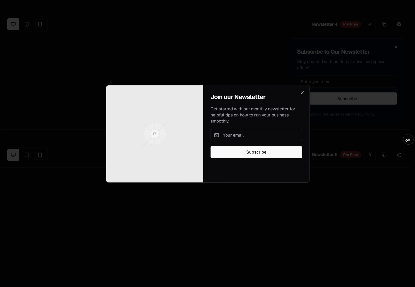
Full-screen or centered modal overlays that demand attention. When used thoughtfully, popup signups capture subscribers who wouldn't have noticed a passive inline form. When used poorly, they annoy visitors and increase bounce rates.
The key is triggering. Effective popup triggers include:
Exit intent — Mouse moves toward the browser's close button (desktop only)
Scroll depth — Visitor has scrolled past 50-70% of the page
Time on page — Visitor has been reading for 30+ seconds
Page count — Visitor is on their second or third page view
Popup variants include:
Centered modal — Standard overlay with backdrop blur
Full-screen takeover — Entire viewport dedicated to the signup
Two-column modal — Image on one side, signup form on the other
With lead magnet preview — Shows a thumbnail of the free resource being offered
Shadcn UI's Dialog component provides the accessible foundation — focus trapping, keyboard navigation, screen reader announcements — while the newsletter-specific content handles the marketing.
Slide-In Panels
Panels that slide in from the bottom-right corner or bottom edge of the viewport. Less interruptive than popups but more noticeable than inline forms. Slide-ins occupy a middle ground that works well for blogs and content sites.
Slide-in forms typically:
Appear after a scroll threshold or time delay
Can be dismissed with a close button
Stay visible as the user continues scrolling
Collapse to a minimized state after dismissal (rather than disappearing entirely)
This pattern respects the user's browsing while still making the signup opportunity visible. Many content sites find slide-ins convert better than popups because they don't block the content.
Footer-Embedded Signups
Newsletter forms built into the site footer. Every page on your site has a footer, which means every page has a signup opportunity. Footer signups are low-pressure — they're there for visitors who reach the bottom and want to stay connected.
Footer newsletter forms are typically compact:
A single line of text explaining the newsletter
An email input
A subscribe button
Optional: links to past issues or a sample newsletter
These pair naturally with footer navigation. The SERP Blocks footer collection (21 blocks) includes footer designs with integrated newsletter sections, but the dedicated newsletter components give you more flexibility in layout and messaging.
Full-Page Capture
An entire page dedicated to newsletter signup. This is the pattern used by dedicated landing pages for lead magnets, course signups, and premium newsletters. The full page gives you room to sell the value of subscribing with testimonials, content previews, and detailed descriptions.
Full-page signups work when:
You're driving paid traffic to the signup page
You have a strong lead magnet (ebook, template, course)
Your newsletter itself is the product (paid or freemium newsletter)
You're running a launch and want to build a waitlist
A full-page newsletter signup might include:
Hero section with headline and description
Social proof (subscriber count, testimonials, notable subscribers)
Content preview (sample of what subscribers receive)
The signup form itself
FAQ addressing common questions
This pattern combines well with hero sections (81 blocks) for the above-the-fold content and testimonial sections (40 blocks) for social proof.
Minimal Banner Signups
Thin banner-style signup forms that appear at the top or bottom of the page, similar to cookie consent bars. They take minimal space but remain persistently visible. Visitors can subscribe or dismiss them.
Banner signups are effective as a secondary capture mechanism — you might have an inline form in your content and a persistent banner for visitors who scroll past it.
Email Marketing Integration
Newsletter signup forms need to send subscriber data somewhere. The major integrations to consider:
ConvertKit (Kit)
Popular with creators and content-focused businesses. ConvertKit's API accepts a simple POST request with the email address and optional fields. Their form endpoints also support tags, allowing you to segment subscribers based on which form they signed up through.
For React applications, the integration typically looks like a server action or API route that forwards the form data to ConvertKit's API. This keeps your API key server-side and lets you add custom validation.
Mailchimp
The most widely used email platform. Mailchimp's API supports adding subscribers with merge fields, tags, and interest groups. Their double opt-in flow is the default, which helps maintain list quality.
Integration follows the same pattern: a server action handles the API call, manages errors (duplicate subscribers, invalid emails), and returns appropriate status messages to the frontend component.
Resend
A developer-focused email platform built for transactional and marketing emails. Resend's API is clean and modern, and it integrates well with React Email for designing newsletter templates in JSX.
For Next.js applications, Resend is particularly convenient because it shares the React ecosystem. You can design your newsletter template as a React component, use the same Tailwind CSS styling, and send through Resend's API.
Other Platforms
Buttondown, Beehiiv, Substack, and Loops all offer API-based subscriber management. The frontend component doesn't change — only the API route that processes the form submission needs to be adapted for each platform.
Lead Magnets and Incentives
A newsletter signup form with a compelling lead magnet converts 3-5x better than one without. The lead magnet gives visitors an immediate reason to subscribe rather than a vague promise of future value.
Effective lead magnets for developer and SaaS audiences include:
Templates and starter kits — Ready-to-use code, design files, or documents
Cheat sheets — Condensed reference guides for frameworks or tools
Email courses — Multi-day educational sequences delivered automatically
Exclusive content — Articles, tutorials, or resources not available publicly
Early access — First look at new features, products, or content
Discounts — Percentage off a product or service (works well for ecommerce)
Your newsletter signup component should visually communicate the lead magnet. Show a thumbnail of the PDF, mention the specific deliverable in the headline, and set expectations about what happens after signup.
A/B Testing Signup Forms
Small changes to newsletter forms can produce significant conversion differences. The elements worth testing:
Copy Variations
Headline: "Join 5,000 developers" vs. "Get weekly React tips"
Button text: "Subscribe" vs. "Get the free guide" vs. "Send me the tips"
Description: Frequency-focused ("Every Tuesday") vs. content-focused ("Component patterns, performance tips, and architecture decisions")
Design Variations
Input field size: Full-width vs. compact
Color contrast: Muted form vs. high-contrast CTA
Social proof: With subscriber count vs. without
Number of fields: Email-only vs. email + first name
Placement Variations
Above the fold vs. below the fold
After the first section vs. after the third section
Fixed position vs. scroll-embedded
Having 13 pre-built newsletter components makes A/B testing practical. You can swap between designs without rebuilding from scratch — test an inline form for two weeks, switch to a slide-in for two weeks, and compare results.
GDPR and Privacy Compliance
If any of your visitors are in the EU (and they almost certainly are), your newsletter signup forms need to comply with GDPR requirements.
The key requirements for newsletter signups:
Explicit consent — Pre-checked checkboxes don't count. The user must actively opt in
Clear purpose — Explain what they're signing up for: "marketing emails about our product" not just "updates"
Easy unsubscribe — Every email must include an unsubscribe link
Data transparency — Link to your privacy policy near the form
Double opt-in — Not legally required but strongly recommended as evidence of consent
Several of the SERP Blocks newsletter components include GDPR-ready consent checkboxes and privacy policy links. These elements are pre-styled and positioned correctly — you just need to link to your actual privacy policy.
For international audiences, consider also addressing:
CAN-SPAM (United States) — Requires physical mailing address in emails and honor opt-out requests within 10 days
CASL (Canada) — Requires express consent before sending commercial emails
LGPD (Brazil) — Similar to GDPR with consent and transparency requirements
Measuring Signup Performance
Track these metrics to understand how your newsletter forms perform:
Impression rate — What percentage of visitors see the form
Conversion rate — What percentage of those who see it subscribe
Quality rate — What percentage of subscribers open and click in subsequent emails
Unsubscribe rate — Are you attracting the right subscribers
A form that converts at 8% but produces subscribers who never open your emails is worse than a form that converts at 3% but attracts engaged readers.
Newsletter Signups in Context
Newsletter forms appear across your entire site. Here's where each pattern fits:
Blog Pages
Inline forms between content sections or at the article's end. Blog readers are your highest-intent audience for newsletters — they're already consuming your content. Pair with blog list layouts (27 blocks) and blog single layouts (12 blocks).
Landing Pages
Full-page capture or prominent inline forms. When the newsletter is your primary conversion goal, give it prime real estate. Combine with hero sections (81 blocks) and CTA sections (32 blocks).
Ecommerce Sites
Footer-embedded or slide-in forms offering discount codes in exchange for signup. Pair with product sections (25 blocks) and pricing pages (21 blocks).
SaaS Applications
In-app banners or modals for product update newsletters. Users who are already in your product are great candidates for feature announcement newsletters.
Related Block Categories
Newsletter forms often combine with:
| Section | Category | Count |
| Call to Action | CTA | 32 |
| Contact Forms | Contact | 33 |
| Blog Layouts | Blog List | 27 |
| Page Footers | Footer | 21 |
| Popup Dialogs | Modal | 13 |
| Cookie Consent | Cookie | 10 |
SERP Blocks includes 1200+ total blocks across 50+ categories. 60 are free, with the full library available through a one-time Pro purchase.