10 Order Confirmation Page Designs with Shadcn UI
Explore 10 order confirmation page designs built with Shadcn UI. From minimal receipts to rich post-purchase experiences with tracking, upsells, and cross-sell CTAs — all ready to drop into your Next.js store.
SERP Blocks Team
Product
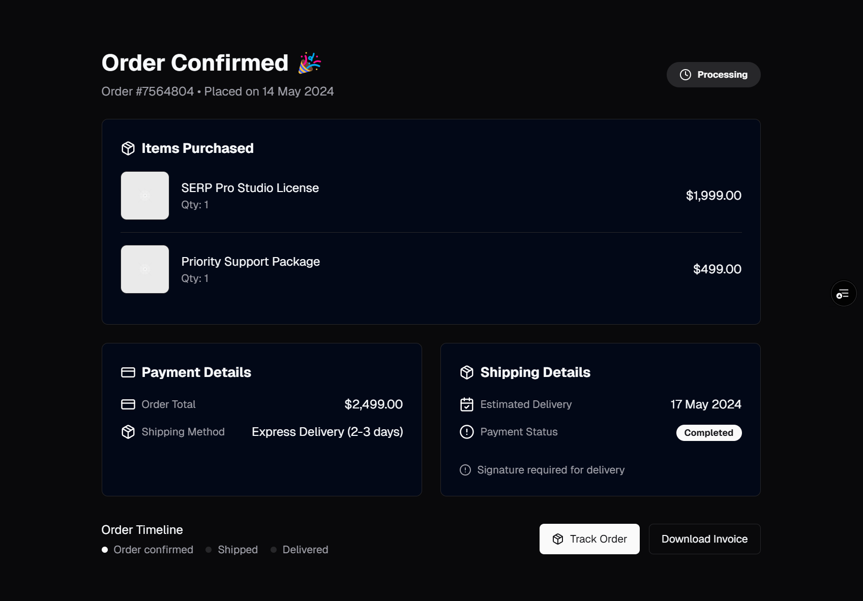
The order confirmation page is the most neglected page in e-commerce. Teams spend months perfecting the product page and checkout flow, then slap a generic "Thank you for your order" message at the end and move on. That is a mistake. The confirmation page is the first touchpoint of the post-purchase experience — and the post-purchase experience determines whether a customer comes back.
A strong confirmation page does three things. It reassures the buyer that their order went through correctly. It sets clear expectations for delivery. And it creates an opportunity to deepen the relationship with cross-sell recommendations, account creation prompts, or newsletter signups. The difference between a confirmation page that just confirms and one that converts is the difference between a one-time buyer and a repeat customer.
The order confirmation collection in SERP Blocks provides 10 distinct designs that cover the full spectrum of post-purchase page patterns. Let's walk through each one and discuss when to use it.
Why Confirmation Pages Matter
Before looking at the designs, it is worth understanding the psychology behind this page. The moment after a purchase is a unique emotional state. The buyer has just made a financial commitment and needs validation that it was the right decision. This is the peak of "post-purchase dissonance" — the buyer is most susceptible to doubt, but also most open to positive reinforcement.
Research from the Harvard Business Review found that emotionally engaged customers are three times more likely to repurchase. The confirmation page is your first chance to create that emotional engagement after the transaction. A cold, minimal confirmation says "we got your money." A warm, detailed confirmation says "we are taking care of you."
There is also a practical conversion angle. Confirmation pages have near-100 percent viewability — every buyer who completes checkout sees this page. That makes it the highest-traffic page in your post-checkout funnel, and potentially your best-performing page for cross-sell impressions.
The 10 Confirmation Page Designs
Design 1: The Clean Receipt
The foundation pattern. A centered card with a green checkmark icon, "Order Confirmed" heading, order number, and a clean line-item receipt showing each product with quantity and price. Below the receipt: subtotal, shipping, tax, and total. A single "Continue Shopping" button at the bottom.
This layout works for stores that want speed and simplicity. The buyer sees everything they need in one glance — what they ordered, what they paid, and their order reference number. No distractions, no upsells, no friction. It loads fast, renders cleanly on mobile, and gets out of the way.
Best for: digital products, low-SKU stores, B2B purchases where the buyer does not want a marketing experience after checkout.
Design 2: Receipt with Shipping Timeline
Builds on the clean receipt by adding a vertical timeline component showing the order fulfillment stages: Order Placed, Processing, Shipped, Out for Delivery, Delivered. The current stage is highlighted with an active color, and future stages are muted.
The timeline sets delivery expectations visually. Instead of "Your order will arrive in 5-7 business days" as text, the buyer sees a progress tracker that contextualizes where their order is right now. This reduces "Where is my order?" support tickets dramatically.
Below the timeline, include estimated delivery dates for each stage and a note about when to expect a shipping confirmation email. This design pairs naturally with a tracking page that reuses the same timeline component.
Best for: physical products, stores with predictable fulfillment timelines, subscription boxes.
Design 3: Order Summary with Product Images
A more visual approach. Instead of a text-only receipt, each line item shows the product thumbnail alongside the name, variant (size, color), quantity, and price. The product images reinforce the buyer's decision — they see exactly what is coming, which reduces anxiety and returns.
The layout uses a two-column grid on desktop (order details on the left, order summary on the right) and stacks to a single column on mobile. The right column includes a subtle card with the payment method used (last four digits of the card), billing address, and shipping address.
Best for: fashion, home goods, any product category where visuals drive the purchase decision.
Design 4: Confirmation with Cross-Sell Section
This design adds a "You Might Also Like" product grid below the order confirmation. Four to six product cards from the product list collection (20 designs) show related or complementary items with images, titles, prices, and "Add to Cart" buttons.
The cross-sell section is the highest-value addition you can make to a confirmation page. The buyer already has their payment method on file and has demonstrated willingness to purchase. Showing relevant products at this moment captures impulse buys that would otherwise require a return visit.
The key is relevance. Do not show random products. Show items that complement what was just purchased — a phone case for a phone, matching accessories for an outfit, refill supplies for a device. Use your recommendation engine or manually curated product associations.
Best for: stores with accessory ecosystems, fashion brands, consumables, any store optimizing for average order value.
Design 5: Detailed Order with Delivery Map
A premium confirmation experience. The order details appear alongside an embedded map showing the delivery address with a pin marker. Below the map, a card shows the shipping carrier, estimated delivery window, and a tracking number that links directly to the carrier's tracking page.
The map adds a visual anchor that makes the confirmation feel concrete and personal. It also serves a practical purpose — the buyer can verify at a glance that the delivery address is correct. If they spot an error, a "Need to change your delivery address?" link connects to customer support before the order ships.
Best for: stores shipping high-value items, same-day delivery services, international shipping where address accuracy matters.
Design 6: Minimal Confirmation with Email Prompt
The most stripped-down design. A large checkmark animation, the order number, a one-line message ("A confirmation email has been sent to your@email.com"), and two buttons: "View Order Details" and "Continue Shopping." That is it.
This works when you want the confirmation email to carry the weight of the post-purchase experience. The page itself is a waypoint — it confirms success and redirects the buyer's attention to their inbox, where a richer, more detailed confirmation email is waiting.
The design includes a subtle prompt: "Didn't receive the email? Check your spam folder or resend confirmation." This handles the common anxiety of not receiving a confirmation email immediately.
Best for: digital products with instant delivery, stores with strong email marketing programs, mobile-first audiences where screen real estate is limited.
Design 7: Confirmation with Account Creation
For guest checkout buyers, this design adds an account creation prompt alongside the order confirmation. A card says "Save your information for faster checkout next time" with email (pre-filled from checkout), password, and confirm password fields, plus a "Create Account" button.
Guest checkout is critical for reducing cart abandonment — forcing account creation before purchase drives buyers away. But the confirmation page is the perfect moment to ask. The buyer has already trusted you with their payment information and personal details. Creating an account is a small incremental step that lets them track orders, save addresses, and check out faster next time.
The design positions account creation as a benefit to the buyer, not a request from the store. The language matters: "Save your details for next time" is better than "Create an account."
Best for: stores with high repeat purchase rates, subscription products, stores building a loyalty program.
Design 8: Rich Confirmation with Order Actions
A feature-dense design for complex orders. The confirmation includes the full order summary, a shipping timeline, and a row of action buttons: "Track Order," "Download Invoice," "Contact Support," and "Return or Exchange."
Each action opens a relevant page or modal. The invoice button generates a PDF receipt. The support button opens a pre-filled contact form with the order number. The return button links to the return initiation flow built with the refund status collection (10 designs).
This design acknowledges that the confirmation page is often bookmarked or revisited. Buyers return to it to check order details, download receipts for expense reports, or initiate returns. Making these actions directly accessible from the confirmation page reduces support load and improves the self-service experience.
Best for: B2B stores, high-value purchases, stores with complex return policies, enterprise customers who need invoices.
Design 9: Confirmation with Newsletter and Social
This design integrates post-purchase marketing directly into the confirmation page. Below the order summary, a section invites the buyer to subscribe to the newsletter using a block from the newsletter collection (13 designs), follow the brand on social media, or share their purchase.
The newsletter signup is particularly effective here. The buyer has just completed a purchase, which is the strongest signal of brand interest. A simple "Get notified about new arrivals and exclusive offers" prompt with an email field (pre-filled from checkout) and a subscribe button converts at significantly higher rates than a popup on a random page.
Social sharing adds organic reach. A "Share your purchase" section with pre-formatted tweets or Instagram story templates turns buyers into brand advocates. Include the product image and a short message like "Just ordered [product] from [store]!" with share buttons for major platforms.
Best for: DTC brands, fashion and lifestyle stores, stores investing in community building, brands with active social media presence.
Design 10: Split-Screen Confirmation with Upsell
A bold, full-width layout. The left half shows the order confirmation with all the essentials — checkmark, order number, summary, delivery estimate. The right half is a dedicated upsell section with a time-limited offer: "Add this to your order within 15 minutes and get 20% off."
The countdown timer creates urgency. The single-product focus avoids decision fatigue — instead of showing six product cards, show one carefully selected product with a compelling discount. The "Add to Order" button processes a secondary charge through Stripe without requiring the buyer to re-enter payment details (using the saved PaymentMethod from the original purchase).
This is the most aggressive conversion-oriented design in the collection. Use it carefully — some buyers will appreciate the offer, while others may feel pressured. Test it against a simpler design to find the right balance for your audience.
Best for: stores with clear accessory or add-on products, subscription services offering an upgrade, brands comfortable with time-limited post-purchase offers.
Post-Purchase Experience Design Principles
Across all ten designs, several principles hold true:
Reduce Buyer's Remorse
The confirmation page should make the buyer feel good about their purchase. This means:
Positive language — "Great choice!" or "Your order is on its way" instead of clinical "Order #12345 received"
Product images — Seeing the products they just bought reinforces the decision
Social proof — "Rated 4.8/5 by 2,400 customers" next to the purchased product
Delivery clarity — Knowing exactly when the order arrives reduces anxiety
Set Clear Expectations
Tell the buyer what happens next. A simple "What's next" section eliminates uncertainty:
You will receive a confirmation email within a few minutes
We will send a shipping notification with tracking when your order ships
Estimated delivery: March 22-24, 2026
Each step includes a timeline so the buyer knows what to expect and when.
Create Return Pathways
Every confirmation page should include a clear path back to the store. "Continue Shopping" is the minimum, but consider more specific CTAs based on what was purchased. If the buyer just bought running shoes, link them to the running apparel category. If they bought a coffee maker, link them to coffee beans and filters.
The product list collection (20 designs) provides the grid and card layouts for these recommendation sections. The shop category collection (20 designs) provides category landing pages to link to.
Handling Edge Cases
Not every order confirmation is straightforward. Account for these scenarios:
Partial Fulfillment
When an order contains items with different fulfillment timelines (e.g., one in-stock item and one backordered item), the confirmation page should show separate delivery estimates per item. Group items by expected delivery date and show a timeline for each group.
Digital Delivery
For digital products, the confirmation page should include immediate download links or access instructions. Do not make the buyer wait for an email. A "Download Now" button with a fallback "We've also emailed your download links" message handles both immediate access and record-keeping.
Failed Payment Recovery
If the payment appears to fail but actually succeeds (network timeout, browser crash), the buyer may end up confused. Design a recovery flow where they can enter their email on a "Check Order Status" page and see their confirmation if the payment went through. This prevents duplicate orders from panicked buyers who attempt to recheck out.
Connecting to the Full Post-Purchase Flow
The confirmation page is just the beginning of the post-purchase experience. SERP Blocks provides components for the entire journey after checkout:
Refund and return tracking — The refund status collection (10 designs) provides interfaces for return requests, refund progress tracking, and return shipping label generation. Link to these from the confirmation page's "Return or Exchange" action.
Product reviews — After delivery, prompt the buyer to leave a review. The reviews collection (13 designs) handles review submission forms and star rating inputs.
Newsletter engagement — The newsletter collection (13 designs) provides signup forms and preference centers for ongoing email engagement.
Account management — The account overview collection (10 designs) gives buyers a dashboard to view past orders, manage addresses, and track active shipments.
Technical Implementation Notes
Server-Side Rendering vs. Client Components
Render the confirmation page as a server component that fetches order data from your database. Pass the order data to client components only where interactivity is needed (countdown timers, add-to-order buttons, newsletter signup forms). This keeps the initial page load fast and SEO-friendly.
// app/order-confirmation/page.tsx
import { getOrderByPaymentIntent } from "@/lib/orders";

export default async function OrderConfirmationPage({
  searchParams,
}: {
  searchParams: { payment_intent?: string };
}) {
  const order = await getOrderByPaymentIntent(
    searchParams.payment_intent ?? ""
  );

  if (!order) {
    return <OrderNotFound />;
  }

  return (
    <div className="container max-w-4xl py-12">
      <OrderConfirmationHeader orderNumber={order.id} />
      <OrderSummary items={order.items} totals={order.totals} />
      <ShippingTimeline
        address={order.shippingAddress}
        estimatedDelivery={order.estimatedDelivery}
      />
      <CrossSellSection categoryId={order.items[0].categoryId} />
    </div>
  );
}
Security Considerations
Never expose sensitive order data in URL parameters. The payment_intent ID is safe to use because it only maps to order data through your server-side lookup. Do not put the full order details, customer email, or billing information in the URL.
For guest buyers without an account, generate a unique, non-guessable order access token and use that as the URL parameter instead. Store the token alongside the order in your database and expire it after 30 days.
Analytics and Conversion Tracking
The confirmation page is where you fire your conversion tracking pixels. Set up:
Google Analytics 4 purchase event with transaction ID, revenue, and item details
Facebook/Meta Conversion API purchase event (server-side for accuracy)
Any affiliate tracking pixels with the order total and commission-eligible items
Fire these events server-side through the Stripe webhook handler for reliability, not from client-side JavaScript that might be blocked by ad blockers.
Choosing the Right Design
Match the confirmation design to your store's personality and business model:
| Store Type | Recommended Design | Why |
| Digital products | Design 6 (Minimal) | Instant delivery, email-focused |
| Fashion/DTC | Design 4 (Cross-Sell) | Maximize AOV with accessories |
| B2B/Enterprise | Design 8 (Order Actions) | Invoice downloads, support access |
| Subscription | Design 7 (Account Creation) | Convert guest buyers to accounts |
| High-value goods | Design 5 (Delivery Map) | Address verification, trust building |
| Community brands | Design 9 (Newsletter + Social) | Post-purchase engagement |
All 10 order confirmation designs are available in the SERP Blocks library alongside 1200+ other blocks across 50+ categories. Start with 60 free blocks or unlock the full collection with a one-time Pro purchase. Copy the code into your Next.js project, connect your order data, and give your buyers a confirmation experience that brings them back.