15 Payment Form Components: Checkout UI with Shadcn
Build secure, high-converting checkout experiences with 15 payment form components for React and Next.js. Credit card forms, multi-step checkout, Stripe Elements integration, Apple Pay and Google Pay patterns. Built with Shadcn UI and Tailwind CSS.
SERP Blocks Team
Product
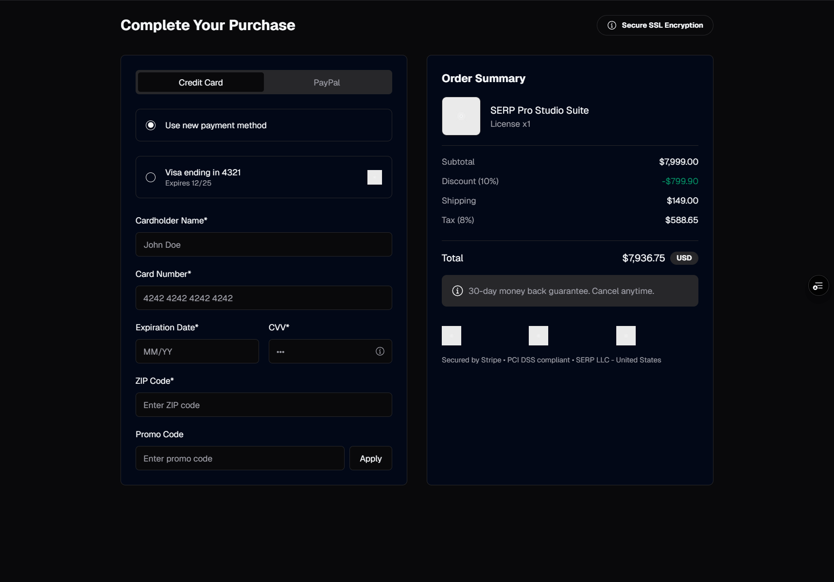
The payment form is where revenue happens. Every field, every label, every validation message on this page directly impacts whether a customer completes their purchase or closes the tab. Baymard Institute's checkout research shows that 18 percent of cart abandonments happen because the checkout process is too long or complicated, and another 17 percent happen because customers do not trust the site with their credit card information. The payment form must solve both problems simultaneously — it needs to be short and simple while also projecting security and professionalism.
Building a production-quality payment form from scratch is one of the hardest frontend tasks in e-commerce. You need form validation with real-time feedback, credit card number formatting, address autocomplete, multi-step flow management, error handling for declined payments, responsive layouts that work on every device, and the visual polish that makes customers feel safe entering their financial information. That is a week of development time, and that is before you integrate Stripe, handle PCI compliance, or add express payment methods like Apple Pay and Google Pay.
SERP Blocks includes 15 payment form blocks covering every major checkout pattern used in production e-commerce. From single-page checkouts to multi-step wizards, from traditional credit card forms to express payment buttons. Combined with 11 shopping cart blocks and 10 order confirmation blocks, they form a complete 36-component purchase flow built with Shadcn UI and Tailwind CSS.
Checkout Layout Patterns
Single-Page Checkout
The single-page checkout puts everything on one screen: shipping address, billing address, payment method, and order summary. The customer fills in the fields from top to bottom and clicks a single "Place Order" button at the end.
Advantages of single-page checkout:
Fewer page loads — No waiting for the next step to load. The entire form is present from the start, and submission is a single action.
Full visibility — Customers can see every field they need to fill out before they start. There are no surprises on "the next step." This transparency reduces anxiety.
Faster for returning customers — With autofill, a returning customer can complete a single-page checkout in seconds. Browser autofill works best when all address and payment fields are on the same page.
The single-page checkout blocks in the payment form collection use a two-column layout on desktop: form fields on the left (65 percent width) and order summary on the right (35 percent width). On mobile, the order summary collapses into an expandable section at the top, and the form fields stack vertically below it. This keeps the mobile layout focused on form completion while still allowing customers to review their order.
Field grouping matters on single-page checkouts. The fields are organized into clearly labeled sections — "Shipping Address," "Billing Address," "Payment Method" — separated by visual dividers. Each section uses a heading and consistent spacing. Without this structure, a single-page checkout with 15-20 fields feels overwhelming. With it, the form reads as three small forms rather than one large one.
Multi-Step Checkout
The multi-step checkout breaks the process into distinct phases, typically three:
Shipping — Name, address, and delivery method selection
Payment — Credit card or alternative payment method
Review — Order summary with all details before final submission
A progress indicator at the top of the form shows which step the customer is on and which steps remain. Shadcn UI's stepper or breadcrumb-style progress indicators work well here. The customer can click back to previous steps to edit information without losing their progress.
Multi-step checkout is the better choice when:
The form is long — If your checkout includes gift options, delivery instructions, account creation, loyalty program enrollment, or other optional fields, a single page becomes too dense. Multi-step lets you separate required fields from optional ones.
Mobile is the primary device — On small screens, a 20-field single-page form requires excessive scrolling. Three steps with 5-7 fields each feel more manageable.
You want to capture email early — The first step of a multi-step checkout typically captures the customer's email address. If the customer abandons after step one, you have their email for cart abandonment recovery campaigns. This is a significant revenue recovery strategy for most e-commerce stores.
Shipping affects pricing — When the delivery method selection changes the total (express shipping, in-store pickup, international shipping), it makes sense to collect shipping information first, show the updated total, and then proceed to payment.
The multi-step payment form blocks include built-in step management with forward/backward navigation, step validation (you cannot proceed to payment until the shipping address is valid), and state persistence (navigating back to a previous step retains all entered data).
Express Checkout
Express checkout layouts prioritize speed for returning customers and customers using digital wallets. The primary payment action is a large Apple Pay, Google Pay, or Shop Pay button at the top of the page. Below it, a divider with "Or pay with card" leads to the traditional credit card form as a fallback.
This pattern acknowledges that a significant and growing percentage of online transactions use digital wallets. Apple Pay and Google Pay handle shipping address, billing address, and payment in a single biometric confirmation — no typing required. For customers with digital wallets configured, express checkout reduces the entire process to two taps: the payment button and the biometric confirmation.
The express checkout blocks in SERP Blocks include properly sized and positioned button areas for Apple Pay and Google Pay, with the traditional form below. The digital wallet buttons are designed to match Apple and Google's brand guidelines for button sizing, spacing, and labeling.
Credit Card Form Design
The credit card input area is the most sensitive part of the checkout. Its design directly influences whether customers trust the page enough to enter their card number.
Card Number Input
The card number field should format the input as the customer types, inserting spaces every four digits (4242 4242 4242 4242). This formatting makes the number easier to verify visually and matches the physical layout of digits on the card itself.
Card brand detection happens in real time. As soon as the customer types the first few digits, the form identifies the card network (Visa, Mastercard, Amex, Discover) and displays the corresponding logo inside or adjacent to the input field. This visual confirmation reassures the customer that the form recognizes their card type.
Implementation note: if you are using Stripe Elements, the CardElement or CardNumberElement handles formatting and brand detection automatically. The SERP Blocks payment form blocks designate a clean mounting area for Stripe Elements so the Stripe-rendered input fits seamlessly into the form's visual design.
Expiration and CVC
Expiration date and CVC fields sit on the same row, typically in a 50/50 or 60/40 split. The expiration field accepts MM/YY format with auto-formatting (typing "1" followed by "2" produces "12/"). The CVC field shows 3 digits for Visa/Mastercard and 4 digits for Amex, adjusting its maxlength based on the detected card brand.
A small card icon or tooltip next to the CVC field showing where the CVC is located on the physical card helps customers who are unfamiliar with the term. This is a small detail that reduces support requests.
Billing Address
The billing address section includes street address, apartment/suite (optional), city, state/province, ZIP/postal code, and country. If the billing address matches the shipping address, a checkbox labeled "Same as shipping address" at the top of the section lets the customer skip all billing address fields. This checkbox should be checked by default — the majority of orders ship to the billing address.
When the checkbox is checked, the billing address fields either hide completely or display as read-only text showing the shipping address. Hiding is cleaner; displaying as read-only provides explicit confirmation. The payment form blocks in SERP Blocks include both approaches.
Form Validation and Error Handling
Checkout form validation has higher stakes than typical form validation. A validation error on a contact form is a minor annoyance. A validation error on a payment form can mean a lost sale. Validation should be helpful, immediate, and non-disruptive.
Real-Time Validation
Validate fields as the customer interacts with them, not after they click "Place Order":
On blur — Validate when the customer leaves a field. If they tabbed past the ZIP code field and it is empty, show the error immediately. Do not wait for form submission.
On change (after first blur) — Once a field has been blurred and shows an error, clear the error as soon as the input becomes valid. If the customer types a valid ZIP code, the error disappears while they type, not when they leave the field.
On submit — If any fields are still invalid when the form is submitted, scroll to the first error, focus the field, and show all errors simultaneously. This catches any fields the customer skipped.
Error Message Copy
Error messages on payment forms should be specific and actionable:
"Please enter your card number" instead of "This field is required"
"Please enter a valid expiration date (MM/YY)" instead of "Invalid format"
"Your card was declined. Please try a different payment method." instead of "Payment failed"
"We could not verify your address. Please check your ZIP code." instead of "Invalid address"
Avoid technical language. "The PaymentIntent status is requires_action" means nothing to a customer. Translate every error into plain language.
Declined Payment Handling
When a payment is declined, the form needs to handle it gracefully:
Show a clear error message at the top of the payment section, not in a generic toast notification. The message should appear exactly where the customer is looking.
Do not clear the form — The customer may want to fix a single digit in their card number, not re-enter everything from scratch.
Suggest alternatives — "Your card was declined. You can try a different card or pay with Apple Pay." Give the customer a path forward rather than a dead end.
Log the attempt — On the server, log declined payments for fraud analysis. Multiple rapid declines from the same session may indicate card testing fraud.
Security UX: Building Visual Trust
Customers entering credit card information are making a trust decision. The visual design of the payment form either reinforces or undermines that trust. Security UX is not about actual security (that is handled by Stripe and PCI compliance) — it is about perceived security.
Trust Signals
Elements that increase perceived security on a payment form:
Lock icon — A small lock icon in the payment section header or next to the "Place Order" button. This is a universal symbol for security that customers recognize instantly.
"Secure checkout" label — Text like "Secure Checkout" or "Protected by 256-bit encryption" near the payment fields. While every HTTPS connection uses encryption, explicitly stating it reassures customers.
Payment brand logos — Visa, Mastercard, Amex, and Discover logos displayed near the card input. These logos signal that the form is a legitimate payment processor, not a phishing page.
Trust badges — Norton Secured, McAfee Secure, or your payment processor's badge (e.g., "Powered by Stripe"). Stripe's badge is particularly effective because Stripe is a recognizable brand associated with security.
SSL indicator — While browsers show HTTPS in the address bar, repeating "SSL Secured" on the form reinforces the message for customers who do not check the address bar.
Visual Isolation
The payment section should feel visually distinct from the rest of the form. A subtle card-like container with a slightly different background color, a border, or a shadow separates the payment fields from the shipping address fields. This isolation signals "this is the sensitive part" and focuses the customer's attention.
Several of the payment form blocks in SERP Blocks use this pattern — the payment method section sits inside a card component with a light border and a lock icon in the header, visually elevated from the surrounding form sections.
PCI Compliance Considerations
PCI DSS (Payment Card Industry Data Security Standard) compliance is mandatory for any business that handles credit card data. The good news for React developers: if you use Stripe Elements, you offload nearly all PCI compliance responsibility to Stripe.
Here is how it works:
Stripe Elements renders the card input in an iframe — The credit card number, expiration, and CVC fields are rendered by Stripe inside an iframe on your page. Your JavaScript code never has access to the raw card data. It never touches your server.
Your responsibility is SAQ A — The simplest PCI self-assessment questionnaire. You attest that you do not store, process, or transmit card data and that you use a PCI-compliant third party (Stripe) for payment processing.
Your form handles everything else — Shipping address, billing address, name, email, phone, and promo codes are all handled by your form. Only the card fields are delegated to Stripe.
This architecture is why SERP Blocks payment form blocks designate a specific area for the payment method input — a container where you mount the Stripe CardElement. The form layout, validation, and styling for all non-card fields are handled by the block. The card input is handled by Stripe. The two integrate visually through Stripe's styling API, which lets you match the CardElement's font, color, and spacing to the rest of your form.
const CARD_ELEMENT_OPTIONS = {
  style: {
    base: {
      fontSize: "16px",
      fontFamily: "Inter, system-ui, sans-serif",
      color: "#1a1a1a",
      "::placeholder": { color: "#a3a3a3" },
    },
    invalid: { color: "#dc2626" },
  },
};
Multi-Step Checkout Implementation
Building a multi-step checkout in React requires managing step state, validation per step, and data persistence across steps. Here is the structural approach used in the SERP Blocks multi-step payment form blocks:
Step Management
Each step is a separate component that receives the shared form data and an onComplete callback. The parent component tracks the current step and renders the appropriate child:
const steps = [
  { id: "shipping", label: "Shipping", component: ShippingStep },
  { id: "payment", label: "Payment", component: PaymentStep },
  { id: "review", label: "Review", component: ReviewStep },
];

const [currentStep, setCurrentStep] = useState(0);
const [formData, setFormData] = useState<CheckoutFormData>({});

const StepComponent = steps[currentStep].component;
Step Validation
Each step validates its own fields before allowing navigation to the next step. The shipping step validates name, address, city, state, and ZIP. The payment step validates the card input (via Stripe's validation) and the billing address. The review step has no validation — it simply displays a summary.
Using React Hook Form with Zod schemas per step provides type-safe validation:
const shippingSchema = z.object({
  firstName: z.string().min(1, "First name is required"),
  lastName: z.string().min(1, "Last name is required"),
  address: z.string().min(1, "Address is required"),
  city: z.string().min(1, "City is required"),
  state: z.string().min(2, "State is required"),
  zip: z.string().regex(/^\d{5}(-\d{4})?$/, "Enter a valid ZIP code"),
});
Progress Indicator
The progress indicator at the top of the checkout shows all steps with their labels, highlights the current step, and marks completed steps with a checkmark. Clicking a completed step navigates back to it. Clicking a future step does nothing (you cannot skip ahead).
Shadcn UI does not include a stepper component out of the box, but the pattern is straightforward to build with Shadcn primitives. A horizontal flex container with step circles, connecting lines, and labels. The SERP Blocks multi-step payment form blocks include this progress indicator as part of the block.
Apple Pay and Google Pay Integration
Digital wallets are growing rapidly. Apple Pay processes over 10 billion transactions annually, and Google Pay is available on over 150 million devices. Offering these payment methods is no longer optional for serious e-commerce stores.
Stripe Payment Request Button
Stripe provides the Payment Request Button, which renders an Apple Pay button on Safari/iOS, a Google Pay button on Chrome/Android, and a Microsoft Pay button on Edge. One API, three payment methods.
The integration works by creating a PaymentRequest object with the order total and shipping options. When the customer clicks the button, their operating system's native payment sheet appears with their saved cards, shipping addresses, and biometric confirmation. The entire checkout happens in the native UI — no form fields needed.
const paymentRequest = stripe.paymentRequest({
  country: "US",
  currency: "usd",
  total: { label: "Your Store", amount: totalInCents },
  requestShipping: true,
  requestPayerEmail: true,
});
The express checkout blocks in SERP Blocks include a prominently placed area for the Payment Request Button at the top of the checkout, with the traditional card form below as a fallback. The layout follows the pattern established by Shopify: digital wallet buttons first, "Or pay with card" divider, traditional form second.
Availability Detection
Not every customer has Apple Pay or Google Pay configured. The Payment Request Button checks availability before rendering:
const [canMakePayment, setCanMakePayment] = useState(false);

useEffect(() => {
  paymentRequest.canMakePayment().then((result) => {
    setCanMakePayment(!!result);
  });
}, [paymentRequest]);
If digital wallets are not available, the express payment section hides and the traditional form takes its place. The payment form blocks handle this gracefully — the layout adapts whether the express section is visible or not.
From Payment to Order Confirmation
After a successful payment, the customer needs immediate confirmation. The 10 order confirmation blocks handle this final step:
Order number and status — A prominent order number with a "confirmed" badge. This is the first thing the customer sees and the number they will reference for any follow-up.
Items purchased — A summary of cart items with images, names, quantities, and prices. This is the digital equivalent of a receipt.
Shipping details — The delivery address, shipping method, and estimated delivery date.
Payment summary — The payment method used (last four digits of the card), subtotal, shipping, tax, discounts, and total charged.
Next actions — "Track your order," "Continue shopping," and "Create an account" (for guest checkouts) as clear call-to-action buttons.
The transition from payment confirmation to order confirmation should be instantaneous. Use Stripe's PaymentIntent confirmation response to populate the order confirmation page directly — do not make the customer wait for a webhook or background process.
Connected E-commerce Blocks
The payment form is one piece of a larger checkout ecosystem. Here is how it connects to other SERP Blocks categories:
| Category | Blocks | Relationship to Payment Form |
| Shopping Cart | 11 | Feeds cart data into checkout |
| Payment Form | 15 | The checkout itself |
| Order Confirmation | 10 | Post-payment receipt |
| Product | 25 | Product pages driving purchases |
| Contact | 33 | Support forms for payment issues |
| FAQ | 21 | Shipping and return policy pages |
Getting Started with Payment Forms
Building a checkout flow with SERP Blocks follows a clear path:
Pick a checkout pattern — Browse the payment form blocks and choose single-page, multi-step, or express checkout based on your product and audience.
Mount Stripe Elements — Install
@stripe/react-stripe-jsand@stripe/stripe-js, create your Stripe account, and mount the CardElement in the designated payment field area of the block.Wire up the cart — Connect a shopping cart block to feed item data and totals into the checkout page.
Add order confirmation — Drop in an order confirmation block and populate it from the Stripe PaymentIntent response.
Test with Stripe test mode — Use Stripe's test card numbers (4242 4242 4242 4242) to run through the entire flow before going live.
SERP Blocks includes 60 free blocks to start building with. For the complete checkout block set and all 1,200+ components across 55 categories, a one-time Pro purchase at blocks.serp.co unlocks everything permanently. No subscription fees, no per-project limits — one purchase covers every project you build.
The checkout page is the last thing standing between a browser and a buyer. Start with a proven layout, integrate Stripe for secure payment processing, and spend your development time on the business logic that differentiates your store. The UI is solved.