20 Portfolio Layouts for Developers and Designers
Browse 20 portfolio layouts for React and Next.js — project grids, case study pages, filterable galleries, and minimal showcases. Built with Shadcn UI and Tailwind CSS for freelancers, agencies, and creative professionals.
SERP Blocks Team
Product
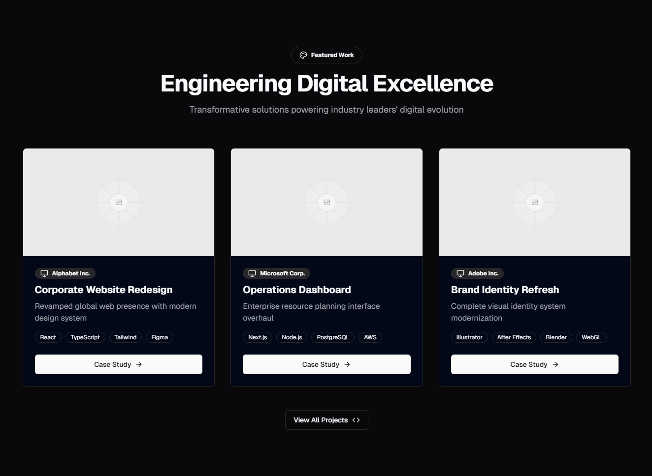
Your portfolio is the highest-leverage page on your personal website. It is the page clients visit before deciding to hire you, the page recruiters check before scheduling an interview, and the page that turns a vague LinkedIn connection into paid work. Yet most developers and designers either cobble together something generic or spend weeks building a custom layout from scratch, time that could have been spent on actual billable projects.
The SERP Blocks portfolio collection includes 20 portfolio layouts built with Shadcn UI and Tailwind CSS. Project grids, case study showcases, filterable galleries, minimal portfolios, and agency-style presentations — each designed to drop into a Next.js project and make your work look as polished as it deserves.
Why Portfolio Layout Matters
A portfolio is not a list of links. It is a curated argument for why someone should work with you. The layout you choose shapes how visitors experience that argument — whether they scan thumbnails quickly, read detailed case studies, or explore projects through interactive filters.
Bad portfolio layout kills good work. A talented designer whose projects are buried in a cluttered grid with inconsistent thumbnails will lose to a mediocre designer with clean presentation. A developer who dumps GitHub repos on a page without context, screenshots, or results will get passed over for someone who tells the story behind each project.
Layout decisions include:
Information density — How many projects are visible at once? Dense grids let visitors scan quickly. Single-project layouts force deeper engagement with each piece.
Visual hierarchy — Which projects get the most space? Featured work should be immediately visible, not buried three rows down.
Navigation pattern — Do visitors scroll a single page, click through tabs, or filter by category? The interaction model changes how people discover your work.
Content balance — How much text accompanies each project? Image-only portfolios work for visual design. Development portfolios need context, tech stacks, and results.
Portfolio Layout Patterns
Project Grid
The foundational portfolio pattern: project cards arranged in a responsive grid. Each card shows a thumbnail, project title, brief description, and tags indicating the tech stack or project type.
Grid variants include:
2-column grid — Large thumbnails with substantial text. Good for portfolios with 4-8 projects where each one deserves attention. The extra horizontal space lets you include a short description directly on the card.
3-column grid — The most common portfolio layout. Balances visual impact with quantity, showing 6-12 projects above the fold on desktop. Thumbnails are large enough to read but compact enough to scan.
4-column grid — Maximum density for large portfolios (15+ projects). Thumbnails are smaller, so every image needs to be instantly recognizable. Works well for photography, illustration, and visual design portfolios.
Mixed-size grid — Featured projects get larger cards (spanning 2 columns or 2 rows), supporting projects fill standard cells. This naturally creates visual hierarchy without requiring visitors to understand your ordering logic.
Project grids work best when your thumbnails are strong. If every project looks the same in a 400px square, the grid becomes a wall of sameness. Invest time in creating distinct, high-quality thumbnails that represent each project at a glance.
Case Study Layouts
Case studies tell the story behind the work — problem, process, solution, results. Case study portfolio layouts present projects as narrative pages rather than thumbnail links, often with a summary card that expands into a full project breakdown.
Case study patterns include:
Summary cards with detail pages — The main portfolio page shows condensed project cards. Clicking a card opens a dedicated page with the full case study: problem statement, design process, technical decisions, screenshots, and measurable results.
Accordion case studies — Each project occupies a full-width row. Click to expand and reveal the case study inline without leaving the page. This pattern keeps visitors in a single scrolling context, reducing the friction of back-and-forth navigation.
Timeline case studies — Projects presented chronologically, showing professional growth over time. Each entry includes dates, role, and key outcomes. Particularly effective for freelancers who want to demonstrate a trajectory of increasing responsibility.
Side-by-side layout — Project list on the left, case study content on the right. Clicking a project in the list updates the right panel. This split-view pattern lets visitors browse projects while reading details simultaneously.
Case study layouts are essential for developers and UX designers. In these fields, the process matters as much as the output. A beautiful interface means nothing if you cannot explain why you made the design decisions you did, what constraints you worked within, and what impact the project had.
Filterable Portfolio Gallery
A project grid with interactive filters — click a category to show only matching projects. Filters can be technology-based (React, Vue, Node.js), type-based (Web App, Mobile, API), industry-based (Fintech, Healthcare, E-Commerce), or role-based (Design, Development, Full Stack).
Filterable portfolios solve a specific problem: diverse skill sets. If you do both front-end and back-end work, or both design and development, a flat grid forces visitors to scan past irrelevant projects. Filters let a potential client looking for React work see only your React projects immediately.
Filter implementation patterns:
Tag-based filters — Each project has multiple tags. Clicking a tag shows all projects with that tag. Multiple tags can be active simultaneously (intersection or union logic).
Category tabs — Mutually exclusive categories shown as tabs. Click "Web" to see web projects, "Mobile" for mobile projects. Simpler than tag filters, better for portfolios with clear categorical divisions.
Search + filter — A search field combined with category filters. Useful for very large portfolios (20+ projects) where browsing alone is insufficient.
The animation on filter transitions matters. When projects filter in and out, smooth CSS transitions (fade, scale, or layout shift) feel polished. Abrupt show/hide feels jarring. The SERP Blocks filterable portfolio components include transition animations that respect prefers-reduced-motion for accessibility.
The gallery collection (25 blocks) provides additional filterable grid patterns that pair well with portfolio content when your work is primarily visual.
Minimal Portfolio
Stripped-down layouts that let the work speak for itself. Minimal portfolios use generous whitespace, large images, and sparse typography. They avoid cards, borders, shadows, and decorative elements in favor of clean presentation.
Minimal portfolio patterns include:
Full-bleed image scroll — Each project is a full-width image with a small text overlay for title and description. Scrolling moves between projects vertically. Maximum visual impact, zero chrome.
Single column with text — Projects listed vertically in a single centered column. Each entry is a project name (sometimes with a thumbnail) and a one-line description. Clicking opens the project. This is the pattern used by many acclaimed design studios.
Name-only list — Just project names, styled typographically. Hovering a name reveals a preview image. This ultra-minimal approach works for established professionals whose project names carry recognition.
Split-screen — Image on one half, text on the other. Scrolling advances to the next project. Each project gets a full viewport of attention.
Minimal portfolios demand excellent content. When you remove all decorative elements, the quality of your project images and the clarity of your writing become the entire experience. Poorly cropped screenshots or vague descriptions have nowhere to hide.
Agency and Multi-Person Portfolios
Portfolios designed for agencies, studios, and teams rather than individuals. These layouts include attribution (who worked on each project), categorization by service offering, and client logos or testimonials alongside project showcases.
Agency portfolio patterns include:
Service-categorized grid — Projects grouped under service offerings: Branding, Web Development, Product Design. Each service section has its own project grid.
Client-focused layout — Organized by client rather than project type. Each client section shows all work done for that client, demonstrating long-term relationships.
Team attribution cards — Project cards include team member avatars showing who worked on the project. Links to individual team member portfolios or bios.
For team attribution, the team section collection (23 blocks) provides member cards and bio layouts that integrate naturally with agency portfolio pages.
Portfolio UX Considerations
Project Showcase Patterns
How you present individual projects within the portfolio matters as much as the overall layout. Common project showcase elements include:
Hero image — A single flagship screenshot or mockup that represents the project at its best. This is the image that appears in the grid thumbnail and at the top of the detail page.
Problem statement — What challenge did the project solve? This context transforms a pretty screenshot into a meaningful accomplishment.
Tech stack badges — Visual indicators of the technologies used. React, TypeScript, PostgreSQL, AWS — these badges help technical recruiters and potential collaborators quickly assess your experience.
Results and metrics — Concrete outcomes: "Reduced page load time by 60%," "Increased conversion rate by 23%," "Served 2M monthly active users." Numbers make your work tangible.
Live demo and source links — Buttons linking to the deployed project and GitHub repository. These are table stakes for developer portfolios.
Process images — Wireframes, design explorations, architecture diagrams, or before/after comparisons that show your thinking, not just your output.
Responsive Image Handling
Portfolio images make or break performance. A grid of 12 project thumbnails, each loading a 2MB screenshot, creates a 24MB page that crawls on mobile connections. Responsive image handling is non-negotiable.
Key techniques:
srcset and sizes — Serve different image resolutions based on viewport width. A thumbnail that displays at 400px wide does not need a 2000px source image.
Next.js Image component — Automatic format optimization (WebP/AVIF), lazy loading, and responsive sizing. The SERP Blocks portfolio components are designed for Next.js Image out of the box.
Aspect ratio containers — Reserve space for images before they load using CSS
aspect-ratioor padding-based techniques. This prevents layout shifts as thumbnails appear.Blur placeholder — Show a blurred, low-resolution version of each image while the full version loads. This progressive loading approach feels faster than empty space followed by a sudden image appearance.
Lazy loading — Only load images when they enter or approach the viewport. For a portfolio with 20 projects, this means loading 6-8 thumbnail images initially instead of all 20.
Navigation and Discovery
How visitors move between projects affects how many they see. If your portfolio is a grid that links to individual project pages, each project page needs clear navigation to the previous and next project. Without this, visitors click back to the grid after every project, and most will stop after viewing 2-3.
Effective portfolio navigation includes:
Previous/Next project links — At the bottom of each project detail page, show the next project with a thumbnail preview to entice continued browsing.
Sticky project navigation — A slim bar at the top or bottom showing all project names, with the current project highlighted. Click any name to jump directly to that project.
Breadcrumb trail — Portfolio > Category > Project. Lets visitors navigate up the hierarchy to explore related work.
Related projects section — At the bottom of each project page, show 2-3 related projects based on shared tags, tech stack, or category.
Building a Complete Portfolio Site
A portfolio page rarely exists in isolation. Combine portfolio blocks with other SERP Blocks categories to build a complete portfolio site:
About Section
Every portfolio needs an about section — who you are, what you do, and why someone should hire you. The about collection (32 blocks) provides bio sections, skill displays, experience timelines, and personal brand statements that pair with portfolio layouts.
For developer portfolios, the about section should cover:
Technical skills — Languages, frameworks, tools, and platforms
Professional background — Previous roles, notable employers, years of experience
Working style — Remote, hybrid, freelance, agency. How you collaborate.
Availability — Open to new projects, currently booked, available starting [date]
Contact Integration
The goal of a portfolio is to generate inquiries. Every portfolio page needs a clear path to getting in touch. The contact collection (33 blocks) provides contact forms, email links, scheduling integrations, and social connection patterns.
Place contact information:
In the navigation — A persistent "Hire Me" or "Get in Touch" button in the header
After each project — A subtle CTA following each case study: "Interested in similar work?"
In a dedicated section — A full contact block at the bottom of the portfolio page
In the footer — Email, social links, and location at minimum
Gallery Expansion
When your portfolio is image-heavy — photography, illustration, graphic design — supplement portfolio layouts with dedicated gallery blocks. The gallery collection (25 blocks) provides masonry grids, lightbox viewers, and carousel galleries that handle large image collections more gracefully than portfolio-specific layouts.
Gallery blocks are particularly useful for:
Photography portfolios — Where you might show 50-100 images per project
Illustration collections — Where each piece is standalone, not part of a project narrative
Before/after showcases — Slider galleries comparing original and final states
Audience-Specific Tips
For Freelancers
Your portfolio is your storefront. Lead with your best 5-8 projects, not every project you have ever touched. Use case study layouts that emphasize results and client satisfaction. Include testimonials if you have them — social proof converts browsers into clients.
Avoid: showing too many projects, including student work alongside professional work, or neglecting to update the portfolio when you complete new work.
For Agencies
Showcase breadth of capability across multiple team members and service lines. Use filterable portfolios that let potential clients find work relevant to their industry or needs. Include client logos prominently — name recognition builds trust.
The team section collection (23 blocks) helps you present the people behind the work, which matters for agencies where clients are hiring the team, not just the output.
For Developers Seeking Employment
Recruiters spend seconds on each portfolio. Make your best project immediately visible — do not make them scroll or click to find it. Include live demos and GitHub links. Show the tech stack for every project. Quantify your impact wherever possible.
Your portfolio should complement your resume, not duplicate it. The resume lists roles and responsibilities. The portfolio shows what you actually built and why it mattered.
For Designers
Image quality is paramount. If your project screenshots are low-resolution, poorly cropped, or shown without context (raw browser screenshots instead of device mockups), the portfolio undermines the work. Invest in presentation — put web projects in browser mockups, mobile projects in device frames, and brand work in contextual mockups.
Minimal portfolio layouts often work best for designers because they avoid competing with the showcased work. Let your designs be the visual focal point, not the portfolio chrome.
Related Block Categories
Portfolio pages combine naturally with several other block types:
| Section | Category | Count |
| Portfolio Showcase | Portfolio | 20 |
| Image Gallery | Gallery | 25 |
| About Section | About | 32 |
| Contact Form | Contact | 33 |
| Team Display | Team | 23 |
| Hero Section | Hero | 81 |
SERP Blocks includes 1200+ total blocks across 50+ categories. 60 are free, with the full library available through a one-time Pro purchase.