25 Product List & Product Grid Components for E-commerce
Browse 45 product list and product grid components for React and Next.js — filterable grids, card layouts, list views, infinite scroll patterns, and sort controls. Built with Shadcn UI and Tailwind CSS for modern e-commerce storefronts.
SERP Blocks Team
Product
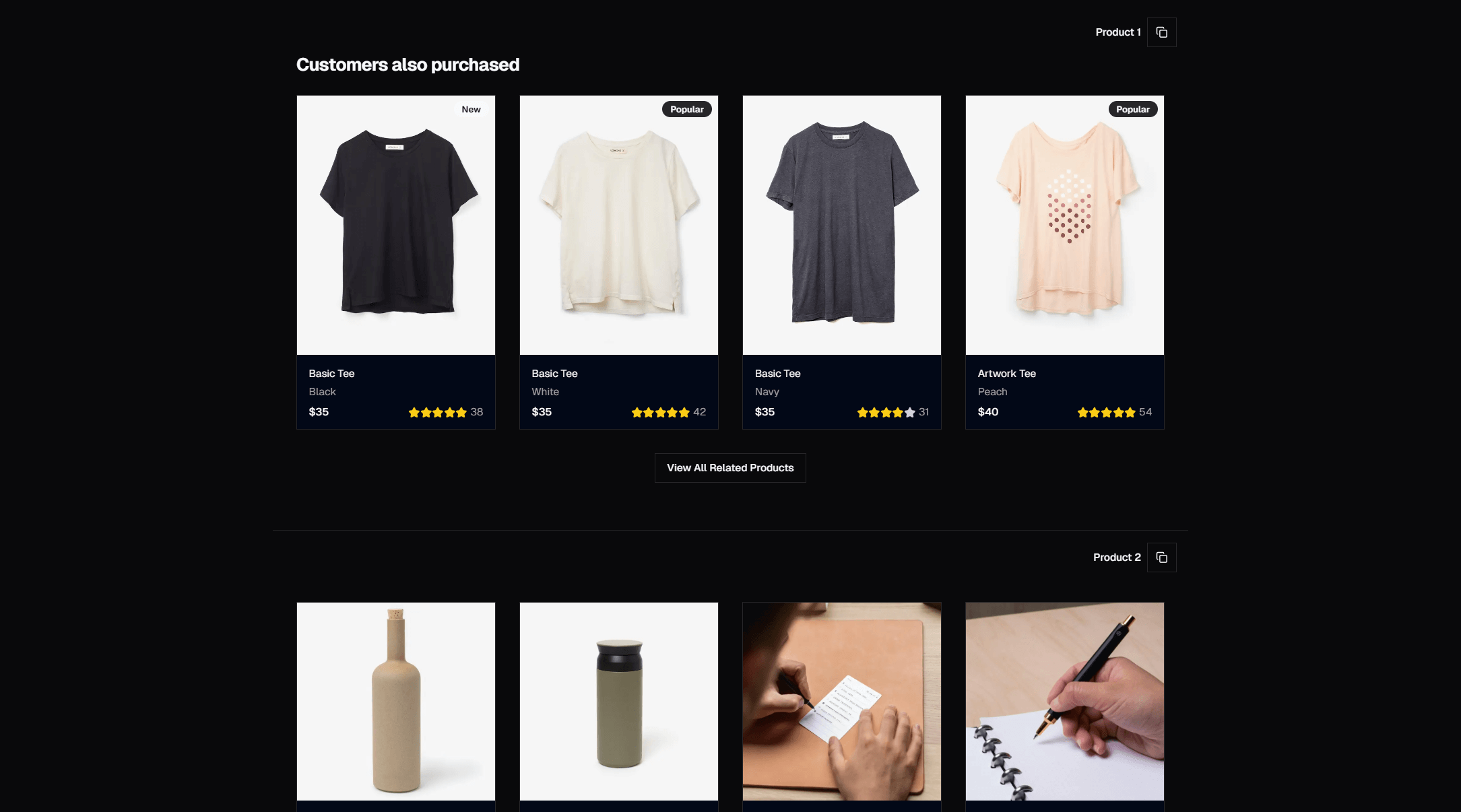
The product listing page is the single most important page in an e-commerce store. Not the homepage, not the product detail page — the listing page. It is where browsing happens. It is where customers decide whether your catalog is worth exploring or whether they should bounce to a competitor. A poorly designed product grid with sluggish filters and awkward responsive behavior will bleed conversions before anyone ever clicks "Add to Cart."
Despite its importance, building a good product listing page from scratch is surprisingly labor-intensive. You need responsive grid layouts, card components with consistent image handling, filter sidebars that work on mobile, sort controls, pagination or infinite scroll, loading states, and empty states. That is a full week of frontend work for a senior developer — and that is before you account for dark mode, accessibility, and cross-browser testing.
SERP Blocks includes 20 product list blocks and 25 product blocks — a combined 45 components covering every major pattern for product browse and discovery. Built with Shadcn UI and Tailwind CSS, they drop into any Next.js project without style conflicts or external dependencies.
Product Grid Layouts
Standard Multi-Column Grids
The foundational e-commerce layout: product cards arranged in a uniform grid. Each card shows a product image, title, price, and a quick-action button (typically "Add to Cart" or "Quick View"). The grid adapts its column count based on screen width.
Common column configurations:
2-column grid — Large product cards with prominent images. Works well for luxury goods, furniture, and any category where product photography is the primary selling point. Each card has room for longer titles, descriptions, and multiple action buttons.
3-column grid — The most widely used e-commerce grid. Balances image size with products per row. Shopify, Amazon, and most major retailers default to three columns on desktop. It is the safe, tested choice.
4-column grid — Compact cards, more products per page. Ideal for stores with large catalogs — clothing, electronics accessories, grocery — where customers want to scan quickly rather than study individual products.
5-6 column grid — Thumbnail-dense layouts for marketplace-style stores or category pages with hundreds of SKUs. Cards are minimal: image, title, price. No descriptions, no secondary actions.
Responsive behavior is critical. Over 60 percent of e-commerce traffic comes from mobile devices, and a 4-column desktop grid that collapses to a single column on mobile wastes valuable screen space. The product list blocks in SERP Blocks use responsive breakpoints that shift intelligently — typically 4 columns on desktop, 3 on tablet landscape, 2 on tablet portrait, and 2 on mobile (not 1). Two columns on mobile lets customers compare products side by side while still seeing enough detail to make decisions.
List View Layouts
Not every product category works best as a grid. List views display products in a single-column stack, with each product occupying a full-width row. The image sits on the left (or top on mobile), with the title, description, price, specifications, and actions filling the remaining space.
List views are better than grids when:
Products need explanation — Technical products, software, professional services. Customers need to read descriptions and specs before they can evaluate the product. A grid card does not have room for this.
Specifications matter — Electronics, auto parts, industrial supplies. Key specs (dimensions, compatibility, ratings) should be visible without clicking into the detail page.
Products look similar — When product photos are nearly identical (white cables, plain t-shirts in different sizes), the distinguishing information is textual. List views put that text front and center.
Comparison shopping — List layouts make it easy to scan vertically and compare prices, ratings, and specs across multiple products.
Several of the product list blocks include a view toggle that lets customers switch between grid and list views. This is the pattern Amazon uses, and it remains the gold standard for product discovery: let customers choose the view that works for their browsing style.
Compact Card Grids
A variation on the standard grid where cards are stripped down to the bare essentials: image, title, and price. No descriptions, no ratings, no secondary actions. The entire card is a clickable link to the product detail page.
Compact grids are effective for:
Browse-heavy categories — Fashion, home decor, art prints. Customers know what they want visually and do not need descriptions until they click through.
Infinite scroll patterns — When the page loads dozens or hundreds of products as the user scrolls, compact cards keep the page light and scrolling fast.
Mobile-first designs — Compact cards mean 2 or even 3 columns on mobile without feeling cramped.
Filter and Sort Patterns
Filter Sidebars
The filter sidebar is the navigation system for product catalogs. It sits to the left of the product grid (or overlays as a drawer on mobile) and lets customers narrow results by category, price range, brand, color, size, rating, availability, and any other product attribute.
Effective filter sidebars include:
Checkbox groups — For multi-select attributes like brand, color, and size. Customers should be able to select multiple values (e.g., "Nike" and "Adidas") to see products matching any selection.
Price range slider — A dual-handle slider for min/max price filtering. Shadcn UI's Slider component handles this natively. Include text inputs alongside the slider for customers who prefer to type exact values.
Collapsible sections — Each filter group (Brand, Price, Color, Size) should be collapsible so customers can hide the filters they do not care about. Shadcn UI's Collapsible or Accordion primitives handle the expand/collapse behavior with proper accessibility.
Active filter pills — Tags showing currently applied filters, each with a remove button. Displayed above the product grid so customers can see and modify their filters without scrolling back to the sidebar.
Clear all button — A single action to reset all filters back to defaults.
On mobile, the filter sidebar typically becomes a bottom sheet or full-screen drawer. The product list collection includes blocks with both patterns. Bottom sheets work when filters are simple (3-4 groups). Full-screen drawers work for complex filtering with many attribute groups.
Sort Controls
A dropdown or button group sitting above the product grid, offering sort options:
Relevance — Default sort, typically based on sales rank, margin, or a merchandising score
Price: Low to High — Budget shoppers
Price: High to Low — Luxury shoppers or customers with a clear budget
Newest — Repeat customers checking for new arrivals
Rating — Social proof sorting, popular for categories with high review volume
Best Selling — A safe default that surfaces proven products
Sort controls should be compact. A single dropdown with a label like "Sort by: Relevance" is the standard pattern. Some blocks use a row of toggle buttons for the most common options (Relevance, Price, Rating) with a dropdown for the rest.
Pagination vs. Infinite Scroll
Two approaches for handling large product catalogs:
Pagination — A numbered page navigation at the bottom of the grid. Page 1 shows products 1-24, page 2 shows 25-48, and so on. Pagination is predictable, bookmarkable, and works well with server-side rendering. Customers can jump to any page and share URLs that point to specific results. Most traditional e-commerce stores use pagination.
Infinite scroll — New products load automatically as the customer scrolls toward the bottom of the page. No page breaks, no clicking "Next." The experience feels seamless and encourages longer browsing sessions. Instagram, Pinterest, and many modern fashion retailers use this pattern.
Load more button — A compromise between pagination and infinite scroll. Products load in batches when the customer clicks a "Load More" button at the bottom. It preserves the user's sense of progress (they chose to load more) without the interaction overhead of numbered pagination.
Each approach has trade-offs. Pagination is best for SEO and direct linking. Infinite scroll is best for engagement and browse-heavy shopping. Load-more splits the difference. The product list blocks cover all three patterns.
Product Card Design
The product card is the atomic unit of the listing page. Every grid is built from these cards, so their design has an outsized impact on the entire browsing experience.
Essential Card Elements
Every product card needs at minimum:
Product image — The dominant element. Typically fills the top 60-70% of the card. Use
object-fit: coverwith a consistent aspect ratio (1:1, 4:3, or 3:4 depending on your product photography) so all cards align in the grid regardless of original image dimensions.Product title — One to two lines, truncated with ellipsis if longer. Font size should be readable but not dominant — the image is the hero.
Price — Clearly visible, often in a bolder weight or accent color. If on sale, show the original price with a strikethrough next to the discounted price.
Quick action — "Add to Cart" button, "Quick View" link, or a heart icon for wishlisting. At least one action should be available without clicking into the product detail page.
Enhanced Card Elements
Beyond the essentials, product cards can include:
Star rating — Average review score shown as filled/empty stars with a review count. Social proof directly in the browse experience.
Badge/tag — "New," "Sale," "Best Seller," "Low Stock" labels overlaid on the card or image. Badges create visual variety in the grid and draw attention to specific products.
Color swatches — Small colored circles showing available colors. Clicking a swatch updates the card image to show that color variant.
Quick-add size selector — For apparel, a row of size buttons (S, M, L, XL) that let customers add to cart without visiting the product page.
Compare checkbox — A checkbox that adds the product to a comparison tray. Useful for electronics and appliances where spec-by-spec comparison is common.
The product blocks collection includes 25 card designs ranging from minimal (image, title, price) to feature-rich (image gallery, swatches, rating, quick-add). Choose the card complexity that matches your product type and customer behavior.
Hover States and Interactions
Product cards should respond to hover in ways that invite clicks:
Image swap on hover — Show a second product image (different angle, product in use) when the cursor hovers over the card. This gives customers more information without a click and is now standard on fashion and lifestyle stores.
Quick-view overlay — A semi-transparent overlay with a "Quick View" button appears on hover. Clicking opens a modal with product details, images, and add-to-cart — all without leaving the listing page.
Elevation change — A subtle shadow or lift effect on hover signals that the card is interactive. Small but important for perceived quality.
Action reveal — Buttons (Add to Cart, Wishlist) that are hidden by default and slide in on hover, keeping the card clean until the customer engages.
Responsive Grid Behavior
Breakpoint Strategy
A responsive product grid needs at least four breakpoints:
| Screen | Width | Columns | Card Size |
| Mobile | < 640px | 2 | Compact |
| Tablet Portrait | 640-1023px | 2-3 | Standard |
| Tablet Landscape | 1024-1279px | 3 | Standard |
| Desktop | 1280px+ | 4 | Full |
The jump from mobile to tablet is where most product grids fail. Going from 2 columns at 639px to 3 columns at 640px can make cards feel cramped. The product list blocks handle this with fluid grid sizing — cards grow smoothly within each breakpoint range rather than snapping between fixed sizes.
Grid Gap and Spacing
Grid gap (the space between cards) affects both aesthetics and usability:
Tight gap (8-12px) — More products visible, denser feel. Good for marketplaces and high-inventory stores.
Medium gap (16-24px) — The standard for most stores. Clean separation without wasted space.
Wide gap (32px+) — Luxury feel, fewer products visible. Appropriate for high-end brands where each product deserves breathing room.
On mobile, tighter gaps make sense because screen real estate is precious. On desktop, slightly wider gaps improve scannability.
Image Aspect Ratios
Choosing a consistent aspect ratio for product images is one of the most impactful design decisions for a product grid:
1:1 Square — The most popular e-commerce aspect ratio. Works for everything and creates a perfectly uniform grid. Instagram trained users to accept square crops.
4:3 Landscape — Shows more of wide products (electronics, furniture). Cards are shorter, so more rows fit above the fold.
3:4 Portrait — Ideal for fashion and apparel. Shows more of the product's length (full outfit, full-length dress). Cards are taller, so fewer rows fit but each product is shown more completely.
Mixed ratios — Use with masonry-style layouts only. Standard grids with mixed ratios create uneven rows and look broken.
E-commerce UX for Browse and Discovery
The First-Screen Problem
When a customer lands on a product listing page, the first screen (above the fold) determines whether they engage or leave. A study by the Baymard Institute found that 64 percent of users form their impression of a product list page within the first three seconds. If the first screen is a wall of text, an empty grid still loading, or products that do not match the expected category — they are gone.
The first screen should show:
Clear category context — A heading or breadcrumb confirming what the customer is browsing
At least 4-6 product cards — Enough to signal variety and relevance
Visible filter and sort controls — So customers know they can refine results
No loading spinners — Server-side rendering or static generation ensures the first screen is ready instantly
Search Integration
Product lists rarely exist in isolation. They are the result of a search query, a category click, or a filter selection. The listing page should reflect the customer's intent:
Search results pages show the query prominently ("Results for 'wireless headphones'") with an option to refine
Category pages show the category name, description, and breadcrumb navigation
Filter results show active filters as pills with remove buttons
Empty and Error States
What happens when filters return zero results? A blank page is the worst outcome. Effective empty states include:
A message confirming no products match the current filters
Suggestions to broaden the search (remove filters, try different terms)
Links to popular categories or best sellers
The filter sidebar remains visible so customers can adjust without starting over
Combining Product List and Product Blocks
The 20 product list blocks handle page-level layouts — the grid structure, filter sidebar, sort bar, and pagination. The 25 product blocks handle individual card and detail designs. Together, they cover the full product browse experience.
For a complete e-commerce storefront, combine these with related categories:
| Section | Category | Count |
| Product Listing Pages | Product List | 20 |
| Product Cards & Details | Product | 25 |
| Product Specifications | Product Info | 15 |
| Category Navigation | Shop Category | 20 |
| Shopping Cart | Shopping Cart | 11 |
| Payment & Checkout | Payment Form | 15 |
| Order Confirmation | Order Confirmation | 10 |
| Customer Reviews | Reviews | 13 |
| Refund Tracking | Refund Status | 10 |
That is 139 blocks dedicated to e-commerce — enough to build a full storefront without writing a single component from scratch.
Accessibility for Product Grids
Product grids have specific accessibility requirements that are easy to overlook:
Landmark regions — The filter sidebar should be a
<nav>or userole="navigation". The product grid should be a<main>orrole="main"region. Screen reader users rely on landmarks to jump between sections.Grid semantics — Product grids can use
role="grid"withrole="gridcell"for each card, enabling arrow-key navigation between products. This is optional but improves the experience for keyboard users browsing large catalogs.Image alt text — Product images need descriptive alt text that includes the product name and key visual details. "Blue Nike Air Max 90 running shoe, side view" is useful. "Product image" is not.
Price announcements — Sale prices should be announced clearly to screen readers. Use
<del>for the original price and<ins>or an aria-label for the sale price so the context is clear.Filter state feedback — When a filter is applied, announce the result count to screen readers using an
aria-liveregion. "Showing 24 of 156 products" tells the user their filter had an effect.Focus management — When filters are applied and the grid updates, focus should move to the top of the results or a results summary. Do not leave focus on the filter that was just changed — the user's attention is on the results.
All product list and product blocks in SERP Blocks are built on Shadcn UI primitives, which handle ARIA attributes, keyboard interactions, and focus management correctly through Radix UI's accessible component foundations.
Performance Considerations
Product listing pages are among the heaviest pages on an e-commerce site. Dozens of product images, filter interaction states, and potentially hundreds of DOM elements combine to create performance challenges.
Image optimization is the highest-impact improvement. Use Next.js Image with loading="lazy" for below-the-fold products, serve WebP/AVIF formats, and size images appropriately for each grid column width. A 4-column grid on a 1280px screen needs images around 280px wide — do not serve 1200px originals.
Virtualized rendering matters for infinite scroll implementations. Once you have 200+ product cards in the DOM, scrolling performance degrades. Libraries like react-window or @tanstack/virtual render only the visible cards, keeping the DOM lean regardless of how far the customer scrolls.
Filter debouncing prevents excessive re-renders. When a customer clicks through multiple filter checkboxes in quick succession, debounce the grid update by 200-300ms so the grid re-renders once rather than five times.
Getting Started
SERP Blocks includes 1,200+ total blocks across 50+ categories. 60 are free to use, with the full library — including all 45 product list and product grid components — available through a one-time Pro purchase. No subscriptions, no per-seat licensing.
Every block ships as clean React/TypeScript code with Tailwind CSS styling. Copy the component into your project, adjust the data and styling to match your brand, and ship.
Browse all 20 product list blocks | Browse all 25 product blocks