20 Shopping Cart UI Components for React E-commerce Apps
Explore 20 shopping cart UI components for React and Next.js — sidebar carts, dropdown carts, full-page carts, mini carts, and complete checkout flows. Built with Shadcn UI and Tailwind CSS for production e-commerce stores.
SERP Blocks Team
Product
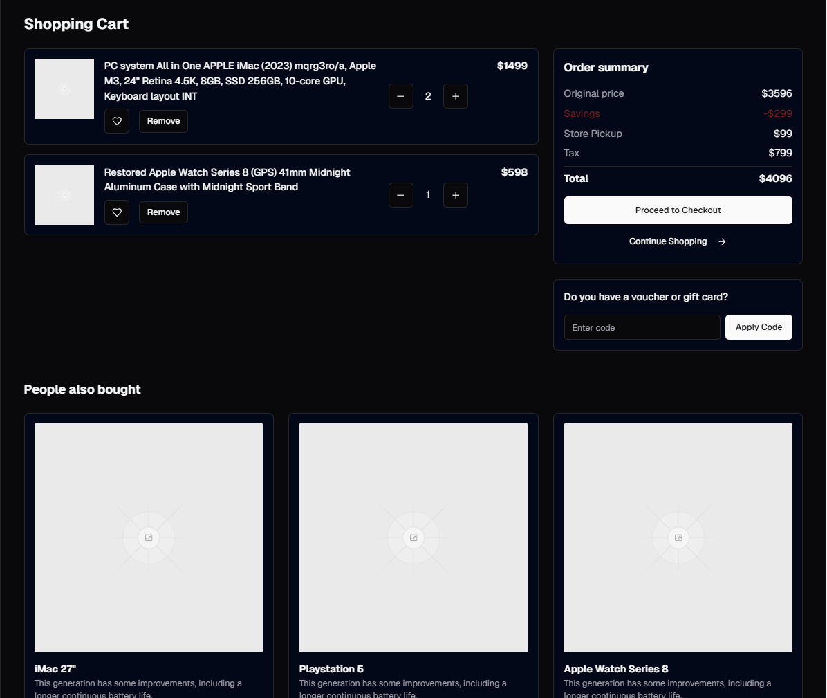
The shopping cart is the most financially consequential component in any e-commerce application. It sits at the exact inflection point between browsing and buying. A cart that is slow to open, confusing to edit, or visually disconnected from the rest of the store will silently kill conversions. Baymard Institute's checkout usability research consistently shows that cart abandonment rates hover around 70 percent, and a significant portion of that abandonment traces back to cart UX problems — unexpected costs appearing too late, difficulty updating quantities, and lack of trust signals.
Building a solid cart component from scratch means handling quantity editing with optimistic UI updates, item removal with undo support, price recalculations, promo code validation, shipping estimates, tax calculations, responsive layouts across every breakpoint, empty states, loading states, and accessible interactions for keyboard and screen reader users. That is two to three days of focused frontend development for a single cart pattern, and most stores need at least two (a mini cart for quick access and a full cart page for detailed review).
SERP Blocks includes 11 shopping cart blocks covering every major cart pattern used in production e-commerce stores. Combined with 15 payment form blocks and 10 order confirmation blocks, you get 36 components that cover the entire purchase flow from add-to-cart through order receipt. All built with Shadcn UI and Tailwind CSS, ready to drop into any Next.js project.
Shopping Cart Patterns
Slide-Out Sidebar Cart
The sidebar cart — sometimes called a drawer cart or slide-out cart — is the dominant cart pattern in modern e-commerce. When a customer clicks "Add to Cart" on a product page, a panel slides in from the right side of the screen showing the cart contents. The customer can review items, adjust quantities, and proceed to checkout without leaving the page they are on.
This pattern works because it preserves context. A customer browsing a product listing page can add an item, glance at the cart in the sidebar, and immediately continue browsing. There is no page navigation, no lost scroll position, no disruption to the shopping flow. Shopify, Nike, Apple, and most high-performing e-commerce stores use some variation of this pattern.
Key implementation details for a sidebar cart:
Overlay backdrop — A semi-transparent overlay behind the cart drawer that dims the rest of the page. Clicking the backdrop closes the cart. This is a standard Shadcn UI Sheet component behavior.
Trap focus — When the sidebar is open, keyboard focus should be trapped inside it. Tab and Shift+Tab cycle through cart items and buttons without escaping to the page behind. Shadcn UI Sheet handles this automatically.
Scroll behavior — The cart item list scrolls independently while the cart header (title) and footer (totals and checkout button) remain fixed. This keeps the checkout CTA visible regardless of how many items are in the cart.
Animation — The sidebar should slide in smoothly (200-300ms transition) and push or overlay the page content. SERP Blocks cart sidebars use CSS transitions for 60fps animation.
The sidebar cart blocks in SERP Blocks come in multiple visual styles — minimal with just item names and prices, detailed with product thumbnails and variant labels, and compact with a condensed layout for stores where the cart is a quick checkpoint rather than a browsing destination.
Full-Page Cart
The full-page cart dedicates the entire screen to cart management. It is the traditional e-commerce cart pattern, used by Amazon, Target, Walmart, and most large retailers. The page typically has a two-column layout on desktop: cart items on the left (60-70 percent width) and order summary on the right (30-40 percent width). On mobile, it stacks vertically with items on top and the summary below.
Full-page carts are the better choice when:
Average order value is high — Customers spending hundreds or thousands of dollars want space to carefully review every item before committing. A sidebar cart feels too casual for large purchases.
Orders contain many items — Grocery stores, office supply stores, and B2B e-commerce platforms where customers routinely have 10-30 items in the cart. A sidebar cannot comfortably display that many line items.
Product customization is complex — Custom-printed items, configurable products, or items with multiple variants (size, color, material, engraving text) need more horizontal space per line item than a sidebar provides.
Cross-sell opportunities exist — Full-page carts have room for "Frequently bought together" or "You might also like" recommendation sections below the cart items. These sections are a proven driver of increased average order value.
The full-page cart blocks in the shopping cart collection include variants with and without recommendation sections, and layouts optimized for both few-item and many-item scenarios.
Dropdown Mini Cart
The mini cart is a compact dropdown that appears when a customer hovers over or clicks the cart icon in the site header. It shows the number of items, a brief list of the first few products, the subtotal, and a link to the full cart page or directly to checkout.
Mini carts serve as a quick status indicator. They answer the question "what have I added so far?" without requiring the customer to navigate anywhere. The best mini carts show:
Item count badge — A small number badge on the cart icon in the header. This is the most important element — it tells the customer at a glance whether their cart is empty or not.
Recent items — The last 2-4 items added, with thumbnail images and prices. If the cart has more items, a "View all items" link takes the customer to the full cart.
Subtotal — The running total before shipping and taxes. This sets expectations and helps customers track their spending.
Quick checkout button — A primary action button that goes directly to checkout, bypassing the full cart page entirely. For stores where customers typically buy 1-2 items, this shortcut can significantly increase conversion.
Mini carts work best when paired with another cart pattern. Use a mini cart in the header for quick glances and a full-page cart or sidebar cart for detailed management. The mini cart is the preview; the full cart is the workspace.
Persistent Bottom Bar Cart
A mobile-specific pattern where a fixed bar at the bottom of the screen shows the cart item count and total. Tapping the bar expands it into a full cart view or navigates to the cart page. This pattern is common in food delivery apps (DoorDash, Uber Eats) and works well for any e-commerce store where mobile customers are building orders incrementally.
The bottom bar stays visible as the customer browses, serving as a constant reminder of their cart state. It avoids the problem of hiding the cart behind a header icon that requires scrolling to the top of the page to access.
Cart Line Item UX
The individual line item in a cart is a small component that carries a lot of responsibility. Each line item needs to display product information, support editing, and handle edge cases gracefully.
Quantity Editing
Quantity controls typically use a stepper pattern: a minus button, the current quantity displayed between them, and a plus button. The implementation details matter more than you might expect:
Debounce updates — When a customer clicks the plus button rapidly, do not fire an API call for each click. Debounce by 300-500ms and send a single update with the final quantity. This reduces server load and prevents race conditions.
Min/max constraints — Set a minimum quantity of 1 (the remove action should be separate from the quantity control) and a maximum based on available inventory. Disable the plus button and show a tooltip when the max is reached: "Only 3 left in stock."
Optimistic updates — Update the quantity and recalculate totals immediately in the UI before the server confirms the change. If the server rejects the update (out of stock), revert the UI and show an error message. This makes the cart feel instant.
Direct input — Allow customers to click on the quantity number and type a value directly. This is faster than clicking plus 20 times for bulk orders. Validate the input on blur.
Removing Items
Item removal should feel safe and reversible:
Confirmation for single items — A simple remove button (trash icon or "Remove" text link) per line item. For carts with few items, consider an undo toast instead of a confirmation dialog. The customer clicks remove, the item disappears, and a toast notification appears: "Item removed. Undo." The undo window lasts 5-8 seconds.
Clear cart — A "Clear cart" action for removing all items. This should always require confirmation via a dialog: "Remove all 7 items from your cart? This cannot be undone."
Swipe to remove — On mobile, a swipe-left gesture to reveal a delete button. This pattern is familiar from iOS and Android list interactions.
Saved for Later
Some cart designs include a "Save for later" option that moves an item out of the active cart and into a wishlist-style section below. This is valuable for customers who are not ready to buy a particular item but do not want to lose track of it. Amazon popularized this pattern, and it remains effective for reducing cart abandonment — customers move uncertain items to "Saved" rather than removing them entirely, and a percentage of those items eventually move back to the cart.
Promo Codes and Discounts
The promo code field is a deceptively complex piece of UI. A simple text input and "Apply" button seems straightforward, but the edge cases multiply quickly:
Validation feedback — Show clear success and error states. A valid code should display the discount amount and the code itself as a removable tag: "SAVE20 applied — $15.00 off." An invalid code should show a specific error: "This code has expired" or "This code requires a minimum order of $50."
Multiple codes — Decide whether your store supports stacking promo codes. If yes, display each applied code as a separate tag with its own remove button and discount amount. If no, replace the previous code when a new one is applied.
Auto-applied discounts — Some discounts apply automatically based on cart contents (buy 2 get 1 free, free shipping over $75). Display these as line items in the order summary with a label like "Volume discount" or "Free shipping." Customers should see why their total is lower than expected.
Placement — The promo code input can live in the order summary section (most common), in a collapsible section below the cart items, or as a link that expands to reveal the input. The collapsible approach keeps the cart clean for the majority of customers who do not have a code.
Order Summary and Estimated Totals
The order summary sidebar (or section, on mobile) is where the customer sees the financial breakdown of their purchase. Transparency here directly impacts cart abandonment rates. Unexpected costs at checkout are the number one reason customers abandon carts.
A complete order summary includes:
Subtotal — The sum of all item prices multiplied by their quantities. Label it clearly as "Subtotal" to distinguish it from the final total.
Shipping estimate — If you can estimate shipping before the customer enters their address, show it. "Standard shipping: $5.99" or "Free shipping on orders over $75 — add $12.50 more to qualify." If you cannot estimate without an address, show "Calculated at checkout" rather than hiding shipping costs entirely.
Tax estimate — Similar to shipping. If you can estimate based on IP geolocation, show it. Otherwise, "Calculated at checkout." Being upfront about taxes, even as estimates, reduces sticker shock at the final checkout step.
Discount — Any applied promo codes or automatic discounts, shown as a negative line item with a green color to make the savings visually obvious.
Estimated total — The final number, clearly labeled as "Estimated Total" if shipping and tax are still estimates, or just "Total" if all costs are finalized.
Savings callout — If the customer is saving money through discounts or sales, show the total savings: "You're saving $23.00 on this order." This positive reinforcement encourages the customer to complete the purchase.
Cart State Management
The shopping cart is one of the few components in a React application that needs truly global state. Every page needs access to the cart — the header shows the item count, product pages need to add items, the cart page displays and edits items, and the checkout page reads the final cart contents.
Common state management approaches for React shopping carts:
React Context
The simplest approach for small to medium stores. Create a CartContext with add, remove, update quantity, and clear actions. Wrap the app in the CartProvider and access cart state from any component with useCart().
The downside of Context is that every cart state change re-renders every component that consumes the context. For a header with an item count badge, a sidebar cart, and a full-page cart, that means updating the item count re-renders the entire sidebar cart unnecessarily. For most stores, this overhead is negligible, but for stores with complex cart UIs and many consuming components, it can cause performance issues.
Zustand or Jotai
Lightweight state management libraries that solve the re-render problem. Zustand stores allow components to subscribe to specific slices of state, so the header item count badge only re-renders when the count changes, not when a quantity is updated. Jotai's atomic approach achieves the same result with a different API.
For e-commerce specifically, Zustand is a popular choice because it supports middleware for persistence (save the cart to localStorage so it survives page refreshes) and because its API is simple enough that junior developers can maintain it.
Server-Side Cart
For stores with user accounts, the cart should be persisted on the server. This lets customers add items on their phone, continue browsing on their laptop, and check out on either device. The frontend cart state becomes a cache of the server state, synced via API calls.
The pattern is: optimistic UI updates on the client (update state immediately for instant feedback), API call to the server (persist the change), and reconciliation if the server state differs (item went out of stock, price changed). The SERP Blocks cart components are designed to work with any of these patterns — they accept cart data as props and emit events for user actions.
Connecting the Cart to Checkout
The shopping cart is the entry point to the checkout flow. The transition from cart to checkout should feel seamless.
Cart to Payment Form
When the customer clicks "Checkout" from the cart, they move to the payment form. SERP Blocks includes 15 payment form blocks that pick up where the cart leaves off. The checkout page typically includes an order summary (pulled from the cart state), shipping address fields, billing address fields, and the payment form itself.
Single-page checkout layouts show everything on one page. Multi-step checkout layouts break the process into steps — shipping, payment, review — with a progress indicator at the top. Both patterns are represented in the payment form collection.
Stripe Integration
Most React e-commerce stores use Stripe for payment processing. The integration point between SERP Blocks cart and payment components and Stripe follows a clean separation:
Cart components manage the items, quantities, and totals
Payment form components provide the UI layout for address fields and payment inputs
Stripe Elements mount inside the payment form's card input area
Your server creates a PaymentIntent based on the cart total and returns the client secret
The client confirms the payment using Stripe.js
This separation means you can swap payment providers without rebuilding the UI. The cart blocks and payment form blocks are payment-processor agnostic — they handle layout, styling, and user interaction while leaving the payment logic to your integration layer.
import { Elements, CardElement } from "@stripe/react-stripe-js";
import { loadStripe } from "@stripe/stripe-js";

const stripePromise = loadStripe(process.env.NEXT_PUBLIC_STRIPE_KEY!);

export function CheckoutPage({ cartItems, total }: CheckoutProps) {
  return (
    <Elements stripe={stripePromise}>
      <PaymentFormBlock cartItems={cartItems} total={total}>
        <CardElement options={{ style: { base: { fontSize: "16px" } } }} />
      </PaymentFormBlock>
    </Elements>
  );
}
Payment to Order Confirmation
After a successful payment, the customer sees the order confirmation page. The 10 order confirmation blocks display the order number, items purchased, shipping details, estimated delivery date, and next-step actions like tracking the order or continuing to shop. The transition from payment success to order confirmation should happen immediately — no loading spinners, no delays.
Mobile Cart Considerations
Over 60 percent of e-commerce traffic comes from mobile devices, and cart UX on mobile requires specific attention:
Touch targets — Quantity buttons and remove links need minimum 44x44px touch targets. The SERP Blocks cart components meet WCAG touch target guidelines.
Sticky checkout button — On mobile, the checkout button should stick to the bottom of the screen so it is always accessible regardless of scroll position. This eliminates the need to scroll past a long list of cart items to find the checkout action.
Swipe gestures — Swipe-to-delete on individual cart items. This is a native-feeling interaction on mobile that reduces the number of taps required to manage the cart.
Bottom sheet cart — Instead of a sidebar that slides from the right, consider a bottom sheet that slides up from the bottom of the screen. This is more natural on mobile because the thumb can easily reach the drag handle at the top of the sheet.
Related E-commerce Blocks
The shopping cart does not exist in isolation. A complete e-commerce checkout flow uses blocks from several categories:
| Category | Blocks | Role in Checkout Flow |
| Shopping Cart | 11 | Cart display and management |
| Payment Form | 15 | Checkout and billing |
| Order Confirmation | 10 | Post-purchase receipt |
| Product | 25 | Product pages with add-to-cart |
| Product List | 20 | Browse pages feeding the cart |
| Navbar | 17 | Header with cart icon and count |
SERP Blocks includes 60 free blocks to start building with. When you need the full e-commerce block set — all 11 cart blocks, 15 payment form blocks, and 1,200+ total components across 55 categories — a one-time Pro purchase at blocks.serp.co unlocks everything. No monthly subscription, no per-project licensing. Buy once and use across every store you build.
Start with a shopping cart block, wire it up to your product pages, and build forward to checkout. The cart is the heartbeat of an e-commerce application — get it right, and the rest of the purchase flow follows naturally.