40+ Shadcn Testimonial Components You Can Copy-Paste
Browse 40 testimonial section designs for React and Next.js — carousel, grid, single quote, star ratings, and video testimonials. Built with Shadcn UI and Tailwind CSS.
SERP Blocks Team
Product
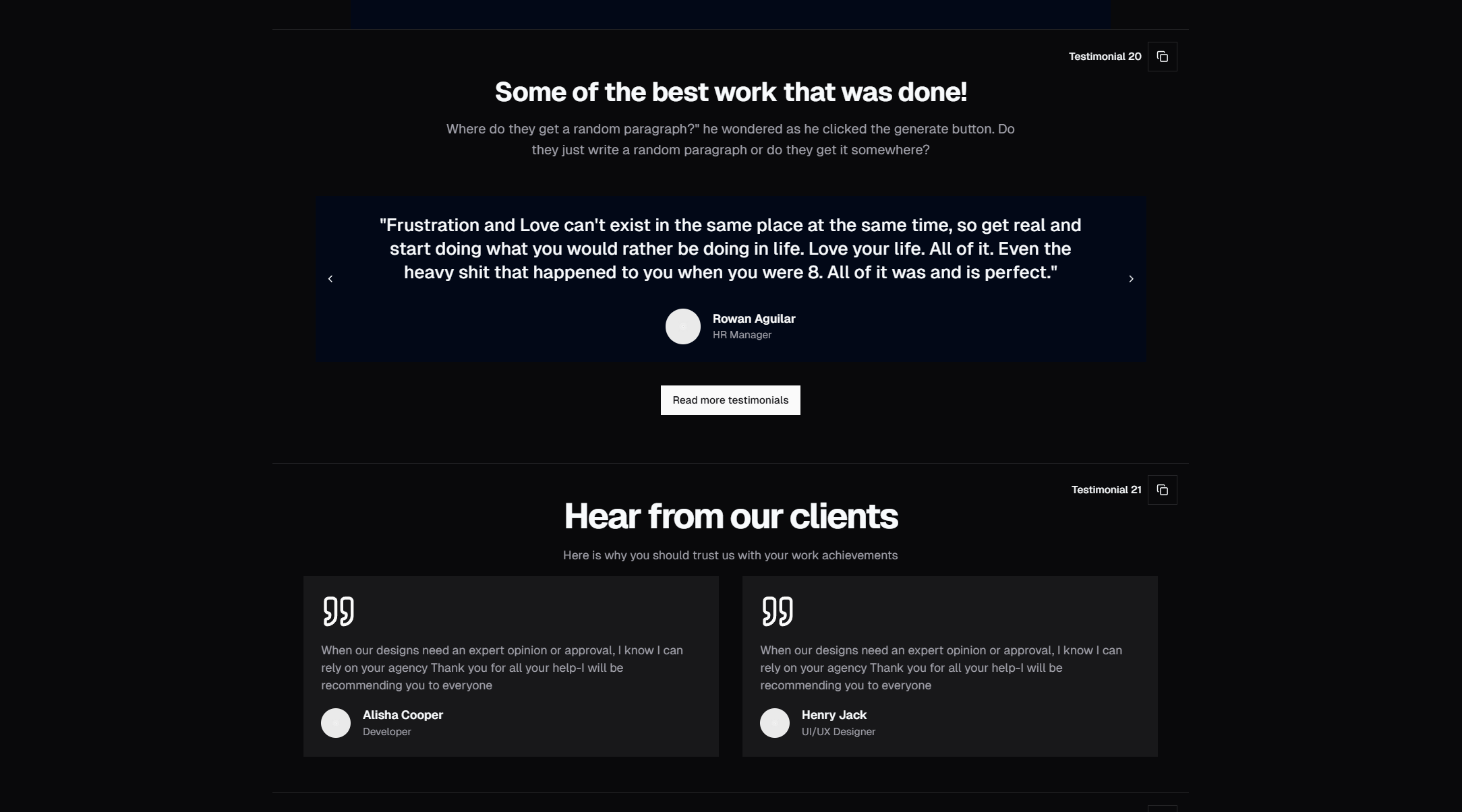
Social proof is one of the most powerful conversion tools on any website. Testimonials, reviews, and endorsements from real users tell your visitors something your marketing copy never can: that other people trust you.
The SERP Blocks testimonial collection includes 40 complete section designs — not just individual quote cards, but full-width, ready-to-use sections with layouts, spacing, and responsive behavior already handled.
Why Testimonials Matter for Conversion
Studies consistently show that testimonials increase conversion rates. The reason is simple: humans are social creatures. When we see that others have had a positive experience, our perceived risk drops. This is especially true in B2B SaaS and e-commerce, where purchase decisions carry financial weight.
But the design of your testimonial section matters as much as the testimonials themselves. A poorly designed section — cramped text, stock photos, no attribution — can actually hurt credibility. A well-designed section with real photos, specific results, and clean typography builds genuine trust.
Testimonial Layout Styles
Single Quote Spotlight
A single, prominent testimonial that fills the section. Large quote text, author photo, name, title, and company. These are high-impact — perfect for a marquee endorsement from a recognizable brand or person.
Use these when you have one standout testimonial that's significantly more persuasive than the rest. Place it immediately after your hero or feature section for maximum impact.
Grid Layouts
Multiple testimonials arranged in a 2-column or 3-column grid. Each card includes the quote, author info, and optionally a star rating or company logo. Grid layouts work well when you have 4-9 strong testimonials and want to show breadth of social proof.
Variants include:
Equal-height cards with truncated text
Masonry-style grids where cards vary in height based on content length
Cards with and without profile photos
Cards with company logos for B2B credibility
Carousel/Slider Layouts
Testimonials that cycle through one at a time or in groups, with navigation arrows or dots. Carousels let you showcase many testimonials without overwhelming the page. They also add subtle motion that draws the eye.
Our carousel variants use smooth CSS transitions and support touch swipe on mobile. Some include auto-play with pause-on-hover behavior.
Logo Wall + Testimonials
A combination of a client logo bar with selected testimonials below. The logo wall provides quick "trusted by" recognition, while the testimonials add depth with specific stories. This pattern is standard in B2B SaaS and enterprise marketing.
Star Rating Testimonials
Testimonials paired with explicit star ratings (typically 5 stars). These are effective for consumer products and services where rating scores are a familiar trust signal. Variants include aggregate rating displays ("4.9 out of 5 from 2,400 reviews") alongside individual reviews.
Video Testimonial Sections
Layouts designed to feature video testimonials — embedded video players with play buttons, thumbnail images, and text quotes for visitors who won't click play. Video testimonials are dramatically more persuasive than text alone because viewers can see real emotion and sincerity.
Minimal Text Testimonials
Clean, typography-first designs with no photos or logos — just the quote text, a dash, and the author name. These project a premium, understated feel and work well when the words themselves are strong enough to stand alone.
Testimonials with Metrics
Testimonials that lead with a specific result: "Increased conversions by 47%" or "Saved 15 hours per week." The metric grabs attention, and the testimonial provides the story behind the number. These are highly effective for products that deliver measurable outcomes.
Best Practices for Testimonial Sections
Use Real Photos
Stock photos kill credibility instantly. If your testimonial features a real headshot, visitors trust it. If it features a generic stock portrait, they don't. Every study on this is consistent — real photos outperform stock photos for testimonial credibility.
Include Specific Details
"Great product!" is worthless. "We reduced our deployment time from 45 minutes to 3 minutes" is compelling. Specific numbers, timeframes, and outcomes make testimonials believable.
Show Company Context
For B2B, the company name and logo matter more than the individual's name. "Sarah, Marketing Director at Stripe" carries more weight than "Sarah M." Company context provides implicit endorsement from the organization, not just the person.
Match Testimonials to Your Audience
Place testimonials from people who match your target audience near relevant content. If you're selling to developers, show testimonials from developers. If you're selling to enterprise CTOs, show testimonials from CTOs at recognizable companies.
Don't Overdo It
3-6 strong testimonials are more effective than 20 mediocre ones. Quality and specificity beat quantity every time. Choose testimonials that address different aspects of your product or different audience segments.
Testimonials in Context
In a well-designed landing page, testimonials typically appear:
After the feature section — Once you've explained what your product does, social proof validates the claims
Before pricing — Trust reduces price sensitivity
Near the final CTA — One last push of confidence before the visitor commits
With SERP Blocks, you can combine testimonial sections with hero sections (81 blocks), feature sections (132 blocks), pricing (21 blocks), and CTA sections (32 blocks) to build complete, conversion-optimized pages.
Technical Details
All 40 testimonial blocks are:
Built with Shadcn UI Card, Avatar, and Badge components
Styled with Tailwind CSS utility classes
Fully responsive across mobile, tablet, and desktop
Dark mode compatible via CSS variable theming
Accessible with proper ARIA roles and heading hierarchy
Available for Next.js, React, Astro, and Vue