10 Timeline Components for Project History and Milestones
Browse 10 timeline components for React and Next.js — vertical timelines, horizontal step trackers, alternating layouts, image-rich histories, and milestone markers. Built with Shadcn UI and Tailwind CSS for company history, changelogs, project roadmaps, and career pages.
SERP Blocks Team
Product
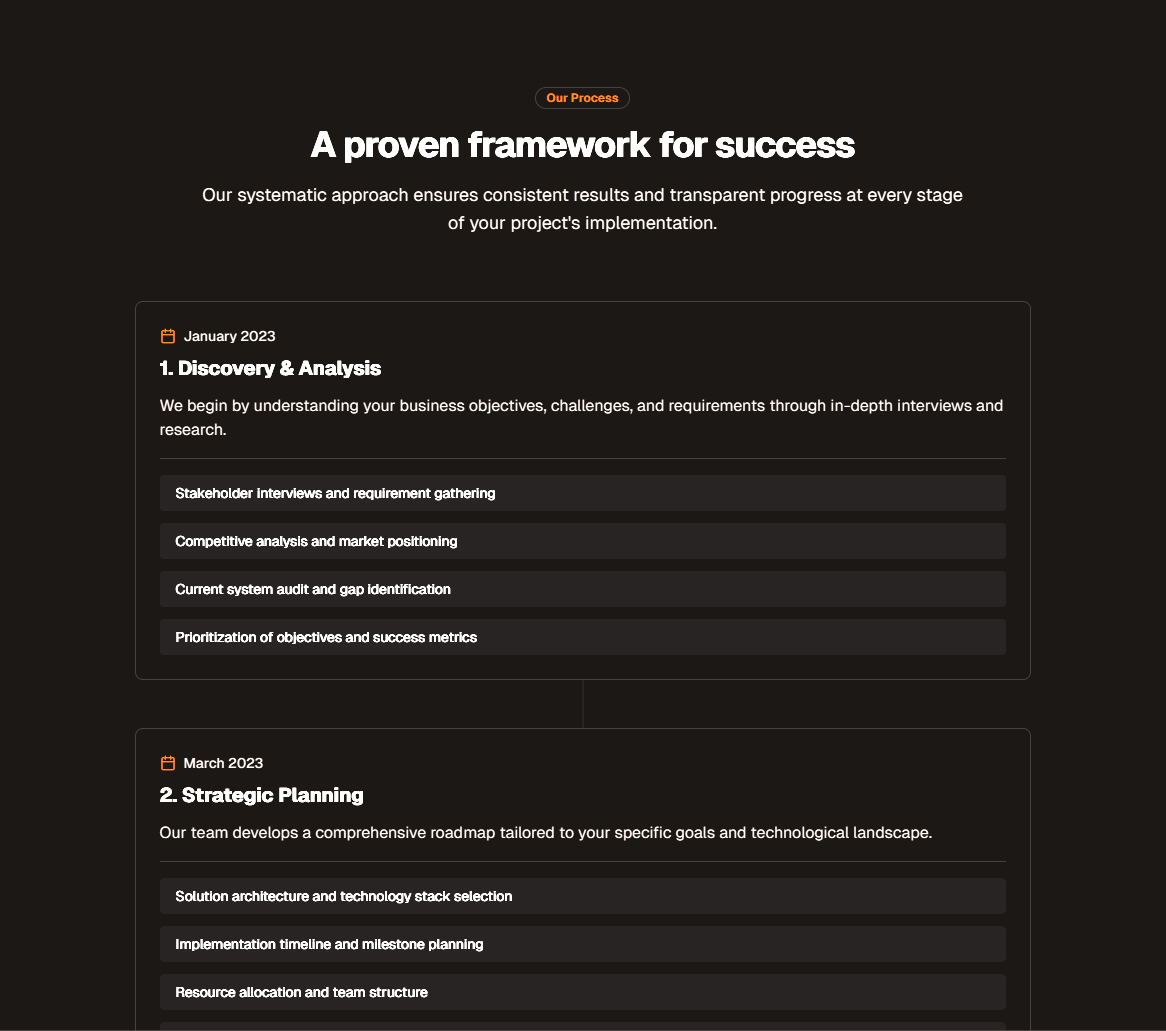
A timeline is one of those UI patterns that looks deceptively simple — a vertical line with some dots and dates — until you actually build one. Then you discover the edge cases. What happens when one event has a paragraph of text and the next has a single sentence? How do you handle six events on mobile versus twenty on desktop? What about images, icons, links, and status badges mixed into the same timeline? How do you make sure a screen reader announces the events in order and conveys the chronological relationship between them?
Most developers end up with a fragile CSS construct that works for the three events on the about page and breaks the moment someone adds a fourth with a longer description. The timeline scrolls off-screen on mobile, the connecting line ends in the wrong place, and the alternating layout collapses into an unreadable overlap.
The SERP Blocks timeline collection includes 10 timeline components built with Shadcn UI and Tailwind CSS. Vertical timelines, horizontal step trackers, alternating layouts, image-rich histories, and milestone markers — each one tested across viewport sizes and designed to handle real content, not just placeholder text.
Where Timelines Belong
Before diving into the components, it helps to understand where timelines actually serve users. A timeline is the right pattern when content has a sequential or chronological relationship and the order matters to the reader. If the order does not matter, you want a grid or a list, not a timeline.
Company History Pages
The most classic use case. Founded in 2018. Launched v1 in 2019. Raised Series A in 2020. Opened the London office in 2021. Reached 10,000 customers in 2022. Every company has a story, and a timeline tells it in a format that visitors can scan in seconds while still providing enough detail for those who want the full narrative.
The SERP Blocks about collection includes 32 about page sections, many of which pair naturally with a timeline component for the company history section. A typical about page pattern is a mission statement hero at the top, a team grid in the middle, and a company timeline at the bottom.
Product Changelogs
When users want to know what changed in the latest release, a timeline presents version history in a format that makes it easy to scan dates, find the release they care about, and read the details. Version numbers serve as natural markers. Release dates provide the chronological axis. Feature descriptions, bug fixes, and breaking changes fill the content for each entry.
The SERP Blocks changelog collection includes 10 changelog components specifically designed for release history. Timeline components complement changelogs when you want a broader product narrative — not just what shipped in v3.2.1, but the evolution of the product across major milestones.
Project Roadmaps
Product teams use timeline layouts to communicate what is planned, what is in progress, and what has been completed. A roadmap timeline differs from a changelog because it includes future events. This introduces a visual distinction: past events are solid and confirmed, current events are highlighted, and future events are muted or shown with a different style to indicate they are planned but not guaranteed.
Career and Milestone Pages
Individual career pages, employee spotlights, and professional portfolios use timelines to show career progression, education history, and key achievements. The SERP Blocks careers collection includes 20 careers page components where timelines fit naturally into the "life at the company" or "growth path" sections that help candidates understand what working at the organization looks like over time.
The 10 Timeline Components
Each component in the collection addresses a specific layout pattern and content type. Here is what the collection covers.
Vertical Timelines
The vertical timeline is the default pattern for most use cases. Events stack from top to bottom in chronological order, connected by a continuous line. The vertical axis works well because it maps to page scroll — as you scroll down, you move forward in time. It also handles varying content lengths gracefully because each event can expand vertically without affecting the layout of adjacent events.
Simple vertical timeline — A clean, minimal layout with date markers on the left and event content on the right. Each event includes a title, date, and description paragraph. The connecting line runs through circular node markers that indicate each event's position in the sequence. This is the workhorse layout for company history pages and basic changelogs where the content is primarily text.
Vertical timeline with icons — Instead of uniform circular markers, each event has a category-specific icon. A rocket icon for a product launch. A people icon for a team milestone. A trophy icon for an award. A code icon for a technical achievement. Icons add a scanning layer — visitors can identify the type of event before reading the title, making it faster to find the specific milestone they are looking for.
Vertical timeline with images — Each event includes a featured image alongside the text content. Product screenshots, team photos, office images, and event photography bring the timeline to life and break up long stretches of text. The image layout adapts on mobile: on desktop, images sit beside the text, while on mobile they stack above it to maintain readability.
Vertical timeline with status badges — Events include colored status indicators — completed, in progress, planned, cancelled. This variant is designed for project roadmaps and development timelines where the current state of each milestone matters as much as its date. Green for completed, blue for in progress, amber for planned, and gray for cancelled or postponed. The status badges use semantic colors that work in both light and dark modes.
Alternating Timelines
The alternating timeline places events on alternating sides of the center line — left, right, left, right. This layout is visually distinctive and uses horizontal space more efficiently than a single-column vertical timeline, making it popular on marketing pages and about sections where visual impact matters.
Classic alternating timeline — The standard alternating layout with content cards that switch sides at each event. On desktop, odd events appear on the left and even events on the right, with the connecting line running down the center. On mobile, the layout collapses to a single column (left-aligned) because alternating layouts do not work on narrow screens where cards would be too narrow to hold readable content.
Alternating timeline with cards — Each event is wrapped in a Shadcn Card component with a subtle shadow and border, giving the timeline a more structured, dashboard-like appearance. Cards include a header area for the date and title, a body for the description, and an optional footer for tags or links. The card treatment works particularly well for changelogs and feature announcements where each event benefits from clear visual containment.
Horizontal Timelines
Horizontal timelines are less common but powerful for specific use cases. They work best when the number of events is small (3-8), when the timeline represents a process with a clear start and end, or when the timeline is used as a navigation element rather than a content display.
Horizontal step timeline — A left-to-right progression with evenly spaced markers connected by a horizontal line. Each step includes a date or label above the marker and a brief description below. This layout works well for order tracking, project phases, and multi-step workflows where the reader needs to see the entire sequence at a glance without scrolling.
Horizontal scrolling timeline — For timelines with more events than fit in the viewport, this variant adds horizontal scrolling with smooth snap points. Navigation arrows on each end allow keyboard and mouse users to scroll the timeline without using a scrollbar. The current or most recent event is highlighted and centered on initial load. This pattern suits long product histories and multi-year roadmaps displayed in a compact section.
Specialty Timelines
Milestone timeline with branching — A vertical timeline where certain events branch into sub-events. A major product release branches into the individual features that shipped with it. A company milestone branches into the team members or departments involved. The branching is represented by shorter connecting lines extending from the main timeline axis, creating a tree-like structure that shows hierarchy within a chronological sequence.
Timeline UX Principles
Building a timeline that looks good in a Figma mockup is easy. Building one that works for real users with real content on real devices requires attention to several design principles.
Content Hierarchy Within Events
Every timeline event has at least three pieces of information: a date, a title, and a description. Most events also have a category, a status, an image, links, or tags. The challenge is establishing a clear visual hierarchy so that scanning visitors see the date and title first, interested visitors can read the description, and no one is overwhelmed by a wall of undifferentiated text.
The date should be visually distinct — either positioned separately from the content (above the card, beside the marker, or in a colored badge) or styled in a different weight, size, or color from the title. The title should be the most prominent text element within each event. The description should be regular body text that does not compete with the title for attention.
Responsive Design for Timelines
Timelines are one of the most challenging UI patterns to make responsive. An alternating layout that looks elegant at 1200 pixels becomes an unreadable mess at 375 pixels. A horizontal timeline that works as a panoramic view on desktop becomes a claustrophobic scrolling box on mobile.
The standard responsive strategy for vertical timelines: at desktop widths, use the alternating or side-by-side layout. Below 768 pixels, collapse to a single-column layout with the line on the left edge and all content to the right. For horizontal timelines, you can either convert to a vertical layout on mobile (preserves readability) or keep horizontal with scroll (preserves the spatial metaphor). The best choice depends on whether the horizontal orientation is essential to meaning or merely aesthetic.
Timeline Accessibility
A timeline is fundamentally an ordered list of events. The semantic HTML structure should reflect this: an <ol> element containing <li> elements for each event. Screen readers will announce "list, 8 items" at the start and "item 1 of 8" for each event, giving assistive technology users the same understanding of sequence that visual users get from the connecting line.
The connecting line, markers, and icons are decorative — hide them from screen readers with aria-hidden="true". Content should be in the DOM in chronological order regardless of visual layout. An alternating timeline should not alternate DOM order; CSS handles visual positioning while the DOM maintains reading order.
For timelines with status indicators (completed, in progress, planned), the status must be communicated in text, not just color. Add aria-label or visually hidden text like "Status: Completed" to each status indicator. Interactive timelines should use <button> or <a> elements for clickable event headers, each with a descriptive accessible name that responds to keyboard activation.
Reduced Motion Considerations
Some timelines use scroll-triggered animations where events fade in or slide into view as the user scrolls. These animations enhance the experience for most users but can cause discomfort for users with vestibular disorders. The prefers-reduced-motion CSS media query detects when a user has requested reduced motion in their operating system settings. When reduced motion is active, timeline events should be visible immediately without entrance animations. The timeline should remain fully functional and visually complete — reduced motion means no animation, not a degraded experience. In Tailwind CSS, use the motion-safe: and motion-reduce: variant prefixes to conditionally apply animation classes.
Building a Company History Timeline
A practical example demonstrates how the components come together. Consider a SaaS company building their about page. They need a company history section that covers founding through the current year, with seven to ten milestones.
Start with the vertical timeline with icons component. Each milestone gets an icon that represents its category: a lightbulb for the founding idea, a rocket for the product launch, a chart for growth milestones, and a flag for geographic expansion. Structure the data as an array of event objects with date, title, description, icon, and status fields. This data structure separates content from presentation, making it straightforward to add, reorder, or remove milestones without touching layout code.
Pair this timeline with an about page hero from the SERP Blocks about collection, which includes 32 about page sections covering mission statements, team grids, value propositions, and culture showcases. The typical layout is: hero with company mission at the top, team section in the middle, and the timeline at the bottom. This structure gives visitors a clear narrative — who we are, who works here, and how we got here.
Timelines for Technical Documentation
Changelogs and release notes are a natural fit for timeline layouts, but technical documentation timelines have different requirements than marketing timelines. Technical readers want precision: exact version numbers, release dates, links to migration guides, and clear categorization of changes into features, bug fixes, breaking changes, and deprecations.
The SERP Blocks changelog collection offers 10 changelog components optimized for technical audiences. Timeline components complement these when you want a high-level view of product evolution across major versions, while changelog components handle the detailed version-by-version breakdown.
Combining Timelines with Other Blocks
Timelines rarely exist in isolation. They are sections within larger pages, and the surrounding sections establish context for the timeline. On an about page, a timeline sits below a mission statement and above a team section. On a careers page, a timeline showing company growth and culture milestones helps candidates understand the company's trajectory. The careers collection includes 20 careers page components — job listing grids, benefit showcases, culture sections, and application forms — that pair with timelines to create complete careers pages.
For long timelines with many events and images, lazy load images with the loading="lazy" attribute so they load only as the user scrolls them into view. For very long timelines (more than thirty events), consider pagination or a "load more" button to keep the initial page weight low.
Getting Started
The complete timeline collection is available at blocks.serp.co/blocks/timeline. All 10 components are built with Shadcn UI primitives and Tailwind CSS utility classes. They render in React and Next.js, with code available for Next.js, Astro, and Vue.
SERP Blocks includes over 1,200 blocks across 55+ categories. 60 blocks are free to use immediately. For access to the full library — including all 10 timeline components, 32 about page sections, 10 changelog components, and 20 careers page layouts — the Pro plan is a one-time purchase with lifetime access and no recurring fees. Every block ships as clean, production-ready source code that you own and customize without restrictions.