Tailwind CSS Feature Section Designs: 100+ Examples
A comprehensive guide to Tailwind CSS feature section design patterns — bento grids, icon grids, alternating layouts, card-based features, and more. Featuring 132 ready-to-use feature blocks from SERP Blocks for React and Next.js.
SERP Blocks Team
Product
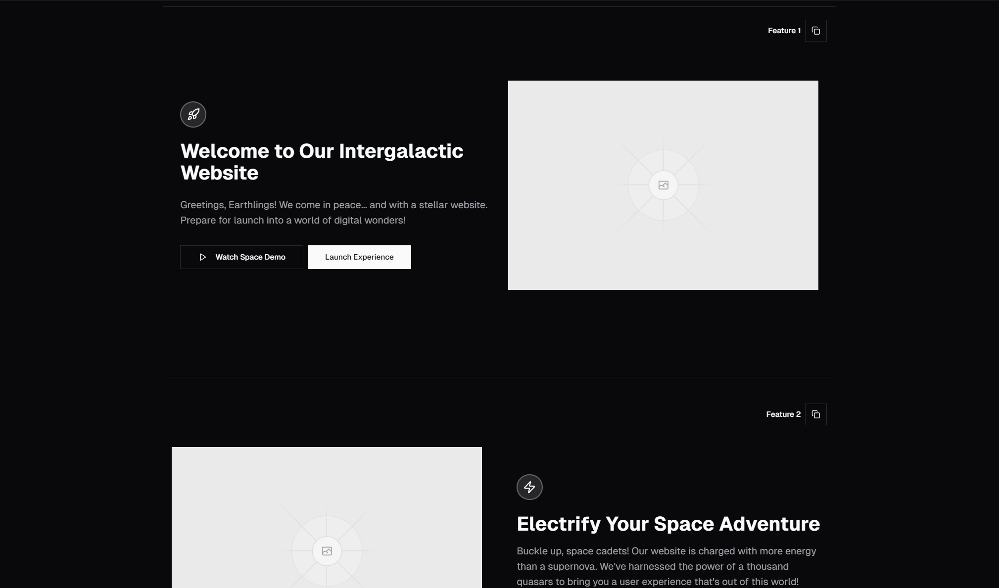
Feature sections are the backbone of every marketing page, product landing page, and SaaS homepage. They sit between the hero and the pricing table, and their job is straightforward: explain what your product does, why it matters, and why the visitor should care. A well-designed feature section converts curiosity into understanding. A poorly designed one gets scrolled past without a second glance.
Tailwind CSS has become the dominant approach for building feature sections because utility classes let you experiment with layouts, spacing, and responsive behavior directly in your markup. You do not need to maintain a separate stylesheet. You do not need to name things. You prototype a bento grid, decide it does not work, and restructure to an alternating layout — all without leaving your template file.
This guide covers every major feature section design pattern in Tailwind CSS, explains when each pattern works best, walks through the responsive behavior and visual hierarchy considerations, and references the SERP Blocks feature collection, which includes 132 feature section blocks built with Tailwind CSS and Shadcn UI.
Anatomy of an Effective Feature Section
Before diving into specific patterns, every feature section needs three foundational elements working together.
Section Header
The section header anchors the entire feature section. It typically includes a small label or eyebrow text ("Features," "Why Choose Us," "How It Works"), a bold headline that frames the features, and optionally a supporting paragraph.
In Tailwind, a typical section header looks like this:
<div class="mx-auto max-w-2xl text-center">
  <p class="text-sm font-semibold text-primary">Features</p>
  <h2 class="mt-2 text-3xl font-bold tracking-tight sm:text-4xl">
    Everything you need to ship faster
  </h2>
  <p class="mt-4 text-lg text-muted-foreground">
    Built for developers who value speed, quality, and flexibility.
  </p>
</div>
The max-w-2xl text-center pattern centers the header and constrains line length for readability. The eyebrow text uses text-sm font-semibold text-primary to create a subtle, branded label above the main headline.
Feature Items
Each feature item communicates a single benefit or capability. The standard feature item has three parts: an icon or visual, a title, and a short description. The icon provides a visual anchor. The title states the benefit. The description expands on it with one to three sentences.
Layout Grid
The grid determines how feature items are arranged on the page. This is where Tailwind's responsive utilities shine. A three-column grid on desktop might become a two-column grid on tablet and a single-column stack on mobile:
<div class="grid grid-cols-1 gap-8 md:grid-cols-2 lg:grid-cols-3">
  <!-- Feature items -->
</div>
This single line of Tailwind handles three breakpoints with zero media queries in a stylesheet.
Feature Section Design Patterns
1. Icon Grid
The icon grid is the most common feature section pattern on the web. Each feature gets an icon, a headline, and a short description, arranged in a uniform grid — typically three or four columns.
This pattern works because it is scannable. A visitor can glance at the six icons, read the six headlines, and understand your product's capabilities in under 10 seconds. The visual uniformity creates a sense of completeness and professionalism.
<section class="py-16 lg:py-24">
  <div class="container mx-auto px-4">
    <div class="mx-auto max-w-2xl text-center">
      <h2 class="text-3xl font-bold tracking-tight sm:text-4xl">
        Built for modern teams
      </h2>
      <p class="mt-4 text-muted-foreground">
        Tools that scale with your workflow.
      </p>
    </div>
    <div class="mx-auto mt-16 grid max-w-5xl grid-cols-1 gap-8 sm:grid-cols-2 lg:grid-cols-3">
      <div class="flex flex-col items-start">
        <div class="rounded-lg bg-primary/10 p-3">
          <!-- Icon SVG -->
        </div>
        <h3 class="mt-4 text-lg font-semibold">Feature Title</h3>
        <p class="mt-2 text-sm text-muted-foreground">
          Brief description of the feature and its benefit to the user.
        </p>
      </div>
      <!-- Repeat for each feature -->
    </div>
  </div>
</section>
When to use it: When you have 3-9 features of roughly equal importance and you want the visitor to scan all of them quickly. This pattern works for SaaS products, developer tools, and service pages.
Responsive behavior: Three columns on desktop, two on tablet (sm:grid-cols-2), and a single stack on mobile. The gap between items should be generous (gap-8 or larger) to prevent the grid from feeling cramped.
The SERP Blocks feature collection includes dozens of icon grid variations — centered icons, left-aligned icons, icons with colored backgrounds, icons with borders, and icons at different sizes. With 132 feature blocks total, there are icon grid variants for every visual style.
2. Bento Grid
The bento grid has become one of the defining design trends of 2024-2026. Inspired by Apple's product pages, bento grids use varied-size cards in an asymmetric grid to create visual interest and hierarchy. Some features get large cards that span two columns, others get standard single-column cards.
The key to a good bento grid is intentional hierarchy. The large cards should contain your most important features. The smaller cards are for supporting features. This asymmetry naturally guides the visitor's eye through the content in order of importance.
<div class="grid grid-cols-1 gap-4 sm:grid-cols-2 lg:grid-cols-3">
  <div class="sm:col-span-2 rounded-2xl border bg-card p-8">
    <!-- Primary feature: spans 2 columns -->
    <h3 class="text-xl font-semibold">Primary Feature</h3>
    <p class="mt-2 text-muted-foreground">Detailed description...</p>
    <div class="mt-6 aspect-video rounded-lg bg-muted">
      <!-- Feature illustration or screenshot -->
    </div>
  </div>
  <div class="rounded-2xl border bg-card p-8">
    <!-- Secondary feature -->
  </div>
  <div class="rounded-2xl border bg-card p-8">
    <!-- Secondary feature -->
  </div>
  <div class="sm:col-span-2 rounded-2xl border bg-card p-8">
    <!-- Another primary feature -->
  </div>
</div>
When to use it: When you have a mix of major and minor features and want to visually prioritize the most important ones. Bento grids work especially well for product launches, where you want to showcase 2-3 headline features alongside several supporting capabilities.
Responsive behavior: On mobile, every card becomes full-width in a single column. On tablet, the two-column span kicks in. On desktop, the full three-column asymmetric layout is visible. The gap-4 creates tight spacing that makes the bento grid feel like a cohesive unit rather than separate cards.
Design tips: Use rounded-2xl for the Apple-inspired rounded corner look. Add subtle borders (border) rather than shadows to keep the design clean. Use bg-card for a slight contrast against the page background. Include illustrations or screenshots inside the larger cards to fill the additional space.
3. Alternating Layout (Zigzag)
The alternating layout places each feature in a two-column row with the image on one side and text on the other. Each row flips the position — image-left/text-right, then text-left/image-right — creating a zigzag visual rhythm as the user scrolls down the page.
This pattern is effective for features that need visual demonstration. If a screenshot or illustration helps explain the feature, the alternating layout gives you ample space for both the visual and the description.
<div class="space-y-24">
  <!-- Feature row 1: Image left, text right -->
  <div class="flex flex-col items-center gap-12 lg:flex-row">
    <div class="flex-1">
      <div class="aspect-video overflow-hidden rounded-xl border bg-muted">
        <!-- Screenshot or illustration -->
      </div>
    </div>
    <div class="flex-1 space-y-4">
      <h3 class="text-2xl font-bold">Feature Title</h3>
      <p class="text-muted-foreground">
        Detailed explanation of the feature and its benefits.
      </p>
      <ul class="space-y-2 text-sm text-muted-foreground">
        <li class="flex items-center gap-2">
          <!-- Check icon --> Benefit point one
        </li>
        <li class="flex items-center gap-2">
          <!-- Check icon --> Benefit point two
        </li>
      </ul>
    </div>
  </div>

  <!-- Feature row 2: Text left, image right -->
  <div class="flex flex-col items-center gap-12 lg:flex-row-reverse">
    <!-- Same structure, flex-row-reverse flips the order -->
  </div>
</div>
When to use it: When each feature benefits from a visual demonstration — a screenshot, a code snippet, a diagram, or an animation. This pattern is common on SaaS product pages, developer tool documentation, and app landing pages.
Responsive behavior: On mobile, the flex-col stacking ensures the image appears above the text in every row, regardless of the desktop order. On desktop, lg:flex-row and lg:flex-row-reverse create the alternating effect. The gap-12 provides comfortable spacing between the image and the text.
4. Card-Based Features
Card-based feature sections place each feature inside a distinct card with a border, background, or shadow. Unlike the flat icon grid, cards create a sense of containment and separation. Each feature feels like a discrete, clickable item.
<div class="grid grid-cols-1 gap-6 sm:grid-cols-2 lg:grid-cols-3">
  <div class="group rounded-xl border bg-card p-6 transition-shadow hover:shadow-lg">
    <div class="flex h-12 w-12 items-center justify-center rounded-lg bg-primary/10">
      <!-- Icon -->
    </div>
    <h3 class="mt-4 font-semibold">Feature Title</h3>
    <p class="mt-2 text-sm text-muted-foreground">
      Feature description with enough detail to explain the value.
    </p>
  </div>
</div>
When to use it: When each feature has a distinct identity and you want visual separation between items. Card-based layouts work well when features link to detail pages or documentation. The card container creates an implicit "clickable" affordance that flat icon grids lack.
Hover interactions: Use Tailwind's hover:shadow-lg or hover:border-primary to add subtle interactivity. The group utility lets you trigger hover effects on child elements when the card is hovered, enabling icon color changes or arrow animations.
5. Large Feature Spotlight
Sometimes you need to dedicate significant screen real estate to a single feature. The large feature spotlight uses a full-width or near-full-width layout with a large illustration, a prominent headline, and detailed supporting text. This is typically used for your product's primary differentiator.
<section class="py-16 lg:py-24">
  <div class="container mx-auto px-4">
    <div class="grid items-center gap-12 lg:grid-cols-2">
      <div>
        <p class="text-sm font-semibold text-primary">Core Feature</p>
        <h2 class="mt-2 text-3xl font-bold tracking-tight sm:text-4xl">
          The feature that changes everything
        </h2>
        <p class="mt-4 text-lg text-muted-foreground">
          A comprehensive description of your primary feature. This section
          should explain what it does, why it matters, and how it benefits
          the user. You have room for 3-4 sentences here.
        </p>
        <div class="mt-8 flex gap-4">
          <a href="#" class="rounded-md bg-primary px-6 py-3 text-sm font-medium text-primary-foreground">
            Get Started
          </a>
          <a href="#" class="rounded-md border px-6 py-3 text-sm font-medium">
            Learn More
          </a>
        </div>
      </div>
      <div class="aspect-square overflow-hidden rounded-2xl border bg-muted">
        <!-- Large feature illustration -->
      </div>
    </div>
  </div>
</section>
When to use it: For your product's headline feature, or when you want to break up a page that has too many uniform grid sections. Place one spotlight section between two grid-based feature sections to create visual variety.
6. Feature List with Icons
A simpler variation of the icon grid, the feature list arranges features vertically or in two columns with inline icons. Each feature is a single line or a tight icon-plus-text pair. This pattern is dense and efficient — it communicates many features in minimal vertical space.
<div class="grid grid-cols-1 gap-4 sm:grid-cols-2">
  <div class="flex items-start gap-3">
    <div class="mt-0.5 flex-shrink-0 text-primary">
      <!-- Check icon or small icon -->
    </div>
    <div>
      <p class="font-medium">Feature name</p>
      <p class="text-sm text-muted-foreground">One-line description.</p>
    </div>
  </div>
  <!-- Repeat -->
</div>
When to use it: When you have 8-20 features and want to list them efficiently without dedicating a full card or visual to each one. This pattern is common in comparison sections, plan feature lists, and "what's included" sections.
7. Tabbed Feature Sections
Tabbed feature sections show one feature at a time, with a tab bar or pill navigation allowing the user to switch between features. This pattern is effective when each feature needs significant visual space (a full-width screenshot, a code example, or a detailed illustration) and you do not want vertical scrolling through all of them.
<div class="space-y-8">
  <div class="flex justify-center gap-2">
    <button class="rounded-full bg-primary px-4 py-2 text-sm font-medium text-primary-foreground">
      Analytics
    </button>
    <button class="rounded-full border px-4 py-2 text-sm font-medium text-muted-foreground hover:text-foreground">
      Automation
    </button>
    <button class="rounded-full border px-4 py-2 text-sm font-medium text-muted-foreground hover:text-foreground">
      Integrations
    </button>
  </div>
  <div class="rounded-2xl border bg-card p-8">
    <!-- Active feature content: headline, description, and large visual -->
  </div>
</div>
When to use it: When each feature deserves a full-width showcase and you want to keep the section height manageable. This works well for complex products with distinct feature areas — like a project management tool showing analytics, workflows, and integrations as separate tabs.
8. Stats + Features Combination
This pattern intersperses large stat numbers with feature descriptions. "100K+ developers," "99.9% uptime," "50ms response time" — each stat is paired with a brief explanation. The numbers create an immediate visual impact that pure text descriptions cannot match.
<div class="grid grid-cols-2 gap-8 lg:grid-cols-4">
  <div class="space-y-2">
    <p class="text-4xl font-bold text-primary">132</p>
    <p class="font-medium">Feature Blocks</p>
    <p class="text-sm text-muted-foreground">
      Pre-built, responsive feature section designs.
    </p>
  </div>
  <!-- Repeat for each stat -->
</div>
When to use it: When you have impressive numbers to showcase alongside features. This pattern is common for established products, infrastructure companies, and enterprise tools where scale and reliability are key selling points.
Visual Hierarchy Principles for Feature Sections
Consistent Spacing
The most common mistake in feature section design is inconsistent spacing. Every feature item in a grid should have identical padding, identical gap between the icon and the title, and identical gap between the title and the description. Tailwind makes this easy because you define spacing once in the grid or the repeated component structure.
Use space-y- for vertical stacking within feature items and gap- for the grid layout. Keep section padding generous: py-16 lg:py-24 gives the section room to breathe without feeling empty.
Icon Consistency
If you use icons, every icon should be from the same icon set, at the same size, with the same stroke weight. Mixing a Lucide icon with a Heroicons icon with a custom SVG creates visual noise. Pick one icon library and stick with it.
In Tailwind, standardize icon containers: flex h-10 w-10 items-center justify-center rounded-lg bg-primary/10 text-primary. Apply this pattern to every feature item without exception.
Typography Scale
Feature section headlines should be smaller than the page hero headline but larger than body text. A typical scale:
Section headline:
text-3xl font-bold tracking-tight sm:text-4xlFeature item title:
text-lg font-semiboldorfont-mediumFeature item description:
text-sm text-muted-foregroundortext-base text-muted-foreground
Never use the same font size for the section headline and the feature item titles. The hierarchy must be immediately obvious.
Responsive Design Considerations
Column Breakpoints
The standard responsive pattern for feature grids is:
Mobile (default): 1 column
Tablet (
sm:ormd:): 2 columnsDesktop (
lg:): 3 or 4 columns
Four-column grids work when feature items are compact (icon + title + one line of description). Three-column grids work for most feature items with descriptions of 2-3 sentences. Two columns should be the maximum for feature items with long descriptions or large visuals.
Touch Targets
On mobile, ensure that any interactive elements within feature items (links, buttons, expandable sections) have a minimum touch target of 44x44 pixels. Tailwind's p-3 or p-4 on icon buttons and links typically satisfies this requirement.
Image Handling
Feature section images (screenshots, illustrations, mockups) should be responsive. Use aspect-video or aspect-square with overflow-hidden to maintain consistent aspect ratios. On mobile, images should span the full width of the content area. On desktop, they share space with text in alternating layouts.
For performance, use Next.js Image with appropriate sizes attributes so the browser loads the correct resolution for each viewport.
Conversion Optimization for Feature Sections
Feature sections are not just informational — they are conversion tools. Every design decision should nudge the visitor closer to the CTA.
Scannable Structure
Most visitors do not read feature sections word by word. They scan headlines and icons, then read descriptions only for features that catch their attention. Design for scanning first: make headlines descriptive and specific ("Real-time collaboration" is better than "Work together"), use icons that visually reinforce the headline, and keep descriptions concise.
Progressive Disclosure
If you have many features, do not dump all of them into a single 12-item grid. Use a tiered approach: show 3-6 key features prominently, then offer a "See all features" link or an expandable section for the full list. This prevents cognitive overload while ensuring completeness.
Social Proof Integration
Feature sections become more persuasive when paired with evidence. A feature about "99.9% uptime" is more credible with a link to a status page. A feature about "loved by 10,000 teams" is more credible with small logo images of recognizable customers. Consider weaving testimonial blocks between feature sections for this purpose.
CTA Placement
Place a CTA button either at the top of the feature section (above the grid) or at the bottom (below the grid). Some designs include a CTA within each feature card, linking to the relevant documentation or detail page. The bottom CTA is the most common: after reading all the features, the visitor is ready to take action.
Building Feature Sections with SERP Blocks
The SERP Blocks feature collection includes 132 feature section blocks — the largest category in the entire library. Every pattern described in this guide is represented with multiple design variations.
The collection covers:
Icon grids in 3-column, 4-column, and 2-column layouts with left-aligned, centered, and inline icon positions.
Bento grids with varying card sizes, image integration, and asymmetric layouts.
Alternating (zigzag) layouts with screenshots, illustrations, and code snippet visuals.
Card-based features with hover effects, gradient backgrounds, and bordered designs.
Feature spotlights with large visuals and detailed descriptions.
Stats + features combinations with animated counters and bold typography.
Tabbed feature sections with pill navigation and content switching.
Feature lists with checkmarks, bullet points, and compact inline layouts.
All 132 blocks are built with Tailwind CSS and Shadcn UI components. They are responsive by default, accessible, and optimized for Next.js and React. Every block is a complete, self-contained section that you can drop into your page and customize with Tailwind utilities and CSS variables.
Beyond feature sections, SERP Blocks provides over 1,200 blocks across 50+ categories. Feature sections rarely exist in isolation — they sit alongside hero sections (81 blocks), CTA sections (32 blocks), pricing tables (21 blocks), testimonial sections (40 blocks), and footer layouts (21 blocks). Having all of these from a single, consistent design system means your entire page looks cohesive from top to bottom.
Sixty blocks are available for free — no account or payment required. The full Pro library is available as an affordable one-time purchase, giving you lifetime access to every block across every category, including card layouts (110 blocks), contact forms (33 blocks), about sections (32 blocks), blog list pages (27 blocks), product pages (25 blocks), gallery components (25 blocks), and many more.
Putting It All Together
The best feature section is not the most visually complex one — it is the one that communicates your product's value most clearly and convinces the visitor to take the next step.
Start with the icon grid pattern if you are unsure which layout to use. It works for nearly every product and scales cleanly across breakpoints. Move to bento grids when you have clear feature hierarchy. Use alternating layouts when you have screenshots to show. Use tabbed sections when each feature needs dedicated screen space.
Keep your Tailwind classes consistent across all feature items. Use CSS variables for color theming so you can adjust the entire section's palette from one file. Maintain generous spacing. Prioritize scannability over density.
Feature sections are iterative. Build one, measure engagement (scroll depth, CTA clicks), and refine the design. With 132 feature block variations available in the SERP Blocks library, you can test different patterns rapidly without building each one from scratch. Start with a free block, customize it to your brand, and ship it. Then iterate based on what your users actually respond to.