Best Tailwind CSS Hero Section Examples in 2026
A comprehensive guide to hero section design patterns in Tailwind CSS — centered, split-screen, video, gradient, animated, and more. Featuring 81 ready-to-use hero blocks from SERP Blocks for React and Next.js.
SERP Blocks Team
Product
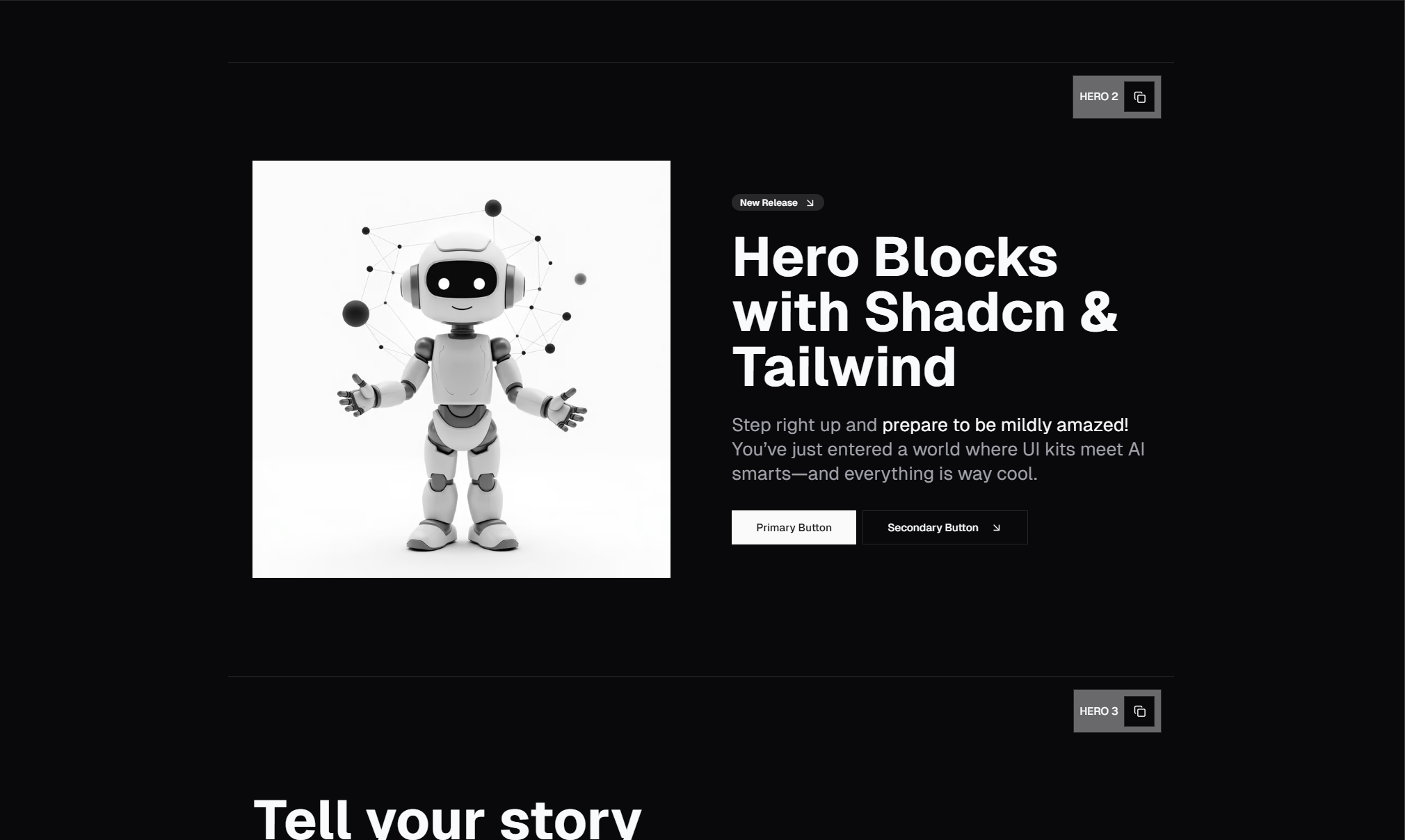
The hero section is the most important piece of real estate on any webpage. It occupies the full viewport on load, it delivers your first impression, and it determines whether visitors scroll down or bounce. In 2026, the bar for hero section design is higher than ever — users expect polished typography, smooth animations, responsive behavior, and fast load times all at once.
Tailwind CSS has become the dominant styling approach for building hero sections, and for good reason. Utility-first classes let you prototype and iterate on hero layouts in minutes rather than hours. You can fine-tune spacing, typography, and responsive behavior directly in your markup without context-switching to a separate stylesheet.
This post covers the major hero section design patterns in Tailwind CSS, explains when each pattern works best, and shows how to approach layout, typography, and CTAs for maximum impact. We will reference examples from the SERP Blocks hero collection, which includes 81 hero section blocks built with Tailwind CSS and Shadcn UI — but the design principles here apply to any Tailwind project.
What Makes a Great Hero Section
Before looking at specific patterns, let us establish what every effective hero section needs:
Visual Hierarchy
The hero should have exactly three levels of content importance:
The headline — the largest, boldest text on the page. This is your one-sentence value proposition. Users should be able to read it in under two seconds.
The supporting text — a subheading or short paragraph that adds context to the headline. Smaller text, lighter weight, often in a muted color.
The call to action — one or two buttons that tell the user what to do next. These should be visually prominent and use action-oriented language ("Get Started," "Try Free," "See Pricing").
In Tailwind, this hierarchy translates directly to utility classes. Your headline might use text-5xl font-bold tracking-tight on desktop and text-3xl on mobile. Your supporting text drops to text-lg text-muted-foreground. Your CTA buttons use contrasting background colors and generous padding.
Responsive Behavior
A hero that looks great on a 27-inch monitor but breaks on a phone is a failed hero. Every layout decision needs a mobile-first consideration. In Tailwind, this means starting with the mobile layout and layering on responsive modifiers:
<div class="flex flex-col lg:flex-row items-center gap-8 lg:gap-16">
  <!-- Text content stacks vertically on mobile, sits side-by-side on desktop -->
</div>
Split-screen layouts stack to single-column on mobile. Font sizes scale down. Padding adjusts. Background images shift or get replaced with simpler treatments. The best hero sections handle all of this gracefully.
Performance
Hero sections sit above the fold and directly impact your Largest Contentful Paint (LCP) score — one of Google's Core Web Vitals. Heavy background images, unoptimized videos, and JavaScript-dependent animations can tank your LCP and hurt your search rankings.
Use Next.js Image with priority for hero images. Lazy-load anything below the fold. Keep hero animations CSS-based rather than JavaScript-driven when possible. Prefer backdrop-blur and CSS gradients over image overlays.
Hero Section Design Patterns
1. Centered Text Hero
The workhorse of web design. A single column of centered text with a headline, subheading, and one or two CTA buttons. No images, no split layouts — just clean typography on a solid or gradient background.
This pattern is effective because it focuses 100% of attention on your message. There is nothing to compete with the headline. It loads fast because there are no images. It is trivially responsive because a single column works at every breakpoint.
In Tailwind, the structure looks like this:
<section class="flex min-h-[80vh] items-center justify-center px-4">
  <div class="mx-auto max-w-3xl text-center">
    <h1 class="text-4xl font-bold tracking-tight sm:text-5xl lg:text-6xl">
      Your headline here
    </h1>
    <p class="mt-6 text-lg text-muted-foreground">
      Supporting description text
    </p>
    <div class="mt-8 flex justify-center gap-4">
      <button class="rounded-md bg-primary px-6 py-3 text-primary-foreground">
        Get Started
      </button>
      <button class="rounded-md border px-6 py-3">
        Learn More
      </button>
    </div>
  </div>
</section>
When to use it: SaaS landing pages, developer tools, API products, and any page where the message is more important than visuals.
2. Split-Screen Hero
The viewport divides into two halves — text content on one side, a visual (image, screenshot, illustration, or video) on the other. This is arguably the most versatile hero pattern because it communicates both a message and a visual simultaneously.
The key Tailwind classes for a split-screen layout:
<section class="flex min-h-[80vh] flex-col lg:flex-row items-center">
  <div class="flex-1 px-8 py-16 lg:px-16">
    <!-- Text content -->
  </div>
  <div class="flex-1">
    <!-- Image or visual -->
  </div>
</section>
On mobile, the two halves stack vertically with text first. On desktop, they sit side by side. The flex-1 class gives each side equal width, though you can adjust the ratio with lg:w-3/5 and lg:w-2/5 for asymmetric splits.
When to use it: Product pages, app showcases, e-commerce homepages, and anywhere you want to show your product alongside the pitch.
3. Hero with Full-Width Background Image
A full-bleed background image spanning the entire viewport with text content overlaid. This creates a cinematic, immersive first impression that works well for visual brands.
The challenge is readability. Text on images is inherently harder to read than text on solid backgrounds. The solution is overlay gradients:
<section class="relative flex min-h-screen items-center">
  <img src="/hero-bg.jpg" class="absolute inset-0 h-full w-full object-cover" />
  <div class="absolute inset-0 bg-black/60" />
  <div class="relative z-10 mx-auto max-w-3xl px-4 text-center text-white">
    <!-- Text content sits above the overlay -->
  </div>
</section>
The bg-black/60 overlay ensures text remains readable regardless of what is happening in the background image. You can use gradient overlays (bg-gradient-to-r from-black/80 to-transparent) for a more sophisticated look that lets part of the image show through clearly.
When to use it: Creative agencies, photography portfolios, travel and hospitality, real estate, and lifestyle brands.
4. Gradient Background Hero
Gradient backgrounds have become a signature look in 2026 tech and SaaS design. Linear gradients, radial gradients, mesh gradients, and aurora effects create visual interest without the performance cost of images.
Tailwind makes simple gradients easy:
<section class="min-h-screen bg-gradient-to-br from-indigo-500 via-purple-500 to-pink-500">
  <!-- Content -->
</section>
For more complex gradients — mesh gradients, animated aurora effects, or multi-stop radial patterns — you will need custom CSS or a utility plugin. The trend in 2026 leans toward subtle, low-contrast gradients that create depth without overwhelming the content. Think soft purple-to-blue transitions rather than aggressive rainbow gradients.
When to use it: SaaS products, developer tools, fintech applications, and brands with strong color identities.
5. Hero with Product Screenshot or Mockup
A hero that features a large product screenshot, browser mockup, or device frame below or beside the headline. This is the "show, don't tell" approach — visitors see exactly what they are signing up for.
The product image typically sits below the headline and CTA in a centered layout, or beside them in a split layout. Common treatments include:
Browser chrome frames around screenshots
Laptop or phone device mockups
Perspective transforms using
transform rotate-y-3for a 3D angled lookDrop shadows with
shadow-2xlfor depthSubtle float animations using CSS keyframes
The SERP Blocks hero collection includes multiple variants of this pattern with different mockup styles and positioning options.
When to use it: Any product with a visual interface — SaaS dashboards, design tools, mobile apps, and web applications.
6. Hero with Social Proof
Social proof built directly into the hero section — customer logos, testimonial quotes, rating stars, or user count badges. This pattern addresses the trust question immediately: "Are other people using this?"
Common social proof elements in hero sections:
A row of customer or press logos below the CTA buttons
An avatar stack showing recent users ("Join 10,000+ developers")
A star rating with review count
A short testimonial quote from a recognizable name
In Tailwind, a logo bar below the CTA might look like:
<div class="mt-12 flex items-center justify-center gap-8 opacity-60 grayscale">
  <img src="/logos/company1.svg" class="h-8" alt="Company 1" />
  <img src="/logos/company2.svg" class="h-8" alt="Company 2" />
  <img src="/logos/company3.svg" class="h-8" alt="Company 3" />
</div>
The opacity-60 grayscale treatment is a common technique that shows the logos without letting them visually overpower the hero content. On hover, you can remove these filters to reveal full-color logos.
When to use it: Any product that has recognizable customers, press coverage, or strong user metrics to display.
7. Video Background Hero
Auto-playing, muted, looping video behind the hero text. This pattern creates immediate visual energy and is effective for brand storytelling, event pages, and creative portfolios.
<section class="relative flex min-h-screen items-center">
  <video
    autoplay muted loop playsinline
    class="absolute inset-0 h-full w-full object-cover"
  >
    <source src="/hero-video.mp4" type="video/mp4" />
  </video>
  <div class="absolute inset-0 bg-black/50" />
  <div class="relative z-10">
    <!-- Content -->
  </div>
</section>
Performance is the critical consideration. Video files are large. Use compressed MP4 (H.264), keep the video short (10-15 seconds), and provide a poster image that loads first. On mobile, consider replacing the video with a static image to save bandwidth.
When to use it: Brand sites, event pages, media companies, and creative agencies. Use sparingly — video backgrounds can feel gimmicky if the content does not warrant them.
8. Animated Hero with Motion
Heroes that incorporate motion — text reveal animations, floating elements, particle effects, scroll-triggered transitions, or animated SVGs. These create a premium, polished feel when done well.
In 2026, the trend is toward subtle, purposeful animation rather than flashy effects. A headline that fades up on load, a product screenshot that slides in from the right, or a gradient that slowly shifts colors — these feel modern without being distracting.
Popular animation approaches with Tailwind:
CSS animations via Tailwind's
animate-utilities (animate-fade-in,animate-slide-up)Framer Motion for React-based entrance animations
CSS
@keyframesfor custom animations referenced with Tailwind'sanimate-[custom]syntaxtransition-all duration-500for hover and interaction effects
When to use it: Product launches, creative portfolios, and premium SaaS products. Avoid heavy animations on content-focused sites where they would distract from the message.
9. Hero with Announcement Banner
A hero section topped with a small banner or badge that highlights a recent announcement — "New: Version 3.0 released," "Featured on Product Hunt," or "Now with AI-powered search." The banner draws attention to news without changing the overall hero structure.
The banner is typically a pill-shaped badge positioned above the headline:
<a href="/changelog" class="inline-flex items-center gap-2 rounded-full border px-4 py-1.5 text-sm">
  <span class="rounded-full bg-primary px-2 py-0.5 text-xs text-primary-foreground">New</span>
  Version 3.0 is now available
  <svg><!-- arrow icon --></svg>
</a>
When to use it: Products with active development cycles, SaaS tools with regular feature releases, and any product that wants to signal momentum.
10. Minimal / Typography-Only Hero
A stripped-down hero that relies entirely on typography — a large, bold headline with minimal or no supporting text, and sometimes no CTA button at all. The power comes from the words and the whitespace.
This pattern is popular with agencies, portfolios, and brands that want to make a statement. It requires a strong headline because there is nothing else to carry the section. Typography choices matter more here than in any other pattern — font family, weight, letter spacing, and line height all contribute to the impact.
When to use it: Agencies, creative portfolios, personal brand sites, and editorial publications.
Typography Best Practices for Hero Sections
Headline Sizing
The headline should be the largest text on the entire page. A common scale in Tailwind:
Mobile:
text-3xlortext-4xl(30-36px)Tablet:
sm:text-4xlormd:text-5xl(36-48px)Desktop:
lg:text-5xlorxl:text-6xl(48-60px)
Use tracking-tight (letter-spacing: -0.025em) on headlines to tighten the character spacing. Large text at default letter spacing looks loose and amateurish. Tight tracking makes headlines feel deliberate and polished.
Line Length
Keep headline lines under 15-20 words. Use max-w-3xl or max-w-4xl to constrain the text container so lines do not stretch across the full viewport on wide screens. Long lines are hard to read and make your hero look like a paragraph instead of a headline.
Font Weight
Headlines should be font-bold (700) or font-extrabold (800). The supporting text should be font-normal (400) or font-medium (500). This contrast in weight is what creates the visual hierarchy between headline and description.
CTA Button Design
Primary and Secondary Actions
Most hero sections benefit from two buttons: a primary action ("Get Started," "Try Free") and a secondary action ("Learn More," "Watch Demo"). The primary button uses a filled background (bg-primary), and the secondary uses an outline or ghost style (border or bg-transparent).
This two-button pattern works because different visitors are at different stages. Someone ready to sign up clicks the primary CTA. Someone who needs more information clicks the secondary CTA. Both paths keep the visitor engaged.
Button Size and Spacing
Hero CTA buttons should be larger than standard buttons. Use px-8 py-4 text-lg rather than the default button sizing. The buttons need to be visually prominent from across the room — users should be able to spot the CTA instantly.
Space buttons with gap-4 in a flex container. On mobile, consider stacking buttons vertically with flex-col sm:flex-row so they do not get squeezed on narrow screens.
Responsive Considerations
Mobile-First Padding
Start with generous mobile padding (px-6 py-16) and adjust for larger screens. It is better to have slightly too much padding on mobile than too little — cramped content on a small screen feels claustrophobic.
Image Handling
Background images should use object-cover to fill the viewport without distortion. On mobile, consider using a different image crop optimized for portrait orientation, or switch to a solid/gradient background when the image does not work at narrow widths.
Minimum Height
Use min-h-[80vh] or min-h-screen for hero sections to ensure they fill the viewport. Avoid fixed pixel heights, which will either leave empty space on large screens or cause overflow on small ones.
Building with Pre-Built Blocks
Designing a hero from scratch with Tailwind is entirely feasible — the utility classes make it straightforward. But building a great hero involves dozens of small decisions: the right line height, the right overlay opacity, the right button spacing, the right responsive breakpoints, proper dark mode colors, accessible focus states.
The SERP Blocks hero collection includes 81 hero section designs that handle all of these details. Each block is built with Tailwind CSS and Shadcn UI, works with React and Next.js, supports dark mode, and is fully responsive. You can copy any block into your project and customize it — change the text, swap the colors, adjust the layout.
Beyond hero sections, the full SERP Blocks library includes 1,200+ blocks across 50+ categories. Pair your hero with feature sections (132 blocks), CTA sections (32 blocks), testimonial sections (40 blocks), pricing tables (21 blocks), and footer sections (21 blocks) to build a complete landing page in minutes instead of days.
60 blocks are available for free. The full Pro library is a one-time purchase — no subscriptions, no recurring fees.
Browse the complete hero section collection at blocks.serp.co.