40+ Shadcn Testimonial Components You Can Copy-Paste
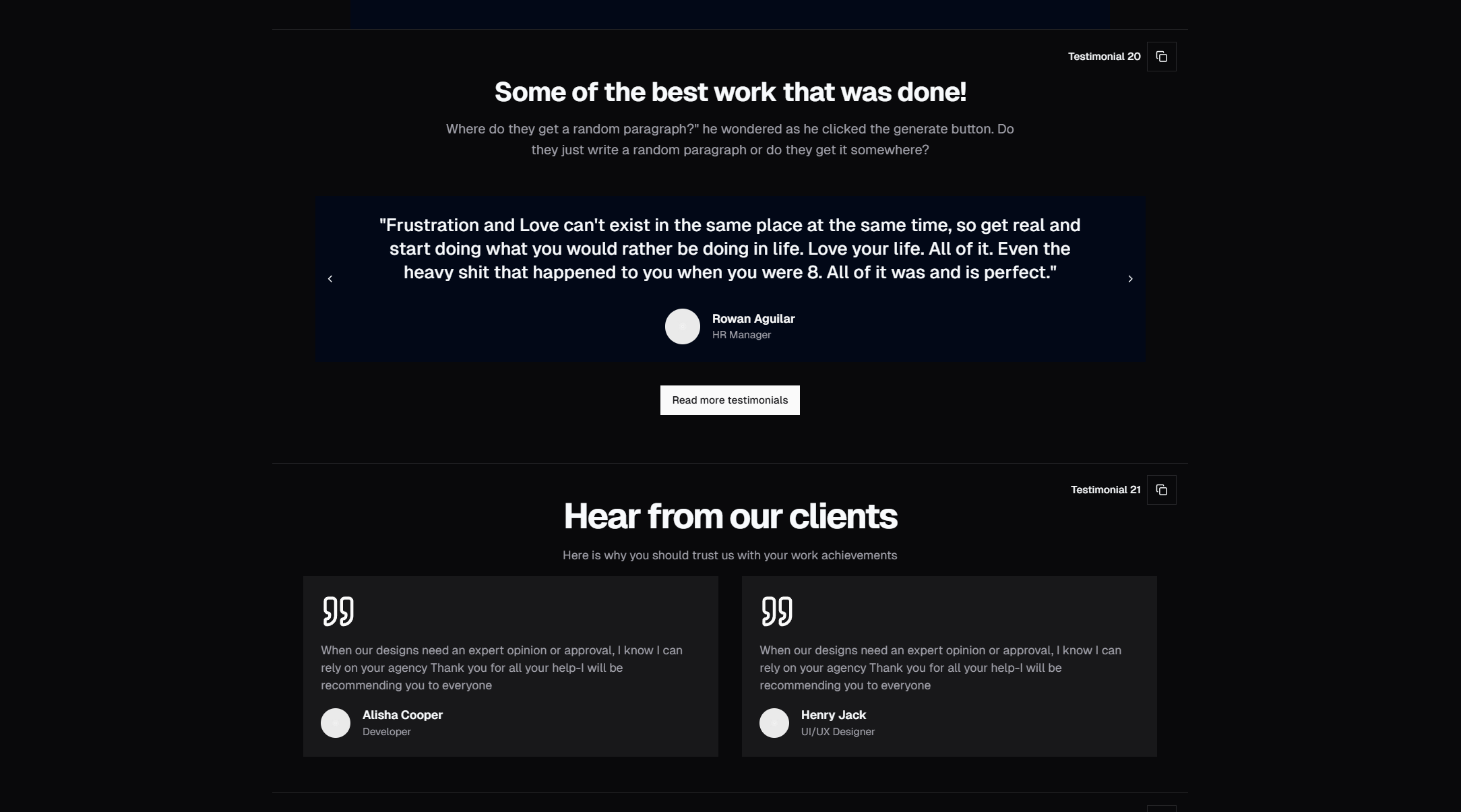
Browse 40 testimonial section designs for React and Next.js — carousel, grid, single quote, star ratings, and video testimonials. Built with Shadcn UI and Tailwind CSS.
Explore UI implementation walkthroughs, design breakdowns, and practical build notes from the component library.

Browse 40 testimonial section designs for React and Next.js — carousel, grid, single quote, star ratings, and video testimonials. Built with Shadcn UI and Tailwind CSS.
Everything you need to know about Shadcn UI — what it is, how it works, why developers love it, and how to start using it in your React and Next.js projects.
Honest comparison of the best free Shadcn UI block libraries — SERP Blocks, shadcnblocks, and others. Block count, quality, categories, and value assessed.
Comprehensive comparison of the best React UI component libraries — DaisyUI, Flowbite, MUI, Chakra, HeroUI, Mantine, Headless UI, and more. Find the right library for your project.

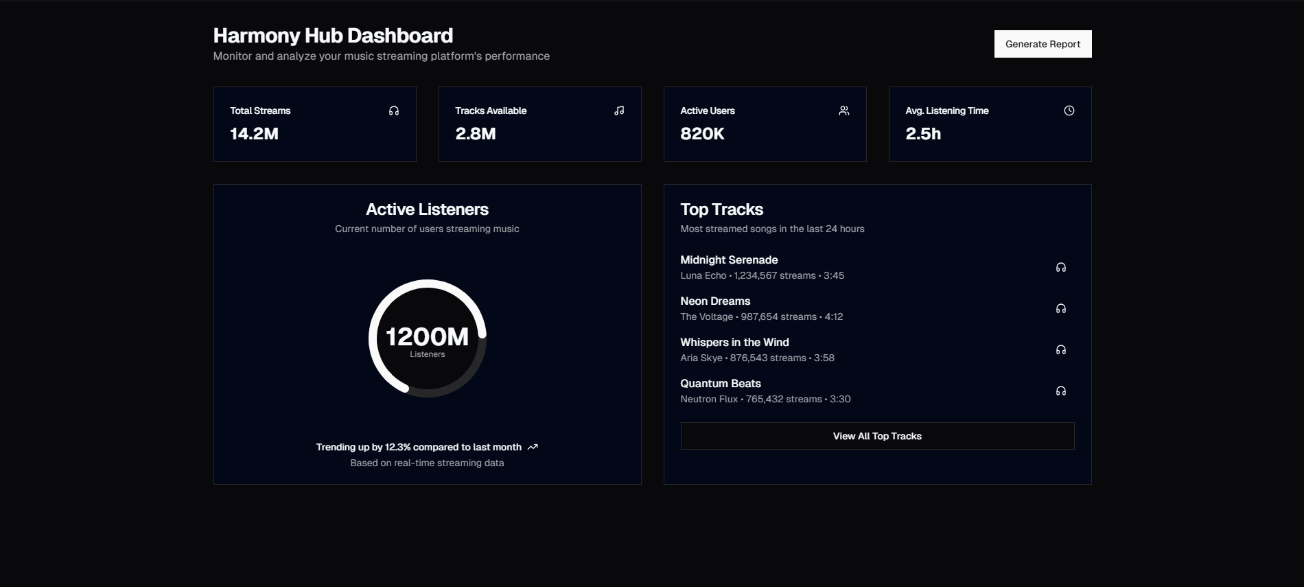
Step-by-step guide to building a complete admin dashboard with Shadcn UI — sidebar navigation, stat cards, charts, data tables, and settings. For Next.js App Router.

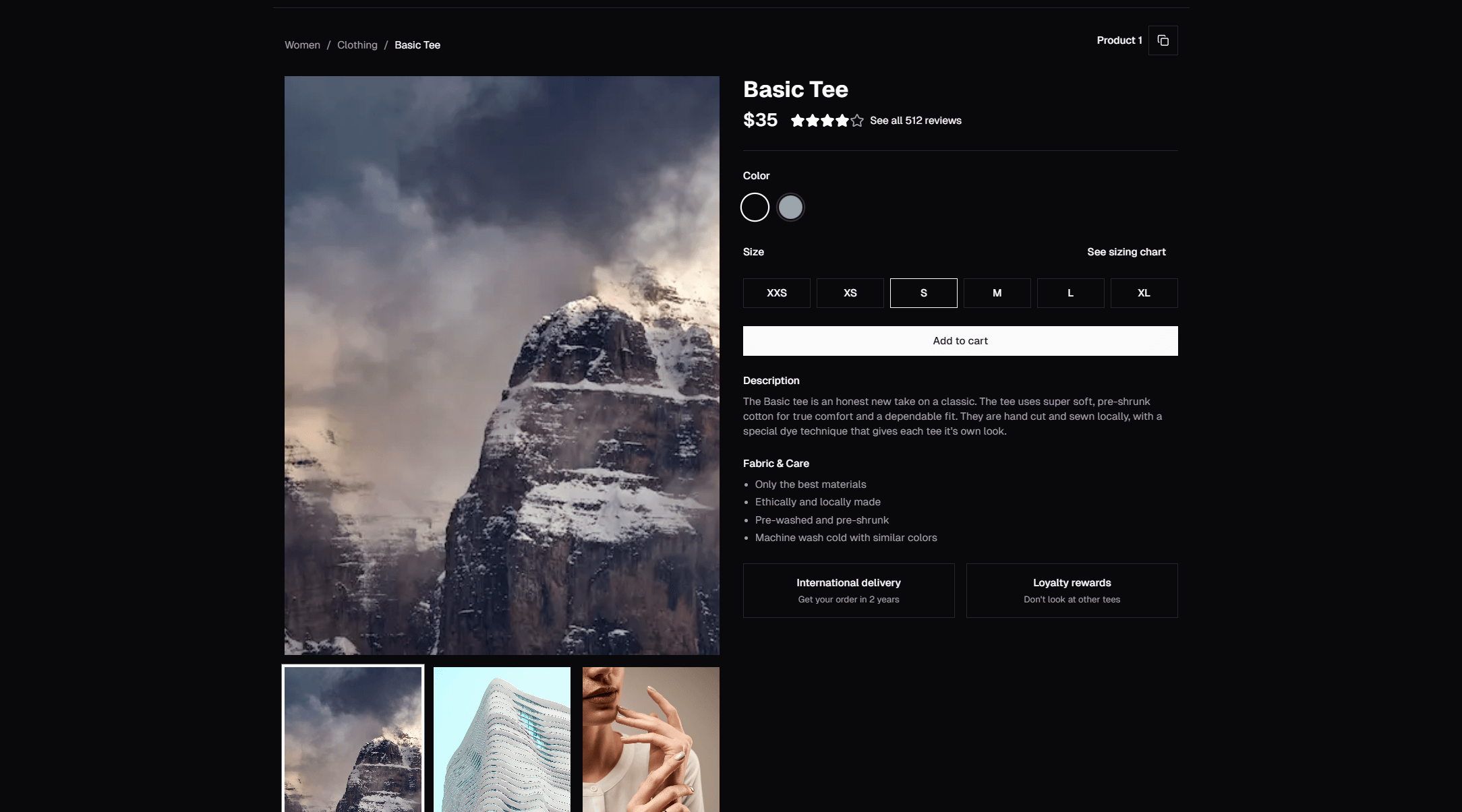
Assemble a full e-commerce product page using Shadcn UI blocks — product info, image gallery, reviews, related products, and shopping cart. Step-by-step for Next.js.

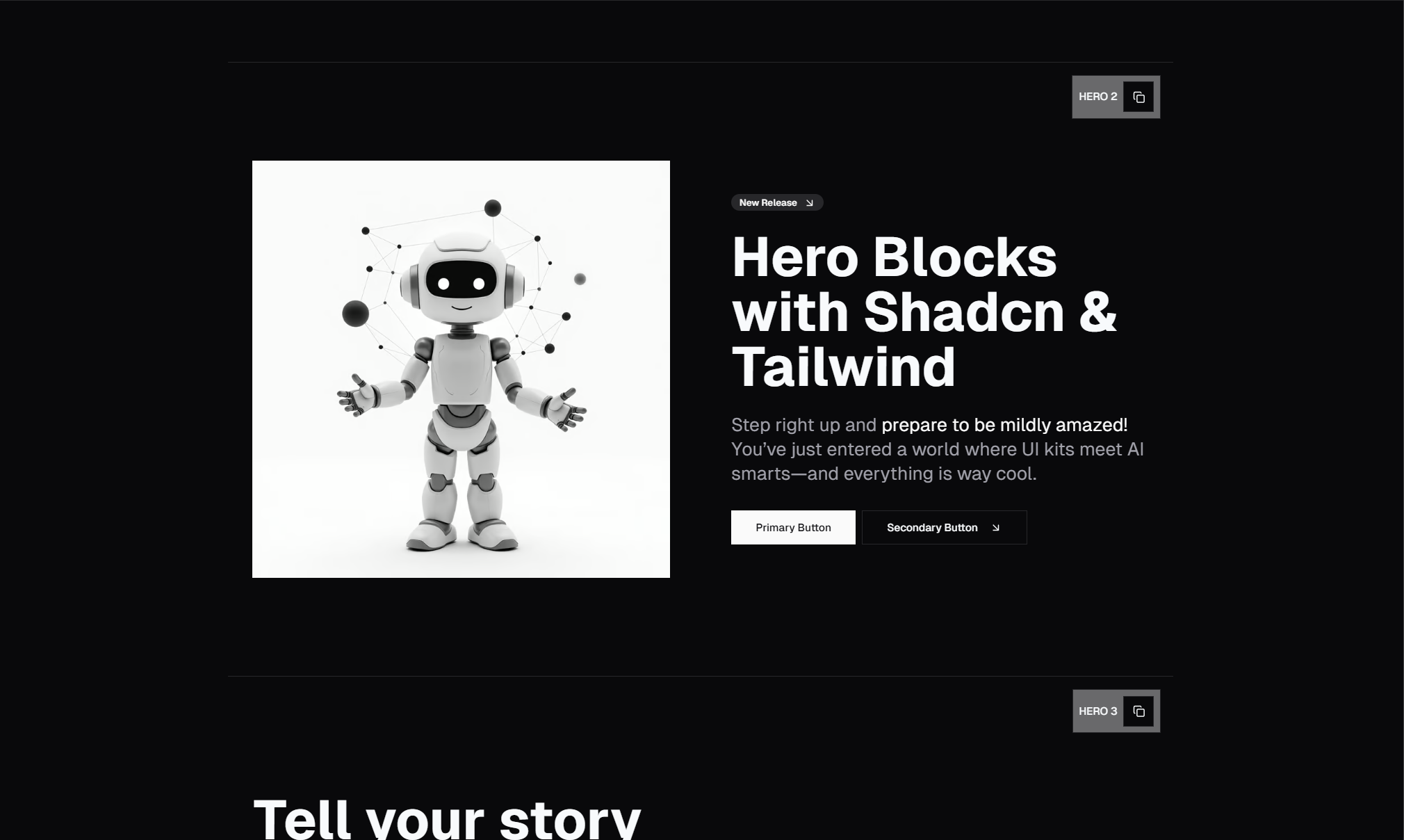
Step-by-step guide to assembling a complete SaaS landing page using Shadcn UI blocks — Hero, Features, Pricing, Testimonials, CTA, and Footer. Copy-paste and ship.

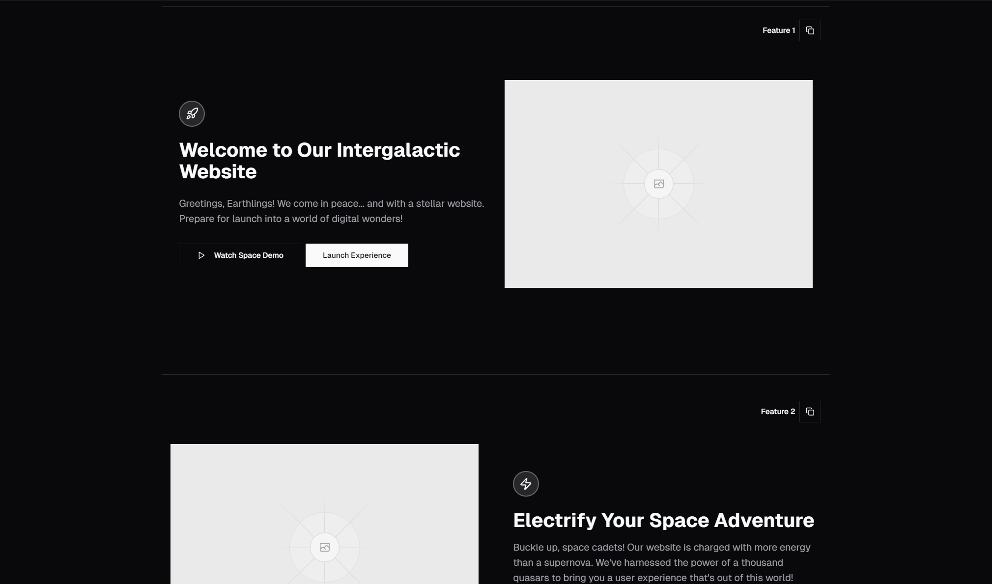
Assemble a complete startup website using Shadcn UI blocks — Navbar, Hero, Logos, Features, Stats, Team, CTA, and Footer. Perfect for indie hackers shipping fast.

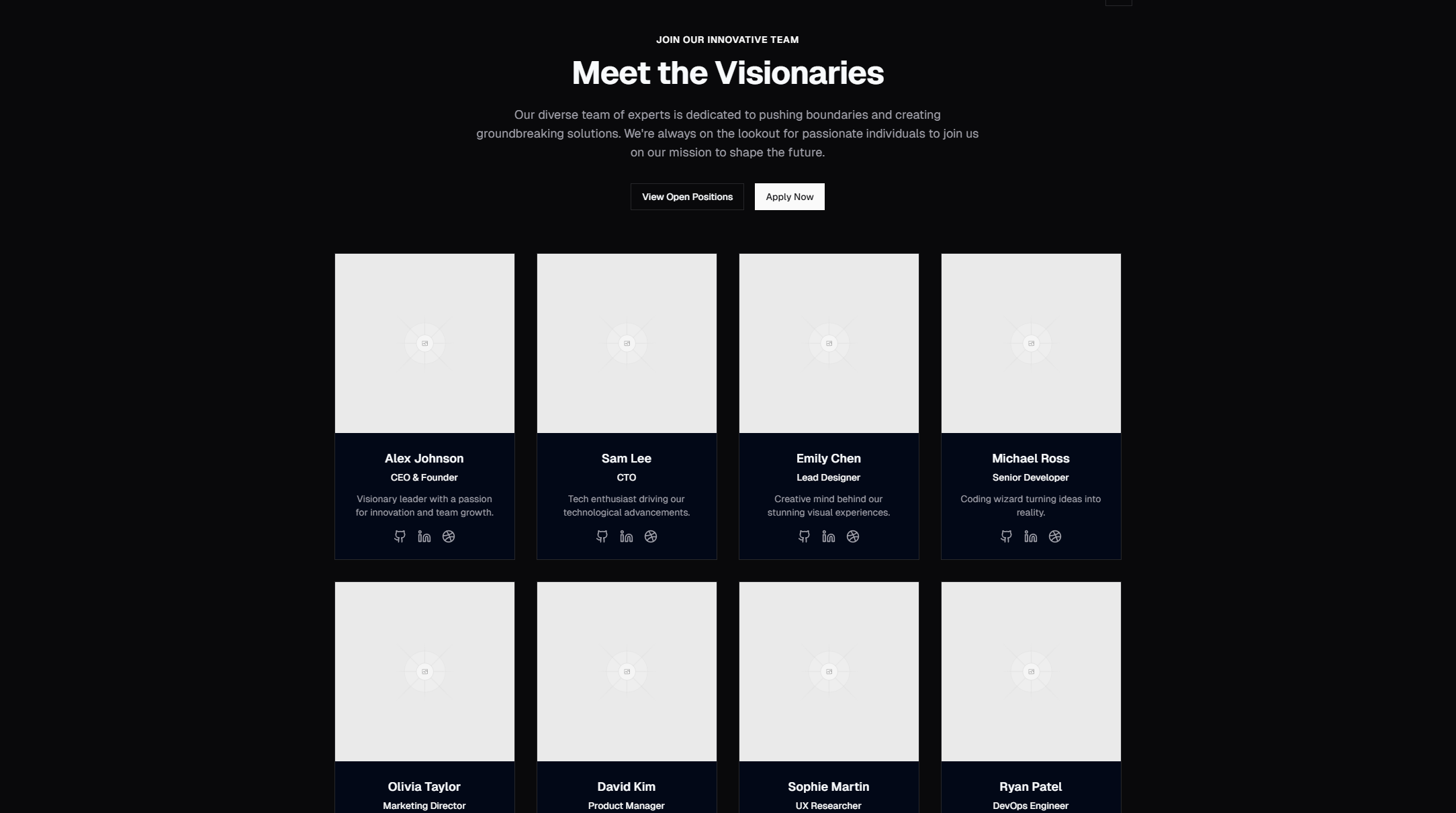
Browse 23 team section designs for React and Next.js — grid with socials, carousel, with bios, and more. Built with Shadcn UI and Tailwind CSS for company and startup websites.