How to Build a Dashboard with Shadcn UI and Next.js
Step-by-step guide to building a complete admin dashboard with Shadcn UI — sidebar navigation, stat cards, charts, data tables, and settings. For Next.js App Router.
SERP Blocks Team
Product
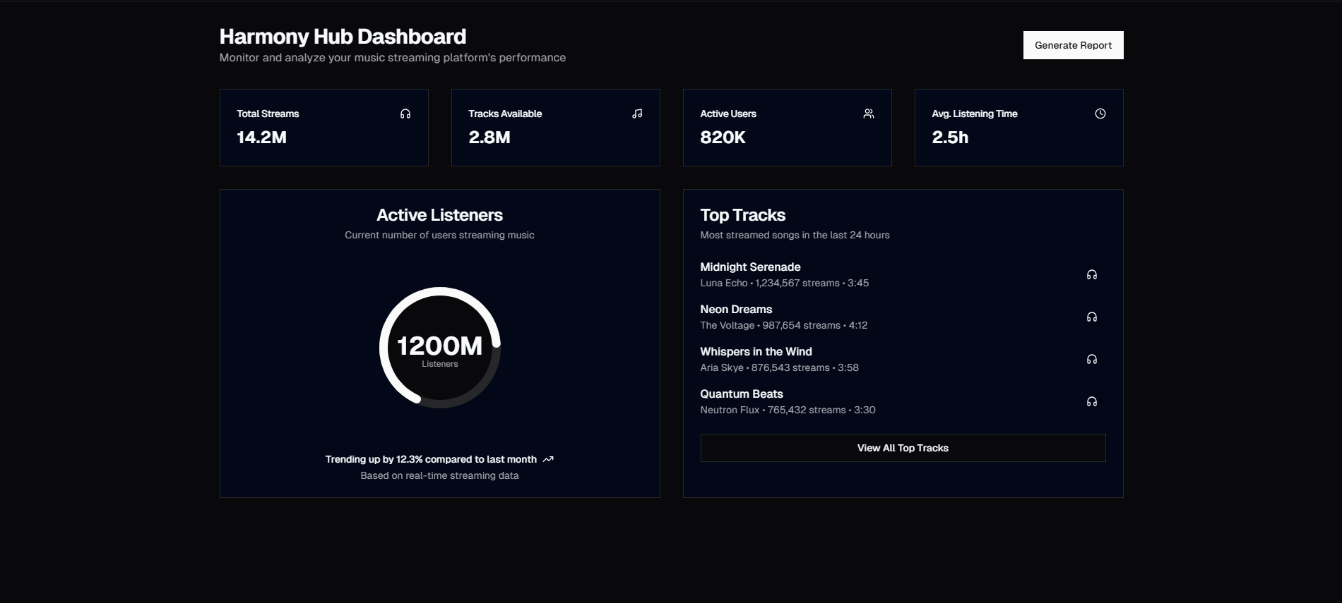
Dashboards are the most time-consuming frontend projects to build. The sidebar alone — with collapsible navigation, nested menus, active state tracking, and mobile responsive behavior — can take a full day. Add stat cards, charts, data tables, and settings pages, and you're looking at a week of pure UI work before you've connected any real data.
This guide shows how to assemble a complete dashboard using SERP Blocks and Shadcn UI, reducing that week to an afternoon.
Dashboard Architecture
A typical SaaS dashboard consists of:
Sidebar navigation — Primary navigation for the app
Header bar — User menu, notifications, search
Overview page — Stat cards and summary charts
Data pages — Tables with sorting, filtering, pagination
Detail pages — Individual record views
Settings — User profile, preferences, billing
Account overview — Subscription status and usage
Each maps to a block category in SERP Blocks.
Step 1: Sidebar Navigation
The sidebar is the skeleton of your dashboard. Browse the admin sidebar collection (10 designs) for options including:
Collapsible sidebar — Full labels that collapse to icon-only on narrow screens or user toggle
Sidebar with sections — Navigation items grouped under section headings (Dashboard, Content, Settings)
Sidebar with user avatar — User profile display at the bottom with logout action
Sidebar with nested menus — Expandable sub-navigation for complex app structures
Sidebar with notification badges — Count indicators for items needing attention
The sidebar should be implemented as a layout component that wraps your dashboard pages. In Next.js App Router:
// app/dashboard/layout.tsx
export default function DashboardLayout({ children }) {
  return (
    <div className="flex min-h-screen">
      <Sidebar />
      <main className="flex-1">{children}</main>
    </div>
  )
}
This ensures the sidebar persists across all dashboard pages without re-rendering on navigation.
Step 2: Overview Page
The dashboard homepage shows key metrics at a glance. Browse the dashboard collection (20 designs) for complete overview layouts.
Stat Cards
The top of the dashboard typically shows 3-4 stat cards with key metrics:
Revenue — Current period revenue with comparison to previous period
Users — Active users, new signups, or total accounts
Orders/Conversions — Primary business metric
Growth indicator — Percentage change with up/down arrow
Stat cards should show the metric name, current value, comparison value, and trend direction. Green for positive, red for negative — this visual encoding lets users assess performance without reading every number.
Charts
Below the stat cards, one or two charts provide trend visualization:
Line chart — Revenue or user growth over time
Bar chart — Monthly comparisons or category breakdowns
Area chart — Cumulative metrics over time
Shadcn UI's Chart component is built on Recharts, providing a consistent API for all chart types. Charts should be interactive — tooltips on hover showing exact values, and optionally clickable for drill-down views.
Recent Activity
A list or table showing the most recent transactions, signups, or events. This gives the dashboard a sense of real-time activity and provides quick access to items that might need attention.
Step 3: Data Tables
Most dashboard pages beyond the overview display data in tables. Browse the table collection (17 designs) for options including:
Sortable tables — Click column headers to sort ascending/descending
Filterable tables — Search inputs and dropdown filters to narrow results
Paginated tables — Page controls for large datasets
Selectable rows — Checkboxes for bulk actions (delete, export, status change)
Expandable rows — Click a row to reveal additional detail without navigating away
For production dashboards, consider using TanStack Table as the data management layer. It handles sorting, filtering, pagination, and selection logic while our blocks provide the visual presentation.
Table Actions
Each table row typically needs action buttons — edit, view, delete, or status change. Our table blocks include action column patterns:
Dropdown menu — Three-dot menu with action options
Inline buttons — Visible edit/delete buttons on each row
Row click — Entire row is clickable, navigating to a detail page
Step 4: Account and Settings Pages
Every dashboard needs user-facing management pages.
Account Overview
The account overview collection (10 designs) provides layouts for:
Plan summary — Current subscription tier, renewal date, usage limits
Usage metrics — API calls, storage, bandwidth with visual progress bars
Billing history — Past invoices with download links
Team management — List of team members with roles and invite flow
Settings Pages
The settings collection (10 designs) includes:
Profile settings — Name, email, avatar, password change
Notification preferences — Toggle switches for email, push, in-app notifications
Security settings — Two-factor authentication, API keys, session management
Danger zone — Account deletion with confirmation flow
Settings pages use Shadcn's form components — Input, Select, Switch, and Button — for consistent styling across all preference controls.
Step 5: Authentication
Dashboard access requires authentication. SERP Blocks provides complete auth screen designs:
Login pages (17 designs) — Email/password, social login, magic link
Sign up pages (11 designs) — Registration forms with validation
Forgot password (10 designs) — Password reset flow
These auth screens should live outside your dashboard layout (no sidebar) and redirect to the dashboard on successful authentication.
Step 6: Onboarding
New users need guidance. The onboarding collection (12 designs) provides:
Welcome screens — First-time user greeting with setup steps
Setup wizards — Multi-step forms for initial configuration
Progress checklists — Guided task lists that track completion
Feature tours — Highlighted feature introductions
Good onboarding directly impacts activation rates — the percentage of users who experience your product's core value. A well-designed onboarding flow can double your activation rate compared to dropping users into a blank dashboard.
Responsive Dashboard Design
Dashboards need to work on tablets, and ideally provide basic functionality on phones. The responsive strategy:
Desktop (1280px+)
Full sidebar + main content area. Stat cards in a 4-column grid. Charts at full width. Tables with all columns visible.
Tablet (768-1279px)
Sidebar collapses to icon-only or becomes a hamburger menu. Stat cards in a 2-column grid. Charts maintain full width. Tables may hide less important columns.
Mobile (< 768px)
Sidebar becomes a bottom tab bar or hamburger overlay. Stat cards stack single-column. Charts are swipeable. Tables use a card-based alternative view.
All SERP Blocks dashboard components handle these responsive breakpoints automatically.
Complete Dashboard Block Summary
| Section | Category | Count |
| Sidebar | Admin Sidebar | 10 |
| Dashboard Views | Dashboard | 20 |
| Data Tables | Table | 17 |
| Account | Account Overview | 10 |
| Settings | Settings | 10 |
| Login | Login | 17 |
| Sign Up | Sign Up | 11 |
| Password Reset | Forgot Password | 10 |
| Onboarding | Onboarding | 12 |
That's 117 blocks for building complete dashboard experiences. All available at SERP Blocks with 60 free blocks and the full 1200+ library through a one-time Pro purchase.