Best React Dashboard Templates and Components in 2026
Compare the best React dashboard templates and component libraries for 2026. Learn what makes a great admin panel, which components you need, and how to build production-ready dashboards with Shadcn UI, Tailwind CSS, and pre-built block libraries.
SERP Blocks Team
Product
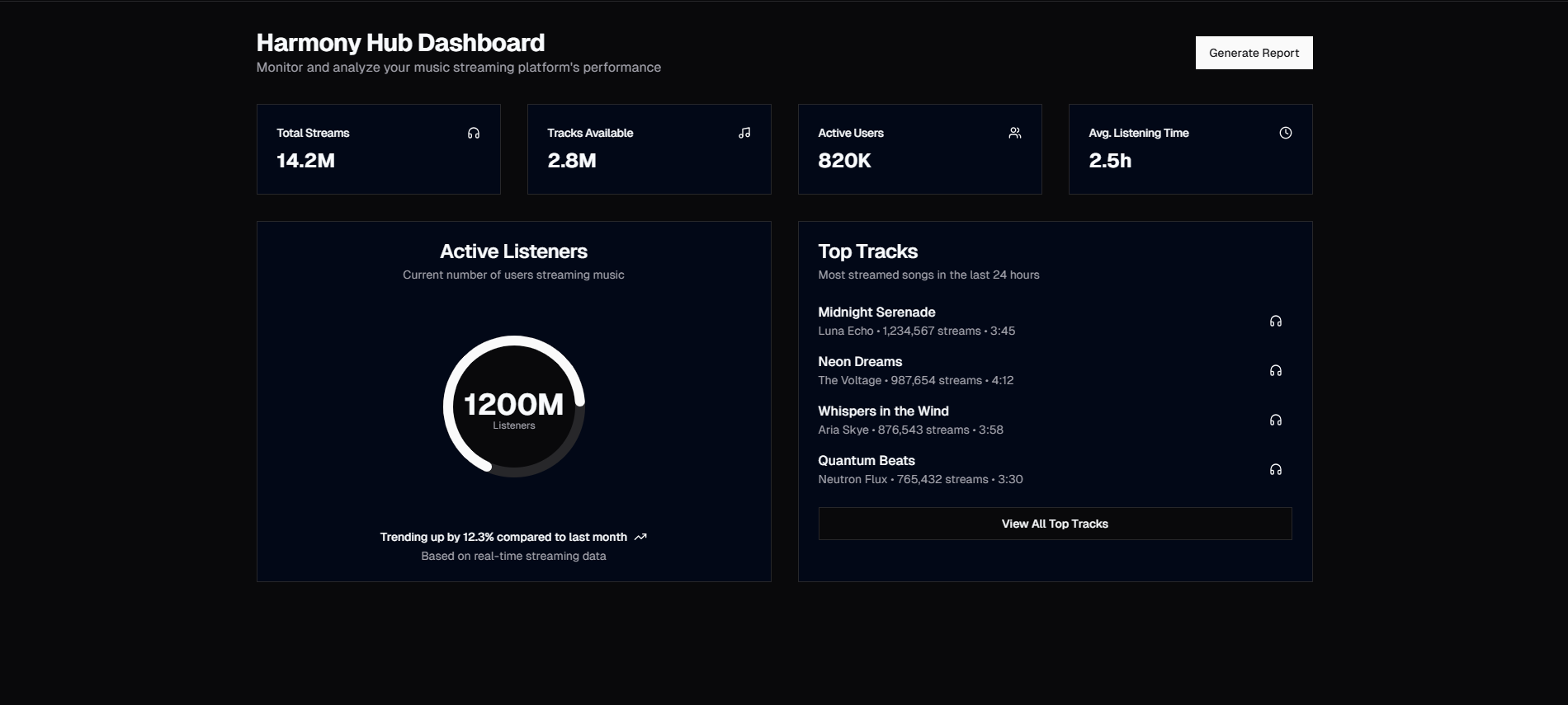
Every SaaS product, internal tool, and admin panel needs a dashboard. It is the first thing users see after login, the surface where they make decisions, and the interface they spend the most time interacting with. Building one from scratch is expensive. A well-designed dashboard involves layout scaffolding, sidebar navigation, data tables, stat cards, charts, settings panels, and account management views — all wired together with responsive behavior and dark mode support.
That is why dashboard templates exist. Rather than spending weeks on layout plumbing, you start with a proven structure and customize it for your product. The question is which approach gives you the best result for the least long-term cost.
This guide compares the major approaches to React dashboard templates in 2026, breaks down the components every dashboard needs, and explains why composable block libraries like SERP Blocks are replacing monolithic templates for teams that want both speed and flexibility.
What Makes a Great Dashboard Template
Before comparing options, it helps to define what separates a good dashboard template from a mediocre one.
Component coverage
A dashboard is not a single page. It is a system of interconnected views: an overview with stat cards, a data table for records, a settings panel, an account page, a sidebar for navigation. Templates that only provide the overview page leave you building the rest from scratch.
The best dashboard templates cover the full surface area: navigation, data display, forms, account management, and configuration views. That means you need components across multiple categories, not just a pretty homepage.
Design consistency
Every component in the dashboard needs to share the same spacing scale, color tokens, border radius, and typography. When stat cards use one shadow style and the data table uses another, the interface looks stitched together from different kits. Consistency comes from a shared design system — ideally one based on CSS variables or design tokens that propagate changes globally.
Customization depth
Templates that look great in the demo but resist customization are a trap. You need to be able to change colors, swap layouts, add or remove sections, and integrate your own data without fighting the template's internal structure. This is where the architecture matters: templates built with utility-first CSS (Tailwind) and composable components (Shadcn UI, Radix) are far easier to customize than those built on opinionated CSS-in-JS or proprietary styling systems.
Responsive behavior and dark mode
In 2026, responsive design and dark mode are not optional. Your dashboard will be viewed on desktop monitors, laptops, tablets, and occasionally phones. Every layout needs to collapse gracefully. And a significant percentage of your users will prefer dark mode, especially for data-dense interfaces they stare at for hours.
The Components Every Dashboard Needs
A production dashboard is built from roughly a dozen component categories. Here is the full list, with real component counts from the SERP Blocks library:
Sidebar navigation
The sidebar is the skeleton of any dashboard. It holds the primary navigation, branding, user avatar, and often a collapse/expand toggle. Sidebars need to support nested menu items, active state indicators, icons, and responsive behavior that collapses to a mobile drawer.
SERP Blocks includes 10 admin sidebar designs ranging from minimal icon-only bars to full multi-level sidebars with section headers and notification badges.
Stat cards and overview layouts
The dashboard overview page is a grid of stat cards showing key metrics — revenue, active users, conversion rate, orders — followed by one or more charts and a recent activity list. These components need to support comparison indicators (percentage change vs. previous period), trend arrows, and loading states.
The dashboard collection includes 20 complete dashboard layouts that combine stat grids, chart areas, and activity feeds into ready-to-use overview pages.
Data tables
Tables are the workhorse of any admin panel. Displaying records, filtering, sorting, pagination, row selection, bulk actions — these interactions need to be smooth and accessible. A basic HTML table is not enough; you need a component that handles column resizing, sticky headers, responsive overflow, and integration with your data layer.
SERP Blocks provides 17 table components covering everything from simple read-only lists to fully interactive tables with inline editing, column toggles, and multi-select.
Settings and configuration
Every product has settings: profile information, notification preferences, billing details, team management, API keys. These pages are form-heavy and typically organized with tabs or a side navigation pattern.
The settings collection includes 10 settings page layouts with different tab arrangements, form sections, and save/cancel patterns.
Account overview
Account pages show the user their profile, subscription status, usage metrics, and recent activity. They sit between the dashboard overview and the settings page — more personal than the main dashboard, less form-heavy than settings.
SERP Blocks includes 10 account overview designs with profile cards, usage bars, subscription status badges, and activity logs.
Modals and dialogs
Dashboard interactions frequently require modals: confirming a destructive action, editing a record inline, displaying details without leaving the current page. Good modal components support different sizes, scroll behavior for long content, focus trapping for accessibility, and stacking for nested modals.
The modal collection provides 13 modal designs covering confirmation dialogs, form modals, detail views, and full-screen overlays.
Onboarding flows
First-run experiences matter. Onboarding components guide new users through setup steps, feature introductions, or configuration wizards. These are often overlooked in dashboard templates, which means teams build them ad hoc and they end up inconsistent with the rest of the interface.
The onboarding collection includes 12 onboarding designs with step indicators, progress bars, and multi-step form layouts.
Approaches to React Dashboard Templates
Monolithic admin templates
Products like AdminLTE, CoreUI, and Vuexy provide complete admin panels as a single downloadable project. You clone the repo, remove what you don't need, and build on top of what's left.
Pros: Fast initial setup. Everything is already wired together. Routing, authentication scaffolding, and sample pages are included.
Cons: Difficult to customize deeply. The template's architecture decisions are baked in — its state management approach, its CSS methodology, its component library. Upgrading when the template releases a new version often means resolving merge conflicts across dozens of files you have modified.
Monolithic templates work best for internal tools where design polish is less important than speed of delivery. For customer-facing products, their rigidity becomes a liability.
Component library dashboards
Libraries like Material UI, Ant Design, and Chakra UI provide individual components (buttons, tables, modals) that you compose into dashboard layouts yourself. Some offer dashboard-specific components like stat cards or sidebar navigation.
Pros: High flexibility. You choose the layout, the routing approach, and the data layer. Components are well-documented and actively maintained.
Cons: You are building the layout from scratch. A component library gives you bricks, not a building. Assembling a complete dashboard from individual buttons, cards, and tables takes significant design and development time. You also inherit the library's styling approach — Material UI's emotion-based theming, Ant Design's Less variables — which adds complexity if it doesn't match your stack.
Composable block libraries
This is the approach that has gained the most traction in 2026. Instead of monolithic templates or individual primitives, block libraries provide pre-assembled sections — a complete sidebar with navigation, a stat card grid with chart area, a settings page with form sections — that you drop into your project and customize.
SERP Blocks is the largest example of this approach, with over 1,200 blocks across 50+ categories. For dashboard work specifically, it covers the full surface:
20 dashboard layouts — overview pages with stat grids, charts, and activity feeds
10 admin sidebars — collapsible navigation with icons, nested menus, and mobile drawers
17 table components — sortable, filterable, paginated data tables
10 account overview pages — profile cards, usage metrics, subscription status
10 settings pages — tabbed forms for profile, notifications, billing, and team management
That is 67 dashboard-related blocks that work together because they share the same design system: Shadcn UI primitives, Tailwind CSS utilities, and CSS variable theming.
Pros: Fast initial setup like monolithic templates, but with the customization depth of building from components. Each block is a self-contained file you copy into your project — no dependency on a library package, no version lock-in. You own the code completely.
Cons: You still need to wire up data fetching, state management, and routing yourself. Block libraries provide the UI layer, not the application layer.
Building vs. Buying: When Each Approach Makes Sense
Build from scratch when:
Your product has a genuinely unique interface pattern that no template covers
Your team has strong design resources and the timeline allows for custom UI development
The dashboard is the core product (analytics tools, monitoring platforms) rather than a supporting feature
Use a monolithic template when:
You are building an internal admin tool where design flexibility is less important than speed
The template closely matches your final design and minimal customization is needed
You do not expect to maintain the project for more than a year
Use a composable block library when:
You want speed without sacrificing customization
Your product is customer-facing and needs to feel polished and unique
You need to cover a wide surface area (dashboard, settings, account, onboarding, tables) with consistent design
Your stack is already based on React, Next.js, and Tailwind CSS
Beyond the Dashboard: Full Application Coverage
One advantage of block libraries over dashboard-specific templates is coverage. A SaaS product is not just a dashboard. It also needs a marketing site, a pricing page, a login flow, a blog, and documentation.
SERP Blocks covers all of these with the same design system:
81 hero sections for landing pages
132 feature sections for product marketing
21 pricing page designs for plan comparison
17 login pages and 11 sign-up pages for authentication flows
21 FAQ sections for support content
When your dashboard sidebar, your marketing hero section, and your login page all share the same color tokens, typography scale, and component primitives, the entire product feels cohesive. That consistency is nearly impossible to achieve when using separate tools for different parts of the application.
Key Technical Considerations
Server components and data fetching
In Next.js 14+, React Server Components change how dashboard data is loaded. Stat cards can fetch their data directly on the server, eliminating the loading spinner pattern that plagues client-side dashboards. When evaluating templates, check whether they support server components or are locked into client-only rendering with "use client" on every file.
Real-time updates
Dashboards for monitoring, support, or e-commerce often need real-time data. WebSocket connections, server-sent events, or polling intervals should be easy to wire into the template's stat cards and tables without major refactoring.
Accessibility
Data tables need proper aria attributes for screen readers. Sidebar navigation needs keyboard support and focus management. Modals need focus trapping. Charts need text alternatives. Accessibility is not a feature you bolt on later — it needs to be built into the components from the start.
Shadcn UI components are built on Radix UI primitives, which handle focus management, keyboard navigation, and ARIA attributes out of the box. Templates and blocks built on this foundation inherit these accessibility features automatically.
Performance
Dashboard pages with multiple charts, large tables, and real-time updates can become performance bottlenecks. Virtualized lists for long tables, lazy-loaded chart libraries, and efficient re-render patterns (React.memo, useMemo) are essential. Templates that load everything eagerly on initial render will feel sluggish as data volume grows.
Getting Started
If you want to evaluate the composable block approach for your next dashboard project, SERP Blocks offers 60 free blocks that you can copy into any React or Next.js project today. The free tier includes samples from multiple categories, so you can test the workflow before committing.
For full dashboard coverage — all 20 dashboard layouts, 10 admin sidebars, 17 tables, and the rest of the 1,200+ block library — the Pro tier is a one-time purchase with lifetime access. No subscription, no recurring fees.
The fastest path to a production dashboard is not building every component from scratch or locking into a monolithic template you will fight against for the life of the project. It is starting with well-designed, composable blocks that you own completely and can customize without limits.