Building a Marketplace UI with Shadcn Blocks
Build a complete two-sided marketplace interface using Shadcn UI blocks — directory listings, product grids, reviews, messaging, search, and payment. A full guide for buyer and seller views.
SERP Blocks Team
Product
Two-sided marketplaces are among the hardest UIs to build well. You need buyer-facing pages that feel like a polished shopping experience and seller-facing pages that feel like a capable management dashboard. There are listing detail pages, search and filter interfaces, review systems, messaging threads, checkout flows, and seller onboarding screens. Each side of the marketplace has its own set of requirements, and every page needs to work together as a cohesive product.
Building a marketplace from scratch means designing and coding dozens of unique page types. With SERP Blocks, you can assemble a complete marketplace UI using pre-built components that cover both buyer and seller experiences across every page type a marketplace needs.
Marketplace UI Architecture
A two-sided marketplace typically requires these page types:
Buyer-facing pages:
Homepage with featured listings and categories
Browse and search results with filters
Individual listing detail pages
Seller profile pages
Reviews and ratings
Messaging with sellers
Checkout and payment
Order tracking
Seller-facing pages:
Seller dashboard
Listing creation and management
Order management
Messaging with buyers
Earnings and payouts
Profile and settings
Let's build each part of the marketplace, starting with the buyer experience.
Buyer Experience: Homepage and Discovery
The marketplace homepage needs to accomplish two things: help buyers discover listings and build trust in the platform. Start with a strong hero section that communicates the marketplace's value proposition.
Hero and Search
Browse the hero collection (81 designs) for a hero that includes a prominent search bar. Marketplace heroes differ from SaaS heroes because the primary action is search, not signup. Look for designs with:
Centered search input with category dropdown or auto-suggest
Popular categories displayed below the search bar as quick-access chips
Background imagery that represents the marketplace category (handmade goods, services, real estate, etc.)
Trust indicators like "50,000+ listings" or "10,000+ verified sellers" built into the hero
The best marketplace heroes put the search bar front and center. The visitor's first instinct should be to type what they're looking for.
Category Navigation
Below the hero, a category grid helps buyers explore the marketplace by type. The directory list collection (10 designs) provides grid and list layouts perfect for displaying marketplace categories:
Icon grid — Category cards with icons, names, and listing counts
Image cards — Visual category cards with representative photos
Featured categories — Highlighted top-level categories with subcategory links
Compact list — Dense category listing for marketplaces with many verticals
Each category card links to a filtered browse page. Include listing counts ("Photography — 2,400 listings") to show marketplace depth and signal an active community.
Buyer Experience: Search and Browse
The browse page is where buyers spend most of their time. It needs robust filtering, sorting, and a scannable listing grid.
Listing Grid
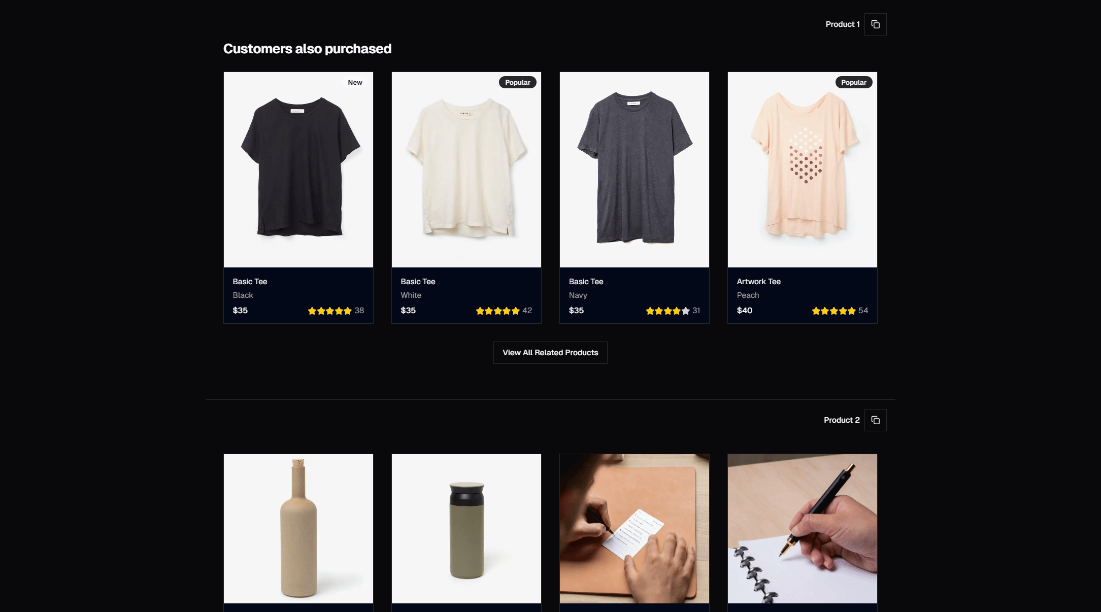
The product list collection (20 designs) provides the grid layouts you need for marketplace browse pages. While these blocks are designed for e-commerce, they map directly to marketplace listings:
Card grid — 3 or 4 column grid with image, title, price, and seller info
List view — Horizontal cards with more detail per listing, better for service marketplaces
Map + list split — Side-by-side map and listing grid for location-based marketplaces
Masonry grid — Pinterest-style layout for visual marketplaces (art, photography, design)
Each listing card should include the essential information a buyer needs to decide whether to click: a primary image, title, price, seller name or rating, and location if relevant. Avoid cramming too much into the card — the detail page handles the rest.
Filters and Sorting
Effective marketplace filtering is the difference between a usable browse experience and an overwhelming wall of listings. Build a filter sidebar with:
Category facets with counts
Price range slider or min/max inputs
Location radius selector for local marketplaces
Seller rating minimum threshold
Availability — Active listings, recently added, ending soon
Sort controls — Relevance, price low-to-high, price high-to-low, newest, highest rated
The product list collection (20 designs) includes layouts with built-in filter sidebars. On mobile, filters should collapse into a modal or slide-out drawer to preserve screen space for the listing grid.
Buyer Experience: Listing Detail Page
The listing detail page is the marketplace equivalent of a product page — it's where the purchase or booking decision happens. This page combines components from several block categories.
Listing Content
The directory single collection (10 designs) provides layouts purpose-built for individual listing pages:
Hero header with primary image or image gallery, title, price, and key details
Description section with rich text content, feature highlights, and specifications
Sidebar layout with sticky booking or purchase widget alongside scrollable listing content
Breadcrumb navigation showing the category hierarchy (Home > Services > Photography > Wedding Photography)
For marketplaces selling physical products, supplement with the product info collection (15 designs) for detailed specification layouts like tabbed content, accordion sections, and feature comparison grids.
Seller Information
Every listing page needs a seller card. Include:
Seller avatar and display name
Member since date
Average rating and total review count
Response time and response rate
A "Contact Seller" button that opens the messaging interface
A link to the full seller profile
This seller card should be visible without scrolling on desktop, typically in a sidebar position.
Reviews and Social Proof
Marketplace trust depends heavily on reviews. The reviews collection (13 designs) provides everything you need:
Aggregate rating summary — Average stars, rating distribution bar chart, total review count
Individual review cards — Buyer name, date, star rating, review text, and optional photos
Review filters — Filter by star rating, sort by most recent or most helpful
Verified purchase badges — Indicators that the reviewer actually completed a transaction
Reviews on a marketplace carry more weight than on a standard e-commerce site because the buyer is trusting an individual seller, not a brand. Display the aggregate prominently at the top of the reviews section and let visitors scan individual reviews below.
Buyer-Seller Messaging
Before purchasing, many marketplace buyers want to ask the seller questions. The contact collection (33 designs) provides contact form layouts that work well as the initial messaging interface:
Simple message form — Subject, message, and send button
Inquiry form with context — Pre-filled listing reference, message, and optional attachments
Quick question buttons — Pre-written common questions ("Is this still available?", "Can you ship to my area?")
For ongoing conversation threads after initial contact, the chat collection (10 designs) provides messaging interfaces with threaded conversations, read receipts, and file sharing.
Buyer Experience: Checkout and Payment
When a buyer decides to purchase, the checkout flow needs to be fast and trustworthy.
Payment Processing
The payment form collection (15 designs) provides checkout interfaces including:
Credit card forms with inline validation and card type detection
Multi-step checkout — Shipping address, payment method, review and confirm
Saved payment methods — Quick checkout for returning buyers
Split payment display — Show the item price, marketplace fee, taxes, and total clearly
For marketplaces, the payment form should clearly communicate that the platform handles the payment securely and that funds are held in escrow until the buyer confirms receipt. This is a trust issue specific to marketplaces that branded e-commerce stores don't face.
Order Confirmation
After payment, the order confirmation collection (10 designs) provides success pages with:
Order summary with line items and totals
Estimated delivery or fulfillment timeline
Seller contact information
Order tracking link
"Continue browsing" CTA to keep the buyer engaged
Seller Experience: Dashboard and Management
The seller side of a marketplace requires a different set of components focused on management and analytics.
Seller Dashboard
The dashboard collection (20 designs) provides the overview panels sellers need:
Revenue summary — Total earnings, pending payouts, this month's sales
Order activity — Recent orders, pending shipments, items to review
Listing performance — Views, saves, conversion rates per listing
Quick actions — Create new listing, respond to messages, update inventory
The dashboard is the seller's home base. It should surface the most important information and action items immediately.
Listing Creation
Sellers need a listing creation flow that captures all the necessary information without being overwhelming. The create post collection (10 designs) provides form layouts for content creation:
Multi-step form — Break listing creation into logical steps (photos, details, pricing, shipping)
Single-page form — All fields on one page with section headers for simpler listing types
Draft and publish workflow — Save drafts, preview before publishing, schedule listings
Combine these with the onboarding collection (12 designs) for first-time seller setup flows that guide new sellers through profile completion, payment setup, and their first listing.
Order and Account Management
For order management, the table collection (17 designs) provides data table layouts with sorting, filtering, and bulk actions — ideal for managing orders, listings, and payouts.
The account overview collection (10 designs) gives sellers a view of their account status, verification level, and platform standing. The settings collection (10 designs) handles profile editing, notification preferences, and payout configuration.
Platform Pages
Beyond the buyer and seller interfaces, a marketplace needs platform-level pages that apply to all users.
Navigation
The navbar collection (17 designs) provides navigation bars that can adapt based on user role. A marketplace navbar typically includes:
Search bar (always visible)
Category dropdown
"Sell" or "List an Item" CTA for potential sellers
Messages icon with unread count
User avatar with dropdown menu (profile, orders, settings, logout)
Trust and Information Pages
Build FAQ pages using the FAQ collection (21 designs) to address common marketplace questions: How do payments work? What happens if there's a dispute? How do returns work? What are the seller fees?
Use the footer collection (21 designs) for site-wide navigation with links to help center, trust and safety, seller guidelines, and legal pages.
Search Architecture
Marketplace search is a critical infrastructure decision. Your UI components need to support:
Search Results Page
Use the product list collection (20 designs) for the results grid. The search results page should include:
Result count and active filters displayed above the grid
Filter sidebar with faceted search (category, price, location, rating)
Sort dropdown (relevance, price, newest, rating)
Pagination or infinite scroll at the bottom
No results state with suggestions and popular categories
Search Suggestions
As the user types, provide real-time suggestions including:
Matching listing titles
Category suggestions
Seller names
Recent searches
This requires a fast search backend (Algolia, Meilisearch, or Elasticsearch) but the UI pattern is straightforward — a dropdown below the search input populated with results.
Technical Considerations
Performance at Scale
Marketplaces grow to thousands or millions of listings. Plan for:
Server-side rendering for listing pages (SEO and initial load speed)
Lazy loading for listing images in grid views
Cursor-based pagination instead of offset pagination for large datasets
Image optimization with Next.js
<Image>component for seller-uploaded photosCDN caching for listing images and static assets
SEO for Marketplaces
Each listing page is a potential search engine entry point. Implement:
Dynamic
<title>and<meta description>tags per listingSchema.org structured data (Product, Offer, Review, LocalBusiness as appropriate)
Canonical URLs for listings that appear in multiple categories
XML sitemap generation for all active listings
Responsive Design
Marketplace UIs need to work across devices because buyers browse on phones and sellers often manage listings from desktops. All SERP Blocks are responsive by default, but pay special attention to:
Filter interfaces on mobile (use drawers instead of sidebars)
Image galleries on touch devices (swipe support)
Data tables for order management on smaller screens (horizontal scroll or card view)
Complete Marketplace Block Summary
| Section | Category | Blocks Available |
| Discovery | Hero | 81 |
| Category Browse | Directory List | 10 |
| Listing Detail | Directory Single | 10 |
| Product Grids | Product List | 20 |
| Reviews | Reviews | 13 |
| Contact/Messaging | Contact | 33 |
| Live Chat | Chat | 10 |
| Payment | Payment Form | 15 |
| Order Confirmation | Order Confirmation | 10 |
| Seller Dashboard | Dashboard | 20 |
| Listing Creation | Create Post | 10 |
| Seller Onboarding | Onboarding | 12 |
| Order Tables | Table | 17 |
| Account | Account Overview | 10 |
| Settings | Settings | 10 |
| Navigation | Navbar | 17 |
| FAQ | FAQ | 21 |
| Footer | Footer | 21 |
That's 340 blocks across 18 categories covering every page of a two-sided marketplace — from buyer discovery to seller payouts. All available at SERP Blocks with 60 free blocks and the full 1200+ block library through a one-time Pro purchase.