React Card Component Examples: 100+ Designs for Every Use Case
Explore 110 React card component examples covering product cards, profile cards, pricing cards, stat cards, blog cards, and more. Built with Shadcn UI and Tailwind CSS for copy-paste use in any React or Next.js project.
SERP Blocks Team
Product
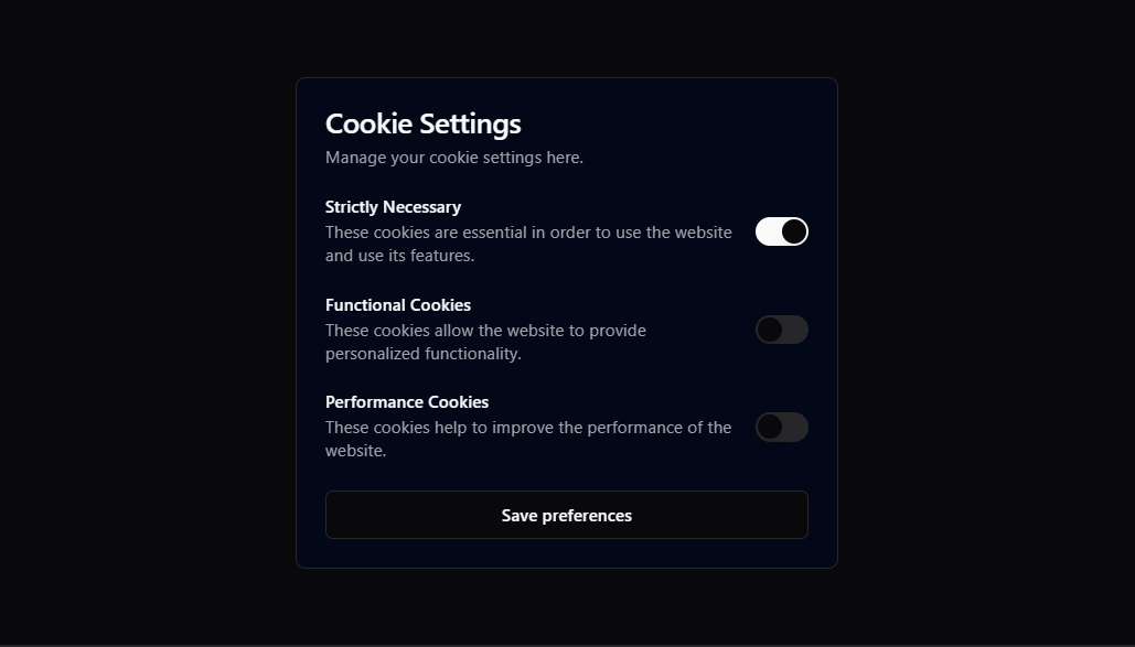
The card is the most versatile UI pattern in web design. It wraps a discrete piece of content — an image, a heading, a description, an action — into a self-contained unit that users instantly understand. Cards are everywhere: e-commerce product grids, team pages, analytics dashboards, blog feeds, pricing tables, feature showcases.
Yet building a good card component from scratch takes more thought than it appears. You need to handle responsive layout, hover states, dark mode, accessibility, content overflow, image aspect ratios, and action placement. Multiply that by the dozen different card types most projects need, and you're looking at serious design and development time.
The SERP Blocks card collection includes 110 card component designs, each built with Shadcn UI and Tailwind CSS. This article walks through the major card categories, the design patterns that make cards effective, and when to reach for a card versus a different UI pattern.
Product Cards
Product cards are the backbone of e-commerce. Every product listing, category page, and search result uses some variation of the same structure: image, name, price, and a call to action.
The challenge is density. A product card needs to communicate enough information for a shopper to decide whether to click through, without overwhelming the visual hierarchy. The most effective product cards follow a strict top-to-bottom flow:
Product image — Full-width, consistent aspect ratio across the grid
Category or brand label — Small, muted text above the product name
Product name — The primary text element, truncated to two lines maximum
Price — Clear and prominent, with sale pricing shown as a crossed-out original price alongside the discounted price
Action — An "Add to Cart" button or a quick-view trigger
Variants in the SERP Blocks collection cover horizontal card layouts where the image sits beside the text content, cards with wishlist heart icons in the top corner, cards with color swatch selectors, and cards with star rating displays. Some use image carousels that let the shopper preview multiple product photos without leaving the grid.
For full product page layouts, the product info collection includes 15 complete designs, and the product list collection has 20 grid layouts built from product cards.
Profile and Team Cards
Profile cards display a person: their photo, name, role, and a short bio or social links. These appear on team pages, user directories, author bylines, and community member lists.
The simplest profile card is a centered layout with a circular avatar, the person's name beneath it, their title in muted text, and a row of social media icons. But profile cards get more interesting with background images, offset avatar positioning, and expandable bio sections.
Horizontal profile cards work well for dense directories where you need to show many people without excessive scrolling. These place the avatar on the left with the name, role, and bio stacked to the right.
For leadership or "about us" pages, larger profile cards with full paragraphs of bio text and multiple contact options create a more personal feel. These often include a background gradient or a brand-colored accent bar along the top or side.
The SERP Blocks library includes 23 complete team section layouts that combine profile cards into full page sections with headers and grid arrangements.
Pricing Cards
Pricing cards present a single plan tier: the plan name, monthly or annual price, a list of included features, and a subscribe or purchase button. They're used individually or arranged in side-by-side comparison layouts.
Effective pricing cards use visual hierarchy to guide the user's eye:
Plan name at the top establishes what they're looking at
Price is the largest text element on the card, anchoring the comparison
Feature list uses checkmarks or icons to make scanning fast
CTA button is the only interactive element, making the action obvious
The most common pattern is to highlight one tier — usually the middle or "recommended" plan — with a different background color, a border, a badge, or a slight scale increase. This visual emphasis nudges users toward the plan you want them to choose.
The SERP Blocks collection includes pricing cards with annual/monthly toggle states, cards with "most popular" badges, enterprise-tier cards with "contact us" CTAs instead of prices, and cards with feature comparison tooltips. For full pricing page designs, the pricing collection has 21 complete layouts.
Stat and Metric Cards
Stat cards are the building blocks of dashboards and admin panels. Each card displays a single metric: a label, a number, and optionally a trend indicator or comparison to a previous period.
A typical stat card shows:
Metric label — "Total Revenue," "Active Users," "Conversion Rate"
Current value — The number itself, formatted appropriately (currency, percentage, abbreviated large numbers)
Trend indicator — An up or down arrow with a percentage change, colored green for positive and red for negative
Sparkline or mini chart — A small line graph or bar chart showing the metric over time
The best stat cards keep the number large and prominent. Everything else is supporting context. If someone glances at a dashboard and can't read the key metrics in under two seconds, the cards are too busy.
Stat cards from the SERP Blocks collection include variants with icon accents, progress bars, comparison columns (this period vs. last period), and goal tracking indicators. They pair naturally with the dashboard collection, which includes 20 complete dashboard layouts.
Blog and Content Cards
Blog cards preview an article in a feed or listing page. They typically show a featured image, the article title, a short excerpt, the author's avatar and name, the publication date, and a category tag.
The most important design decision for blog cards is the image-to-text ratio. Full-width images above the text content create a magazine-style feel and work well when you have strong photography. Smaller thumbnail images to the left of the text content create a more compact, scannable layout suited for news feeds or documentation sites.
Other variations include cards with no images at all — useful for text-heavy blogs where featured images add visual noise without information. Text-only blog cards rely on typography, spacing, and a clear heading hierarchy to create visual interest.
The SERP Blocks collection includes blog cards that pair with the blog list layouts (27 designs) and blog single layouts (12 article page templates).
Feature Cards
Feature cards highlight a single capability or benefit: an icon, a heading, and a short description. They're the atoms that combine into feature sections — those multi-column grids on landing pages that explain what a product does.
Feature cards come in several structural patterns:
Icon top, text below — The most common layout, stacking an icon or illustration above the feature name and description
Icon left, text right — A horizontal layout that's more compact and suits long feature lists
Large illustration cards — Cards where the visual element is a full illustration or screenshot rather than a simple icon
Numbered cards — Steps or processes where each card represents a sequential step, numbered prominently
Individual feature cards from the SERP Blocks collection can be used standalone or combined into custom layouts. For ready-made feature sections, the feature collection includes 132 complete layouts — the largest category in the library.
Testimonial Cards
Testimonial cards display a customer quote, the person's name, their company, and optionally their photo and a star rating. They serve as social proof on landing pages, product pages, and checkout flows.
The best testimonial cards make the quote itself the visual focus. Large quotation marks, slightly larger font size for the quote text, and a clear attribution line below. Photos of real people increase trust — generic avatar placeholders do the opposite.
Variations include cards with company logos, cards with video testimonial thumbnails, cards with linked case studies, and cards with verified purchase badges. For full testimonial sections with carousels and grids, the testimonial collection has 40 complete designs.
Design Patterns That Make Cards Work
Consistent Spacing
Cards in a grid need identical internal padding and external margins. When one card has 16px padding and its neighbor has 24px, the entire grid looks misaligned even if the cards are technically positioned correctly. The SERP Blocks card collection uses consistent spacing scales derived from Tailwind's spacing system.
Controlled Content Length
Cards break visually when one card in a grid has three lines of text and another has eight. The best approach is to truncate text content at a consistent line count using CSS line-clamp:
<p className="line-clamp-3 text-sm text-muted-foreground">
  {description}
</p>
This ensures every card in the grid maintains the same height regardless of content length.
Shadow and Elevation
Cards use shadow to communicate elevation — the sense that the card floats above the page surface. A subtle base shadow (shadow-sm) establishes the card boundary, while a hover shadow (hover:shadow-md) provides interactive feedback.
Avoid heavy shadows. The trend toward flatter design means most modern card implementations use very light shadows or rely on background contrast and borders instead.
Border Radius Consistency
Shadcn UI uses a CSS variable (--radius) to control border radius globally. This means all 110 card variants automatically match your project's border radius when you adjust this single variable. If you set --radius: 0.75rem, every card rounds its corners to that value.
Responsive Card Grids
Cards should reflow across breakpoints. The standard approach with Tailwind:
<div className="grid grid-cols-1 gap-6 sm:grid-cols-2 lg:grid-cols-3 xl:grid-cols-4">
  {cards.map((card) => (
    <CardComponent key={card.id} {...card} />
  ))}
</div>
This gives you a single column on mobile, two columns on small tablets, three on laptops, and four on wide screens. The gap-6 utility maintains consistent spacing between cards at every breakpoint.
Dark Mode
Every card in the SERP Blocks collection includes dark mode support through Tailwind's dark: variants and Shadcn's CSS variable system. Background colors, text colors, borders, and shadows all adapt automatically when the user's theme preference changes.
When to Use Cards vs. Other Patterns
Cards are powerful but not universal. Choosing the right pattern for your content matters.
Cards work best when:
Each item is independent and self-contained
Users need to scan and compare multiple items
Content has a repeating structure (image + title + description + action)
The page benefits from a grid or masonry arrangement
Items have a clear primary action (click to view, add to cart, select)
Use a table instead when:
Users need to compare specific attributes across many items
Data has many columns that need to be visible simultaneously
Sorting and filtering are primary interactions
The content is primarily numerical or tabular
The SERP Blocks table collection includes 17 table designs for these use cases.
Use a list instead when:
Items are sequential or ranked
The content is primarily text with minimal visual elements
Users need to process items in order
Screen space is limited and cards would create excessive scrolling
Use a timeline instead when:
Items have a temporal relationship
The sequence or chronology is the primary information
Users need to understand progression over time
Building with Shadcn UI Card Primitives
All 110 card designs in the SERP Blocks collection use Shadcn UI's Card primitives as their foundation:
import {
  Card,
  CardHeader,
  CardTitle,
  CardDescription,
  CardContent,
  CardFooter,
} from "@/components/ui/card";

export function ExampleCard() {
  return (
    <Card>
      <CardHeader>
        <CardTitle>Card Title</CardTitle>
        <CardDescription>Card description text</CardDescription>
      </CardHeader>
      <CardContent>
        <p>Main content goes here</p>
      </CardContent>
      <CardFooter>
        <Button>Action</Button>
      </CardFooter>
    </Card>
  );
}
These primitives handle the structural layout, background, border, and border-radius. All custom styling is applied through Tailwind utility classes, meaning every card integrates seamlessly with your existing Shadcn theme and CSS variables.
Cards Across the Full SERP Blocks Library
Cards don't exist only in the dedicated card collection. They appear throughout the 1200+ block library as building blocks within larger sections:
Hero sections — 81 layouts, many featuring card-based content grids
Feature sections — 132 layouts using feature cards in various arrangements
Gallery blocks — 25 layouts with image cards and lightbox cards
Portfolio blocks — 20 layouts with project showcase cards
Order confirmation blocks — 10 layouts with order summary cards
Account overview blocks — 10 layouts with settings and activity cards
60 blocks across the entire library are available for free. The Pro plan unlocks all 1200+ blocks with a one-time purchase — no subscription.