20 Must-Have UI Sections for Every SaaS Landing Page
The 20 essential sections every SaaS landing page needs to convert visitors into customers — from hero and pricing to FAQ and footer. Learn what each section does and how to build them fast with pre-built Shadcn UI blocks.
SERP Blocks Team
Product
Most SaaS landing pages fail not because the product is bad, but because the page is missing sections that visitors expect to see. A hero without social proof feels hollow. A pricing table without an FAQ leaves objections unanswered. A features section without testimonials asks people to take your word for it.
The highest-converting SaaS landing pages share a common blueprint — a predictable sequence of sections that guides visitors from curiosity to confidence to conversion. This post breaks down all 20 of those sections, explains why each one matters, and shows you how to build them with pre-built Shadcn UI blocks.
Why Section Sequence Matters
Visitors don't read landing pages. They scan. Eye-tracking research consistently shows that people move through web pages in an F-pattern — reading the headline, scanning left-to-right across key sections, then scrolling down the left edge looking for anchors that catch their attention.
This means the order and structure of your sections is just as important as the content inside them. Each section should answer a specific question the visitor has at that point in their journey:
Top of page: "What is this and why should I care?"
Middle of page: "How does it work and can I trust it?"
Bottom of page: "How much does it cost and what do I do next?"
Get the sequence right, and your landing page becomes a conversion funnel. Get it wrong, and visitors bounce before they ever see your pricing.
Here are the 20 sections you need — in order.
1. Hero Section
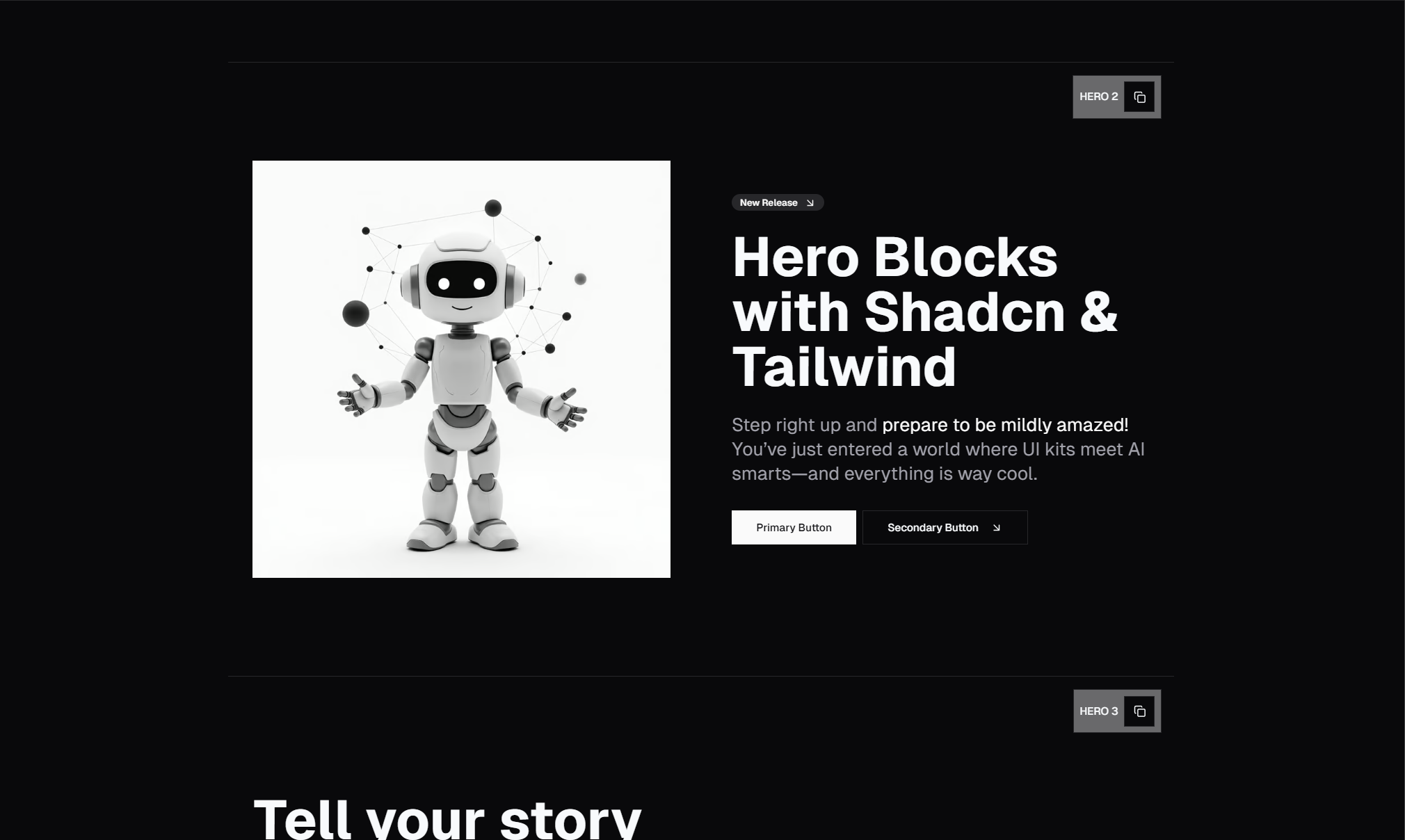
The hero is your first impression and your most important section. It needs to communicate your core value proposition in a single headline, support it with a brief subheading, and present a clear call-to-action button. Nothing else matters if your hero doesn't stop the scroll.
Great SaaS heroes use short headlines (under 10 words), a one-sentence description that adds context, and a high-contrast CTA button. Some include a product screenshot or illustration to the right of the text; others keep it minimal with centered copy only.
SERP Blocks includes 81 hero sections — split-screen layouts, centered text, video backgrounds, gradient overlays, and more. Every one is responsive and dark-mode ready.
2. Logo Cloud
Immediately below the hero, a logo cloud answers the unspoken question: "Who else uses this?" Displaying logos of recognizable companies or publications builds instant credibility before the visitor reads another word.
Keep it simple — a single row of 4 to 8 grayscale logos with a short label like "Trusted by" or "Featured in." No links, no descriptions. The logos do all the talking.
Browse 11 ready-made logos sections in SERP Blocks to find the right layout for your brand.
3. Features Overview
Once visitors know what your product is and who uses it, they want to know what it does. A features section typically uses a grid of 3, 4, or 6 cards — each with an icon, a short title, and a one-line description.
Avoid feature dumps. Pick your 3 to 6 strongest differentiators and present them clearly. Save the full feature list for a dedicated features page.
With 132 feature section blocks, SERP Blocks gives you icon grids, alternating image-text layouts, tabbed feature explorers, and every other pattern you might need.
4. How It Works
Features tell visitors what your product does. A "How It Works" section tells them how it does it. This is typically a 3-step horizontal layout with numbered icons, a title for each step, and a brief description.
The three-step pattern works because it makes complex products feel simple. Even if your product has 50 features, boiling the user journey down to three steps reduces friction and builds confidence.
You can build this with feature section blocks — several of the 132 variants are designed specifically for step-by-step flows.
5. Testimonials
Social proof is the most powerful conversion tool on any landing page. Testimonials show real people getting real results, which is far more convincing than any copy you could write yourself.
Use testimonials with photos, names, and roles. Pull quotes work well for short endorsements. For longer case-study-style testimonials, use a card layout with a quote, attribution, and optional star rating.
SERP Blocks includes 40 testimonial blocks — single quotes, carousels, grids, and sidebar layouts.
6. Pricing
Pricing is where visitors make their decision. A clear, well-designed pricing section eliminates confusion and reduces the number of support emails you receive.
Most SaaS products use a 2-to-3 tier layout with a highlighted "recommended" plan. Include a monthly/annual toggle if you offer both billing cycles, and list the most important features for each tier.
Choose from 21 pricing blocks — toggle-based, comparison tables, single-card, and enterprise layouts.
7. FAQ
Every pricing section should be followed by an FAQ. This is where you preemptively answer the objections that prevent people from buying: "Can I cancel anytime?" "Is there a free trial?" "Do you offer refunds?" "What payment methods do you accept?"
Accordion-style FAQs are the standard. They keep the section compact while allowing visitors to expand only the questions they care about.
SERP Blocks offers 21 FAQ blocks — accordion, two-column, searchable, and category-grouped layouts.
8. Call-to-Action (CTA)
A standalone CTA section near the bottom of the page gives visitors one last push to convert. This is different from the hero CTA — by this point, the visitor has read your features, seen your pricing, and checked your testimonials. The final CTA reinforces the value proposition and makes the action unmistakable.
Use a contrasting background color, a strong headline, and a single button. Keep it simple.
Explore 32 CTA blocks in SERP Blocks for banners, split layouts, and full-width conversion sections.
9. Footer
The footer is more than a legal requirement — it's a navigation safety net. Visitors who scroll to the bottom are engaged. Give them links to your product, company, and support pages. Include social media icons, a newsletter signup, and your copyright notice.
Pick from 21 footer designs — minimal, multi-column, CTA-integrated, and more.
10. Stats Section
Numbers build trust faster than words. A stats section displaying metrics like "10,000+ customers," "99.9% uptime," or "50M+ requests processed" adds quantitative proof that your product delivers results.
Place it after the hero or after the testimonials section for maximum impact. Keep it to 3 or 4 key stats.
SERP Blocks includes 10 stat blocks with counters, icon-based layouts, and animated number displays.
11. Team Section
For early-stage SaaS products, showing the team behind the product builds trust. A team section with headshots, names, and roles humanizes your brand and tells visitors there are real people behind the product.
Browse 23 team section layouts — grids, carousels, and cards with social links.
12. Blog Preview
A blog preview section shows visitors that your company produces valuable content and is actively maintained. Display your 3 most recent posts in a card grid with titles, dates, and featured images.
This section serves double duty: it provides value to the visitor and drives internal traffic to your blog. Choose from 27 blog list layouts in SERP Blocks.
13. Newsletter Signup
Not every visitor is ready to buy today. A newsletter section captures their email so you can nurture them over time. Keep it to a single input field and a submit button, with a short value proposition explaining what they will receive.
SERP Blocks has 13 newsletter blocks — inline, modal, and banner-style signups.
14. Banner / Announcement
A banner at the top of the page highlights time-sensitive information: a product launch, a limited-time discount, a new feature release, or an upcoming event. It sits above the navbar and creates urgency.
Pick from 20 banner blocks with dismissible, sticky, and animated styles.
15. Comparison Table
If your product competes in a crowded market, a comparison table showing how you stack up against alternatives can be the section that tips the decision. List your product alongside 2 to 3 competitors and use checkmarks, X marks, and feature labels to highlight your advantages.
You can build comparison tables using the 17 table blocks available in SERP Blocks.
16. Integrations / Logo Grid
Beyond the trust-building logo cloud near the top, a dedicated integrations section shows visitors which tools your product works with. Display integration logos in a grid with names and brief descriptions.
Use the logos blocks or feature blocks to build this section. The 11 logos layouts and 132 feature layouts give you plenty of options.
17. Security and Trust Badges
For SaaS products that handle sensitive data, a section showing security certifications (SOC 2, GDPR compliance, encryption standards) reduces anxiety and builds confidence. This is especially important for B2B products where procurement teams review security posture.
A simple row of badge icons with labels is often enough. Build it with content blocks or feature blocks.
18. Case Studies Preview
While testimonials provide quick social proof, case studies go deeper. A case studies preview section shows 2 to 3 cards with customer names, their industry, the problem solved, and a key result metric. Each card links to a full case study page.
Use card blocks to create this section — SERP Blocks includes 110 card layouts that work for case study previews, blog cards, and product highlights.
19. Demo / Video Section
Some products are easier to understand when you see them in action. A video section with an embedded product demo or explainer video converts visitors who prefer watching over reading. Place it after the features section for the best flow.
Build this with hero sections that include video backgrounds or embedded video players. Several of the 81 hero variants are designed specifically for video-first layouts.
20. Contact Section
Even on a self-serve SaaS landing page, a contact section is important. Enterprise prospects, partnership inquiries, and press requests all need a way to reach you. A simple form with name, email, and message fields — or even just a link to your support email — is enough.
SERP Blocks has 33 contact form blocks — embedded forms, side-by-side layouts, and map-integrated designs.
Putting It All Together
Here is the recommended section order for a high-converting SaaS landing page:
Banner (optional, for announcements)
Navbar
Hero
Logo Cloud
Features Overview
How It Works
Video / Demo
Testimonials
Stats
Case Studies Preview
Pricing
Comparison Table
FAQ
Team
Blog Preview
Newsletter
CTA
Contact
Integrations
Footer
You don't need every single section for every landing page. A pre-launch MVP might use just the hero, features, pricing, and CTA. An enterprise SaaS might lean heavily on case studies, comparison tables, and security badges. The key is understanding which sections your audience needs to see before they are willing to convert.
Building It Fast with Pre-Built Blocks
The traditional approach — designing each section in Figma, translating it to code, making it responsive, adding dark mode support, and testing across browsers — can take weeks for 20 sections.
With SERP Blocks, you can assemble a complete landing page in an afternoon. The library includes over 1,200 blocks across 50+ categories, all built with Shadcn UI and Tailwind CSS. Every block is copy-paste ready for Next.js, and 60 blocks are completely free.
Instead of spending a sprint on landing page design, spend an hour picking the right blocks and a day customizing the copy and colors to match your brand. That is the difference between shipping this week and shipping next month.
Final Thoughts
A SaaS landing page is not a single design — it is a system of sections, each serving a specific purpose in the visitor's decision-making journey. Miss a section, and you leave a question unanswered. Include every section in the right order, and you build a page that guides visitors from "What is this?" to "Take my money."
Start with the 20 sections above, cut the ones that don't apply to your product, and build the rest with pre-made blocks. Your landing page should be a solved problem — not a bottleneck.