17 Table Components: Data Tables with Sorting and Filtering
Browse 17 data table components for React and Next.js — sortable columns, filterable rows, pagination, selectable rows, and expandable details. Built with Shadcn UI and Tailwind CSS with TanStack Table integration.
SERP Blocks Team
Product
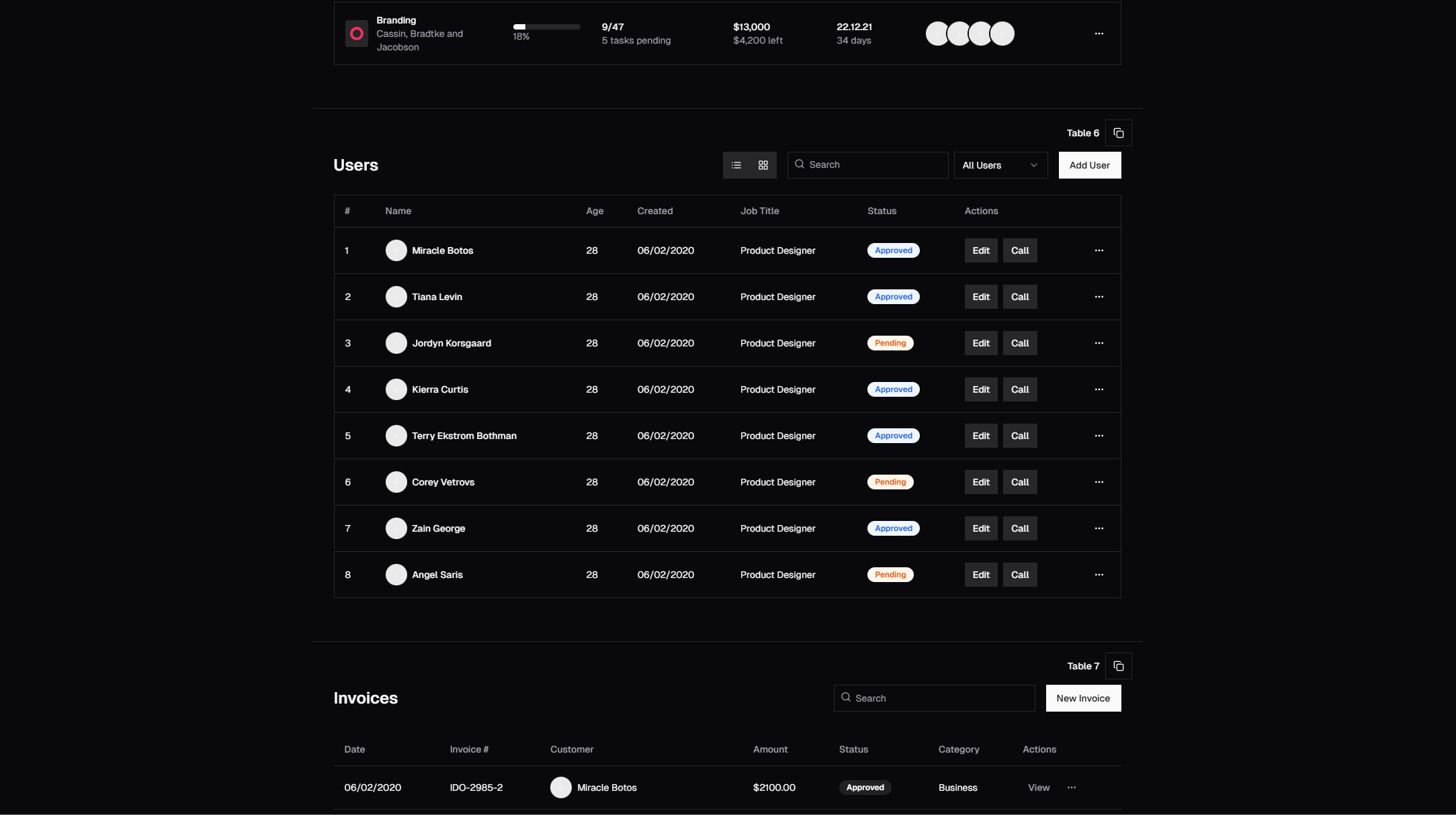
Tables are the oldest UI pattern on the web. Before CSS Grid, before Flexbox, before divs — developers used <table> elements to lay out entire pages. The semantic table has since returned to its proper role: displaying structured, tabular data. But the gap between a basic HTML table and a production-ready data table is enormous. Sorting, filtering, pagination, row selection, column resizing, virtual scrolling, server-side data fetching — these features turn a simple grid of cells into one of the most complex components in any application.
The SERP Blocks table collection includes 17 data table components built with Shadcn UI, Tailwind CSS, and TanStack Table. Each one handles a different data table pattern — from simple read-only tables to fully interactive data grids with inline editing, multi-column sorting, faceted filtering, and bulk row actions.
Why Tables Still Matter
Dashboards, admin panels, CRM interfaces, analytics tools, inventory systems, user management screens — tables dominate data-heavy applications because no other component communicates structured information as efficiently. A card grid might look prettier, but when a user needs to compare 50 records across 8 fields, a table is the only practical option.
Tables work because they leverage two cognitive shortcuts:
Spatial consistency — Every row has the same structure. Once a user learns the column layout, they can scan any row instantly without re-orienting.
Alignment for comparison — Values in the same column are vertically aligned, making it trivial to compare across rows. Try comparing prices across 20 products in a card layout versus a table column — the table wins every time.
The challenge is that raw tables are hostile to users. Hundreds of unsorted rows with no way to filter, no way to select, no pagination — the data is technically visible but practically useless. The table components in SERP Blocks solve this by layering interaction patterns on top of the semantic table structure.
Core Table Features
Column Sorting
Sorting is the most basic table interaction: click a column header to sort ascending, click again for descending, click a third time to clear the sort. A sort indicator (arrow icon) in the column header shows the current sort direction.
Single-column sorting works for most cases, but some data sets need multi-column sorting. Sort by department first, then by name within each department. Multi-column sorting is typically activated by holding Shift while clicking additional column headers. The sort order is shown by numbered indicators on each sorted column.
Design details that matter for sort headers:
Cursor change — Sortable column headers should show a pointer cursor on hover. Non-sortable columns (like action columns) should not.
Sort indicator visibility — Show a faint sort icon on hover for unsorted columns (so users know sorting is available), and a solid icon for the actively sorted column.
Default sort — Tables should load with a sensible default sort, not unsorted. Most user tables default to newest-first (descending by date). Alphabetical tables default to A-Z.
TanStack Table (formerly React Table) provides the sorting logic out of the box. Its getSortedRowModel handles single and multi-column sorting, stable sort order, and custom sort functions for non-standard data types (dates, formatted numbers, status enums).
Column Filtering
Filtering lets users narrow the table to rows matching specific criteria. Filter UI patterns include:
Text search filters — A text input above a column that filters rows containing the typed value. Best for name, email, and title columns.
Select/dropdown filters — A dropdown listing all unique values in a column. Users select one or more values to filter by. Best for status, category, and role columns.
Range filters — Two inputs (min and max) for numeric or date columns. Show users with salaries between $50,000 and $100,000, or orders placed between March 1 and March 15.
Faceted filters — Checkboxes or chips showing all unique values with counts. "Active (124) | Inactive (31) | Pending (7)." Users click to toggle values. This pattern, popularized by e-commerce sites, is extremely effective for categorical data because users see the distribution before filtering.
Global search — a single text input that searches across all columns simultaneously — is the fastest path to a specific record. Users type a name, email, or ID and the table instantly narrows to matching rows. Combine global search with column-specific filters for powerful data exploration.
TanStack Table's getFilteredRowModel and getFacetedRowModel provide the filtering engine. Column filter functions can be customized per column: fuzzy matching for text, exact matching for enums, range comparison for numbers.
Pagination
Pagination breaks large data sets into manageable pages. A table with 10,000 rows needs pagination (or virtual scrolling) to remain usable.
Pagination UI patterns:
Page numbers — "1 2 3 ... 47 48 49" with ellipsis for gaps. Users can jump to any page. Best when the total page count is known and users need random access.
Previous/Next — Simple arrow buttons that move one page forward or back. Minimal UI footprint. Best for sequential browsing where users typically read pages in order.
Page size selector — A dropdown letting users choose how many rows per page: 10, 25, 50, 100. Different users have different density preferences. Analysts want 100 rows; casual users prefer 10.
Row count display — "Showing 26-50 of 1,247 results." This contextualizes the current view within the total data set.
Server-side pagination sends only the current page's data from the server, keeping the initial load fast regardless of total data size. Client-side pagination loads all data upfront and slices it in the browser — simpler to implement but unsuitable for data sets larger than a few thousand rows.
Row Selection
Row selection enables bulk operations: delete 15 records, export 200 rows, assign a tag to 30 items. Selection patterns include:
Checkbox column — A checkbox in the first column of each row. A header checkbox selects/deselects all visible rows. This is the standard pattern for admin interfaces.
Row click selection — Clicking anywhere on a row selects it. Shift-click selects a range. Ctrl/Cmd-click toggles individual rows. This pattern works well for desktop applications but can conflict with clickable cells on mobile.
Selection toolbar — When one or more rows are selected, a toolbar appears above the table showing the selection count and available bulk actions: "12 selected — Delete | Export | Assign Tag." This toolbar replaces or overlays the filter bar to draw attention to the active selection.
Selection state management matters. When a user selects rows on page 1, navigates to page 2, selects more rows, and then clicks "Delete Selected," the application must track selections across pages. TanStack Table handles this with a row selection state object keyed by row ID, independent of pagination.
Expandable Rows
Some data does not fit into a flat table structure. An order has line items. A user has activity logs. A project has subtasks. Expandable rows solve this by letting users click a row to reveal additional content below it.
Expandable row patterns:
Detail panel — Clicking a row reveals a full-width panel below it containing detailed information: a form, a sub-table, a chart, or rich text. The expand/collapse toggle is typically a chevron icon in the first column.
Sub-rows — Hierarchical data displayed as nested rows with indentation. A department row expands to show employee rows underneath. Sub-rows maintain the table column alignment, so parent and child data share the same structure.
Accordion rows — Similar to detail panels, but only one row can be expanded at a time. Expanding a new row collapses the previously expanded one. This keeps the table height manageable when detail panels are tall.
Expandable rows work well with the dashboard collection (20 blocks), where tables are a primary data display within admin interfaces.
Server-Side vs. Client-Side Data
The choice between server-side and client-side data handling fundamentally shapes table architecture.
Client-Side Tables
All data is loaded into the browser. Sorting, filtering, and pagination happen in JavaScript without additional network requests. The user experience is instantaneous — clicking a sort header reorders the table in milliseconds because the data is already in memory.
Client-side tables work when:
The total data set is small (under 5,000-10,000 rows)
The data does not change frequently during the user's session
Fast, responsive interactions are prioritized over initial load time
The downside is initial load time. Fetching 5,000 rows from an API and then sorting them client-side means the user waits for the full data transfer before seeing anything. This can be mitigated with loading skeletons (showing table structure with placeholder content while data loads).
Server-Side Tables
Only the current page of data is fetched from the server. Sort, filter, and pagination parameters are sent as query parameters, and the server returns only the matching rows. Initial load is fast because only 10-50 rows are transferred.
Server-side tables are necessary when:
The data set is large (tens of thousands to millions of rows)
The data changes in real time (new records appear, existing records update)
Complex filtering requires database-level operations (full-text search, joins, aggregations)
Security requires that users only access data they are authorized to see (row-level security applied server-side)
The trade-off is latency. Every sort change, filter adjustment, or page navigation triggers a network request. The table shows a loading state during each request, and interactions feel slower compared to client-side processing. Debouncing filter inputs (waiting 300ms after the user stops typing before sending the request) and optimistic UI updates (showing the sort change immediately while fetching confirmation from the server) reduce perceived latency.
Hybrid Approach
Load the first page from the server, then prefetch adjacent pages in the background. When a user navigates to page 2, the data is already in the browser cache. Continue prefetching page 3. This approach combines fast initial load (server-side) with instant navigation (client-side) for the most common browsing patterns.
Virtual Scrolling for Large Datasets
When a table has thousands of rows and pagination is not desirable (the user needs to scroll through all data continuously), virtual scrolling renders only the visible rows. A table with 50,000 rows might render only the 30 rows currently visible in the viewport, plus a small buffer above and below.
Virtual scrolling with TanStack Virtual (the virtualization companion to TanStack Table):
Fixed row height — The simplest case. Each row is 48px tall. The total scroll height is calculated (50,000 rows times 48px = 2,400,000px), and a spacer element creates the scrollable area. Only visible rows are rendered as actual DOM elements. Scrolling recalculates which rows are visible and swaps the rendered elements.
Variable row height — Rows with different content lengths have different heights. This requires measuring each row after rendering and adjusting the scroll calculations dynamically. TanStack Virtual handles this with a measurement cache.
Overscan — Rendering a few extra rows above and below the visible area prevents blank flashes during fast scrolling. An overscan of 5 rows means 5 extra rows are rendered above and 5 below, providing a buffer that covers the scroll distance of a typical scroll event.
Virtual scrolling is critical for performance. Rendering 50,000 DOM rows makes the browser unresponsive. With virtualization, the DOM contains only 30-40 rows regardless of data size, keeping the browser fast and memory usage low.
Column Customization
Power users want control over which columns are visible and in what order. Column customization patterns include:
Column visibility toggle — A dropdown button in the table toolbar listing all columns with checkboxes. Users toggle columns on and off. Hidden columns are removed from the DOM, not just visually hidden, so they do not affect layout or performance.
Column reordering — Drag-and-drop column headers to rearrange column order. The user grabs a column header and drags it to a new position. This is particularly useful for wide tables where the most-needed columns should be first.
Column resizing — Drag the edge of a column header to resize it. A resize handle appears on hover between column headers. This lets users allocate more space to columns with long content (descriptions, names) and less to columns with short content (status, date).
Persisted preferences — Save column visibility, order, and width to localStorage or a user preferences API. The next time the user opens the table, their customizations are restored.
Table Design Considerations
Density Options
Different users and contexts need different table densities:
Compact — Minimal padding, small font size. Fits maximum data in minimum space. Preferred by analysts and power users who work with tables all day.
Default — Balanced padding and font size. Appropriate for most applications.
Comfortable — Extra padding, larger font, more whitespace. Better for infrequent table users, mobile contexts, or when row actions need larger touch targets.
Offering a density toggle (three horizontal-line icons representing compact, default, and comfortable) lets users choose their preference.
Sticky Headers and Columns
When a table scrolls, the header row should remain fixed at the top so users always know which column they are reading. CSS position: sticky on the <thead> handles this without JavaScript.
For wide tables with horizontal scrolling, the first column (typically an identifier like Name or ID) should stick to the left edge. This keeps the row identity visible while scrolling through additional columns.
Empty and Loading States
A table with no data should not show a blank void. Empty states include:
No data message — "No users found" with a suggestion or call to action: "Invite your first team member."
No results message — "No results match your filters" with a button to clear all filters and return to the full data set.
Error state — "Failed to load data" with a retry button. Do not leave users staring at an empty table wondering if the page is broken.
Loading states use skeleton rows — rows with gray animated blocks matching the table's column widths. This tells users that data is loading and gives them a preview of the table structure before content appears.
Integration with Admin Components
Data tables rarely exist in isolation. They are part of larger admin and dashboard interfaces where tables are the primary data display.
The dashboard collection (20 blocks) provides complete dashboard layouts where tables sit alongside charts, KPI cards, and navigation elements. A dashboard overview page might show a summary chart above a table of recent transactions — the chart shows trends, the table shows details.
The admin sidebar collection (10 blocks) provides navigation components for admin panels. A typical admin layout has a sidebar with navigation links (Users, Orders, Products, Settings) and a main content area containing a data table for the selected section.
The account overview collection (10 blocks) includes account management interfaces where tables display user activity, billing history, API usage, and connected integrations.
Together, these collections provide a complete admin panel toolkit: sidebar navigation selects a section, the dashboard layout frames the content, and the data table displays the section's data with full sorting, filtering, and interaction capabilities.
Related Block Categories
Table components integrate with several other block categories in SERP Blocks:
| Section | Category | Count |
| Data Tables | Table | 17 |
| Dashboard Layouts | Dashboard | 20 |
| Admin Sidebar | Admin Sidebar | 10 |
| Account Overview | Account Overview | 10 |
| Settings Pages | Settings | 10 |
| Pagination & Cards | Card | 110 |
SERP Blocks includes 1200+ total blocks across 50+ categories. 60 are free, with the full library available through a one-time Pro purchase.