20 Schedule & Calendar Components with Shadcn UI
Browse 20 schedule and calendar components for React and Next.js — weekly views, event cards, booking UIs, availability pickers, and timeline schedules. Built with Shadcn UI and Tailwind CSS for SaaS scheduling tools.
SERP Blocks Team
Product
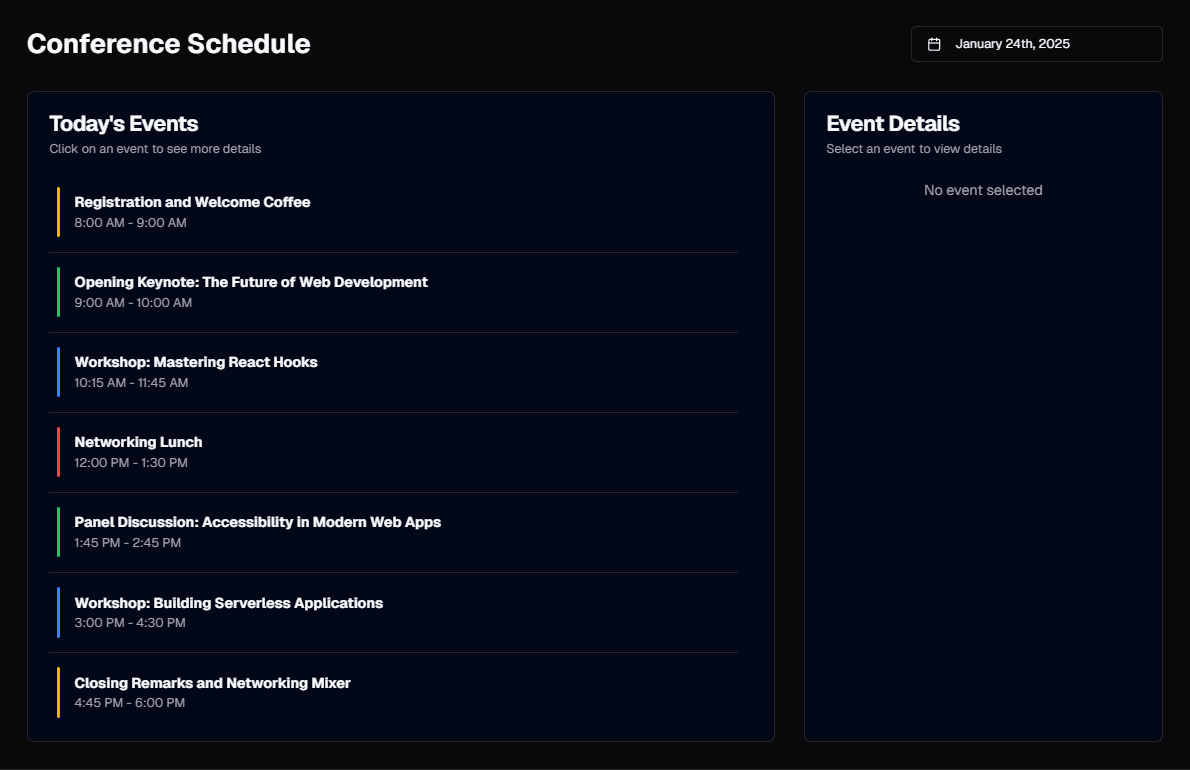
Scheduling UIs are among the most complex components in web development. A calendar that looks simple to the user — a grid of days with colored event blocks — requires a surprising amount of logic underneath. Time zone handling, overlapping event layout, drag-to-create interactions, recurring events, multi-day spans, responsive behavior that works on both a 27-inch monitor and a phone screen. Building a production-ready schedule component from scratch can easily consume two to three weeks of development time.
Most teams reach for a third-party calendar library like FullCalendar or react-big-calendar. These work, but they bring their own styling systems that fight Tailwind CSS, their own component trees that do not integrate with Shadcn UI, and their own bundle weight. You end up with a calendar that looks like a foreign widget pasted into your application rather than a native part of the design.
The SERP Blocks schedule collection takes a different approach. It includes 20 schedule and calendar components built entirely with Shadcn UI primitives and Tailwind CSS. No external calendar libraries, no conflicting styles, no bundle bloat. They look and feel like they belong in your application because they are built with the same design system as everything else.
Schedule Layout Patterns
Weekly View
The weekly view is the workhorse of scheduling applications. Seven columns (one per day), with time slots running vertically from morning to evening. Events appear as colored blocks positioned at their start time and sized to match their duration.
Weekly views are the default for:
Work calendars — Google Calendar and Outlook both default to weekly view because it shows enough context to plan a workweek without overwhelming the user with monthly noise.
Employee scheduling — Shift management tools need to show who is working when, across a full week.
Room/resource booking — Conference rooms, equipment, studio time. The weekly view shows availability at a glance.
Key design considerations for weekly views:
Time slot height affects information density. Tall slots (60px per hour) give plenty of room for event titles and details but require scrolling for a full day view. Short slots (30px per hour) show the whole day without scrolling but events become cramped. The SERP Blocks schedule components use a balanced height that shows 8-10 hours without scrolling while keeping events readable.
Current time indicator — A horizontal line showing the current time, typically with a colored dot on the left edge. This orients the user instantly. Without it, users waste time scanning for "what's happening now."
Overlapping events — When two events occupy the same time slot, they need to share the column width. The standard approach is to divide the column into sub-columns: two overlapping events each get 50% width, three get 33%, and so on. Getting this layout calculation right is one of the harder parts of schedule UI development.
Weekend handling — Some applications show 7 days, others show only the 5 weekdays. Business scheduling tools typically default to Monday-Friday with an option to show weekends. The layout should handle both without breaking.
Daily View
A single column showing one day's schedule in detail. Time slots run vertically, events are placed at their start time. The daily view is used when the schedule is dense enough that a weekly view would be too cramped — medical appointments, 15-minute meeting slots, classroom schedules.
Daily views have room for richer event details:
Full event title (not truncated)
Attendee names or avatars
Location or room information
Status indicators (confirmed, tentative, canceled)
Quick-action buttons (reschedule, cancel, join meeting)
Monthly View
The traditional calendar grid: a 7-column layout with 4-6 rows, each cell representing a day. Events appear as small labels or dots within each cell. Monthly views are best for high-level planning — seeing which days have events, identifying free days, and understanding workload distribution across the month.
Monthly views necessarily compress event information. A cell might only have room for 2-3 event titles before adding a "+4 more" overflow indicator. Clicking a day typically opens a daily or weekly view centered on that date, or expands into a popover showing all events for that day.
Agenda / List View
Events listed chronologically without a calendar grid. Each event gets its own row with full details: title, date, time, duration, location, attendees, and status. The agenda view works like a to-do list for time — it answers "what's coming up?" without any spatial/grid overhead.
Agenda views are ideal for:
Mobile scheduling — Grid-based calendars are hard to navigate on small screens. An agenda list scrolls naturally and shows all relevant information without tapping.
Read-only schedules — Conference agendas, class schedules, event programs. Users need to see what is happening and when, but do not need to create or modify events.
Activity feeds — A chronological list of past and upcoming events in an application's timeline.
Event Card Design
The event card is the atomic unit of any schedule component. Whether it appears as a small block in a weekly grid or a full row in an agenda list, the card needs to communicate the event's essential information at a glance.
Essential Event Information
Every event card should display:
Title — The event name. Truncate with ellipsis if it exceeds the available space in grid views; show full title in agenda views.
Time — Start time at minimum, start and end time when space allows. Use 12-hour or 24-hour format consistently based on locale.
Visual category indicator — A colored left border, background tint, or dot that categorizes the event by type (meeting, focus time, personal, out of office). Colors should be distinguishable and consistent across the application.
Enhanced Event Information
For cards with more space (daily view, agenda view, popovers):
Location — Physical address or virtual meeting link
Attendees — Avatar stack showing participants, with a "+3" overflow for large groups
Status — Confirmed, tentative, canceled. Shown as a badge or icon.
Description preview — First line or two of the event description
Recurrence indicator — An icon showing the event repeats (daily, weekly, monthly)
Action buttons — Edit, delete, reschedule, join meeting link
Color Coding
Color is the primary visual language for calendar events. Users learn to associate colors with categories — blue for meetings, green for personal, red for deadlines, gray for canceled. Effective color coding requires:
High contrast against the card background — Light-colored event blocks with dark text, or dark blocks with white text. Do not use medium colors that make text hard to read in either light or dark mode.
Consistent meaning — Once blue means "meeting," it should always mean "meeting" across every view and every component.
Limited palette — Five to seven colors maximum. More than that and users cannot remember what each color represents.
Accessibility — Do not rely on color alone to convey meaning. Add a text label, icon, or pattern so colorblind users can distinguish event types.
Booking and Availability Patterns
Appointment Booking UI
Booking UIs flip the calendar paradigm from "show my events" to "show available slots." Instead of displaying existing events, the calendar shows open time slots that a visitor can claim.
The standard booking flow:
Select a date — A date picker or mini calendar showing available dates. Days with no availability are grayed out or crossed out.
Select a time slot — A list of available times for the selected date. Slots are typically 15, 30, or 60 minutes. Booked slots are hidden or shown as unavailable.
Confirm details — Name, email, phone, notes. Minimal form fields to reduce drop-off.
Confirmation — Summary of the booking with options to add to calendar (Google, Outlook, Apple).
This is the pattern used by Calendly, Cal.com, and every medical/dental appointment scheduler. The schedule blocks include booking UI patterns that implement this flow with Shadcn UI's date picker and form components.
Availability Picker
An interface for the event owner to define when they are available for bookings. Typically a weekly template: "Monday 9am-5pm, Tuesday 9am-12pm, Wednesday unavailable" and so on.
Availability picker patterns include:
Toggle grid — A 7-column (days) by 24-row (hours) grid where clicking a cell toggles it between available and unavailable. Fast for setting broad availability.
Time range inputs — A list of days, each with start/end time inputs. "Monday: 9:00 AM - 5:00 PM." Add button to create multiple ranges per day (e.g., morning and afternoon blocks with a lunch break).
Drag-to-select — Click and drag across time slots to mark a range as available. The most intuitive interaction for setting availability but requires careful implementation for touch devices.
Resource Scheduling
When multiple resources (rooms, equipment, people) need to be scheduled, the calendar becomes a grid with resources on one axis and time on the other. Each resource gets its own column (or row), and events are placed in the corresponding resource's lane.
Resource scheduling components need:
Resource headers — Name, avatar, or icon for each resource across the top of the grid
Conflict detection — Visual indication when a resource is double-booked
Drag-and-drop — Move events between resources and time slots
Capacity indicators — Show when a resource is near or at capacity (e.g., a room has 8 of 10 seats filled)
Timeline Schedule Patterns
Timelines differ from calendars in that they represent a sequence of events along a single axis, without the day/week/month grid structure. They are used for project milestones, historical events, process flows, and any scenario where the sequence and relative timing matter more than the calendar position.
The timeline collection includes 10 dedicated timeline components. Combined with schedule blocks, they cover both structured calendar views and linear timeline presentations.
Timeline variants include:
Vertical timeline — Events stacked top to bottom with a connecting line. Each event has a date, title, and description. Alternating left/right placement adds visual interest on wider screens.
Horizontal timeline — Events arranged left to right along a horizontal track. Works for processes with a clear start and end — project phases, onboarding steps, delivery tracking.
Gantt-style timeline — Horizontal bars showing duration, overlap, and dependencies between tasks. Used in project management tools and often combined with a data table listing task details.
SaaS Scheduling Tool Patterns
Meeting Scheduler
The meeting scheduler is the most common scheduling UI in SaaS. A logged-in user creates events, invites participants, and manages their calendar. The UI needs:
Quick-create — Click on an empty time slot to create an event. A popover appears with title, time, and attendees fields. No full-page navigation for simple events.
Drag-to-resize — Drag the bottom edge of an event block to change its duration. Drag the top edge to change its start time. The event snaps to 15-minute increments.
Drag-to-move — Drag an event from one time slot to another, or one day to another. The event updates automatically.
Event popover — Click an event to open a popover with full details and action buttons (edit, delete, duplicate). The popover is lighter than navigating to a full edit page.
Shift Scheduling
Employee shift scheduling adds constraints that personal calendars do not have. Shifts must cover required hours, employees have maximum hour limits, some shifts need minimum staffing levels, and swaps between employees need approval workflows.
Shift schedule UIs typically use a weekly grid with employees as rows and days as columns. Each cell shows the assigned shift (morning, afternoon, evening, off). Color coding distinguishes shift types, and empty cells indicate unassigned slots that need coverage.
Appointment Management Dashboard
For businesses that take appointments — clinics, salons, consultancies — the schedule component lives inside a dashboard (20 blocks available). The dashboard combines the day's schedule with:
A stat card showing today's appointment count, completed, canceled, and no-shows
An upcoming appointments list with patient/client names and service types
A quick-book action for walk-ins or phone bookings
Revenue summary based on completed appointments
The dashboard blocks provide the overall layout, while the schedule blocks provide the calendar component that fits within it.
Data Display Integration
Schedule components frequently appear alongside data display elements. The table collection (17 blocks) is particularly useful for complementary schedule views:
Event list tables — A sortable, filterable table showing all events with columns for title, date, time, type, status, and actions. This tabular view complements the visual calendar by making events searchable and sortable.
Attendee tables — For events with multiple participants, a table showing RSVPs, attendance status, and contact information.
Booking history tables — Past appointments with dates, services, providers, and outcomes. Useful for client-facing portals.
Responsive Calendar Design
Calendar components face the hardest responsive design challenge of any UI pattern. A weekly grid that shows seven days and 10 hours of time slots on a desktop monitor has to work on a 375px-wide phone screen. There is no way to display the same information at both sizes — the mobile design must make deliberate trade-offs.
Mobile Patterns
Day view default — On mobile, switch from weekly to daily view automatically. Show one day at a time with horizontal swipe navigation between days. This preserves all the time-slot detail while eliminating the cramped multi-column layout.
Mini calendar + agenda — Show a compact month calendar at the top (small enough to fit on a phone screen) with an agenda list below. Tapping a day in the mini calendar scrolls the agenda to that day's events. This pattern works well for read-only schedule displays.
Bottom sheet event details — On mobile, tapping an event opens a bottom sheet rather than a popover. Bottom sheets provide more room for event details and actions, and they feel native to mobile interaction patterns.
Swipe navigation — Swipe left/right to move between days or weeks. Swipe gestures should be snappy — less than 150ms to register — with visual feedback showing the calendar sliding to the next period.
Tablet Optimization
Tablets occupy the middle ground. A 3-day view often works better than a full 7-day week on a tablet in portrait orientation. The schedule blocks include variants that show 3-day and 5-day views as intermediate layouts between mobile (single day) and desktop (full week).
Time Zone Handling
Schedule components that serve users across time zones need clear time zone indicators:
Display time zone label — Show "(PST)" or "(UTC-8)" next to times so users know what zone they are viewing.
Time zone selector — Let users switch the calendar to a different time zone. Essential for distributed teams scheduling across offices.
Multi-zone display — Show the same event with times in two zones (e.g., "2:00 PM PST / 5:00 PM EST"). Useful for meeting invitations that span zones.
Local time conversion — Automatically detect the user's time zone and display all events in their local time, with an option to view in the event's original time zone.
Accessibility for Schedule Components
Calendar components present significant accessibility challenges:
Keyboard navigation — Users must be able to navigate the calendar grid using arrow keys, jump between days/weeks with Page Up/Down, and interact with events using Enter and Space. The grid should use
role="grid"with properrole="gridcell"markup.Screen reader announcements — When the calendar view changes (next week, next month), announce the new date range via
aria-live. When focus moves to an event, announce the full event details (title, date, time, location) not just the visible label.Focus management — When creating, editing, or deleting an event, manage focus transitions carefully. After closing an event creation dialog, focus should return to the time slot that triggered it. After deleting an event, focus should move to the next event or the nearest empty slot.
High contrast mode — Event colors must remain distinguishable in Windows High Contrast mode. Use borders and patterns in addition to color fills.
Reduced motion — Calendar transitions (sliding between weeks, event drag animations) should respect
prefers-reduced-motionand switch to instant state changes.
Related Block Categories
Schedule components integrate with several other block types to build complete scheduling applications:
| Section | Category | Count |
| Schedule & Calendar | Schedule | 20 |
| Timeline Views | Timeline | 10 |
| Dashboard Layouts | Dashboard | 20 |
| Data Tables | Table | 17 |
| Contact / Booking Forms | Contact | 33 |
| Stat Cards | Stat | 10 |
| Modal Dialogs | Modal | 13 |
| Navigation Sidebar | Admin Sidebar | 10 |
Together, these categories provide 133 blocks for building scheduling applications, appointment platforms, project management tools, and any SaaS product with a calendar at its core.
SERP Blocks includes 1,200+ total blocks across 50+ categories. 60 are free to use, with the full library — including all 20 schedule and calendar components — available through a one-time Pro purchase.