Website Redesign Checklist: Sections Every Modern Site Needs
A comprehensive website redesign checklist mapping every essential section — from hero to footer — to ready-made UI blocks. Covers content audit, design system setup, mobile-first strategy, SEO preservation, and launch planning.
SERP Blocks Team
Product
A website redesign is one of the highest-leverage projects a business can undertake. Done well, it improves conversion rates, reduces bounce rates, strengthens brand perception, and sets the foundation for years of content and growth. Done poorly, it tanks SEO rankings, confuses returning visitors, and costs months of recovery.
The difference between a successful redesign and a painful one usually comes down to preparation. Teams that inventory every section they need, map content to the right components, and plan for mobile, dark mode, and performance from day one ship faster and with fewer revisions.
This post is a comprehensive checklist for redesigning a modern website. It maps every essential section type to a specific UI component category, covers the pre-design groundwork that prevents costly mistakes, and provides a launch checklist to ensure nothing falls through the cracks.
Phase 1: Pre-Design Groundwork
Before opening a design tool or writing a single line of code, there is foundational work that determines whether the redesign succeeds or stalls.
Content Audit
Every redesign should start with an honest inventory of existing content. Open a spreadsheet and document every page on the current site, its URL, its purpose, its traffic (from analytics), and a keep/revise/remove decision.
Common findings from a content audit:
Pages with significant organic traffic that must be preserved (and their URLs maintained or properly redirected)
Outdated content that actively hurts credibility
Redundant pages that can be consolidated
Missing content gaps where competitors have coverage
The content audit directly informs which sections you need. If you have 50 blog posts worth keeping, you need blog list and blog single layouts. If you have a product catalog, you need product list, product info, and shop category pages. Let the content define the component needs, not the other way around.
Design System Setup
A redesign without a design system becomes an exercise in inconsistency. Before building any pages, establish your foundational decisions:
Typography scale: Heading sizes, body text, small text, and how they change across breakpoints
Color palette: Primary, secondary, neutral, success, warning, and error colors with light and dark mode variants
Spacing system: Consistent padding and margin values (Tailwind CSS handles this well with its default spacing scale)
Component style: Border radius, shadow depth, border usage, and overall density
Dark mode strategy: Will you support dark mode? If so, define every color token for both themes upfront
Tools like Shadcn UI make this process faster because the design system is already defined. You customize the CSS variables for your brand, and every component inherits those decisions automatically. This is the approach used across all 1,200+ blocks in SERP Blocks — change the theme once, and every block updates.
Mobile-First Planning
Designing desktop-first and then squeezing content into mobile is the most common redesign mistake. It leads to cut features, broken layouts, and a mobile experience that feels like an afterthought.
Start with the mobile layout for every section. Ask: what is the minimum content this section needs to communicate its purpose on a 375px screen? Build that first, then progressively enhance for tablet and desktop.
Mobile-first planning surfaces content priority issues early. A hero section that works on mobile needs a tight headline, a concise subtext, and a single CTA. If you cannot communicate your value proposition in that format, the copy needs work — and that is better to discover before the desktop layout is finalized.
Phase 2: Essential Page Sections (The Full Checklist)
Every modern website needs a specific set of sections. Below is the complete inventory, organized in the order visitors typically encounter them, with the component category that serves each need.
Navigation
The navigation is on every page and sets the structural framework for the entire site. Get it right first.
Navbar: Responsive header with logo, links, and CTA button. Consider mega menus for complex sites, sticky behavior for long pages, and mobile hamburger menus. SERP Blocks includes 17 navbar blocks covering standard, centered, transparent overlay, and mega menu styles.
Banner: Announcement bars for promotions, product launches, or important notices. The 20 banner blocks include dismissible, multi-line, and countdown timer variants.
Footer: Contact information, site map, social links, legal links, and newsletter signup. The 21 footer blocks range from minimal single-row footers to complex multi-column layouts with embedded forms.
Hero Section
The hero section carries the weight of first impressions. This is where visitors decide whether to scroll or leave.
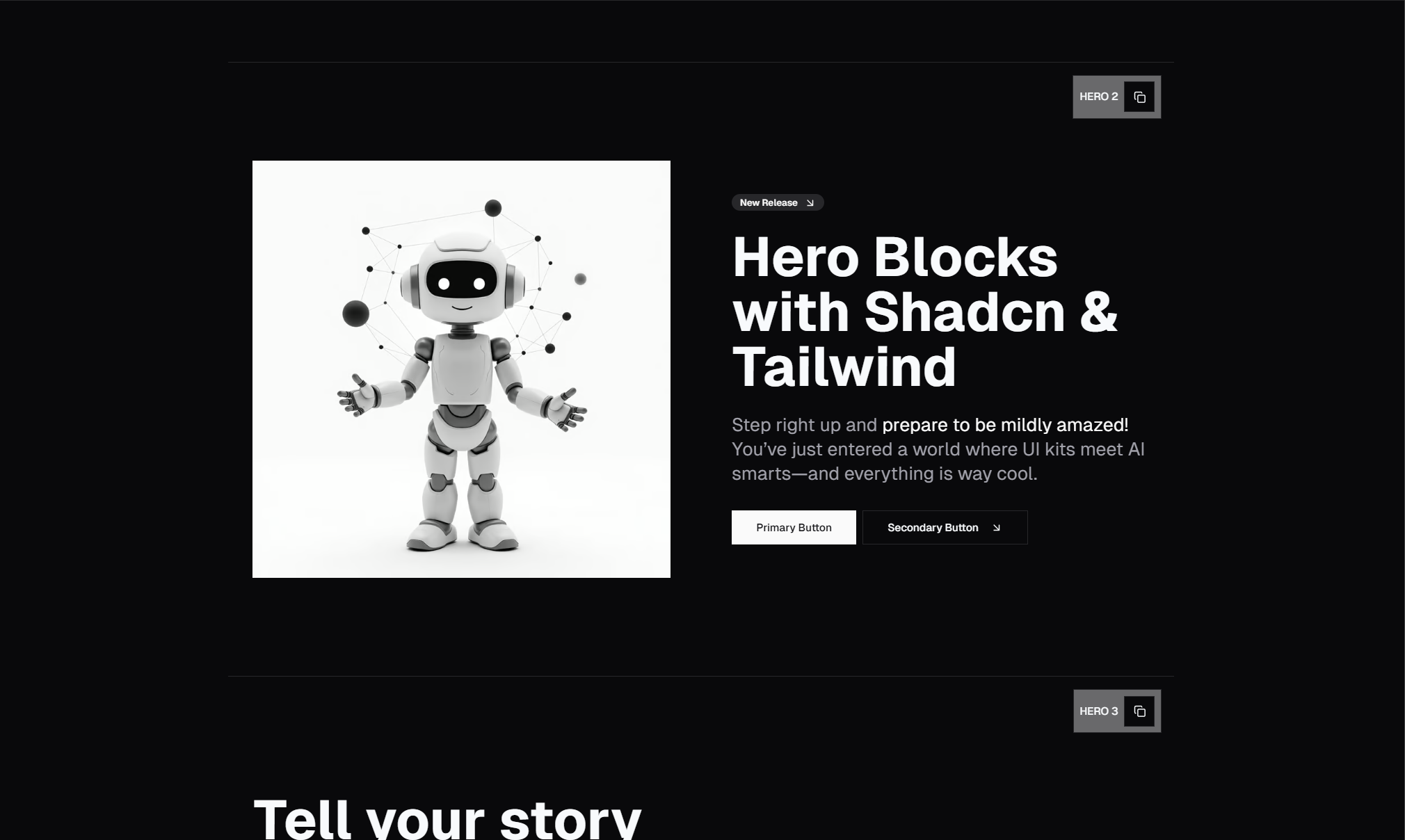
Your hero needs three elements: a headline that communicates your core value, supporting text that provides context, and a call-to-action that drives the next step. Beyond these basics, hero sections can include background images, video, product screenshots, customer logos, or animated elements.
The hero collection in SERP Blocks includes 81 blocks across every major style — centered, split-screen, with background media, with app screenshots, gradient overlays, and more. Start here and customize rather than building from scratch.
Value Proposition and Features
After the hero, visitors want to understand what you offer and why it matters. This section bridges the promise of the headline with the specifics of your product or service.
Feature sections: Icon-and-text grids, alternating image-and-text rows, bento grid layouts, and tabbed feature showcases. The 132 feature blocks cover every common pattern. This is the largest category in the library for a reason — feature sections appear on nearly every commercial website.
Card components: Self-contained content units used throughout feature sections, dashboards, and content layouts. The 110 card blocks include pricing cards, stat cards, profile cards, image cards, and interactive cards.
Content sections: Long-form explanatory content with proper typography, pull quotes, and inline images. The 13 content blocks handle article-style layouts.
Social Proof
Visitors trust other customers more than they trust your marketing copy. Social proof sections convert browsers into buyers.
Testimonials: Customer quotes with photos, company logos, star ratings, and video testimonials. The 40 testimonial blocks include single featured quotes, carousel sliders, grid layouts, and quote walls.
Logos: Client or partner logo bars that establish credibility through association. Simple to implement but often overlooked. The 11 logo blocks include static rows, scrolling marquees, and multi-tier arrangements.
Reviews: User-generated reviews with ratings, dates, and verified badges. The 13 review blocks are designed for product pages and service listings.
Stats: Hard numbers that demonstrate scale and impact — customers served, uptime percentage, response time. The 10 stat blocks present metrics in visually prominent formats.
Awards: Trust badges, certifications, and industry recognition. The 10 awards blocks display these credibility signals effectively.
Conversion Sections
Every page should guide visitors toward a specific action. Conversion sections make that action clear and accessible.
CTA sections: Full-width calls to action with headlines, supporting text, and buttons. Place them between content sections and always at the bottom of the page before the footer. The 32 CTA blocks include centered, split, gradient, and image-backed styles.
Pricing: Plan comparison tables, individual plan cards, and toggle switches for monthly/annual billing. The 21 pricing blocks handle everything from simple three-tier layouts to complex enterprise comparison tables.
Newsletter signup: Email capture forms with value propositions for subscribing. The 13 newsletter blocks include inline forms, popup-style cards, and full-section designs.
Contact forms: Lead capture with name, email, message, and optional fields. The 33 contact blocks range from simple forms to layouts with maps, office hours, and multiple locations.
FAQ and Support
Unanswered questions are conversion killers. Address objections proactively.
FAQ sections: Accordion-style expandable questions, two-column layouts, and categorized FAQ pages. The 21 FAQ blocks include single-column, multi-column, and searchable designs.
Cost estimator: Interactive calculators that help prospects understand pricing for variable-cost products. The 10 cost estimator blocks provide slider-based and input-based calculation interfaces.
About and Team
People buy from people. About pages and team sections humanize your brand.
About sections: Mission statements, company history, values, and culture. The 32 about blocks include narrative layouts, timeline-based histories, and split designs with images.
Team sections: Member cards with photos, names, roles, and social links. The 23 team blocks range from simple grid layouts to detailed profile cards with bios.
Timeline: Company milestones, product history, or process steps. The 10 timeline blocks include vertical, horizontal, and alternating styles.
Careers: Job listings, company culture showcases, and application sections. The 20 careers blocks cover job boards, benefit grids, and culture sections.
Blog and Content
Content marketing drives organic traffic. Your blog architecture matters for both readers and search engines.
Blog list: Article index pages with featured posts, category filters, and pagination. The 27 blog list blocks include magazine layouts, minimal lists, and card grids.
Blog single: Individual article templates with proper typography, table of contents, author attribution, and related posts. The 12 blog single blocks handle long-form content presentation.
Changelog: Product update logs that keep users informed about new features and fixes. The 10 changelog blocks present updates chronologically with version numbers and categories.
News sections: Current events, press releases, or industry updates. The 8 news blocks handle media-rich news presentations.
Discussion: Comment threads, forum-style conversations, and community features. The 11 discussion blocks provide threaded conversation layouts.
Create post: Content creation interfaces with rich text editors and media uploads. The 10 create post blocks include form-based and WYSIWYG editor layouts.
E-Commerce Sections
If you sell products online, the redesign needs to cover the entire purchase flow.
Product pages: Detailed product views with images, descriptions, specs, and add-to-cart. The 25 product blocks and 15 product info blocks handle single-product presentation.
Product listings: Category pages, search results, and filtered product grids. The 20 product list blocks and 20 shop category blocks cover browsing interfaces.
Shopping cart: Cart summary, quantity adjustments, and proceed-to-checkout. The 11 shopping cart blocks include sidebar carts, full-page carts, and slide-out drawers.
Payment forms: Checkout interfaces with card input, billing address, and order summary. The 15 payment form blocks handle secure-looking payment collection.
Order confirmation: Post-purchase pages with order details, shipping estimates, and next steps. The 10 order confirmation blocks provide reassuring post-checkout experiences.
Refund status: Order tracking and refund progress interfaces. The 10 refund status blocks keep customers informed about return processing.
Authentication and Onboarding
The first interaction logged-in users have with your product shapes their perception of quality.
Login pages: Email/password forms, social login buttons, and magic link options. The 17 login blocks include centered, split-screen, and branded layouts.
Sign up pages: Registration forms with progressive disclosure and social signup. The 11 sign up blocks balance conversion optimization with data collection needs.
Forgot password: Password reset flows with email verification. The 10 forgot password blocks handle this critical recovery path.
Onboarding flows: Multi-step welcome sequences, feature tours, and preference selection. The 12 onboarding blocks guide new users through setup.
Dashboard and Admin
For applications with logged-in experiences, internal interfaces need the same design attention as marketing pages.
Dashboard: Overview pages with key metrics, recent activity, and quick actions. The 20 dashboard blocks provide admin home screens for SaaS products.
Admin sidebar: Navigation panels for admin interfaces with collapsible menus and icons. The 10 admin sidebar blocks handle application navigation.
Account overview: User profile summaries, subscription status, and usage data. The 10 account overview blocks present personal account information.
Settings: Preference panels, notification controls, and profile editing. The 10 settings blocks provide structured form layouts for user preferences.
Tables: Data display with sorting, filtering, and pagination. The 17 table blocks handle everything from simple lists to complex data grids.
Modals: Dialog overlays for confirmations, detail views, and inline forms. The 13 modal blocks include alert dialogs, form modals, and full-screen overlays.
Specialized Sections
These sections appear on specific page types but are easy to overlook during a redesign.
Gallery: Image and media showcases with lightbox, carousel, and masonry layouts. The 25 gallery blocks present visual content effectively.
Portfolio: Project showcases with filtering, case study previews, and detail views. The 20 portfolio blocks serve creative professionals and agencies.
Schedule: Event calendars, booking interfaces, and availability displays. The 20 schedule blocks handle time-based content.
Directory list and single: Business or member directories with search and filtering. The 10 directory list and 10 directory single blocks cover listing and detail pages.
Link hub: Link-in-bio style pages that consolidate multiple destinations. The 14 link hub blocks provide Linktree-style layouts.
Chat: Live chat widgets and messaging interfaces. The 10 chat blocks include floating widgets and embedded conversation panels.
Cookie consent: GDPR and privacy compliance banners. The 10 cookie blocks handle consent collection with style.
Error pages: 404 and 500 pages that keep users on your site. The 11 error blocks turn dead ends into navigation opportunities.
Phase 3: SEO Preservation
A redesign that ignores SEO can wipe out months or years of organic traffic gains. This is not optional.
URL Mapping and Redirects
Create a complete map of every URL on the current site and its corresponding URL on the new site. Every changed URL needs a 301 redirect. No exceptions.
Common redirect scenarios:
/about-uschanges to/about/blog/2025/03/post-titlechanges to/blog/post-titleProduct URLs restructured from
/products/123to/products/product-name
Test every redirect before launch. A broken redirect is worse than no redirect because it signals to search engines that the page is intentionally gone.
Metadata Preservation
Every page that currently has a title tag, meta description, Open Graph tags, and structured data needs those same elements on the redesigned version. Do not lose existing metadata during the rebuild.
Performance Budget
Search engines factor page speed into rankings. Set a performance budget before the redesign starts:
Largest Contentful Paint (LCP): Under 2.5 seconds
First Input Delay (FID): Under 100 milliseconds
Cumulative Layout Shift (CLS): Under 0.1
Using pre-built blocks helps here. Blocks from SERP Blocks are built with Tailwind CSS (which tree-shakes unused styles) and Shadcn UI (which avoids runtime CSS-in-JS overhead), keeping bundle sizes lean and render times fast.
Internal Linking
During the redesign, audit and rebuild internal links. Ensure every page is reachable within three clicks from the homepage. Link related content together — blog posts to product pages, feature pages to pricing, case studies to testimonial sections.
Phase 4: Launch Checklist
The final phase covers everything that needs to happen in the days before and after going live.
Pre-Launch
All redirects are configured and tested
Mobile layout reviewed on actual devices (not just browser dev tools)
Dark mode tested on every page
All forms tested with valid and invalid submissions
Analytics tracking reinstalled and verified
Social sharing previews checked (Open Graph and Twitter Card tags)
Cookie consent banner functional and compliant
Error pages designed and configured for 404 and 500 responses
XML sitemap generated and submitted
robots.txt reviewed and updated
SSL certificate active on all pages
Performance tested on slow 3G connection
Post-Launch (First 48 Hours)
Monitor Google Search Console for crawl errors
Check analytics for unexpected traffic drops
Test all critical user flows (sign up, purchase, contact form)
Verify redirects are working via server logs
Monitor Core Web Vitals in the field
Check for broken images and missing assets
Review mobile usability report in Search Console
Post-Launch (First 30 Days)
Compare organic traffic week-over-week with pre-launch baseline
Monitor keyword rankings for priority terms
Collect and address user feedback on the new design
A/B test hero section and CTA copy
Review conversion rates against pre-redesign benchmarks
Building with Pre-Made Blocks
A website redesign touches every section of your site. Building each section from scratch — hero, features, testimonials, pricing, FAQ, footer, dashboard, authentication, e-commerce flows — takes weeks or months of design and development time.
Pre-built block libraries compress this timeline dramatically. With SERP Blocks, you get 1,200+ blocks across 50+ categories, covering every section in this checklist. 60 blocks are free to start with, and a one-time Pro purchase unlocks the entire collection. Every block is built with Shadcn UI and Tailwind CSS, works with Next.js, and supports dark mode out of the box.
Instead of building from zero, start with blocks that match your section needs, customize colors and content to match your brand, and focus your development time on the custom logic and integrations that make your site unique.
Browse the full library at blocks.serp.co and map every section of your redesign to a ready-made block. The checklist above tells you what you need. The blocks give you a head start on building it.